Blog

  • Choosing an AI Image Model by Creative Direction (Not Hype)

    Choosing an AI Image Model by Creative Direction (Not Hype)

    Model choice is not a “which one is best” question.

    It is a routing question.

    Route by creative direction and bottleneck after your QA gates are defined. Then the model becomes an implementation detail—not a gamble.

    Key Takeaways

    • Creative direction defines what must stay true (world + roles + QC gates).
    • The bottleneck defines what the model must solve for you.
    • Pick the model after you lock direction—then test under the same gates.
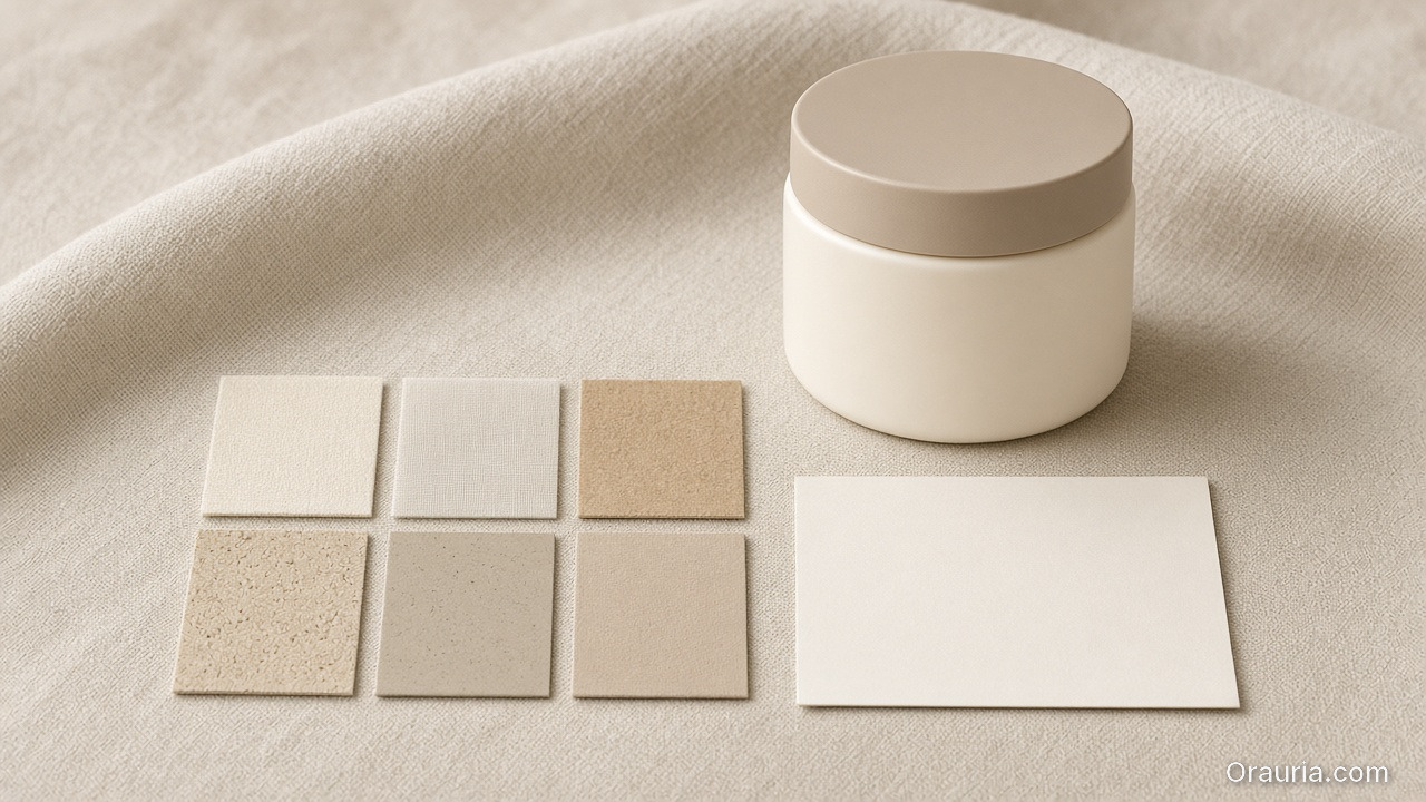
    An unlabeled cream jar on beige linen beside six small material swatches and a blank card

    Step 1 — Lock direction first (inputs you must keep constant)

    Before you compare models, lock:

    • world promise (light family + palette logic),
    • identity anchors (faces/characters or texture cues),
    • and your QA gates (geometry truth + readability).

    If direction changes while models change, you learn nothing.
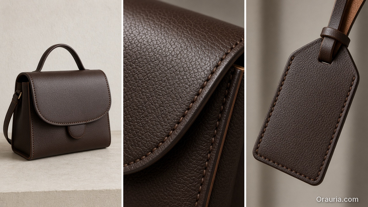
    A triptych of a brown leather handbag: full silhouette, close stitching texture, and a blank leather tag

    Step 2 — Identify your bottleneck type

    Most ecommerce issues fall into one of three bottleneck types:

    1. Geometry bottleneck: edges, proportions, product silhouette
    2. Texture bottleneck: materials, labels, stitching cues
    3. Readability bottleneck: text/label clarity after resize

    Your model should be selected based on the bottleneck you actually see.
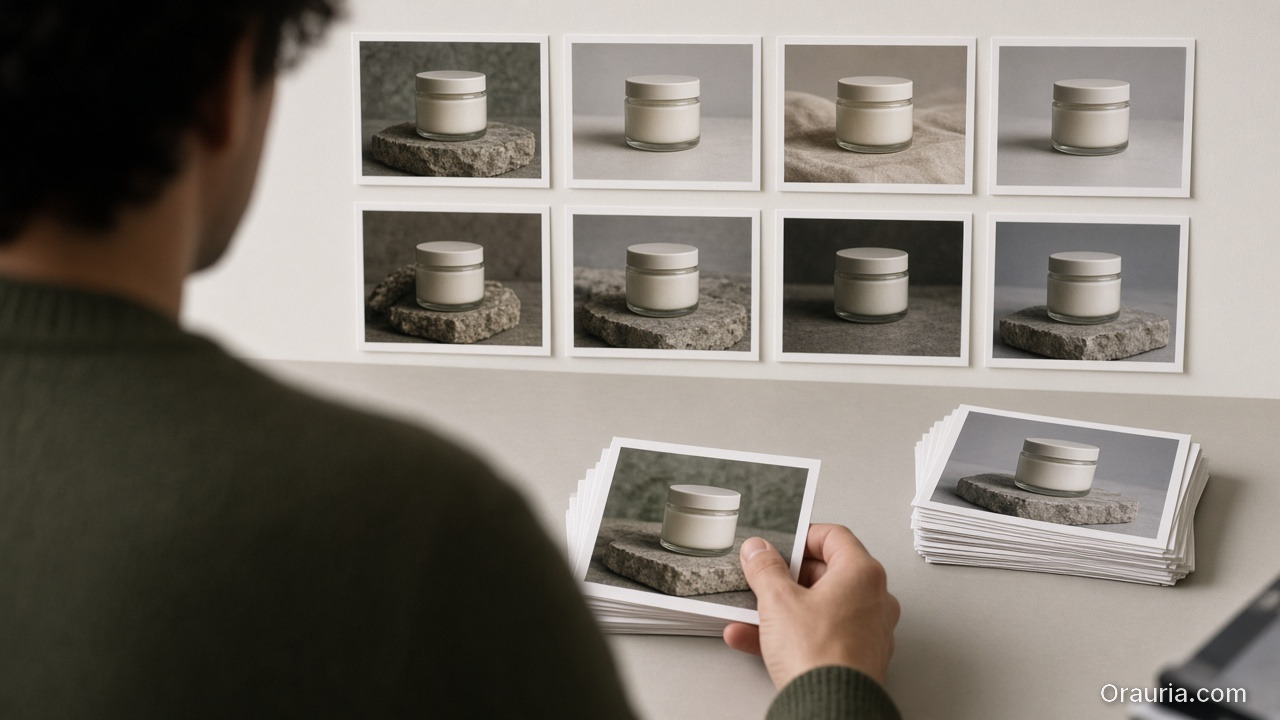
    A person seen from behind reviewing a wall of cream-jar stills, holding one print with two stacks on the desk

    Step 3 — Route outputs through QA gates

    Don’t decide by what the image “feels like”. Decide by pass/fail:

    • geometry truth gate,
    • readability gate,
    • world continuity gate (shadow family + tone),
    • and offer tone gate (if your copy implies a different promise).
    An open notebook with empty numbered lines beside two prints of the same matte bottle in slightly different light

    A practical routing checklist

    Use this checklist whenever a new model trend appears:

    1. What bottleneck are we solving today?
    2. Are direction + gates unchanged?
    3. Can we compare on the same output formats (1:1, 9:16, listing)?
    4. Are we rejecting failures early (before polish)?

    If yes: test models. If no: fix the direction kit first.

    What to do next

    Start with the direction-after rule:

    Then upgrade routing to bottleneck-first:

    • pick the model by QA evidence,
    • and keep your gates constant.
  • Orauria vs Canva + ChatGPT: Honest Comparison for Ecommerce Teams

    Orauria vs Canva + ChatGPT: Honest Comparison for Ecommerce Teams

    Many teams try this stack:

    • ChatGPT for briefs and copy,
    • Canva for layout and crops,
    • and “AI images from somewhere else” for visuals.

    It works—until you scale.

    The failure point is not output quality. It is handoff cost.

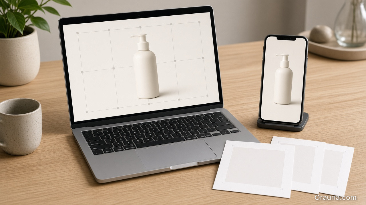
    A tidy wooden desk with a laptop showing a pump bottle in a crop grid and a phone showing the same bottle vertically

    Where Canva + ChatGPT excels

    Canva is great for:

    • quick crops,
    • fast social templates,
    • and design iteration when the direction is already locked.

    ChatGPT is great for:

    • brainstorming,
    • first drafts of captions,
    • and helping you write the brief.
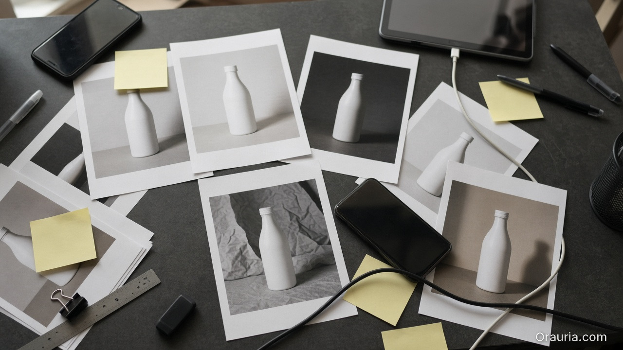
    An overhead view of a dark desk cluttered with inconsistent white-bottle prints, blank sticky notes, two phones and cables

    Where the stack breaks in ecommerce production

    When you go from one asset to a drop system, you need:

    • a shared brand kit,
    • consistent identity anchors,
    • and QA gates across formats.

    In a scattered stack, your system becomes “people remembering”. But production requires “rules enforcing”.

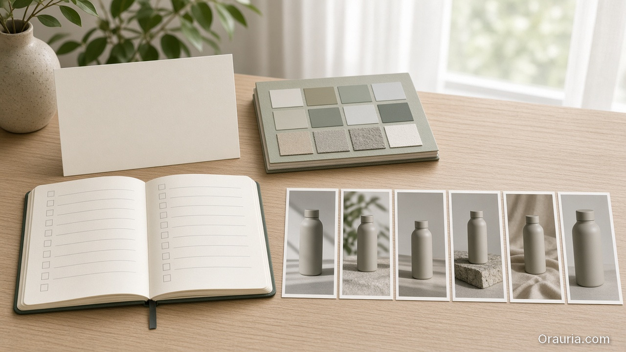
    A sunlit desk with a blank card, a color-and-texture kit, an open checklist notebook, and six consistent vertical stills of the same bottle

    Orauria’s advantage: workflow continuity

    Orauria is built around the loop:

    1. Brief (intent + constraints),
    2. Brand kit (rules that must not change),
    3. Gates (QC checks before you upscale/export),
    4. Generate and route variants,
    5. Publish-ready exports for ads and listings.

    This turns many outputs into one recognizable system.

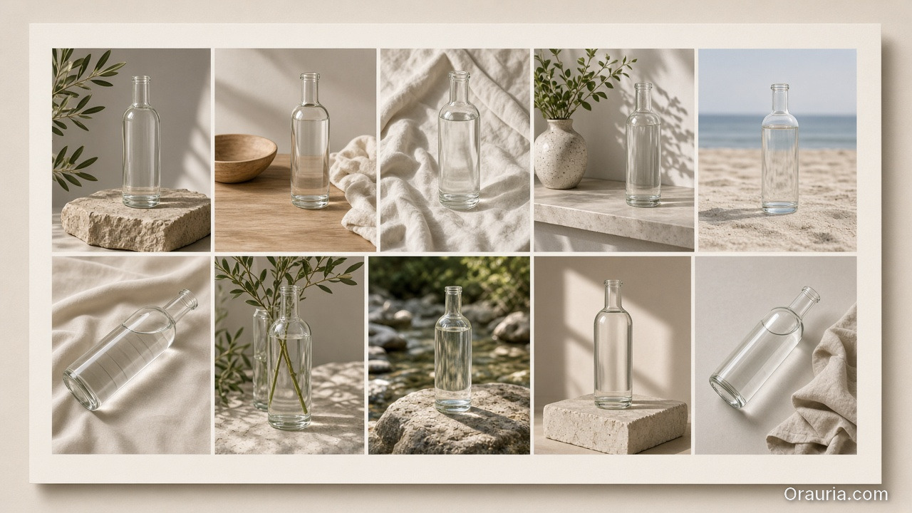
    A ten-cell grid of the same clear glass bottle in related lifestyle and studio settings, visually consistent

    The decision rule (when Orauria wins)

    Orauria wins when:

    • you need 10+ assets per campaign,
    • you must preserve brand identity across sizes and channels,
    • and you don’t have time to manually re-explain the brief every run.

    If your process is “one designer, one asset, one export”, then Canva may be enough.

    What to do next

    If you are switching stacks, start with the mindset:

    • brief once,
    • lock kit once,
    • enforce gates,
    • then generate and publish.

    For a workflow blueprint:

  • Case: 30-SKU Shop, Zero Studio — Lookbook in 3 Days

    Case: 30-SKU Shop, Zero Studio — Lookbook in 3 Days

    This case is not about “fast rendering”. It is about fast decisions under constraints.

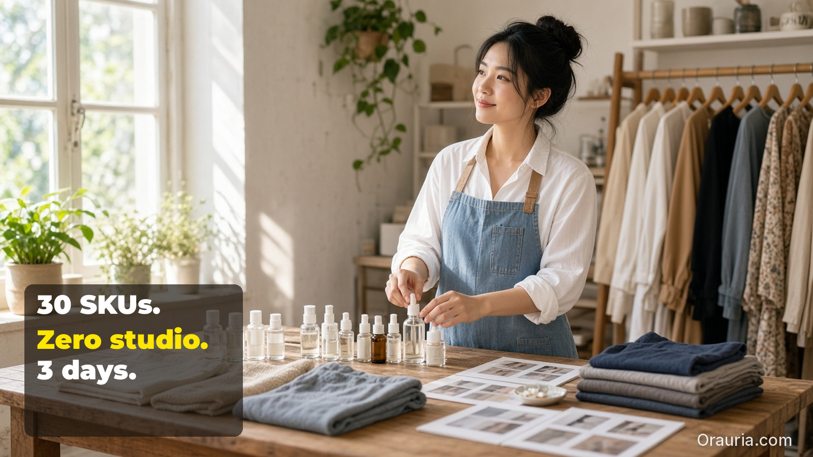
    A 30-SKU shop had no studio time. The goal was a lookbook that could also be reused for ads and marketplace listings.

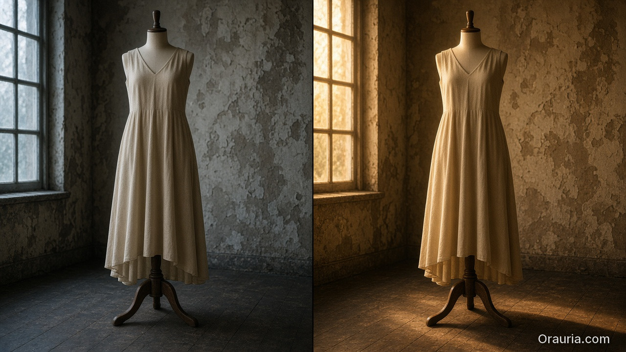
    A split photo of the same beige dress on a wooden stand: cool blue window light on the left, warm golden light on the right

    The bottleneck

    When you generate lookbook scenes quickly, your real failure modes are:

    • identity drift (faces/characters not stable),
    • world collapse (shadows and tone change scene to scene),
    • and QA blindness (geometry or label readability fails after resizing).

    So the case success is measured by: continuity + QA gates + reusable roles.

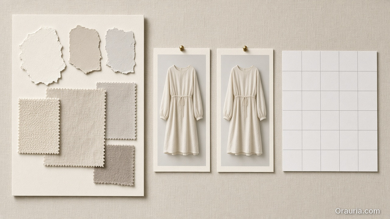
    A planning board with beige fabric and paint swatches, two nearly identical dress prints pinned as anchors, and a blank white grid

    Experiment setup (what we locked first)

    World kit

    • one light family (shadow logic stays inside a range),
    • one palette logic (background + product accents),
    • one continuity anchor set (identity + product geometry truth).

    Creative directions (roles)

    We used lookbook thinking:

    • hook role: first-second value,
    • proof role: texture + label readability,
    • offer role: CTA and promise tone,
    • reuse role: later export into ad-safe formats.

    Scene grid plan

    30 SKUs were not treated as 30 independent projects. They were mapped into a batch:

    • same world kit,
    • roles repeated across scenes,
    • only the SKU variable changes.
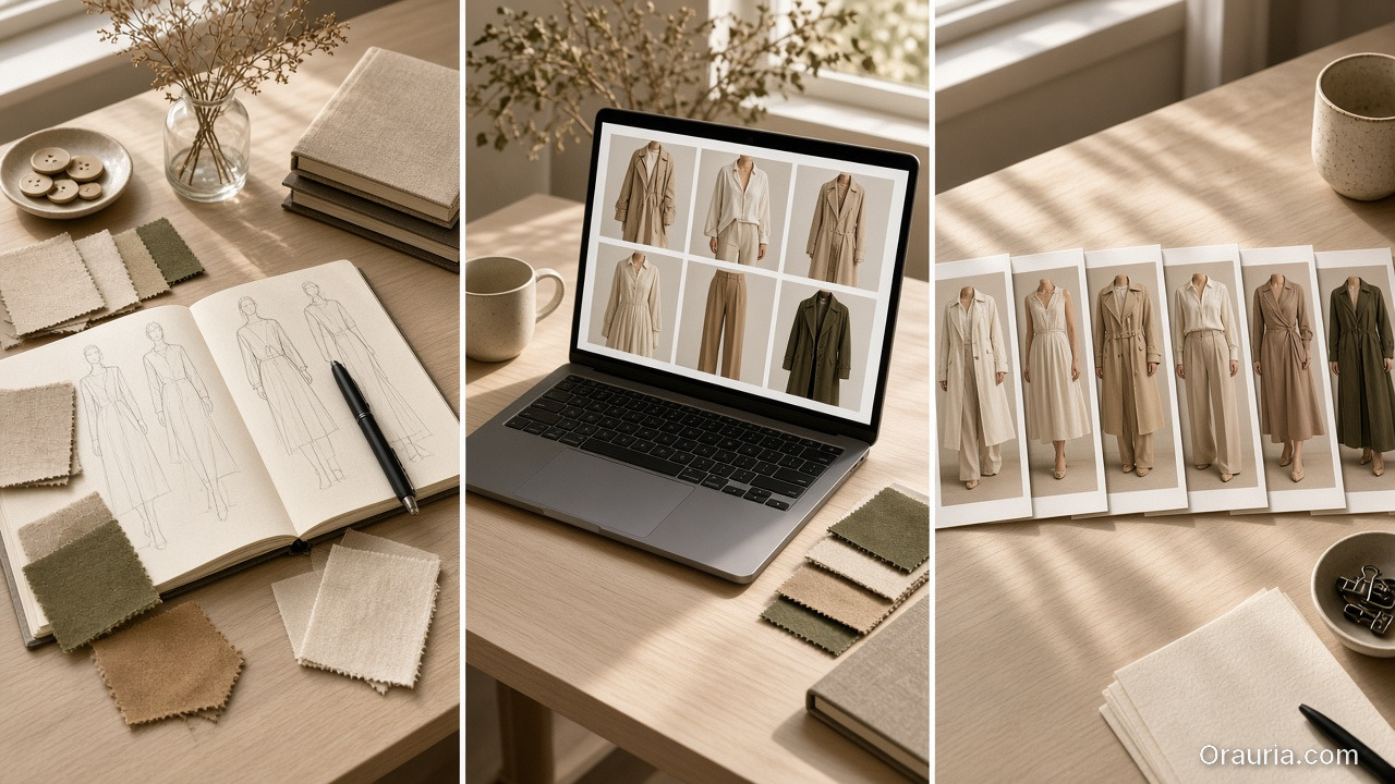
    A triptych of a fashion desk: planning with sketches and swatches, a laptop showing a six-look grid, and a row of printed garment stills

    The 3-day schedule (how speed actually happened)

    Day 1 — Plan + role map

    Lock directions and world kit. Write the QA checklist before any generation.

    Day 2 — Generate batches

    Generate scenes per role, not per SKU. Reject drift candidates early so we don’t waste polish time.

    Day 3 — QA gates + export

    Run the gates and export channel-safe variants:

    • lookbook page frames,
    • ad-ready crops,
    • marketplace listing support frames.
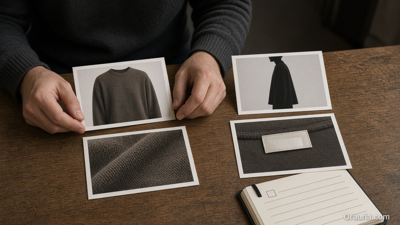
    Hands arranging four prints on a wooden table: a sweater, a dark silhouette, a fabric close-up, and a blank clothing label, with a small checkbox notebook

    QA gates used (what got checked every time)

    We used four gates:

    1. Identity gate: continuity anchors match across scenes.
    2. Geometry gate: edges and proportions stay stable.
    3. Readability gate: labels/CTA remain legible after resizing.
    4. Offer gate: captions imply the same promise as the visuals.

    If any gate fails, we update the kit (rules), then regenerate only affected outputs.

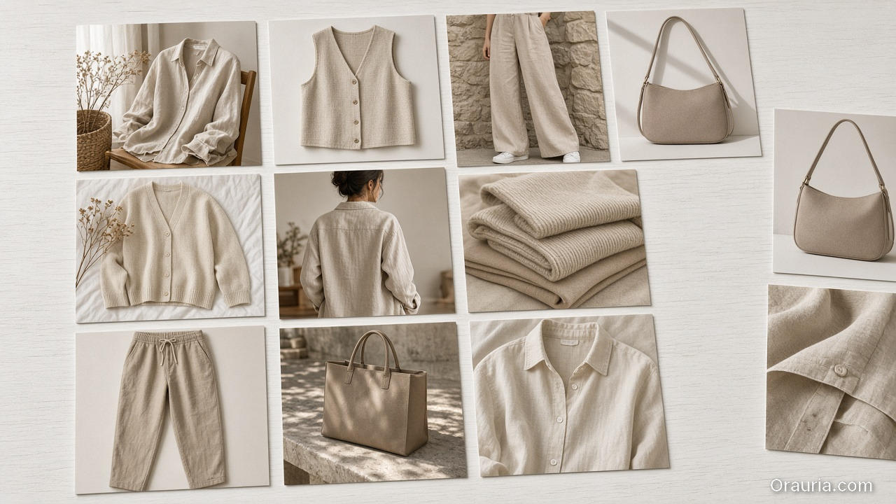
    A light-table spread of about a dozen consistent beige fashion stills: shirts, a vest, trousers, bags, knits and fabric close-ups

    What actually shipped

    • one coherent lookbook world,
    • consistent brand identity across many scenes,
    • and reusable exports for ads and listings.

    The result is not “many images”. The result is a production system the shop can rerun for future drops.

    What to do next

    If you want to build the same pipeline:

  • What Is Orauria? The AI Creative Workspace for Ecommerce

    What Is Orauria? The AI Creative Workspace for Ecommerce

    Orauria is not just another AI chat.

    It is a creative production workspace for ecommerce and marketing teams—built for the real bottleneck: turning an idea into a consistent set of assets that can be shipped, resized, and reused.

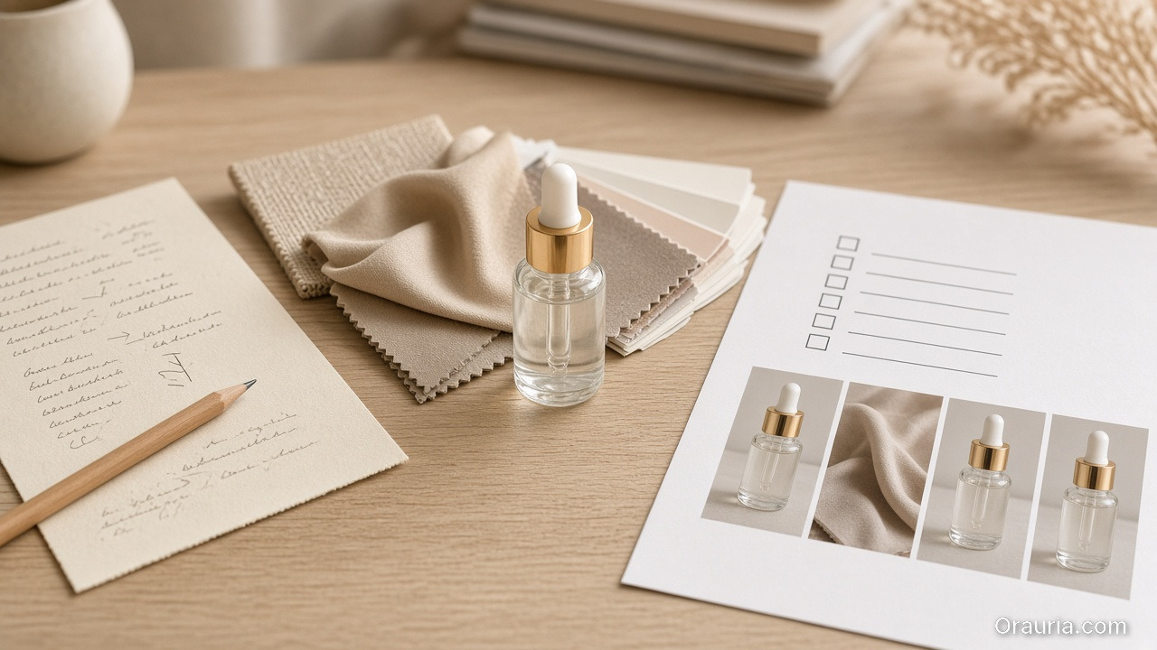
    A light wood desk with a handwritten brief, beige fabric and paint swatches, a glass dropper bottle, and a blank checklist beside product stills

    The core idea: brief → kit → gates → publish

    Most content workflows fail because they treat AI outputs like standalone files.

    Orauria connects the steps:

    1. Brief: capture intent and constraints.
    2. Brand kit: lock palettes, light family, identity anchors, and rules.
    3. Gates (QC): reject drift before you upscale or export.
    4. Publish-ready exports: generate channel-safe variants without rebuilding from scratch.
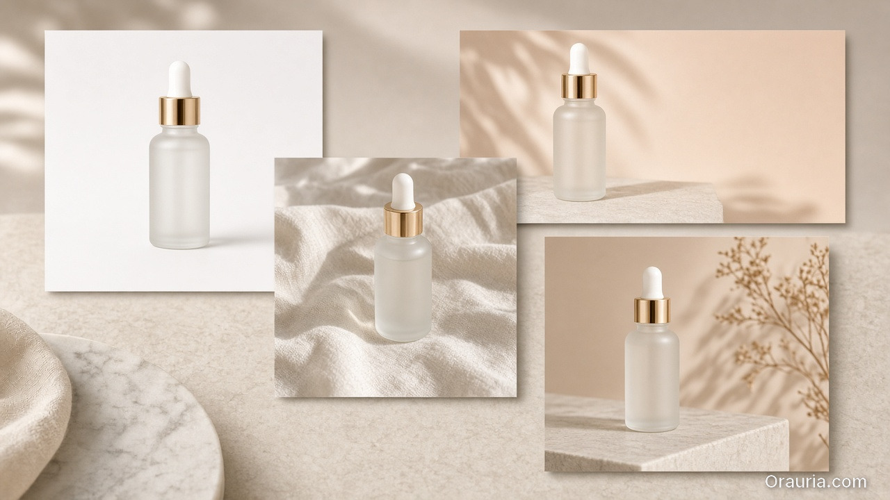
    The same frosted serum bottle shown as a white packshot, a linen lifestyle still, a wide peach banner, and a vertical ad crop

    Why it matters for ecommerce

    Ecommerce needs recognition.

    Buyers expect the same product truth across:

    • listing visuals,
    • social feed and Reels,
    • marketplace banners,
    • and ad campaigns.

    Orauria’s workflow mindset is designed to keep that recognition stable.

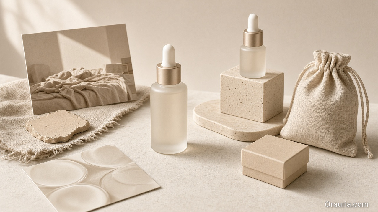
    A reusable beige product world kit: matching dropper bottles, a linen scene card, a texture swatch, a cloth pouch and a small box

    What you do in Orauria (in one sentence)

    You build a reusable creative system, then generate assets that stay inside the same world promise.

    If you want the workflow blueprint, start with:

    What to read next

    If you want the thinking behind the system:

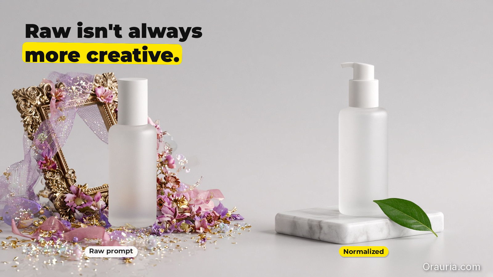
  • When to Use Prompt Normalizer vs Raw Creative Prompts

    When to Use Prompt Normalizer vs Raw Creative Prompts

    Most teams treat “prompting” as one skill. It isn’t.

    For ecommerce production, prompting is actually two different jobs:

    • turning a messy idea into a structured intent (a normalizer),
    • and pushing style choices inside a locked direction (a raw creative prompt).

    If you mix these jobs, you get inconsistent outputs and wasted iterations.

    Key Takeaways

    • Raw prompts are good for exploration.
    • Normalizers are good for alignment and repeatability.
    • Your workflow should choose the tool by bottleneck, not by preference.
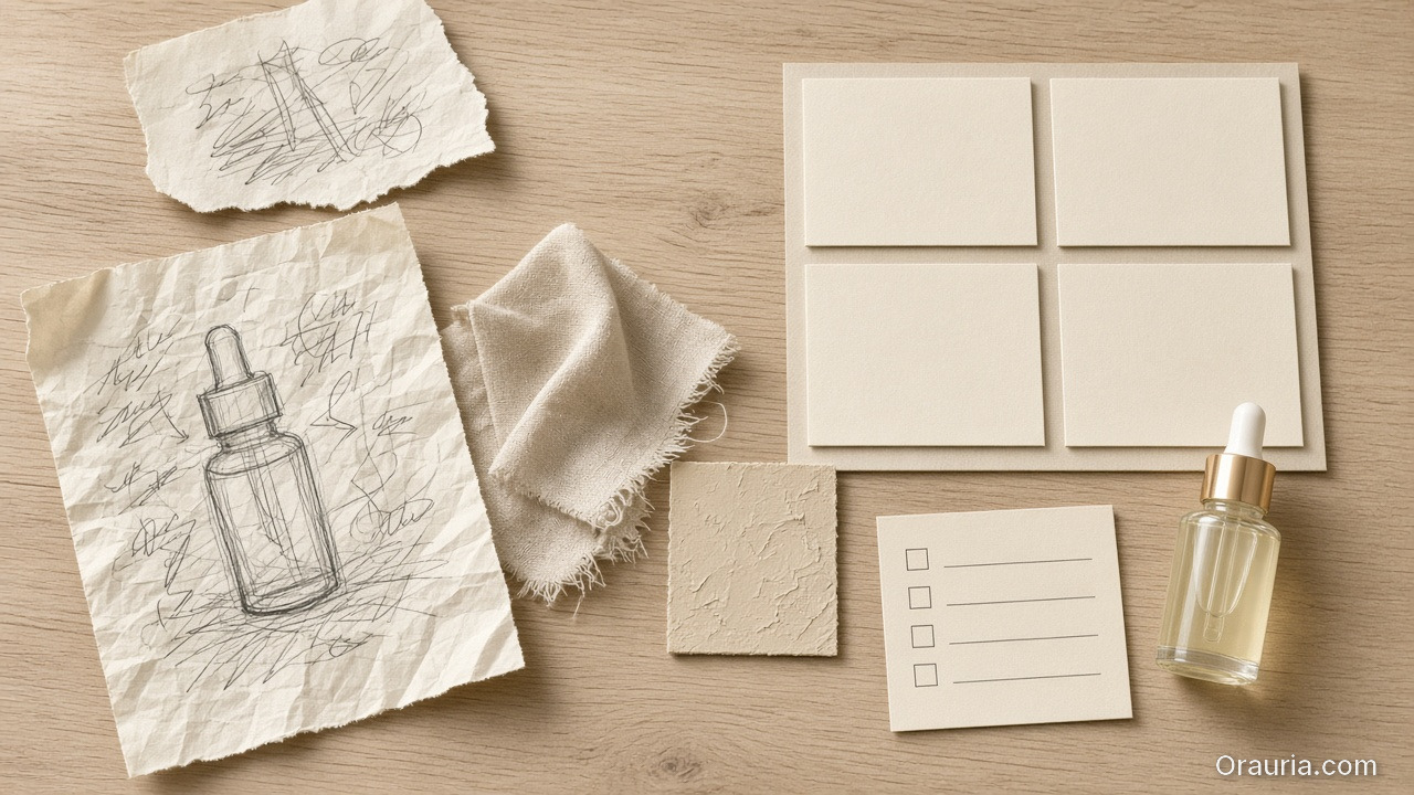
    A messy bottle sketch on crumpled paper beside a tidy blank brief grid, beige swatches, a checklist and a glass dropper bottle

    What is a prompt normalizer (production view)?

    A normalizer takes input like:

    • “make it premium”,
    • “use the same model”,
    • “make it look like our brand”,
    • “turn this into an ad”.

    And converts it into a structured brief:

    1. Intent: what outcome it must achieve,
    2. Slots: what can vary vs what cannot,
    3. Constraints: QA-gate rules (geometry, readability, world logic),
    4. Output routing: which model family fits the bottleneck.

    In other words, it is the briefing layer.

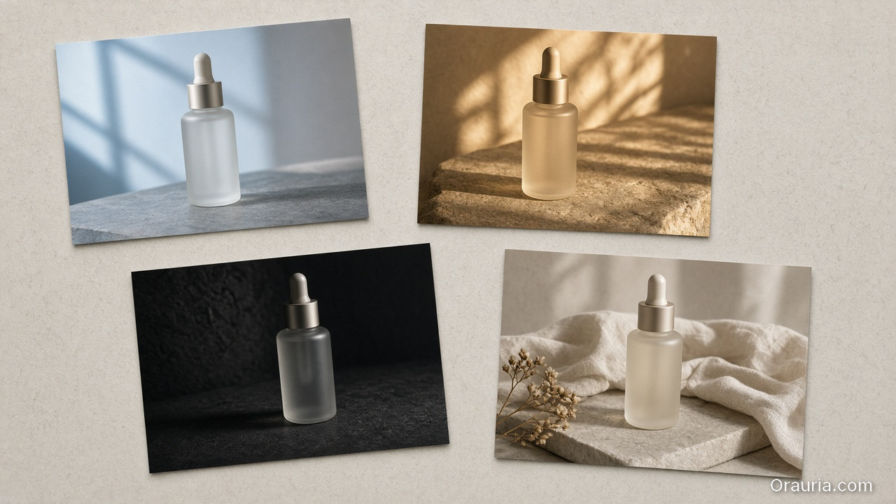
    Four prints of the same frosted serum bottle in cool window light, warm stone light, a dark scene, and a linen lifestyle setup

    What are raw creative prompts (exploration view)?

    Raw prompts are where you:

    • try a new visual twist,
    • adjust scene tone,
    • explore typography density,
    • test hook variations.

    Raw prompts are not wrong. They are just wrong for tasks that require alignment.
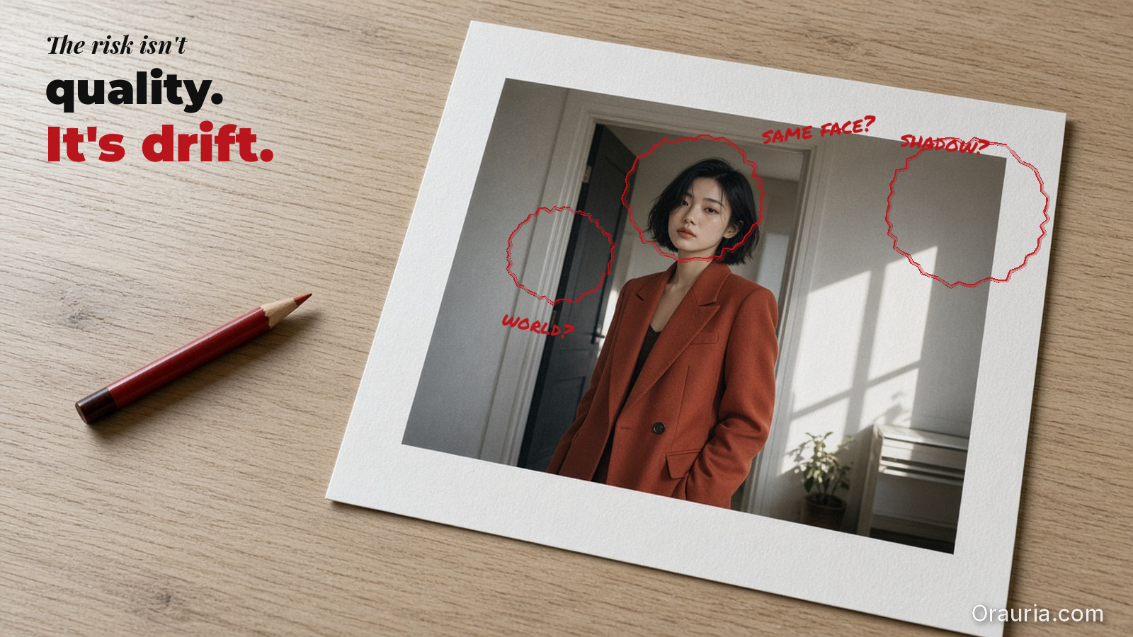
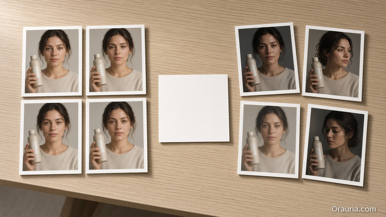
    Two groups of prints of a woman holding a beige bottle: tightly aligned faces on the left, drifted angles and lighting on the right

    The decision guide: choose by bottleneck

    Ask this:

    A) Are you missing alignment?

    If results drift in:

    • face/identity,
    • shadow family,
    • label clarity,
    • caption promise vs visuals,

    then you are missing rules. Use a prompt normalizer.

    B) Are you already aligned and just exploring?

    If identity is stable and only style options are unclear, then exploration is fine. Use raw creative prompts.

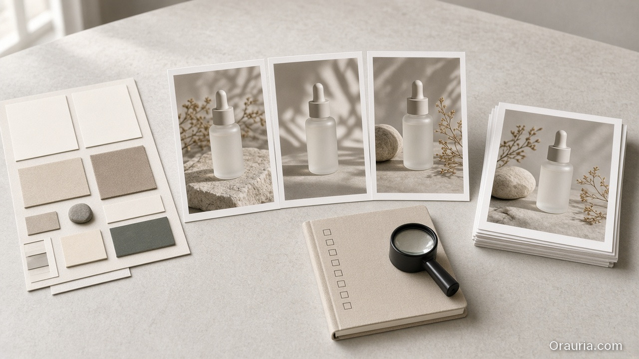
    A four-step desk: a swatch brief, three consistent bottle stills, a blank checklist with a loupe, and a stack of selected prints

    A simple workflow that prevents waste

    Use this loop:

    1. Normalize the brief (intent + slots + constraints)
    2. Generate exploration variants inside the locked world kit
    3. Gate by QA checks
    4. Ship only the winners into your content system

    This is what “workflow mindset” means in prompting: you are building a reusable system, not repeating trials.

    What to do next

    If you want the brief template:

    If you want workflow routing:

  • The Consistency Trap: Beautiful AI Images, Broken Brand

    The Consistency Trap: Beautiful AI Images, Broken Brand

    Consistency is the one thing AI can’t “handle for free”.

    It can generate a beautiful frame every time. But your audience doesn’t buy frames. They buy recognition.

    And recognition only happens when your brand’s rules survive across scenes, formats, and drops.

    Key Takeaways

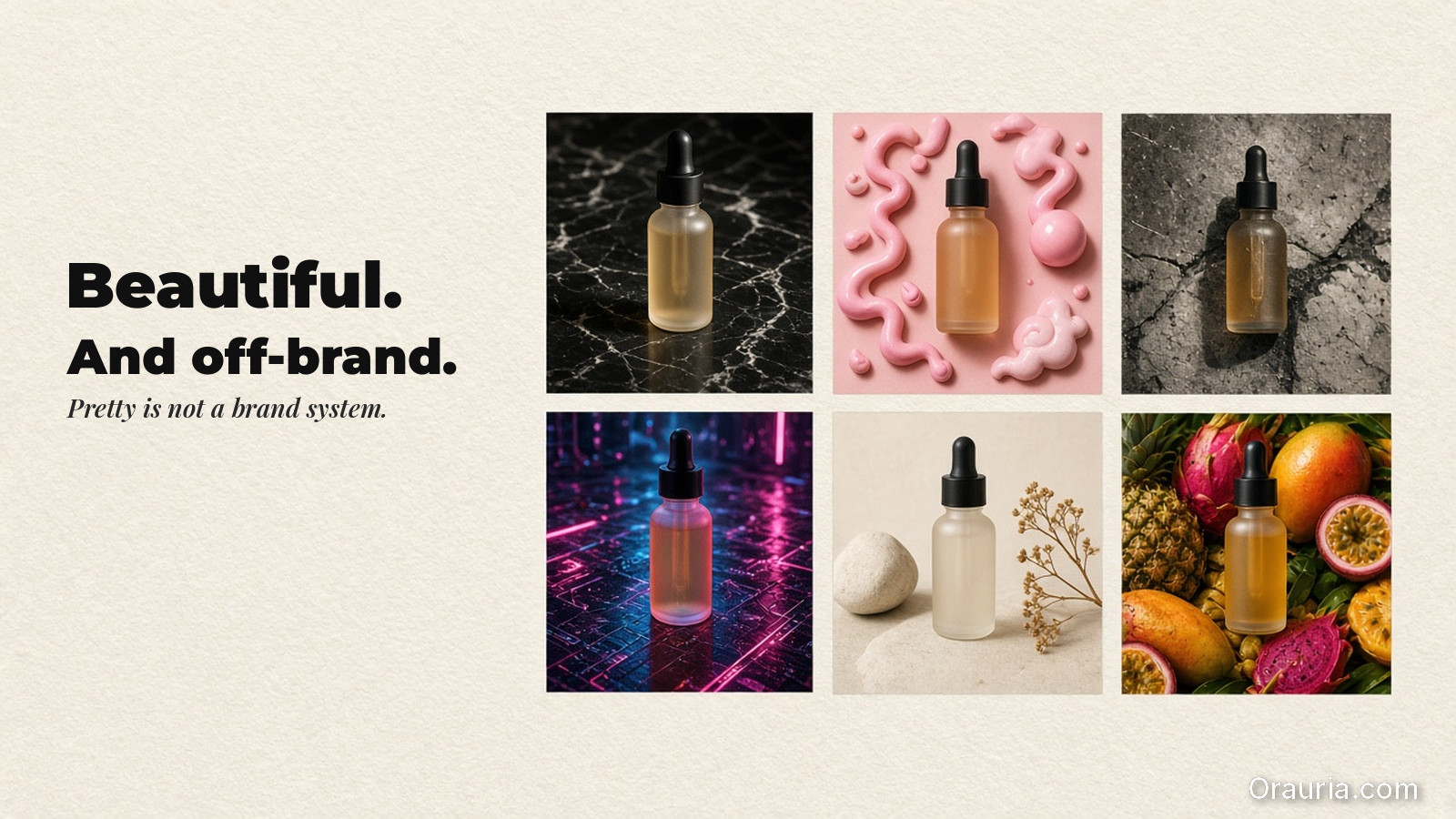
    • The consistency trap is thinking “pretty” equals “aligned”.
    • Visual identity needs rules (what must not change) and gates (how you verify it).
    • World kits turn many outputs into one recognisable brand.
    Four lookbook prints of a woman with a beige bottle that look beautiful but drift in face, light and mood, next to a blank caption card

    What the trap looks like (in production)

    You ship a lookbook or a set of ecommerce creatives.

    Everything looks fine… until:

    • faces feel slightly different across images,
    • shadows change style between scenes,
    • product texture looks inconsistent after resizing,
    • your captions promise a different “why” than the visuals show.

    Each issue is small. Together they train buyers to doubt the brand.

    Scattered stills of the same beige bottle in mixed light and shadow styles, surrounding a blank unused rule card

    The real cause: missing “brand rules”

    Most teams don’t define rules. They define prompts.

    Prompts are flexible. Rules are strict.
    If your workflow has no strict rules, the model will “solve” each output independently. That creates drift.
    Build a consistency system: Rules → Gates → World

    A locked identity board with a hair-silhouette crop, texture swatches, a warm light-and-shadow family, a blank type card and a beige bottle

    1) Rules (what must not change)

    Pick a small set of invariants:

    • face/character identity anchors (identity range, hair silhouette, skin tone logic),
    • texture/label clarity rules (what makes the product “real”),
    • shadow and light family (shadow style + color temperature range),
    • typography and CTA style (if text appears, it must follow the same rules).

    Rules define “identity space”. Everything outside that space gets rejected.

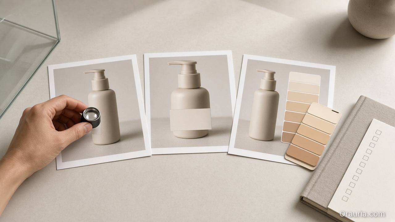
    A hand with a loupe inspects three pump-bottle prints beside a warm swatch card and a notebook of empty checkboxes

    2) Gates (how you verify identity quickly)

    Use QC gates that catch drift early:

    • geometry truth gate: edges + proportions within range,
    • readability gate: label/CTA still readable after resizing,
    • world gate: light family matches kit constraints,
    • promise gate: copy tone matches the visuals’ implied offer.

    Gates are checklists, not opinions.

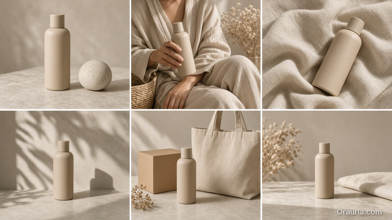
    A six-panel world kit of the same beige bottle in a shared warm light family: packshot, lifestyle, fabric crop, shadow study, bag and box, banner

    3) World kit (how rules become repeatable outputs)

    World kit is your consistency contract:

    • same world logic across scenes,
    • same role structure (hook / proof / offer),
    • the same routing rules for which model to use when bottlenecks change.

    Once your world kit exists, you can scale without losing recognition.

    What to do next

    Start with one brand rule set and one world kit:

    • lock identity anchors,
    • define light family,
    • build QC gates,
    • then generate and export.

    If you want supporting frameworks:

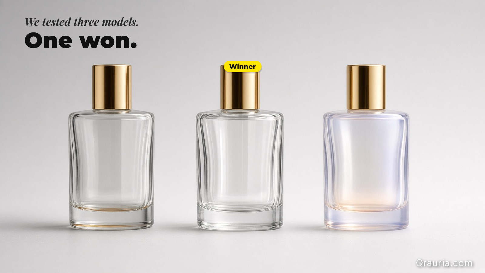
  • We Tested 3 AI Image Models for Product Shots — One Clear Winner

    We Tested 3 AI Image Models for Product Shots — One Clear Winner

    Most model comparisons fail because they do not compare the same bottleneck.

    They ask:

    “Which model looks best?”

    For ecommerce, the better question is:

    “Which model preserves product truth under our QA gates?”

    Key Takeaways

    • Stop ranking models by aesthetics.
    • Rank by geometry truth, texture fidelity, and label clarity.
    • Choose a model after creative direction—not before.

    Experiment design (so the result is real)

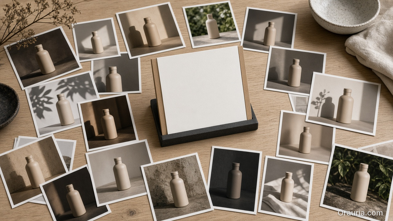
    A locked direction kit: a frosted dropper bottle, warm palette and fabric swatches, three blank crop-frame cards, and a linen checklist

    1) Lock the direction

    Use one direction kit:

    • one world setup (light family + palette logic),
    • one angle brief (angles that answer buyer questions),
    • one QA checklist (what must not break).
    Three side-by-side stills of the same frosted serum bottle in the same warm stone light, with only subtle texture and highlight differences

    2) Generate with three models

    Run the same direction kit across three image model families.

    Do not change prompts between models.

    Let the test measure what matters.

    A QA desk with a loupe on a print, a frosted bottle, a texture card, a warm swatch strip, and a blank checkbox card

    3) QA gates (where winners are decided)

    Check:

    • geometry stability (edges, proportions),
    • texture fidelity (fabric, material cues),
    • label readability (after resizing),
    • shadow family consistency.
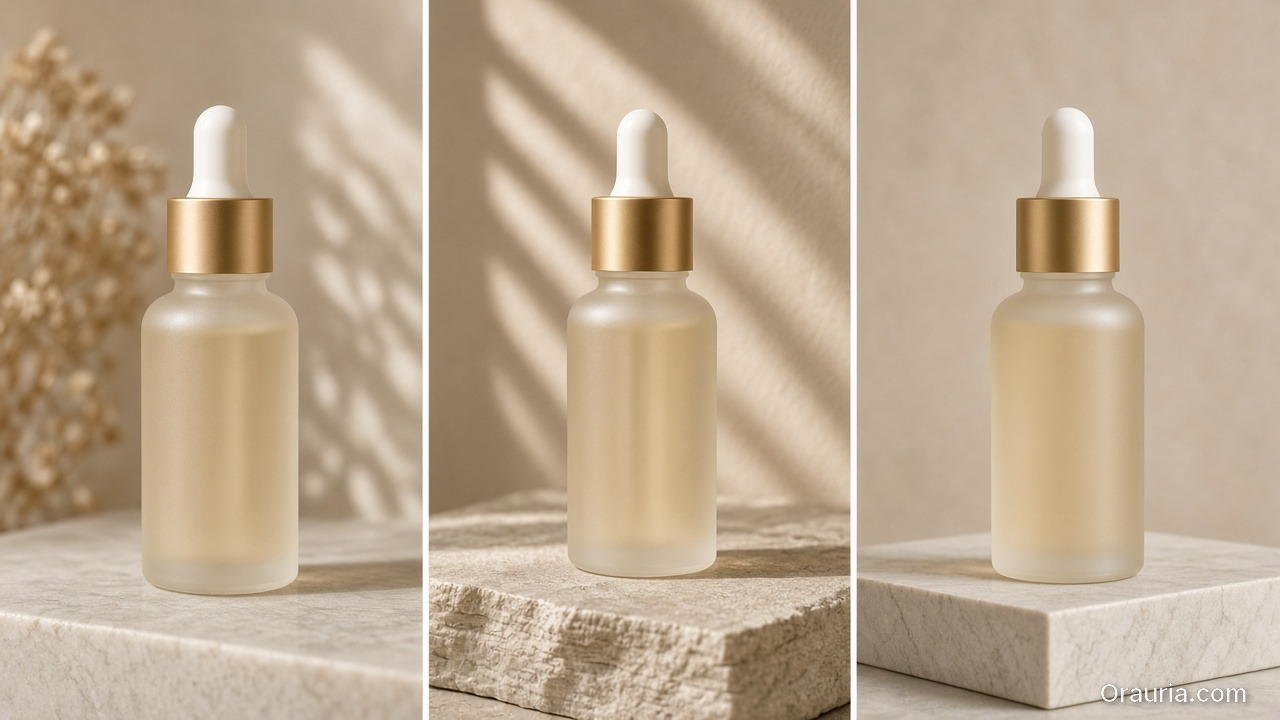
    Three comparable exports of the same frosted gold-cap serum bottle on a stone podium in shared warm leaf-shadow light

    4) Export the same outputs

    Export comparable sizes:

    • feed-safe square,
    • ad-safe vertical,
    • and marketplace listing proof.

    If a model looks good on one size but fails on another, it is not your winner.

    What to do next

    If you want the framework:

    Then run this 3-model QA experiment whenever your bottleneck changes:

    • new product category,
    • new label density,
    • or new scene world.
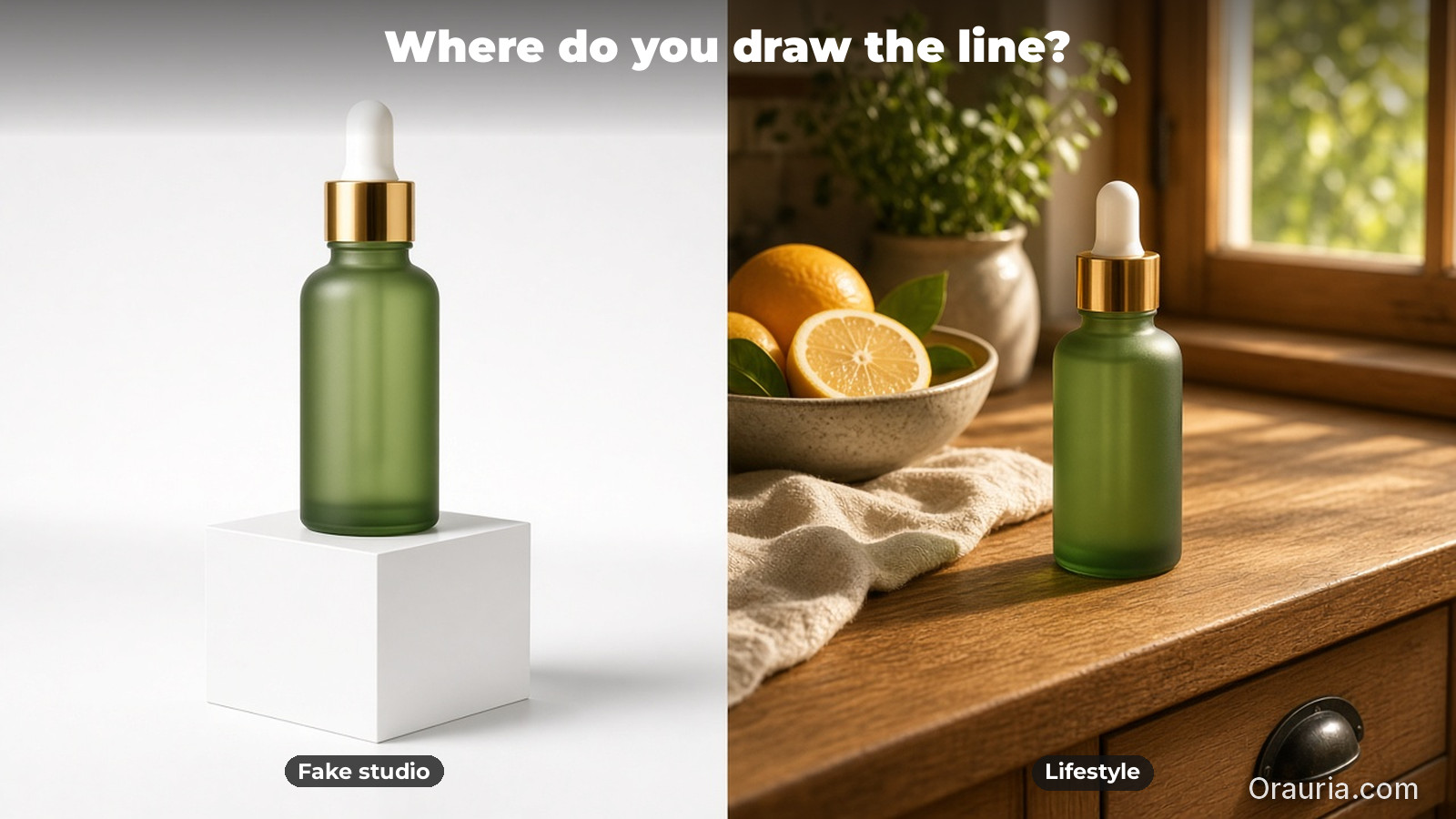
  • Fake Studio vs Lifestyle AI Ads: Where to Draw the Line

    Fake Studio vs Lifestyle AI Ads: Where to Draw the Line

    AI makes it easy to generate “studio shots”.

    But studio shots are not a guarantee of trust.

    Sometimes the right world is the fake studio.

    Sometimes the right world is real lifestyle.

    The framework is simple:

    You do not choose by aesthetics. You choose by world truth—what the buyer expects before they decide.

    Key Takeaways

    • Fake studio is not “bad”. It is a tool with a job slot.
    • Lifestyle works when the offer depends on context and ritual.
    • QC is not “pretty”. QC is whether the scene keeps the same world promise.

    The decision framework (Promise → World → Scene)

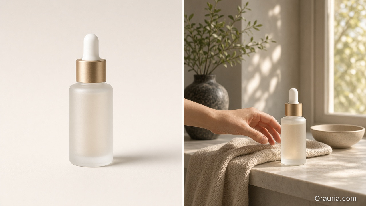
    A diptych of the same gold-cap serum bottle: a clean studio proof on the left, and a sunlit vanity lifestyle ritual with a reaching hand on the right

    1) Promise (what you are trying to sell)

    Ask: what does the buyer need to believe?

    • Geometry truth (fit, labels, texture)? → studio-like proof frames can work.
    • Ritual truth (how it is used, felt, timed)? → lifestyle wins.
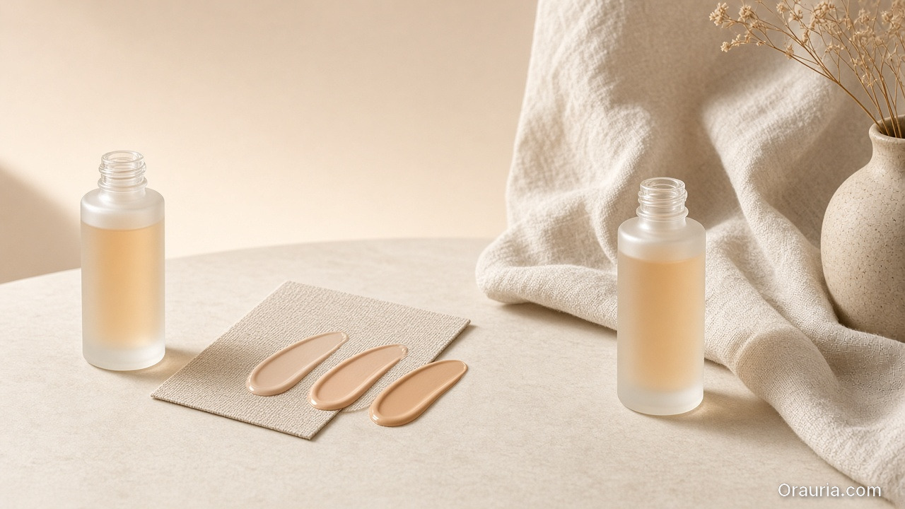
    Two open frosted bottles in the same warm light family, with a fabric swatch card of three beige product smears and linen drapery tying the worlds together

    2) World (the continuity system)

    World includes:

    • light family (shadow style and temperature),
    • background logic (real-world coherence),
    • and tone (premium, calm, energetic).

    If world rules are missing, both studio and lifestyle outputs drift.

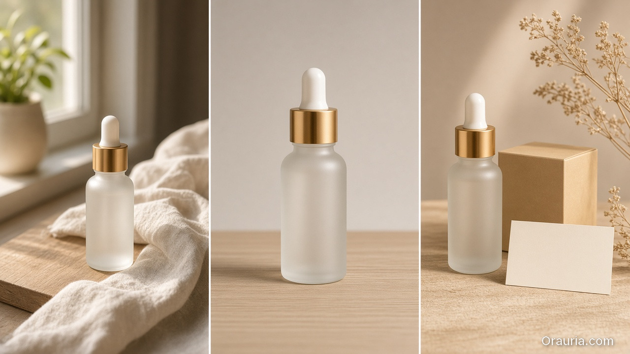
    Three prints of the same bottle: a window lifestyle hook, a clean studio proof, and an offer close with a box and a blank card

    3) Scene roles (assign responsibilities)

    Scenes should have roles:

    • hook frame (value instantly),
    • proof frame (product truth),
    • offer close (CTA + tone).

    When you assign roles, you can mix studio-like proof with lifestyle context without contradiction.

    A studio packshot and a window lifestyle print of the same bottle compared on a stone desk with a loupe, a texture crop and a blank card

    QC gates: how you prevent the “it feels wrong” moment

    Use gates that catch world mismatch:

    1. Shadow family gate: does the shadow style match the kit across scenes?
    2. Texture truth gate: do labels and textures stay readable after resizing?
    3. Context coherence gate: does the lifestyle setting make sense for the product’s promise?
    4. Offer tone gate: does the caption imply the same promise as the visuals?

    If one gate fails, you update the world kit. You do not “regenerate until it looks better”.

    What to do next

    Start with lifestyle context mapping for beauty and ritual-driven offers:

    Then expand the same framework to any category with:

    • proof frames (studio-like),
    • and story scenes (lifestyle-like).
  • Lookbooks Without Photographers: Opportunity and Risk for Small Brands

    Lookbooks Without Photographers: Opportunity and Risk for Small Brands

    Small brands remove photographers for one reason: cost.

    But the bigger truth is this:

    When you remove the studio, you also remove the continuity mechanism.

    AI can generate images. It cannot automatically preserve your brand identity across scenes, drops, and formats.

    That is the real risk—and the real opportunity.

    Key Takeaways

    • The opportunity: faster drops and lower production overhead.
    • The risk: identity drift (faces, shadows, texture logic, tone).
    • The fix: world kits + QC gates, not random regeneration.
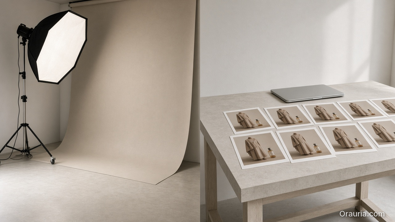
    An unused studio backdrop and softbox on the left, and a desk of repeating lookbook stills of a beige coat beside a closed laptop on the right

    Why “no photographer” changes everything

    Studios do more than take pictures.

    They enforce consistency through:

    • stable light setups,
    • predictable composition rules,
    • and human curation.

    Without that system, “pretty” becomes the default objective.

    Then each new image feels like a new brand moment.

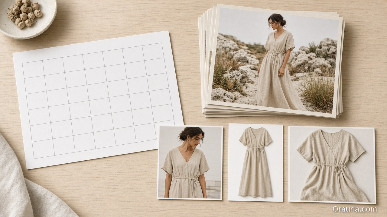
    A blank calendar grid, a stack of consistent lookbook portraits in a linen dress, and three channel crops of the same garment

    The opportunity map (what improves)

    1) Speed to market

    You can plan drops by calendar instead of by availability.

    If your workflow has gates, you can scale safely.

    2) Coverage across channels

    Lookbooks are not only web pages.

    They feed ads, marketplace creatives, PDP visuals, and retargeting.

    No photographer means you need a pipeline that can reuse the same world rules.

    3) Iteration without sunk cost

    Studio reshoots are expensive.

    With AI production, iteration becomes a controlled creative loop.

    The risk map (what breaks)

    Four portraits of a woman in the same beige dress that drift in face, hairstyle and color temperature

    Identity drift

    Faces and character cues change when direction is missing.

    Even small shifts in shadow family or label readability train buyers to doubt the brand.

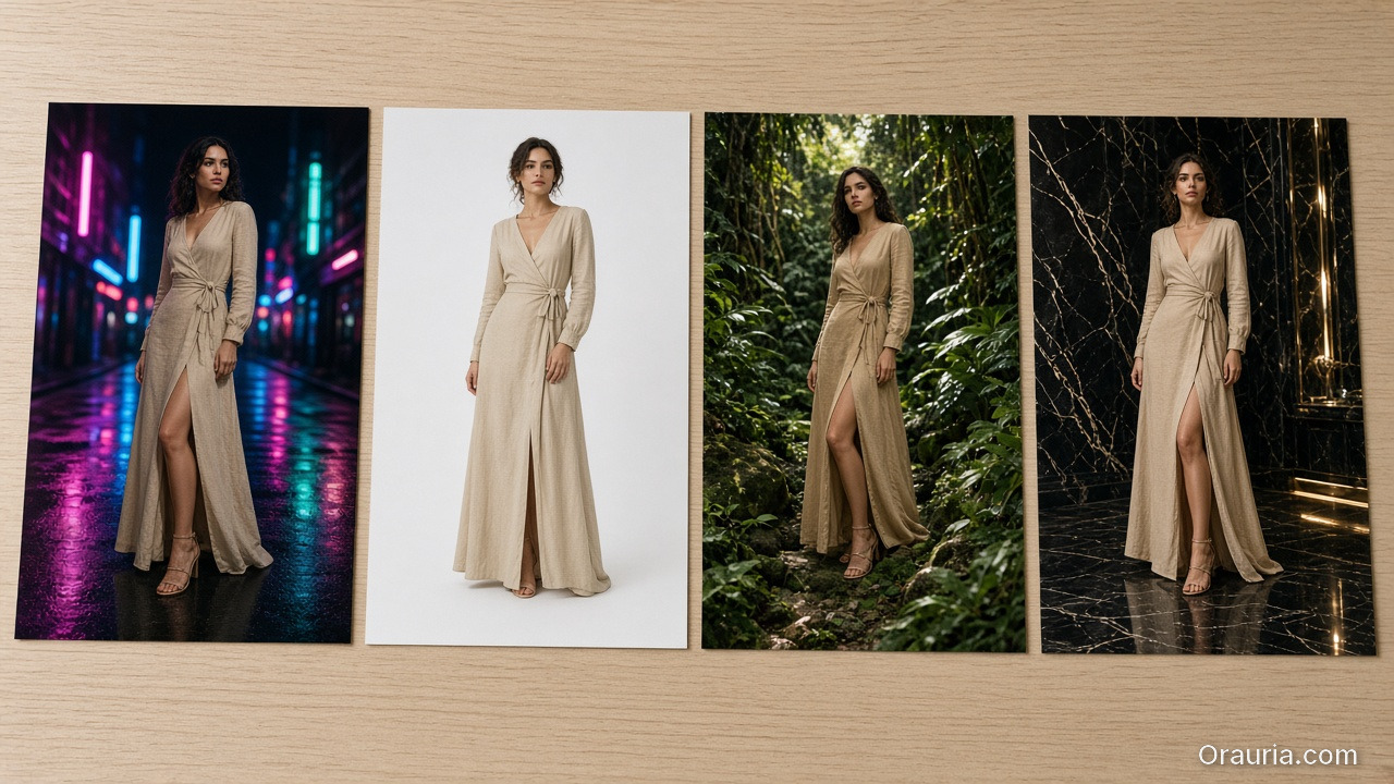
    Four prints of the same beige wrap dress in unrelated worlds: neon street, white studio, jungle, and dark marble luxury

    World collapse

    Lookbooks fail when every scene is a new aesthetic.

    Your audience reads that as inconsistency—not experimentation.

    QA blindness

    If you only check “looks good”, you will ship wrong geometry and wrong offer tone.

    A continuity kit on stone: a silhouette portrait, a dress still, warm swatches, small role prints and a linen checkbox notebook

    The QC gates that replace studio curation

    Treat your workflow like a continuity contract:

    1. Continuity anchors: identity + product geometry range
    2. Light family: shadow style must remain within the kit
    3. Scene roles: hook, proof, and offer must be assigned
    4. Offer safety: claims and CTA tone must repeat safely

    If a gate fails, do not regenerate blindly.

    Update the kit and regenerate only the affected outputs.

    What to do next

    If you are starting today, start with world-building:

    Then ship small: lock one world kit, generate 3 scenes, run gates, and expand.

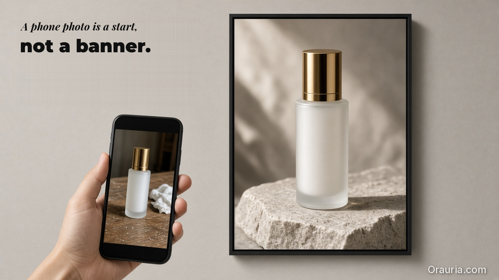
  • Before/After: Phone Product Photo to Professional Banner (Real Workflow)

    Before/After: Phone Product Photo to Professional Banner (Real Workflow)

    Before/after is not a “wow” feature.

    It is a production test: if your workflow can explain the transformation, you can repeat it.

    Key Takeaways

    • Phone input is fine. The bottleneck is direction + QA gates, not device quality.
    • Treat the banner like a business slot: hook frame, proof frame, offer close.
    • Efficiency comes from rejecting failures early—before upscale and export.
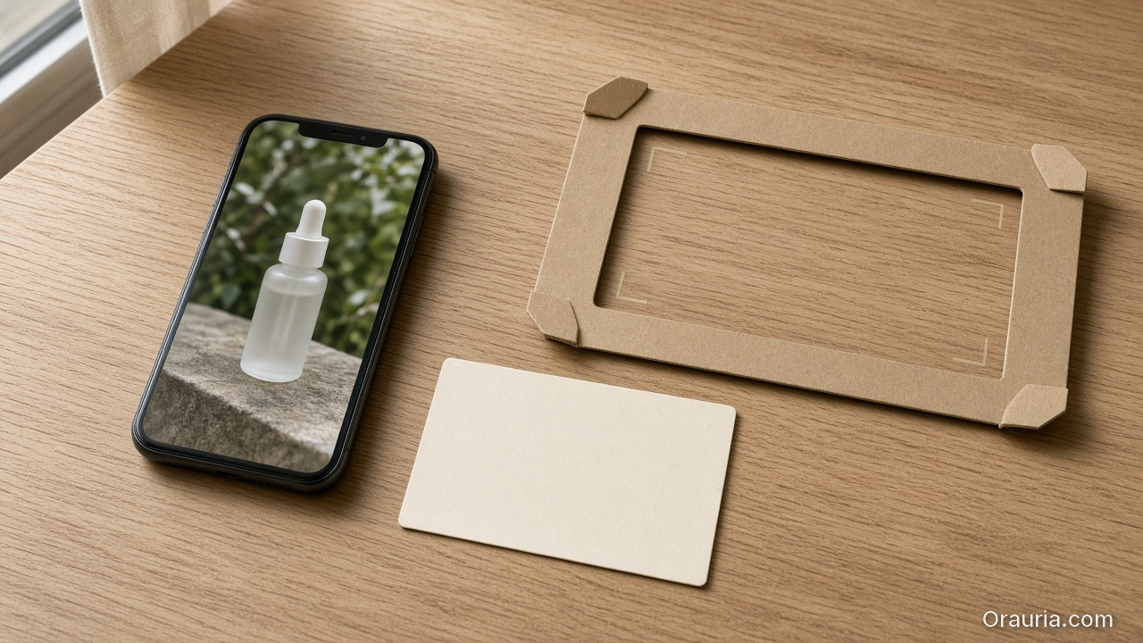
    A phone showing a casual photo of a frosted dropper bottle, a blank direction card, and an empty cardboard banner frame with corner marks

    Experiment setup: what we start with

    Input:

    • one phone photo (acceptable lighting, readable product silhouette)
    • one direction brief (world + scene role)
    • one banner target (aspect ratio + safe zones)

    Constraints:

    • keep product geometry honest (no “almost” edges)
    • preserve label readability and design elements
    • use a stable shadow and background logic for the final banner cut

    The workflow (step-by-step)

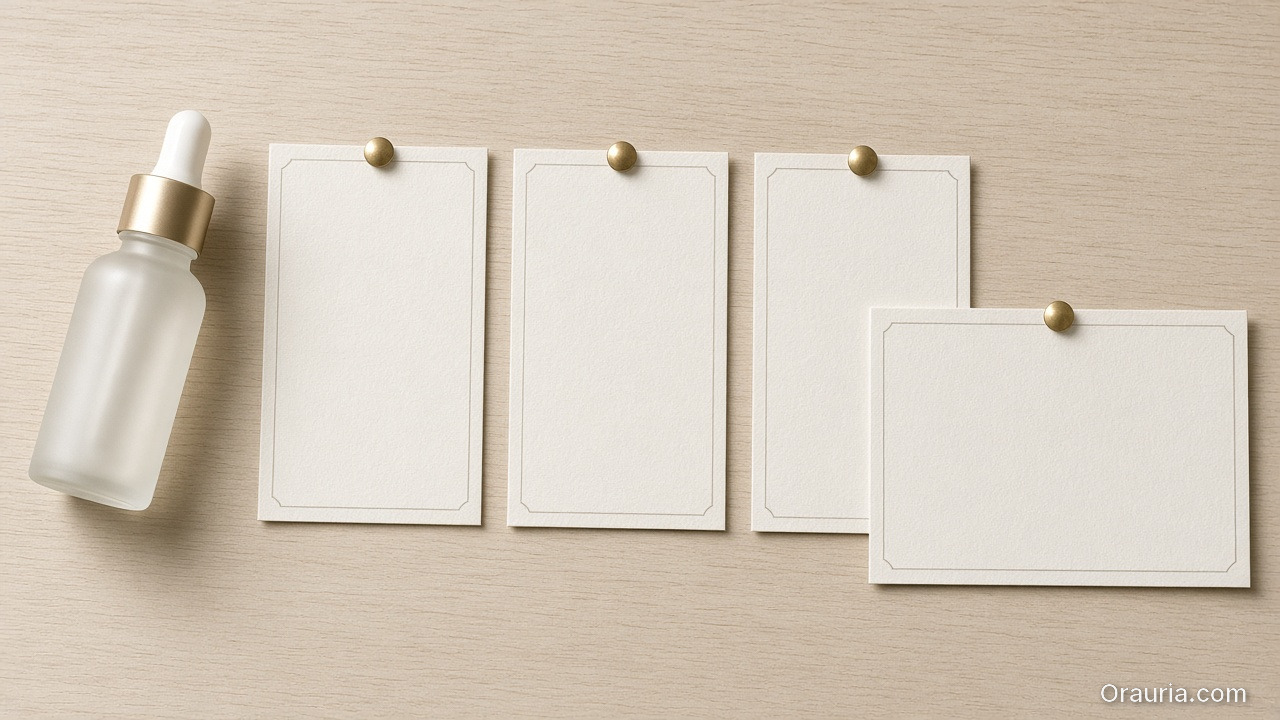
    A frosted gold-cap bottle beside three blank vertical cards and one wider blank banner card, pinned on a pale desk

    1) Direction kit (the real “before”)

    Compress the job into:

    1. what moves (pose/camera feel),
    2. what stays true (geometry, label readability),
    3. what the banner must do (hook + proof + offer).

    This is where you stop the prompt sprawl.

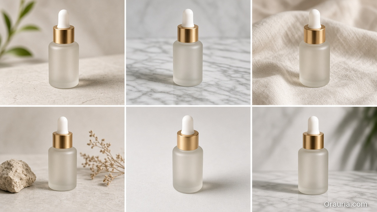
    Six candidate stills of the same gold-cap serum bottle on stone, marble and linen, generated under one direction

    2) Generation (produce candidates, not winners)

    Generate multiple candidates under the same direction kit.

    Your goal is coverage:

    • does the product look correct?
    • does the background logic match the banner slot?
    • does the hook frame read instantly?
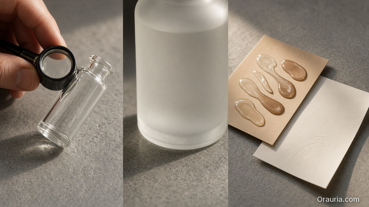
    A loupe inspecting a glass bottle edge, a tight frosted-texture crop, and a card of product smears beside a blank sheet

    3) QA gates (reject drift early)

    Check:

    • edges: are they stable or warped?
    • text: is anything unreadable after resizing?
    • shadow family: does it match the banner’s light logic?

    Reject failures before you upscale.

    Three banner-ready crops of the same gold-cap serum bottle on stone in a shared warm light family

    4) Export banner-ready

    After QA passes, export final banner variants:

    • feed version (1:1 or 4:5)
    • ad version (platform-safe)
    • marketplace listing support (consistent proof frame)
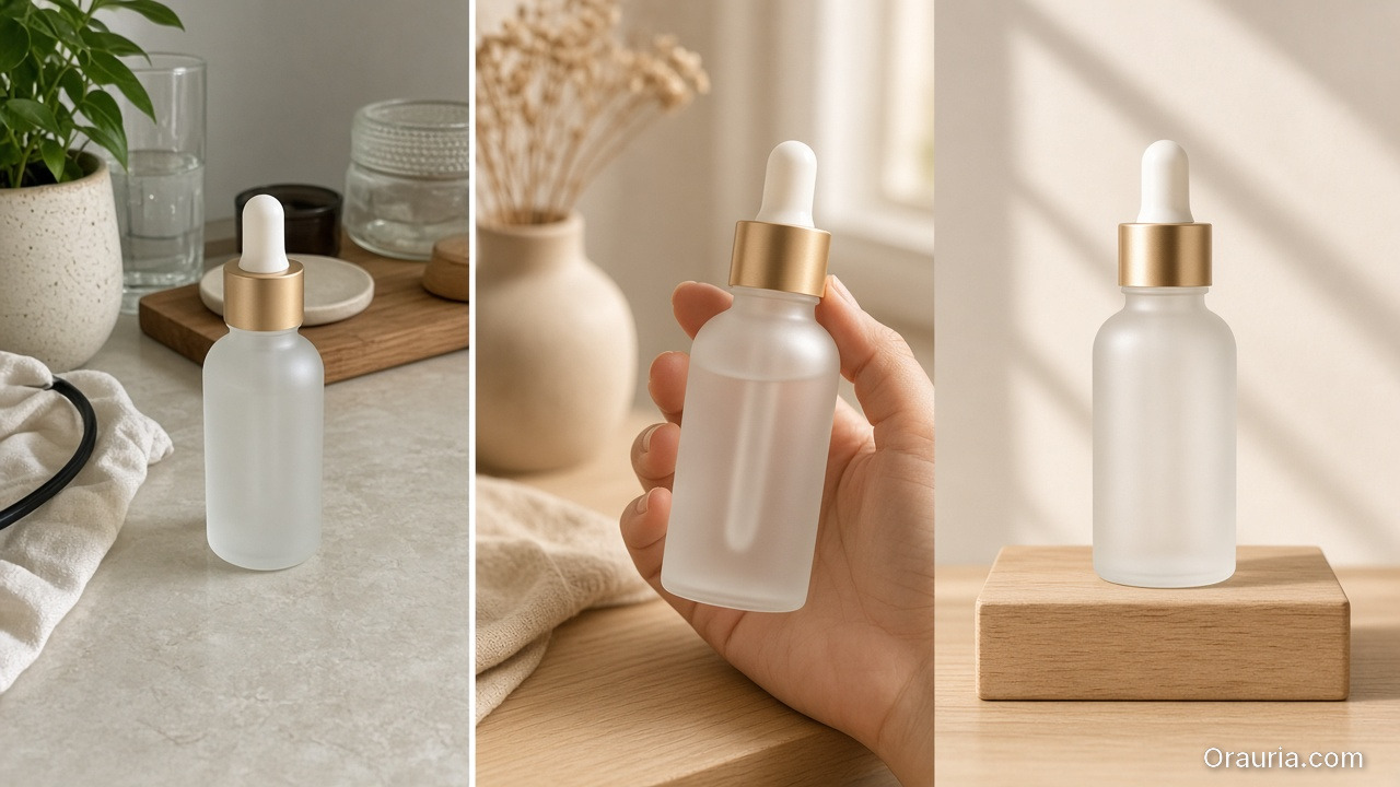
    A casual cluttered-table phone shot of the bottle beside a lifestyle hand-held frame and a clean proof packshot on a wood block

    What changes the most across the before/after?

    Not just “quality”.

    The biggest change is confidence:

    • the product truth survives resizing,
    • the hook frame communicates instantly,
    • and the world kit stays consistent across variants.

    That confidence is what converts.

    What to do next

    If you want a reusable workflow template, start here:

    Then apply the same direction kit + QA gate mindset to every new banner drop.