You know the feeling. You stop scrolling. A typographic proof sheet, a fashion-editorial cover, a layout with a grid so clean it hurts a little — and your first thought is not “nice.” It is “how did they do that?”
The second thought, if you work with AI images at all, is usually less glamorous: you open a prompt box and type something like “minimal poster, professional, high quality.” The result comes back polite, generic, and nothing like the thing that made you stop.
That gap is not a talent problem. It is a vocabulary problem. The skill is learning to read an image the way a designer would — composition, typography, lighting, restraint — and then turning that reading into a prompt you can actually run. The Orauria browser extension, AI Assistant Copilot – Orauria, has a feature that does the first half of that work for you: Image to prompt. You point it at almost any image you see on Pinterest or X, get a detailed prompt back, and then take that prompt into Orauria to generate your own version.
This is a walkthrough of that skill, based on two real demos: a Pinterest pin by lais maratch, and an X post from @abduzeedo sharing the Matter Cine Week identity by Akronim Design Bureau.
Why reverse-engineering a prompt is a real design skill
Designers have always studied other designers. You look at a poster and notice the grid before you notice the headline. You look at a portrait and clock the color of the light, the crop, the type sitting on top of the body. That kind of looking is already a skill. Image-to-prompt just asks you to make it explicit.
A weak prompt describes a vibe. A strong one describes a system:
- Composition. Is it a 4:5 vertical cover or a 3:2 landscape proof sheet? Is there generous empty space, or is the subject centered and tight?
- Typography. Condensed uppercase wordmarks, stacked bold pairs, oversized ivory serifs, monospaced annotations — these are not interchangeable “nice fonts.”
- Lighting and color. Warm frontal cinematic light is a different world from flat, shadowless, neutral studio light.
- What is not in the picture. “No shadows, no perspective, no extra imagery” is often the sentence that keeps a result from falling apart.
Once you can see those decisions, you can steal the thinking without copying the work. That is the point of this workflow. The extension writes a first draft of the brief. You bring the judgment.
First, install the extension
Image to prompt only works after you install the Chrome extension AI Assistant Copilot – Orauria. Get it from the Chrome Web Store, then come back to the pin or the post. Once it is on, the right-click menu on Pinterest and the Prompt quick action on X will be waiting for you.
How to do it on Pinterest
Pinterest is the easy path, because the extension hooks into the right-click menu on the image itself.
For this demo, we used an editorial social-media cover by lais maratch: a calm, direct portrait, oversized serif type reading “pouco seguidor,” and a translucent social-profile layer in the background. You can look at the original pin here: pinterest.com/pin/897201557046198997.
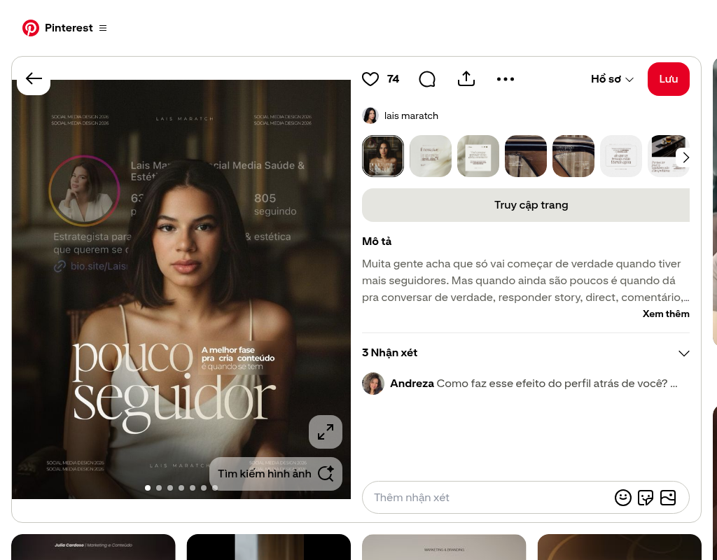
Step 1. Right-click the image.
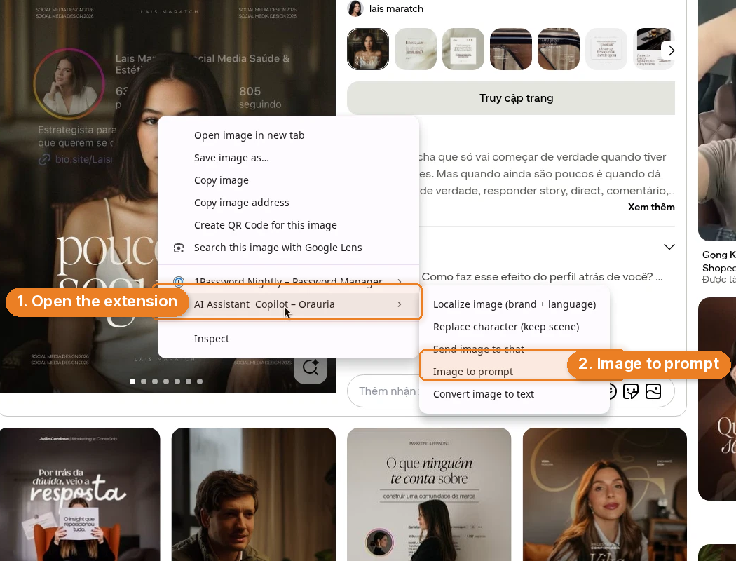
Step 2. In the context menu, open AI Assistant Copilot – Orauria, then choose Image to prompt.
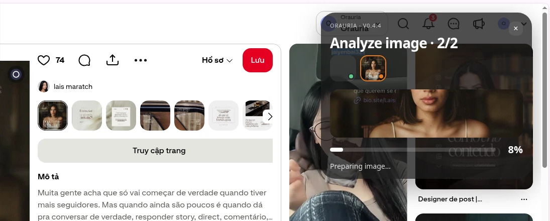
Step 3. A panel opens and starts analyzing the image. You will see a status like “Analyze image” and “Preparing image…” while it works.
Step 4. When it is done, the same panel returns a detailed prompt, with a Copy button at the bottom. Click Copy, and you have a brief you can paste, edit, and run.
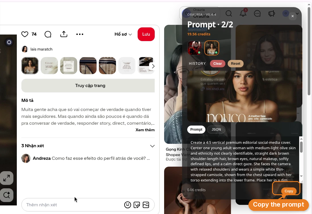
Here is the prompt it wrote for the lais maratch pin, quoted in full:
Create a 4:5 vertical premium editorial social-media cover. Center one young adult woman with medium-light olive skin and ethnicity not clearly identifiable, straight dark brown shoulder-length hair, brown eyes, natural makeup, softly defined lips, and a calm direct gaze. She faces the camera with relaxed shoulders and wears a simple white thin-strapped camisole, shown from the chest upward with her torso extending into the lower frame. Place her in a dim, warm, softly blurred interior containing vague wood, shelving, and furniture shapes. Layer a translucent social-profile interface behind her: a circular female profile portrait at upper left, faint follower and bio fragments, a link symbol, repeated small text “SOCIAL MEDIA DESIGN 2026” near the corners, and spaced lettering “LAIS MARATCH” centered at the top and bottom. Overlay enormous elegant ivory-white high-contrast serif lettering across the lower torso reading “pouco seguidor”. Beside the upper portion of the title, add compact bold white Portuguese copy reading “A melhor fase pra criar conteúdo é quando se tem”. Use warm frontal cinematic lighting, soft facial shadows, dark brown-black surroundings, subtle amber highlights, shallow depth of field, realistic skin texture, restrained contrast, sophisticated fashion-magazine typography, and carefully balanced graphic layering.
That is already more useful than “editorial portrait with typography.” In a moment we will look at why. First, the slightly trickier path: X.
How to do it on X
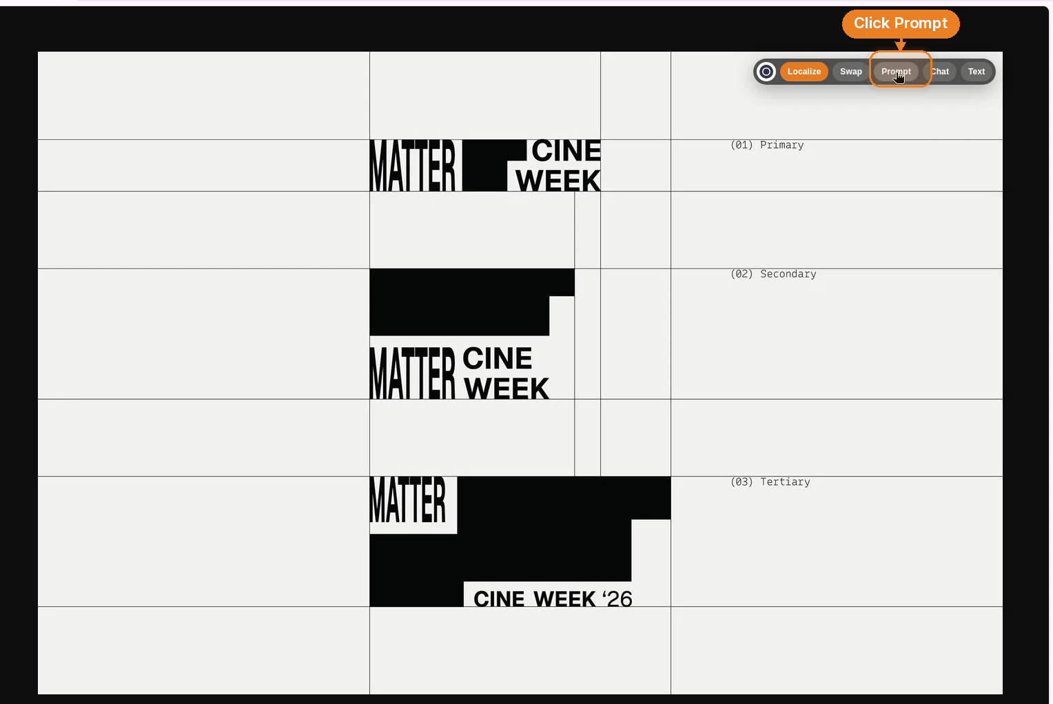
X is the same skill with a different click. The platform blocks the extension’s right-click item, so you cannot follow the Pinterest path exactly. Instead, use the extension’s image-tools bar that appears on the image, and click the Prompt quick action.
The demo post is from @abduzeedo, sharing a typographic identity system by Akronim Design Bureau for Matter Cine Week. Three black-and-white wordmark studies sit on a pale modular grid, labeled primary, secondary, and tertiary. The original post is here: x.com/abduzeedo/status/2119852848003567830.
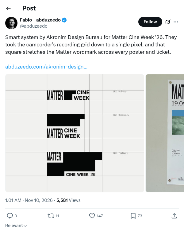
Step 1. Open the image so you can see it clearly. The extension’s image-tools bar appears on the image itself — a small row of actions along the top.
Step 2. Click Prompt.
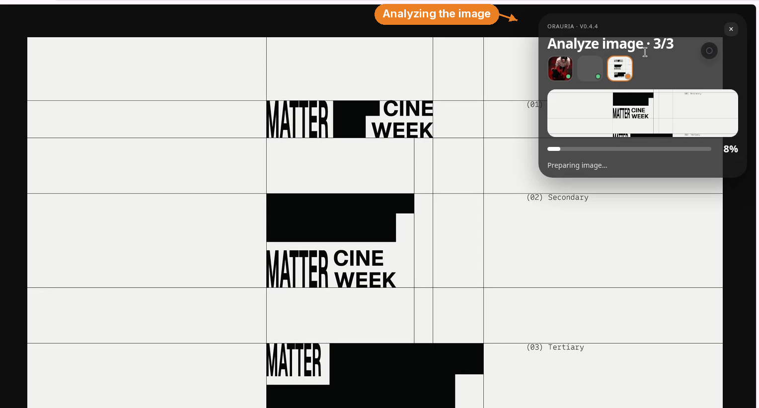
Step 3. The familiar analyze panel appears and reads the image.
Step 4. It returns a detailed prompt with a Copy button. Copy it, then take it into Orauria.
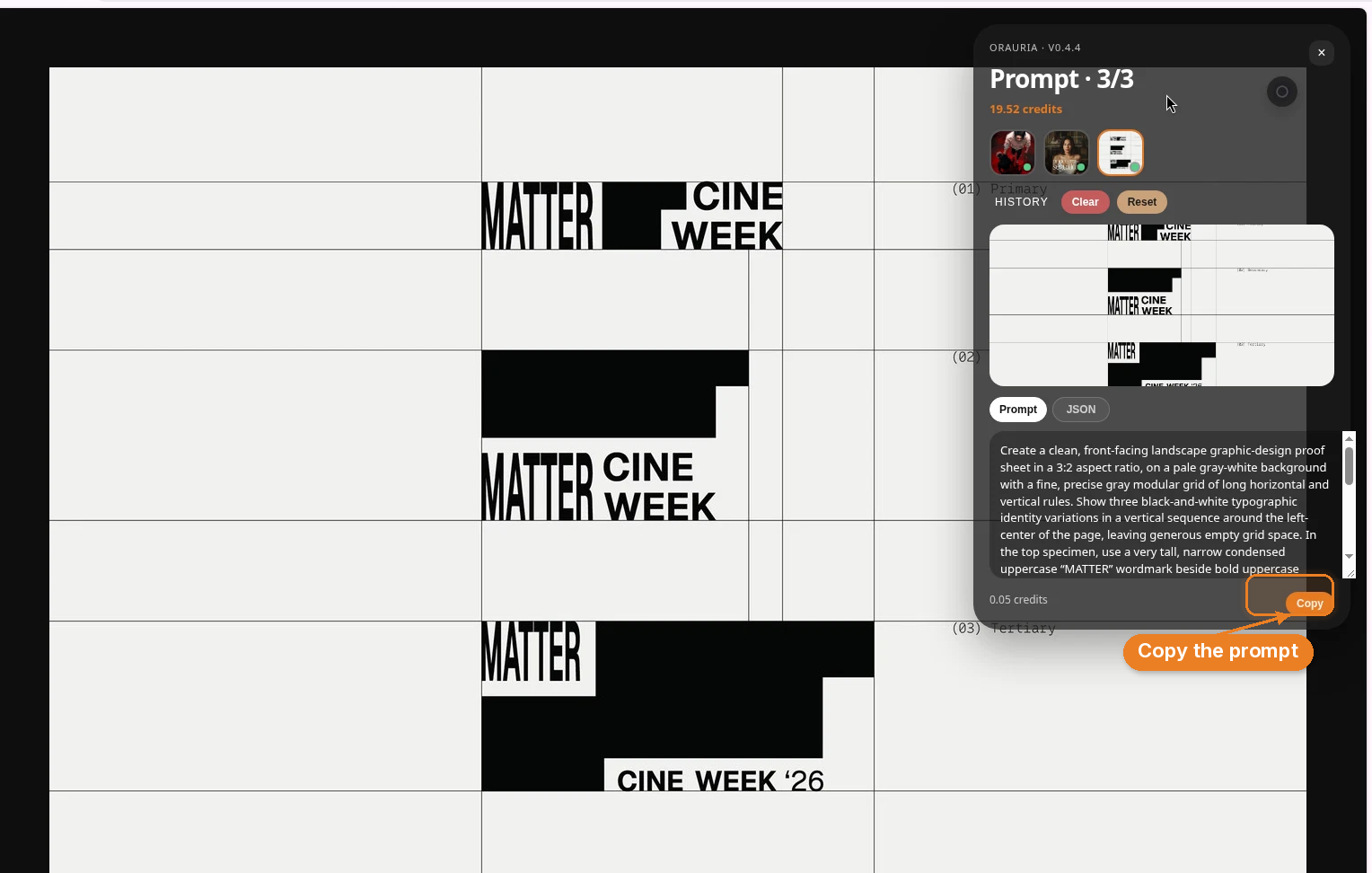
Here is the prompt it wrote for the Matter Cine Week proof sheet, quoted in full:
Create a clean, front-facing landscape graphic-design proof sheet in a 3:2 aspect ratio, on a pale gray-white background with a fine, precise gray modular grid of long horizontal and vertical rules. Show three black-and-white typographic identity variations in a vertical sequence around the left-center of the page, leaving generous empty grid space. In the top specimen, use a very tall, narrow condensed uppercase “MATTER” wordmark beside bold uppercase “CINE” over “WEEK”, arranged with strong black rectangular fields and white cutouts; let the top treatment feel partially cropped by its grid cell. In the middle specimen, place a wide black rectangle above a condensed “MATTER” at left and stacked bold “CINE / WEEK” to its right. In the bottom specimen, use a large black horizontal field, a small white label at its upper-left edge containing “MATTER”, and a white label near the lower right reading “CINE WEEK ’26”. Put small monospaced annotations in the right column, exactly “(01) Primary”, “(02) Secondary”, and “(03) Tertiary”, aligned with the three studies. Maintain sharp vector-like edges, careful baseline and grid alignment, flat neutral lighting, no shadows, no perspective, no extra imagery, and a restrained Swiss-influenced editorial identity-system aesthetic.
If you have ever tried to prompt “a minimal logo presentation” and gotten a fake mockup on a wooden desk, this is the difference. The brief names the format, the grid, each specimen, the annotations, and — just as important — everything that should stay out of the frame.
What makes a prompt like this actually good
The two results look nothing like each other, which is a feature. One is a warm, cinematic social cover. The other is a flat, typographic identity sheet. What they share is specificity. A few patterns are worth stealing for your own writing, even when you never touch the extension.
Start with the format, not the mood. “4:5 vertical premium editorial social-media cover.” “Clean, front-facing landscape graphic-design proof sheet in a 3:2 aspect ratio.” Aspect ratio and use-case do more work than adjectives like “beautiful” or “professional.”
Describe the structure as if you were art-directing a photoshoot or a layout. The Pinterest prompt places the subject (chest-up, torso into the lower frame, relaxed shoulders, calm direct gaze), then the room (dim, warm, softly blurred, vague wood and shelving), then the graphic layers (profile interface, corner type, oversized title). The X prompt builds a page: pale ground, modular grid, three studies in a vertical sequence, generous empty space, annotations in the right column. You can follow both with your finger.
Get typographic on purpose. “Enormous elegant ivory-white high-contrast serif lettering” is a different instruction from “big text.” “Very tall, narrow condensed uppercase ‘MATTER’ beside bold uppercase ‘CINE’ over ‘WEEK’” is a different instruction from “bold logo.” If type is doing the heavy lifting in the original, the prompt has to say how.
Name the light, then name the limits. Warm frontal cinematic lighting, soft facial shadows, subtle amber highlights, shallow depth of field — that is a portrait. Flat neutral lighting, no shadows, no perspective, no extra imagery, sharp vector-like edges — that is a proof sheet. The “no” list is not pessimism. It is how you keep a typographic grid from growing a drop shadow and a potted plant.
Use aesthetic language that points at a tradition, not a trend word. “Sophisticated fashion-magazine typography” and “a restrained Swiss-influenced editorial identity-system aesthetic” are still interpretations, but they are sharper than “minimal” or “editorial.” They give the model a family of decisions to stay inside.
Read those two prompts next to the original images and you will start to see the mapping: every clause is doing a job. That mapping is the skill you are practicing, whether the extension writes the first draft or you do.
A few rules so this stays a craft, not a copy machine
Use it to learn, not to clone. The win is not an identical picture. The win is being able to see, and then describe, why the original works. If you generate a frame-by-frame replica of someone else’s cover or identity system and publish it as your own, you have skipped the part that makes this worthwhile.
Credit the people who made the work worth studying. This article exists because lais maratch made a cover with a point of view, and because Akronim Design Bureau built a tight identity system that @abduzeedo was generous enough to share. Link the pin. Link the post. Name the designer. If you post your own version, say what you were studying.
Change the things that make it yours before you hit generate. This is the practical step. Swap the subject. Swap the brand name. Swap the language on the cover. Swap the palette. Keep the structure you just learned — the grid, the crop, the type hierarchy, the light — and let the content belong to you. “MATTER / CINE WEEK” can become your studio’s title treatment. “pouco seguidor” can become a line in your own voice, in your own language.
Then paste the edited prompt into Orauria and generate from that.
Try it on the next image that makes you stop scrolling
You do not need a special kind of project to practice this. The next time a pin or an X post makes you pause, run Image to prompt on it. Read the result the way you would read a design crit. Keep the sentences that feel true, rewrite the ones that do not, change the subject and the brand, and generate your own version in Orauria.
The extension will get you from “I like this” to a brief. The designer’s job — your job — is everything that happens after Copy.
Ready when you are: install the extension from the Chrome Web Store, then start at orauria.com.
Leave a Reply