Author: admin

  • One Product → Feed, Story, Cover: Marketplace Banner Thinking

    One Product → Feed, Story, Cover: Marketplace Banner Thinking

    Editorial cover for One Product to Feed Story Cover marketplace banner thinking
    Editorial cover for One Product to Feed Story Cover marketplace banner thinking

    Friday afternoon, media buying Slack: “Need the 1:1, 4:5, 9:16, and the store cover by tonight.” Someone crops the hero. The logo clips. The product drifts off-center on story. The cover looks like a different brand. Nobody “failed design.” They used resize thinking when the job was marketplace banner thinking.

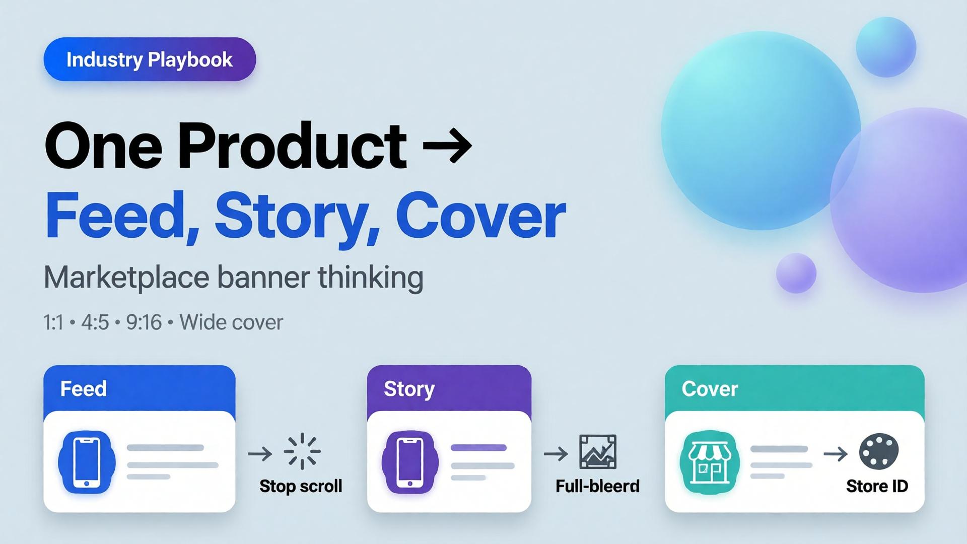
    AI marketplace banners are not a folder of stretched JPEGs. They are one creative direction expressed as a ratio family — feed, story, cover — that still reads as one campaign when a buyer sees all three in the same hour.

    Key Takeaways

    • Resize thinking crops a finished hero. Banner thinking re-composes for safe zones, hook placement, and platform habits.
    • Adobe’s 2026 Creators’ Toolkit Report: 57% of creative AI outputs still need moderate or extensive editing before publish — ratio failures are a top silent cause.
    • Build from a packshot-true product block, then adapt scene and layout per size — not the other way around.
    • Orauria’s Marketplace Banners path is built for feed / story / cover families inside the same Studio workspace as packshot and workflow cleanup.

    This spoke sits next to Packshot Thinking: packshots answer “what is the product?”; banner thinking answers “how does that product survive every placement?”

    What Is Marketplace Banner Thinking?

    Marketplace and paid social surfaces share a brutal constraint: the same SKU must look intentional at three different aspect ratios.

    Surface Typical job What breaks if you only resize
    Feed (1:1 / 4:5) Stop the scroll with product + hook Crowded center; type too small
    Story / Reels static (9:16) Full-bleed mobile interruption Product crushed; empty sky wasted
    Cover / banner (wide) Store or campaign identity Product postage-stamp; brand unread

    Banner thinking starts with a composition brief per ratio, not with Photoshop’s crop tool.

    A multi-size export is not automation of cropping. It is automation of layout decisions you already made — if you never made them, AI will invent three different campaigns.

    Why Multi-Size Tools Fail Without a Direction

    Feature pages love to promise “one click, all sizes.” That only works when three inputs already exist:

    1. A true product block (packshot-grade reference)
    2. A three-line creative direction (how to write one)
    3. Safe-zone rules per platform (logo, CTA, face/product keepout)

    Without those, batch generation produces volume. With them, it produces a system. That is the same distinction as AI ecommerce design vs AI image.

    Adobe’s surveys show creators already hop between multiple AI tools in a quarter. Multi-size chaos is what happens when each tool owns a ratio and nobody owns the campaign.

    The Feed → Story → Cover Pipeline

    1. Lock the product block

    Use an approved front or 45° packshot. If you do not have one, stop and build it first — packshot thinking. Banner AI cannot fix a false product.

    2. Write one campaign line, three layout notes

    Example for an electrolyte pouch:

    • Campaign line: Gym-bag fuel, no sugar crash.
    • Feed: Product lower-third; sweaty bottle silhouette optional; hook in primary text, not burned in.
    • Story: Product mid-frame; vertical negative space for sticker UI.
    • Cover: Product left or right third; brand wordmark in safe zone; no tiny legal type.

    3. Generate per ratio — do not clone crops

    Ask for a re-compose, not a stretch. The product scale, horizon, and negative space should change on purpose.

    4. QA the family together

    Open 1:1, 4:5, and 9:16 side by side. Fail the set if:

    • Cap color drifts between ratios
    • Logo treatment changes personality
    • Product “grows” or “shrinks” unrealistically
    • Any ratio needs a different brand story to make sense

    5. Hand off to workflow cleanup

    Remove leftover backgrounds, upscale for cover width, crop for marketplace specs — ideally in one Workflow path rather than three downloads. Background removal belongs here when catalog cutouts are required.

    Ratio Cheat Sheet (Practical, Not Dogma)

    Ratio Primary use Composition bias
    1:1 Meta feed, many marketplace tiles Centered or rule-of-thirds product; short hook
    4:5 Vertical feed Slightly larger product; less wasted side space
    9:16 Stories, TikTok static companions Vertical stacking; UI keepout top/bottom
    1.91:1 / wide Covers, some display Landscape brand field; product as anchor, not speck
    728×90 / classic banners Legacy display Extreme simplification — often type + logo only

    Exact pixels change by platform and year. The thinking does not: each ratio is a layout problem.

    Where Orauria Fits (Without Turning This Into a Manual)

    On Orauria you keep the loop inside one creative system:

    Brand Style and Character Library keep color and talent consistent when the same campaign spans static and short video stills. Prompt Library stores the ratio briefs so freelancers do not reinvent Friday panic — see also one workflow template for five clients.

    Common Failure Modes

    Failure Symptom Fix
    Stretch culture Distorted bottles Re-generate layout; never free-transform product
    Text-in-pixel addiction Unreadable claims on story Move claims to platform text; keep art clean
    Hero monopoly One beauty shot forced into all sizes Build ratio family from brief
    SKU drift Ads disagree with PDP Packshot QA before banner batch
    Tool sprawl Each size from a different app One workspace + Brand Style

    Frequently Asked Questions

    Can I just upload one image and auto-generate every size?

    You can generate volume that way. Campaign-quality families still need a direction, a true product block, and side-by-side QA. Automation amplifies a brief — it does not invent one.

    Should marketplace banners match my PDP packshot exactly?

    The product should match. The scene and crop should adapt. Exact pixel clones across ratios usually look wrong on mobile.

    How is this different from Canva resizing?

    Canva resizing moves pixels. Banner thinking redesigns hierarchy for each surface. AI helps when it recomposes; it hurts when it only stretches.

    Do I need video if I have strong static ratios?

    Not always. Many prospecting tests still win on static. When you do move to motion, keep the same product block and Brand Style so the still and the video feel like one system — inside Orauria’s image + video workspace rather than a separate avatar stack.

    What should I do first if my ads look “off-brand” across sizes?

    Audit Brand Style (color, type, photography rules), then rebuild one SKU’s ratio family correctly before scaling to 100 SKUs.

    Soft next step

    If your bottleneck is “every size looks like a different campaign,” start with Marketplace Banners on Orauria and lock feed → story → cover for a single SKU this week. Pair it with a true packshot so the product block never lies.

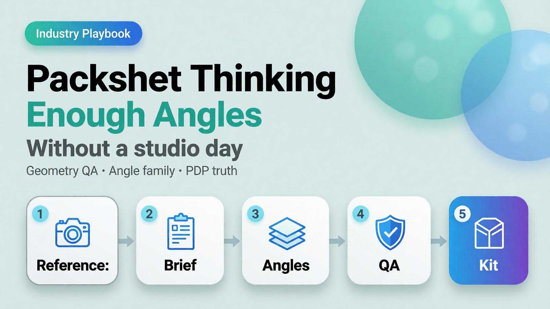
  • Packshot Thinking: Enough Angles Without a Studio Day

    Packshot Thinking: Enough Angles Without a Studio Day

    Editorial cover for Packshot Thinking: Enough Angles without a studio day
    Editorial cover for Packshot Thinking: Enough Angles without a studio day

    Most ecommerce teams still treat a packshot as a single file: product centered, white background, “good enough for the listing.” Then returns spike because buyers never saw the hinge, the texture, or the size relative to a hand. The problem was never the camera. The problem was packshot thinking — treating product photography as one pretty frame instead of a system of angles that answers buyer questions.

    AI packshot work in 2026 is not “make the bottle prettier.” It is: from one honest reference, produce enough commercial angles that a stranger on a phone can decide without calling support.

    Key Takeaways

    • A packshot is a question-answering set, not a hero beauty shot. Front, 45°, detail, scale, and packaging are different jobs.
    • Adobe’s 2026 Creators’ Toolkit Report found 57% of creative AI outputs still need moderate or extensive editing before publish — packshot QA fails for the same reason: geometry and label fidelity, not “vibe.”
    • Studio days buy control. Packshot thinking buys coverage: enough angles to list, retarget, and reuse without booking another shoot.
    • Orauria’s Packshot Studio and Ecommerce solutions are built for this job — reference in, angle family out — inside one creative workspace.

    If you have already read AI Ecommerce Design Is Not AI Image, this post is the product-layer version of that idea. Ecommerce design is the system. Packshot thinking is how the SKU itself survives marketplace scrutiny.

    What Is Packshot Thinking?

    Packshot thinking means you plan product images the way a merchandiser plans a shelf talker: every frame must close a doubt.

    Angle Buyer question it answers Fail mode if missing
    Front hero What is this product? Listing looks empty or “stock”
    45° / 3/4 What is the form in space? Flat, toy-like, hard to trust
    Detail / macro What is the material / print / finish? “Looks cheap online” returns
    Scale How big is it? Size shock after delivery
    Packaging / in-box What arrives? Unboxing disappointment
    Lifestyle bridge (optional) Where does it live? Cold catalog, weak ads

    White-background front shots are not “dead” — they are incomplete. Visual Commerce 2026 argued that white-only feeds underperform when every competitor ships context. Packshot thinking agrees — and adds a rule: lifestyle does not replace geometry. You still need the honest product block.

    A studio day gives you control. Packshot thinking gives you coverage. Coverage is what marketplaces and media buyers actually buy.

    Why Do Teams Still Book Studio Days for Simple SKUs?

    Three reasons — all rational, all incomplete.

    1. Fear of label drift. AI that “improves” a bottle often invents typography. Media buyers then reject the export because the listing hero and the ad disagree. The fix is not “never use AI.” The fix is reference-first packshots with a QA checklist that scores geometry before beauty.

    2. Habit of one hero. Designers deliver one approved beauty shot. Marketing asks for six crops Friday afternoon. Nobody owned the angle family. From Phone Photo to Campaign names this as a workflow failure, not a photography failure.

    3. Confusion between packshot and campaign. Campaign images sell aspiration. Packshots sell truth. Mixing the briefs produces images that are neither listable nor scroll-stopping.

    Adobe’s 2025–2026 creator surveys show most teams already juggle more than one creative AI tool in a quarter. That sprawl is exactly what packshot thinking tries to prevent: one reference, one brand kit, one angle plan — then generate.

    How Many Angles Are “Enough”?

    Enough is not a fixed number. Enough is coverage of buyer doubt for that category.

    Category Minimum useful set Notes
    Supplements / beauty bottles Front + 45° + label detail + scale Label fidelity is the QA bottleneck
    Electronics / gadgets Front + ports/detail + in-hand scale + packaging Ports and buttons must stay readable
    Apparel accessories Front + texture + on-model or flat scale Texture sells more than logo
    Home / hard goods Front + 45° + material detail + room bridge Staging is secondary to form

    If you only ship one angle, you are optimizing for the photographer’s portfolio — not the PDP.

    How to Build a Packshot Angle Family with AI

    This is a thinking workflow, not a button tour. Use any capable image model inside Orauria Studio; the discipline matters more than the model name.

    Step 1 — Lock the reference, not the vibe

    Upload a clean product photo: label facing camera, product centered, minimum ~1000×1000 px if you can. Phone photos work as references if focus holds on the label — see the phone-to-campaign mindset post.

    Write what must not change: bottle height, cap color, logo placement, material finish. That list is your Brand Style guardrail, not a moodboard.

    Step 2 — Write the angle brief before prompts

    Borrow the SCENE method only for lifestyle bridges. For pure packshots, write a shorter table:

    • Angle name
    • Buyer question
    • Background rule (white / soft gray / none)
    • Crop rule (full product vs detail)

    Do not invent scene poetry until the front and 45° pass QA.

    Step 3 — Generate the geometry set first

    Produce front and 45° before lifestyle. Score each export on:

    1. Does the SKU still read as the SKU?
    2. Is type on the label still legible at phone width?
    3. Do proportions match the reference (no “stretched bottle”)?

    If an export fails geometry, regenerate. Do not “fix in Photoshop for an hour” and pretend the system worked.

    Step 4 — Add detail, scale, then optional lifestyle

    Detail and scale close returns. Lifestyle bridges feed ads and social. Keep them in that order so campaign beauty never overwrites listing truth.

    Step 5 — Publish the family into a reusable kit

    Store approved angles with the SKU ID. When batch thinking across 100 SKUs starts, you reuse the angle plan — not reinvent prompts per product.

    For the productized path — shot planner plus studio generation — see Orauria’s AI Packshot landing and the broader ecommerce hub.

    Packshot QA Checklist (Traffic-Ready)

    Use this before anything leaves the folder:

    • [ ] Front hero matches listing color and silhouette
    • [ ] 45° does not invent new branding
    • [ ] Detail crop shows real texture / print / seam
    • [ ] Scale cue is honest (hand, coin, known object — or stated dimensions in copy)
    • [ ] No burned-in promo text unless the ad brief requires it
    • [ ] Background removal / cutout edges are clean for marketplace upload (background removal workflows)
    • [ ] All angles feel like one SKU, not three product lines

    Adobe’s finding that 57% of AI creative still needs editing before publish is not a reason to avoid AI. It is a reason to budget QA as part of packshot thinking.

    How Does Packshot Thinking Connect to Ads and Marketplaces?

    Packshots feed three surfaces:

    1. Marketplace PDPs — geometry and trust
    2. Prospecting statics — same product block, new scenes and ratios
    3. Workflow reuse — nodes that cut, upscale, and re-crop without re-shooting

    The next post in this cluster — One Product → Feed, Story, Cover — covers ratio families for Meta, TikTok, and marketplace banners. Packshot thinking is the source of truth. Banner thinking is the channel adaptation.

    Inside Orauria, that handoff lives in one workspace: Packshot for angles, Banner Ads / marketplace tools for sizes, Workflow for cleanup — instead of exporting to three vendors and losing brand coherence.

    Frequently Asked Questions

    Is an AI packshot good enough for Amazon or Shopee listings?

    It can be — if geometry and label fidelity pass human QA. Marketplaces punish misleading imagery. Treat AI as a production system for angles, not a license to invent product features.

    Should lifestyle images replace white-background packshots?

    No. Lifestyle answers context; packshots answer form. Strong catalogs use both. See Visual Commerce 2026.

    What if I only have a messy phone photo?

    Start with phone-to-campaign workflow mindset. Clean the reference enough that the label is readable, then build the angle family. Do not expect a blurry label to become sharp legal type.

    Which AI image model is best for packshots?

    The model that holds product geometry under your QA checklist. Choose the model after the angle brief — not before. That decision framework is covered in Choose the Image Model After Creative Direction.

    How is this different from a full studio day?

    A studio day maximizes control for hero campaigns. Packshot thinking maximizes coverage and reuse for catalogs and weekly ads. Many teams need both — just not for every SKU every week.

    Soft next step

    If your bottleneck is “we never have enough angles,” open Orauria Packshot and plan the angle family before you chase another model trend. For the full ecommerce loop — listing through social reuse — start at solutions/ecommerce.

  • Moodboard Before Render: Why Designers Still Need This Step

    Moodboard Before Render: Why Designers Still Need This Step

    Moodboard Before Render: Why Designers Still Need This Step

    The fastest way to waste an afternoon with AI is to skip the slowest step: the moodboard.

    Teams open an image model, type "premium lifestyle product shot," generate twenty variations, pick three they like, and discover on Friday that marketing needs eight more scenes in the same world — and none of the new renders match Tuesday's winners. The model did not fail. The moodboard gate did.

    An AI moodboard workflow is not nostalgia for pre-digital art direction. It is the pre-render contract — light temperature, palette, emotional register, composition habits — that turns exploration into a system you can scale.

    Key Takeaways
    >
    > – Moodboard before render = lock direction before pixels. Without it, AI exploration produces orphans, not campaigns.
    > – Adobe's 2026 Creators' Toolkit Report: 57% say AI outputs need moderate or extensive editing before publish — much of that editing is unfixed direction, not bad models (Adobe, 2026).
    > – A working moodboard answers four questions: What light? What palette? What feeling? What composition habits?
    > – Moodboard is the bridge between explore mode and reference-heavy scale.
    > – Skilled designers still moodboard — especially when AI is the camera (lookbook thinking).

    If you have read When to Use Reference Images vs Let AI Explore, you know exploration and scale are different modes. The moodboard is what you lock when exploration ends — the artifact that says: this world, not those twenty other worlds we tried.

    Fashion art director moodboard with color swatches lifestyle references and product hero frame before AI render

    What Is a Moodboard in an AI Creative Workflow?

    A moodboard in 2026 is not a Pinterest dump. It is a directional lock — typically 5–12 frames that define:

    Dimension What the moodboard locks What it prevents
    Light Time of day, temperature, direction, hardness Random neon vs soft window drift
    Palette Dominant hues, accent rules, neutrals SKU 40 in a different color universe
    Emotion Calm, urgency, aspiration, intimacy Mixed emotional registers in one gallery
    Composition Distance, crop, product-to-frame ratio Inconsistent scale across scenes
    Environment type Kitchen, commute, bathroom — not specific props Stock photo roulette

    The moodboard does not need to include your product. It often should not. It defines the world; product references attach separately in reference mode.

    Why Did Teams Think AI Made Moodboards Optional?

    Three myths enabled the skip:

    1. "The prompt is the brief." Prompts describe one frame. Moodboards describe a family of frames — the visual dialect every scene must speak.

    2. "We will fix it in post." Adobe reports 57% of AI outputs need meaningful editing before publish (2026). Post fixes one image. It does not fix a catalog that drifted across fifty SKUs.

    3. "Exploration is the deliverable." Exploration finds options. The deliverable is a curated set in one world — the lesson from our eight-scene experiment.

    What Belongs on a Pre-Render Moodboard?

    Minimum viable moodboard (5 frames)

    1. Light reference — one frame defining temperature and direction
    2. Palette anchor — swatches or a scene with correct dominant hues
    3. Environment type — the room/street/shelf logic, not luxury clichés
    4. Emotion reference — one frame that nails the feeling (calm, energy, intimacy)
    5. Composition habit — distance and crop logic for the batch

    Extended moodboard (8–12 frames)

    Add: negative references (what to avoid), texture/material examples, character/talent tone if applicable, and one hero product placement sketch — not a final render, a layout intention.

    Pair the moodboard with a 3-line brief:

    Flat lay of design moodboard materials color swatches and reference photos on desk
    Brief line Moodboard expression
    Line 1 Buyer Emotion + environment type frames
    Line 2 World Light + palette frames
    Line 3 Close Composition + channel-intent frame

    Then expand into SCENE rows — each row must pass the moodboard test: could this scene exist on the same film day as frame 3?

    Creative workspace with printed reference images color swatches and laptop for AI moodboard workflow

    Where Does Moodboard Sit in the Pipeline?

    BRIEF (3-line) → MOODBOARD (lock world) → SCENE MAP → EXPLORE (test) → CURATE → REFERENCE MODE (scale)
    Stage Moodboard role
    Before explore Define boundaries — what worlds are in play
    After explore Select 5–8 winners that become the locked board
    Before batch Attach as reference anchors alongside product shots
    During QA Reject any render that breaks board light or palette
    On drift recovery Return to board — not random prompt edits (brand trap)

    This is Direction 2 from lookbook thinking: moodboard before render — lock temperature, palette, and emotional direction before AI exploration scales.

    How Do You Build a Moodboard in One Working Session?

    Step 1 — Write the world sentence (10 minutes)

    One sentence: "Urban autumn morning, soft window light, warm neutrals, unhurried confidence." If you cannot write it, you are not ready to render.

    Step 2 — Collect references (20 minutes)

    Pull 10–15 candidates from past shoots, brand archives, licensed stock, or approved AI exploration frames. Do not render new images yet.

    Step 3 — Curate to five (15 minutes)

    Kill frames that disagree on light or palette. The board should feel like one photographer's afternoon, not a design trend collage.

    Step 4 — Add negatives (5 minutes)

    List 3–5 visual habits to reject: marble bathrooms, gold fixtures, neon gradients, oversaturated skin, floating products with no shadow logic.

    Step 5 — Sign-off gate (5 minutes)

    Explorer and curator (or client) agree: this board is the world. No batch runs until sign-off.

    Total: under one hour. Cheaper than regenerating forty wrong scenes.

    What Breaks When You Skip the Moodboard?

    Skip symptom Root cause Fix
    Pretty orphans No shared world Moodboard gate
    Palette drift mid-batch No palette anchor Lock swatches on board
    Inconsistent light Explored without boundaries Light reference frame
    Client "something feels off" Emotion not agreed Emotion frame + brief Line 3
    Brand consistency trap No recovery anchor Rebuild board from 3 winners only

    When drift appears, do not tweak prompts randomly. Return to the moodboard and ask which dimension broke: light, palette, emotion, or composition.

    Split comparison of chaotic AI image grid versus curated moodboard-directed scene family

    How Does Moodboard Connect to Catalog Scale?

    For 100-SKU batches, the moodboard is per scene family, not per SKU:

    Scene family Moodboard scope
    Morning ritual One board for all bathroom/shelf SKUs
    Desk pause One board for homeware + drinkware
    Travel kit One board for minis and pouches

    Swap product references; do not swap worlds mid-family. That is how batch thinking preserves soul at scale.

    Moodboard vs Brand Style vs References — What Is the Difference?

    Artifact Job
    3-line brief Strategic decisions — buyer, world, close
    Moodboard Visual lock — light, palette, emotion, composition
    Brand Style (tool layer) Enforced rules in generation pipeline
    Product references SKU truth — shape, label, color accuracy
    SCENE grid Per-scene commercial mapping

    The moodboard is the human-readable version of what Brand Style encodes in software. Both should agree — if they diverge, trust the signed-off board.


    Lock direction before render on Orauria: Try Orauria

    Frequently Asked Questions

    Do I still need a moodboard if I have Brand Style presets?

    Yes. Brand Style enforces rules; the moodboard chooses which world this job lives in. Presets without direction still drift.

    Can the moodboard be AI-generated images?

    Yes — if they are curated exploration winners, not random generations. Exploration produces candidates; moodboard locks the selection.

    How many frames is enough?

    Five for a minimum viable board. Eight to twelve for complex fashion or multi-channel campaigns.

    How long should moodboarding take?

    Under one hour for most ecommerce jobs. If it takes days, the brief is not decided yet — fix 3-line brief first.

    Is moodboard only for fashion?

    No. Beauty needs ritual environments. FMCG needs desk and shelf worlds. Any SCENE-driven job benefits from pre-render lock.

    When can I skip the moodboard?

    Single-frame exploration with no scale intent — mood discovery only. The moment you need a set, the board returns.

    Conclusion

    AI did not retire the moodboard. It relocated it — from wall pin-up to pre-render gate in every pipeline that ships more than one image.

    Write the world sentence. Curate five frames. Sign off before the batch. Let SCENE and references do the rest.

    Designers who still moodboard are not clinging to the past. They are refusing to pay for direction drift in pixels — one render at a time, one hundred SKUs at a time.


    References

    1. Adobe, 2026 Creators' Toolkit Report, June 16, 2026. https://news.adobe.com/news/2026/06/creators-toolkit-report-2026
    2. Adobe, Inaugural Creators' Toolkit Report (Adobe MAX 2025), October 28, 2025. https://news.adobe.com/news/2025/10/adobe-max-2025-creators-survey
  • Batch Thinking: 1 Brand Kit × 100 SKUs Without Losing Soul

    Batch Thinking: 1 Brand Kit × 100 SKUs Without Losing Soul

    Your merchandising team drops one hundred SKUs next Friday. Your creative lead has three days, one freelancer, and a folder of packshots. The obvious move? Open the AI tool and write one prompt per product. By SKU forty, every image looks like a different brand. By SKU seventy, someone asks why the light keeps changing. By SKU one hundred, you have volume, and zero soul.

    AI ecommerce batch content does not fail because models are weak. It fails because teams treat scale as one hundred separate creative decisions instead of one brand kit multiplied by SKU-specific references. Batch thinking fixes that. One spine. Many products. Creative direction that survives the drop.

    Key Takeaways

    >

    Batch thinking means one locked brand kit (palette, light logic, no-go rules) applied across hero SKU families, not one bespoke prompt per product.

    – Adobe’s 2026 Creators’ Toolkit Report found 57% of creators say AI outputs need moderate or extensive editing before publish. Most of that rework traces to missing batch structure, not bad luck (Adobe Creators’ Toolkit Report, 2026).

    – Group SKUs by scene family, not category tree. Reference-heavy mode at scale beats exploratory prompting once direction is locked.

    – Soul survives scale through curator gates: explorer generates, approver enforces kit, slot map assigns channel jobs before render.

    If you have read AI Ecommerce Design Is Not AI Image, you know commercial creative is a system. This playbook answers the scaling question inside that system: how does one brand kit cover a hundred SKUs without the gallery looking like a stock-site accident?
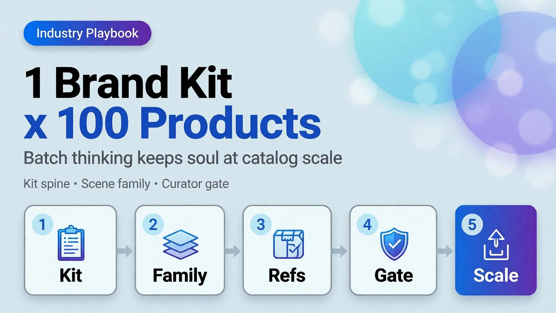
    Ecommerce creative director reviewing unified brand kit applied across multiple product SKU scenes One kit, many SKUs: batch thinking is multiplication, not repetition.

    Why Does Scaling 100 SKUs With AI Feel Like 100 Different Brands?

    Because prompt-per-SKU workflows optimize for individual frames, not set coherence. Each new product invites a fresh adjective stack, a new scene guess, a new light mood. The model complies. The catalog fractures.

    Adobe surveyed more than 16,000 creators globally in 2026 and found 75% describe creative AI as integrated or essential. Yet the same report shows 42% believe AI-generated work makes it harder for distinctive voices to surface (Adobe Creators’ Toolkit Report, 2026). That is not a model problem. That is a direction problem wearing a volume badge.

    The math is simple. One hundred SKUs times three scene types equals three hundred generation jobs. Without a brand kit spine, you are running three hundred micro-briefs. With batch thinking, you run one kit times three scene templates times SKU references. Same output count. One world.

    Citation capsule: Scaling AI ecommerce batch content fails when teams prompt per SKU. Adobe’s 2026 data shows 57% of creators still edit AI outputs heavily before publish. Batch structure reduces that rework by locking direction before generation starts.

    What Is Batch Thinking, and How Is It Different From Batch Generating?

    Batch generating is a button. You queue one hundred jobs, walk away, hope the folder looks on-brand. Batch thinking is a design decision made before the queue opens.

    Batch generating Batch thinking
    One prompt per SKU One brand kit per drop
    Scene invented at render time Scene families defined upfront
    References optional SKU references mandatory
    Curator reviews output Curator approves kit first
    Success = file count Success = set coherence

    Batch thinking borrows from how studios shoot lookbooks: one lighting setup, one set family, many products walked through the same world. AI does not change that logic. It amplifies the cost of skipping it.

    The SCENE method still applies (Story, Context, Emotion, Narrative, Extension), but at batch scale, SCENE rows attach to scene templates, not individual SKUs. SKUs inherit the template and swap only what must change: product geometry, colorway, label legibility.

    Soul is not a vibe word. It is creative direction that survives multiplication. When every SKU shares light logic and palette enforcement, the buyer feels one brand made one hundred considered choices, not one algorithm rolled dice one hundred times.

    Side-by-side comparison of chaotic per-SKU AI prompts versus organized brand kit batch workflow Batch generating fills folders. Batch thinking fills a world.

    What Belongs in the Brand Kit Spine?

    The brand kit is the non-negotiable layer every SKU inherits. Think of it as the creative contract the model cannot negotiate away.

    Palette and color behavior

    Lock primary, secondary, and accent hex values. Define how product colorways interact with environment neutrals. State whether backgrounds warm or cool relative to skin and packaging. Without this, SKU seventeen drifts mint while SKU eighty-two goes sage. Both read “green.” Neither is yours.

    Light logic

    One sentence beats ten adjectives. Example: Late-morning window light, 5200K, soft shadow falloff, no harsh rim. Every scene family in the drop repeats that sentence. Light logic is where the brand consistency trap hides when teams scale fast.

    No-go rules

    List what never appears: competitor visual tropes, off-brand props, wrong era furniture, illegible label blur, hands without grooming rules. No-go lists are boring to write and expensive to skip.

    Character rules (when faces matter)

    If the drop uses models, define age band, styling lane, expression range, and casting consistency. Character is not “a woman in her thirties.” Character is one approved casting lane referenced across hero families, same as a studio would book one talent day.

    Slot map (channel jobs)

    Before rendering, assign which scene types serve which slots: marketplace hero, PDP gallery row two, paid social vertical, email hero. The visual commerce 2026 split still applies: compliance truth plus lifestyle story. Batch thinking names those slots before SKU one renders.

    Brand kit document showing palette swatches light logic notes and no-go rules for ecommerce batch production The kit is short. The enforcement is daily.

    How Do Hero SKU Families Replace Category-Tree Thinking?

    Merchandising organizes by category: tops, bottoms, accessories, home, beauty. Creative direction organizes by scene type: tabletop ritual, on-body movement, shelf context, outdoor carry, detail macro.

    Hero SKU families group products by which scene template they walk through, not which nav tab they sit under.

    Example family map for a mixed apparel-and-accessories drop:

    Hero family Scene template Example SKUs
    Morning flatlay Bathroom marble, soft steam Serums, scarves, small leather goods
    Commute carry Street light, bag scale shot Totes, crossbodies, laptop sleeves
    On-body movement Walking frame, natural stride Dresses, outerwear, sneakers
    Detail proof Macro texture, stitch or grain Knitwear, leather, ceramics
    Compliance hero Pure white, 85%+ frame fill All marketplace main images

    A linen dress and a ceramic mug may share the morning flatlay family if the buyer moment matches: quiet ritual, not product taxonomy. That is how you cover one hundred SKUs with twelve scene templates instead of one hundred invented rooms.

    Fashion teams discovered this through lookbook thinking. Ecommerce batch drops use the same move at warehouse scale.

    Citation capsule: Hero SKU families group products by shared scene templates (morning flatlay, commute carry, on-body movement), not by merchandising category trees. One brand kit can cover 100 SKUs with roughly 10-15 scene families instead of 100 unique prompts.

    When Should You Switch to Reference-Heavy Mode at Scale?

    Exploration is for discovery. Reference-heavy mode is for production.

    When to Use Reference Images vs Let AI Explore draws the line: explore when the world is unknown; reference when the world is locked. A hundred-SKU drop is never the moment to explore.

    At scale, every generation job carries:

    1. Brand kit block: palette, light, no-go (pasted identically)
    2. Scene template reference: one approved frame per hero family
    3. SKU reference: packshot or phone capture of the actual product
    4. SCENE row: story and emotion for that family only

    The SKU reference handles geometry, label, and colorway truth. The scene template handles world coherence. The brand kit handles identity. Prompt text becomes assembly, not invention.

    Adobe’s 2025 survey found 52% of creators use creative AI primarily for asset generation, while 48% use it for ideation (Adobe MAX 2025, 2025). Batch drops belong in the generation lane. Ideation already happened when the kit and families were approved.

    [CHART: Bar comparison – rework hours per 100-SKU drop: prompt-per-SKU workflow vs brand-kit batch workflow – illustrative workflow efficiency data]

    What Does the Curator Workflow Look Like for a 100-SKU Drop?

    Volume without curation is how distinctive brands become generic ones. A 100-SKU drop needs gates, not hope.

    Gate 1: Kit approval (before any SKU)

    Creative lead signs off palette, light logic, no-go list, and slot map. No generation until this passes. One meeting. One document.

    Gate 2: Family template approval (per hero family)

    Generate three to five explorations per family once. Pick one winning template per family. That template becomes the reference for every SKU in the family.

    Gate 3: SKU batch review (per family, not per SKU)

    Run ten to twenty SKUs through the same family template. Review as a set at thumbnail grid scale. Ask: do these look like one brand shot one afternoon?

    Gate 4: Slot compliance check

    Marketplace heroes against white-background rules. PDP lifestyle against emotion brief. Social crops against safe zones. The phone-to-campaign mindset applies: shoot (or reference) once, adapt to slots. Do not re-invent per channel.

    Gate 5: Publish set curation

    Ship three to five images per SKU, not twenty “good enough” frames. Adobe reports 85% of creators insist the final creative decision must remain theirs (2026). Curator gates protect that judgment instead of drowning it in volume.

    Freelancers running multiple clients should save the kit-plus-family structure as a reusable template, the same move described in One Workflow Template for Five Clients.

    Curator reviewing thumbnail grid of AI generated product images for brand consistency across SKU batch Curators judge sets, not singles. The grid tells the truth.

    What Breaks When Batch Thinking Is Missing?

    Four failure modes appear in almost every distressed 100-SKU drop.

    Brand drift

    Individual images pass review. The collection fails it. Light warms on SKU twelve. Shadows harden on SKU sixty-one. Accent colors creep toward model defaults. This is the brand consistency trap at warehouse scale. Fix it by returning to the kit, not by re-prompting adjectives.

    Orphan scenes

    A beautiful kitchen frame for a product that never belongs in a kitchen. Orphan scenes happen when prompts invent context per SKU instead of inheriting family templates. They convert like wallpaper: pretty, purposeless.

    No slot map

    The team renders cinematic landscapes, then discovers marketplace needs RGB 255 white heroes and paid social needs vertical safe zones. Rework doubles. The global visual commerce platform market is projected to grow from $4.6 billion in 2025 to $13.8 billion by 2034 at a 12.8% CAGR (DataIntelo, 2025). That growth rewards teams who plan slots before pixels, not after.

    Prompt-per-SKU fatigue

    By SKU fifty, whoever writes prompts starts cutting corners. Adjectives compress. References drop off. Quality variance becomes visible to buyers scrolling the catalog. Fatigue is a workflow bug, not a talent bug.

    Aggregated ecommerce A/B data commonly shows lifestyle context additions lifting conversion 15–30% over packshot-only galleries when scenes share coherent world logic (industry aggregates, 2025–2026). Incoherent batches waste that uplift.

    What Is the 5-Step Batch Thinking Playbook?

    Copy this sequence for the next drop.

    Step 1: Write the brand kit (one page). Palette, light logic, no-go rules, character lane if needed, slot map. Approve before opening any model.

    Step 2: Map hero SKU families. List every SKU. Assign each to a scene family by buyer moment, not category tree. Target ten to fifteen families for a hundred-SKU mixed drop.

    Step 3: Lock family templates. Explore three to five options per family. Curator picks one reference frame per family. No SKU work until templates hold.

    Step 4: Run reference-heavy batches. Each job = kit block + family template + SKU reference + SCENE row. Batch by family, not by merchandising sort order.

    Step 5: Curate publish sets. Review at grid scale. Enforce slot compliance. Ship three to five frames per SKU. Save the kit and family map as next season’s template.

    Teams consolidating tools should read Orauria vs a Scattered AI Stack for why batch thinking needs one workflow surface, not six tabs with six different light moods.

    Five-step batch thinking playbook flowchart from brand kit through hero families to curated publish set Five steps, one world. The playbook is thinking, not clicking.


    Run your next 100-SKU drop on Orauria: Try Orauria

    Frequently Asked Questions

    Is batch thinking only for large catalogs?

    No. The same logic applies to twenty-SKU seasonal drops. Batch thinking scales down cleanly: one kit, three families, curated sets. The failure mode (prompt-per-SKU drift) hurts small drops too; it just arrives faster.

    How many hero families do I need for 100 SKUs?

    Plan ten to fifteen families for a mixed catalog. Fewer if the drop is single-category (eight families for apparel-only). More than twenty families usually means you are back to per-SKU invention wearing a taxonomy costume.

    Can I still explore creatively inside a batch drop?

    Yes, but only at Gate 2 (family template approval). Exploration is bounded, intentional, and once per family. Production SKUs inherit the winner. That is how soul survives scale without killing discovery.

    What if SKUs need genuinely different contexts?

    Split the SKU into a second family with its own template. Do not write a one-off prompt. If a product truly needs a unique world, it is a new family row, not an exception that breaks the kit.

    Does batch thinking replace white-background marketplace heroes?

    No. Compliance heroes are a slot, not a scene family competitor. The visual commerce 2026 dual-layer model still applies: white truth for marketplaces, lifestyle families for brand channels. One kit governs both.

    How do freelancers charge for 100-SKU batch work?

    Price the kit, family map, and curation system, not per-image generation. Clients who buy volume without direction buy rework. Adobe’s 2026 data shows 57% of creators already edit AI outputs heavily; batch structure is billable creative direction, not a discount line item.

    Conclusion

    One hundred SKUs is not one hundred prompts. It is one brand kit, ten to fifteen hero families, reference-heavy production, and curator gates that protect the final call.

    Batch thinking is how ai ecommerce batch content keeps soul at scale. The kit holds identity. Families hold coherence. References hold product truth. Curators hold judgment.

    Write the kit before SKU one. Group by scene, not category. Explore once per family, then multiply. Review the grid, not the single.

    That is not slower than prompt-per-SKU chaos. It is the only speed that ships a catalog buyers trust.


    References

    1. Adobe, 2026 Creators’ Toolkit Report, June 16, 2026. https://news.adobe.com/news/2026/06/creators-toolkit-report-2026
    2. Adobe, Inaugural Creators’ Toolkit Report (Adobe MAX 2025), October 28, 2025. https://news.adobe.com/news/2025/10/adobe-max-2025-creators-survey
    3. DataIntelo, Global Visual E-Commerce Platform Market Report, 2025. https://dataintelo.com/report/global-visual-e-commerce-platform-market
    4. Amazon Seller Central, Product Image Requirements, 2025. https://sellercentral.amazon.com/help/hub/reference/G1881
    5. acceleroi, Shopify Beauty & Skincare Conversion Rate Benchmark 2026. https://www.acceleroi.com/posts/benchmarks/shopify-beauty-skincare-conversion-rate
  • Orauria vs Scattered AI Stack: When All-in-One Actually Wins

    Orauria vs Scattered AI Stack: When All-in-One Actually Wins

    Orauria vs Scattered AI Stack: When All-in-One Actually Wins

    The default ecommerce AI stack in 2026 looks like this: ChatGPT for briefs. Midjourney or Flux for images. A separate upscaler. Canva for crops. Google Drive for versions. Slack for "which file is final?"

    Each tool is good at one job. Together they create a hidden job nobody budgeted for: integration — moving assets, re-explaining the brief, re-uploading references, and hoping the brand did not drift between login screens.

    An AI all in one platform is not automatically better. It is better when handoff cost exceeds tool specialization benefit — which is exactly where most ecommerce creative teams land after the first successful AI pilot.

    Key Takeaways
    >
    > – Adobe's 2026 Creators' Toolkit Report found 60% of creators used more than one creative AI tool in three months — multi-tool is normal; the question is whether your stack is designed or accidental (Adobe, 2026).
    > – 57% say AI outputs need moderate or extensive editing before publish — scattered stacks often add editing because context is lost at every handoff (Adobe, 2026).
    > – Scattered stacks win for exploration, single deliverables, and team members who already have tool mastery.
    > – Integrated workspaces win for repeatable ecommerce pipelines — brand style, scene families, channel exports, saved workflows (AI ecommerce design vs one-off AI image).
    > – Decision rule: if you ship the same creative job type weekly, integration beats best-of-breed sprawl.

    If you have read AI Ecommerce Design Is Not AI Image, you know the business problem is systems, not renders. This comparison asks a narrower question: does your tool architecture match that system — or fight it?

    Integrated AI creative workspace dashboard compared to multiple scattered design tool windows

    What Is a Scattered AI Stack?

    A scattered stack chains specialized tools with manual glue:

    Layer Typical tools What breaks
    Brief / copy ChatGPT, Claude, Gemini Brief lives in chat history, not attached to assets
    Image generation Midjourney, DALL·E, standalone Flux apps No shared brand style across sessions
    Edit / upscale Topaz, Magnific, Photoshop Separate files, separate approvals
    Layout / crop Canva, Figma Brand kit duplicated, not synced to gen models
    Storage Drive, Dropbox, Notion final_v7_REAL.png taxonomy
    Video / voice Runway, ElevenLabs Another reference upload, another style drift

    Nothing is wrong with any single tool. The tax is context loss: every export is a amnesia event. The brand consistency trap is what happens when five good tools produce five different visual dialects.

    What Is an AI All-in-One Creative Workspace?

    An AI all in one platform for commercial creative — Orauria included — bundles generation, direction, and workflow in one account:

    • Multi-model access — image, video, voice, chat models without separate subscriptions per vendor
    • Brand Style — palette, photography style, composition rules applied across generations
    • Character library — face and identity consistency across scenes
    • Prompt / workflow library — reusable pipelines, not one-off chat threads
    • Workflow builder — nodes for upload → brand style → generate → upscale → crop (node thinking coming soon)

    The promise is not "one model to rule them all." It is one spine for phone-to-campaign and catalog-scale production — where the brief, references, brand rules, and exports stay attached.

    When Does the Scattered Stack Win?

    Choose best-of-breed sprawl when:

    1. You are exploring, not producing. Mood boards, one-off concepts, personal art direction experiments — Midjourney or a single strong image model may be faster than configuring a workspace.

    2. One specialist owns one tool deeply. A retoucher who lives in Photoshop, a copywriter who lives in Claude — forcing them into a new UI for one step adds friction, not speed.

    3. Deliverable volume is low. If you publish four images a month and never reuse the pipeline, integration ROI is weak. Pay the handoff tax; it is cheaper than migration.

    4. You need a capability the workspace lacks. Niche video models, proprietary enterprise integrations, legacy DAM systems — scattered stacks remain valid as specialist nodes, not as the whole architecture.

    Honest comparison: ChatGPT solves briefing and copy well. Midjourney solves aesthetic exploration well. Canva solves quick social crops well. None of them were built to run a dual-layer visual commerce system (visual commerce 2026) across fifty SKUs.

    When Does All-in-One Actually Win?

    Integration wins when the job is repeatable commercial creative — the same pipeline, different SKU:

    Signal Why integration wins
    Weekly SKU launches Saved workflow beats rebuilt prompts
    Multi-channel exports Crop presets tied to generation, not manual redo
    Brand consistency requirements Style + character libraries enforce guardrails
    Freelancer multi-client ops One template, swappable slots (freelancer playbook)
    Team handoffs Brief → generate → curate → export in one audit trail
    10+ images per product SCENE grids need persistent context

    Adobe reports 85% of creators insist the final creative decision must remain theirs (2026). All-in-one does not remove the curator — it removes the file archaeology between generation and approval.

    Total cost: subscription vs integration tax

    Cost type Scattered stack All-in-one workspace
    Subscriptions $20–60+ per tool × N tools Single platform tier
    Setup per job Re-upload refs, re-write brief Swap slot in saved workflow
    Revision loops Re-export, re-import, version hunt Regenerate node, same context
    Brand drift rework High — no shared style layer Lower — style attached to pipeline
    Onboarding new freelancer Learn 5 UIs Learn one spine

    The subscription line item often favors scattered tools until you count hours lost per launch. Freelancers billing creative direction learn this fast: clients pay for outputs, not your Drive archaeology (freelancer playbook).

    Comparison workflow diagram showing scattered tool handoffs versus integrated AI creative pipeline nodes

    How Do the Two Approaches Compare for Ecommerce Teams?

    Dimension Scattered AI stack Orauria-style all-in-one
    Best for Exploration, one-offs, specialist steps Repeatable ecommerce pipelines
    Brief → image link Manual copy-paste Brief attached to workflow
    Brand consistency Per-tool discipline Brand Style + Character layers
    Model choice Best model per task, manually Multi-model in one account
    Workflow reuse Screenshots and hope Saved nodes / templates
    Channel adaptation External crop tools Export presets in pipeline
    Learning curve Low per tool, high across stack Higher upfront, lower per job
    Vendor lock-in risk Low per tool, high on folder habits Medium — mitigated by export
    Curator role Same — human approves Same — human approves

    Neither column wins every row. Ecommerce teams shipping campaign systems — not single renders — tend to shift right as volume grows.

    What Does a Hybrid Stack Look Like?

    The honest answer for many teams in 2026 is hybrid:

    • All-in-one spine for product imagery, brand-governed scenes, and catalog batches
    • Specialist tools for steps the workspace does not own — enterprise DAM, print prep, legal review PDFs

    Freelancers often run hybrid internally: client-facing exports in their format, internal production in one template. SMEs can keep ChatGPT for email copy and run visual production in a workspace — the mistake is running five image tools with zero shared brand layer.

    What Should You Choose? A Decision Framework

    Answer four questions:

    1. How often do you repeat this job type? Weekly or more → favor integration. Quarterly one-off → scattered is fine.

    2. How many handoffs between brief and publish? More than two → handoff tax is your bottleneck.

    3. Does brand drift cost you money? Returns, re-shoots, marketplace rejections → you need Brand Style + curator gates, not more generators.

    4. Is your deliverable a file or a system? Ten PNGs = files. Campaign kit + saved workflow = system. Systems favor all-in-one (AI ecommerce design).

    Your answer pattern Recommendation
    Weekly SKUs, multi-channel, brand-sensitive All-in-one workspace as spine
    Monthly exploration, single hero image Scattered stack OK
    Agency white-label, high volume All-in-one + export to client DAM
    Solo creator, low volume Start scattered; migrate when repetition hurts
    Ecommerce team reviewing AI-generated product images on unified creative workspace

    What Are Common Mistakes When Comparing Stacks?

    Mistake Reality
    "All-in-one replaces creativity" It replaces fragmentation — curators still curate
    "More tools = more capability" More tools = more context loss without discipline
    "Cheapest subscription wins" Integration tax often exceeds subscription delta
    "We will integrate later" Folder habits compound — migration gets harder
    "One model is enough" Commercial work needs model choice inside one workflow

    How Does Orauria Fit This Comparison?

    Orauria is positioned as an AI creative workspace for ecommerce — not a single image model:

    • Multi-model chat, image, video, and voice in one account
    • Brand Style and Character libraries for consistency across batches
    • Workflow automation from idea through image, video, voice, and export
    • Prompt library for reusable 3-line briefs and SCENE rows

    It is not the right tool for every job. It is built for teams tired of paying the scattered stack tax on every SKU launch.

    Deeper brand overview: What Is Orauria? (coming soon). Canva + ChatGPT comparison: coming in a future post.

    Multiple AI application windows on desktop representing fragmented creative tool stack

    Run ecommerce creative on one spine: Try Orauria

    Frequently Asked Questions

    Is an AI all-in-one platform always better than specialized tools?

    No. Specialized tools win for exploration, niche capabilities, and low-volume one-offs. All-in-one wins when you repeat commercial creative pipelines and handoff cost hurts.

    Can I keep Midjourney and use Orauria?

    Yes — hybrid stacks are common. Use specialist tools where they excel; use a workspace as the spine for brand-governed ecommerce production.

    How is this different from Canva or Adobe Express?

    Canva and Express excel at layout and quick design. Orauria focuses on multi-model generation + brand style + workflow automation for ecommerce scene production — a different layer of the stack.

    What is the main hidden cost of a scattered AI stack?

    Context loss: re-uploading references, re-explaining briefs, hunting versions, and fixing brand drift between tools. Adobe's 2026 data shows most AI output still needs editing — scattered stacks often add editing at every handoff.

    When should a freelancer switch from scattered to all-in-one?

    When you run the same job type for multiple clients and spend unbillable hours on setup. The one workflow, five clients model needs a spine.

    Does all-in-one mean vendor lock-in?

    Any workflow creates habits. Mitigate by exporting finals, documenting prompts, and choosing platforms that let you own output files. The tradeoff is real but usually smaller than five-tool folder chaos.

    Conclusion

    Orauria vs scattered AI stack is not a purity contest. It is an architecture question.

    Scattered tools win when you explore, specialize, and ship rarely. An AI all in one platform wins when ecommerce creative is a repeatable system — brief, brand style, scene family, channel export — and every handoff between tools costs time, consistency, and margin.

    Count your handoffs before your subscriptions. If the same pipeline runs every week, integration is not luxury. It is how AI ecommerce design stops being a slide deck and starts being operations.


    References

    1. Adobe, 2026 Creators' Toolkit Report, June 16, 2026. https://news.adobe.com/news/2026/06/creators-toolkit-report-2026
    2. Adobe, Inaugural Creators' Toolkit Report (Adobe MAX 2025), October 28, 2025. https://news.adobe.com/news/2025/10/adobe-max-2025-creators-survey
  • Visual Commerce 2026: Is the White-Background Product Shot Dying?

    Visual Commerce 2026: Is the White-Background Product Shot Dying?

    Visual Commerce 2026: Is the White-Background Product Shot Dying?

    Every few months, a headline declares the white-background product shot dead. Lifestyle won. UGC won. AI scenes won. Meanwhile, Amazon still rejects your main image for a gray background, your marketplace hero still needs to read at thumbnail size, and your paid social still needs a world — not a floating SKU in a void.

    Visual commerce trends in 2026 are not about picking a winner. They are about splitting the job: white-background heroes as truth and compliance, contextual lifestyle as conversion and story. The packshot is not dying. It has been demoted from "the only image" to "layer one" in a dual-layer system.

    Key Takeaways
    >
    > – White-background shots still dominate slot one on marketplaces and category grids — lifestyle wins slots 2–8, ads, and social (Nightjar, 2026).
    > – Salsify's 2026 consumer research found 61% of shoppers rank images and video as the most important product page elements when deciding to buy (Salsify, 2026).
    > – 42% of shoppers try to determine product size from images — in-scale and contextual shots are not decorative (Baymard).
    > – Adobe's 2026 Creators' Toolkit Report: 57% say AI outputs need moderate or extensive editing before publish — AI scales lifestyle, not strategy (Adobe, 2026).
    > – Visual commerce 2026 = dual-layer imagery + creative direction (SCENE) at scale.

    If you have read AI Ecommerce Design Is Not AI Image, you know commercial creative is a system. This article is the trend layer — what is changing in how that system gets built and sequenced across channels.

    Split view of white background product packshot and lifestyle contextual ecommerce scene

    What Does Visual Commerce Mean in 2026?

    Visual commerce is the practice of using imagery not as decoration but as the primary sales interface — PDP galleries, marketplace thumbnails, paid social, email heroes, and short video frames that together answer: What is it? How big is it? Will it fit my life? Can I trust it?

    In 2026, three forces reshape that interface:

    1. Mobile-first scanning. Thumbnails are smaller, scroll is faster, and the first image must communicate product identity in under two seconds. Clean heroes still win that moment.

    2. Platform rules vs brand worlds. Amazon and Walmart require pure white (RGB 255,255,255) main images. Shopify and DTC sites have more freedom — but shoppers still expect a clear hero before context (Nightjar, 2026).

    3. AI as scale layer, not strategy layer. Hybrid workflows — real product truth plus AI-generated context — are becoming the default economics for lifestyle expansion (Deep-Image hybrid photography analysis, 2026). The strategy question is not "AI or studio." It is what job each image slot performs.

    Why Do Marketplaces Still Demand White-Background Heroes?

    Because slot one is a compliance and comparison job, not a storytelling job.

    Platform Main image rule Lifestyle role
    Amazon Pure white background, product fills frame Alternate images: in-use, lifestyle, infographics
    Walmart White or neutral per category guidelines Gallery slots 2+
    Google Shopping Solid white/gray/light for non-apparel Apparel may use on-model lifestyle
    Shopify / DTC No enforced background Sequence strategy is yours — but clarity first

    Marketplace algorithms and human moderators treat slot one as product identification. A busy lifestyle scene in slot one fails readability at thumbnail size and often fails policy. White-background heroes are the barcode of visual commerce — unglamorous, essential, not optional.

    That does not mean boring. High-performing 2026 catalogs treat white as a controlled color: realistic shadows, clean edges, visible texture — not flat cutout paste (PicVisual 2026 playbook).

    Where Does Lifestyle Imagery Win Conversion?

    Lifestyle wins where the question shifts from "what is this?" to "how does this fit my life?" Academic A/B research on home décor found contextual lead images roughly 2× conversion on Wayfair (3.93% vs 1.99%) — but no significant lift when contextual images replaced the Amazon hero (Tilburg University, academic study).

    Research synthesis across UX and ecommerce sources points to a consistent pattern:

    Channel / slot Best image type Why
    Marketplace main image White-background hero Policy + thumbnail clarity
    PDP gallery slots 2–8 Lifestyle, detail, in-scale Answers context and trust
    Paid social / feed ads Lifestyle Blends with feed; drives click
    Email hero Lifestyle or styled scene Emotional hook
    Category grid Clean hero or consistent on-model Comparison at speed

    Baymard's product page research emphasizes that users need in-scale images — 42% try to judge size from photos alone (Baymard). Lifestyle without scale reference increases returns. Lifestyle with scale logic reduces doubt.

    For fashion, the sequence matters as much as the type: clarity first, fit second, lifestyle after the product is understood (fashion PDP image order research). That aligns with lookbook thinking — worlds matter, but not before the product reads.

    Ecommerce product gallery showing white hero image followed by lifestyle contextual shots

    What Is the Dual-Layer Model for Visual Commerce?

    Stop choosing white or lifestyle. Run both as layers in one system:

    Layer 1 — Truth (hero / reference)

    • White or neutral marketplace-compliant hero
    • Accurate color, label, geometry, material texture
    • Source for all downstream scenes
    • Phone capture is valid input (phone-to-campaign workflow)

    Layer 2 — Story (scene family)

    • 4–8 contextual images per SKU or outfit
    • SCENE-directed worlds — same light logic, same buyer moment
    • In-scale and detail inserts where Baymard-style UX requires
    • Channel crops from one curated set

    This is AI ecommerce design in practice: not one render, but a coordinated image system per product.

    Beauty brands map buyer rituals before scenes (beauty context mapping). Fashion brands run eight-scene experiments from one outfit. The dual-layer model is the container both fit inside.

    How Is AI Changing the Economics — Not the Strategy?

    AI does not retire the white-background shot. It changes what happens after you have one.

    Hybrid AI photography — real product pixels preserved, AI-generated environment around them — is the 2026 default for scaling lifestyle without reshooting (Deep-Image, 2026). Amazon and Shopify allow AI-assisted alternate images when they accurately represent the real product; heroes still need authentic product truth (ProPhotoStudio 2026 platform rules).

    Adobe's 2026 data frames the human role: 85% of creators insist the final creative decision must remain theirs, and 57% say AI outputs need meaningful editing before publish (Adobe Creators' Toolkit Report, 2026). AI lowers the cost per lifestyle scene. It does not remove the curator.

    Without creative direction With dual-layer + SCENE
    AI lifestyle that drifts from product truth Scenes locked to reference geometry
    Random gallery order Slot-mapped sequence
    Pretty orphans Same-world scene family
    Brand drift at scale Consistency discipline

    The economic shift: one hero capture → many directed scenes. The strategic shift: brief before batch.

    What Breaks When Teams Skip Creative Direction?

    When teams treat visual commerce as "more images, cheaper," three failures show up:

    1. Lifestyle in slot one. Pretty, ambiguous, bad for search and comparison. Conversion friction rises before the shopper understands the SKU.

    2. Scenes that contradict the hero. Color shift, label drift, wrong scale — return rates climb. Hybrid workflows exist precisely to prevent this (Deep-Image, 2026).

    3. No gallery sequence logic. Six random images underperform a deliberate six-image sequence. Image strategy is among the highest-leverage PDP variables (Nightjar, citing Baymard).

    The brand consistency trap is visual commerce at scale without a spine — different scenes, different light, same logo.

    Creative director reviewing ecommerce product image gallery on monitor

    What Is the SME Playbook for Visual Commerce 2026?

    You do not need a studio rebuild. You need a repeatable dual-layer pipeline:

    Step 1 — Capture truth (one afternoon)

    Phone or simple studio hero per SKU. Consistent light. Multiple angles if possible.

    Step 2 — Map slots before generating

    Slot Image job
    1 White/neutral hero — compliance + clarity
    2 Best lifestyle scene — primary context
    3 Detail or texture close-up
    4 In-scale reference
    5–6 Alternate angles or use cases
    7–8 Brand expression / seasonal variant

    Step 3 — Direct with SCENE

    Write 4–6 scene rows obeying one buyer moment and one light logic. Generate scene family — not one-off prompts.

    Step 4 — Curate before publish

    Reject orphans. Check hero-to-scene color match. Approve sequence, not individual files.

    Step 5 — Adapt per channel

    Marketplace main = Layer 1 hero. Meta ads = Layer 2 lifestyle crop. Email = text-safe lifestyle frame.

    Small brands can run this from a phone reference — the phone-to-campaign mindset is the SME entry point to dual-layer visual commerce.

    Small brand entrepreneur photographing product with smartphone for ecommerce reference

    What Should Brands Stop Doing in 2026?

    Stop Start
    "Lifestyle only" PDP heroes on marketplaces Compliant hero + lifestyle gallery
    "White only" DTC galleries with no context Dual-layer sequence
    Generating scenes without reference truth Hybrid: real product pixels + directed world
    Treating AI as replacement for art direction SCENE + curator gate
    One image per SKU 6–8 slot-mapped images per hero SKU
    Online shopping interface with product images on mobile and desktop screens

    Build dual-layer visual commerce on Orauria: Try Orauria

    Frequently Asked Questions

    Is the white-background product shot really dying?

    No. It is specializing. It remains the default for marketplace slot one and comparison contexts. Lifestyle grows in gallery slots 2–8, ads, and social — not as a replacement for the hero.

    Should DTC brands use white-background images if Shopify does not require them?

    Yes for slot one clarity — especially category grids and Google Shopping surfaces. Then add lifestyle in slots 2+. Sequence beats ideology.

    Can AI replace the white-background studio shot?

    Not for marketplace heroes and product truth. AI excels at scaling lifestyle and context from a real reference — the hybrid model platforms increasingly expect in 2026.

    How many images does a product need in 2026?

    For hero SKUs, plan 6–8 slot-mapped images: hero, lifestyle, detail, in-scale, alternates. One image is a catalog entry, not a visual commerce system.

    Does lifestyle or white background convert better?

    Neither universally. Slot and funnel stage decide. White wins slot one and comparison. Lifestyle wins context slots, ads, and social. Best performers use both deliberately.

    How does this connect to AI creative direction?

    Direction defines which scenes belong in slots 2–8 and ensures they match Layer 1 truth. Without SCENE discipline, AI only produces cheaper inconsistency.

    Conclusion

    The white-background product shot is not dying in 2026. Its monopoly is.

    Visual commerce is splitting into two layers: truth (compliance hero, reference geometry, marketplace slot one) and story (lifestyle scenes, in-scale context, channel adaptation). AI makes Layer 2 affordable at scale — but only when Layer 1 is locked and a curator protects sequence.

    The brands that win are not arguing white vs lifestyle. They are building dual-layer systems with creative direction baked in — one hero, one world, one gallery logic per SKU.

    That is the visual commerce trend worth following. Not more images. Better slots.


    References

    1. Nightjar, "Lifestyle vs White Background Product Photos: Which Converts Better, and When," 2026. https://nightjar.so/blog/lifestyle-vs-white-background-product-photos
    2. Baymard Institute, "Product Page UX: Provide at Least One 'In Scale' Image," https://baymard.com/blog/in-scale-product-images
    3. Adobe, 2026 Creators' Toolkit Report, June 16, 2026. https://news.adobe.com/news/2026/06/creators-toolkit-report-2026
    4. Deep-Image, "Hybrid AI Photography: Authenticity in E-commerce (2026)." https://deep-image.ai/blog/hybrid-ai-photography-ecommerce/
    5. ProPhotoStudio, "AI Product Photos on Amazon & Shopify: 2026 Rules." https://www.prophotostudio.net/blog/learning-center/ai-product-photos-amazon-shopify-2026/
    6. PicVisual LLC, "Product Photography Trends in 2026: Full Playbook," LinkedIn Pulse. https://www.linkedin.com/pulse/product-photography-trends-2026-full-playbook-picvisualllc-kh8kc
  • Freelancer Playbook: One Workflow Template for Five Clients

    Freelancer Playbook: One Workflow Template for Five Clients

    Freelancer Playbook: One Workflow Template for Five Clients

    The freelance trap in AI creative work is not bad clients. It is rebuilding the pipeline from zero every Monday.

    Client A wants lifestyle product shots. Client B wants lookbook scenes. Client C sends a phone photo and needs a campaign by Thursday. You open three different tools, three different folder structures, three different prompt habits — and bill for hours of setup you cannot charge for.

    An AI freelance design workflow should work like a production template, not a one-off experiment. One spine. Five brand slots. Same curator discipline. Different 3-line briefs, same nodes.

    Key Takeaways
    >
    > – One template = fixed pipeline stages + swappable client slots (brief, references, brand style, output formats).
    > – Adobe's 2026 Creators' Toolkit Report found 60% of creators used more than one creative AI tool in three months — freelancers who survive that chaos run one workflow, not one tool per client (Adobe, 2026).
    > – 85% insist the final creative decision must remain theirs — your template should separate explorer (generate) from curator (approve), not collapse both into one tired freelancer at midnight (Adobe, 2026).
    > – Charge for the system handoff, not just the image folder. The template is a deliverable.

    If you have read Phone Photo to Campaign, you know the five-stage mindset: Capture → Clean → Direct → Extend → Adapt. This playbook is the freelancer layer on top — how to run that pipeline five times without five mental resets.

    Freelancer workspace with laptop and organized client folders for reusable AI design workflow

    Why Do Freelancers Rebuild Workflows Per Client?

    Three habits eat margin:

    1. Client-shaped folders, not workflow-shaped folders. Every job starts as ClientName_Final_v3_NEW. No saved nodes. No reusable SCENE grid. Next launch, you reverse-engineer your own process from screenshots.

    2. Tool-shaped workflows, not deliverable-shaped workflows. Midjourney for exploration, another tool for upscale, another for crop. Each client picks a different stack because you never standardized what the pipeline produces.

    3. Generation without curation. Adobe reports 57% of creators say AI outputs need moderate or extensive editing before publish (2026). When one person generates and approves in the same session, quality drifts — and the brand consistency trap shows up on invoice day.

    What Is the One-Template, Five-Client Model?

    Think of your workflow as a film production kit — same crew, same call sheet structure, different cast and location each shoot.

    Layer Fixed (template) Swappable (per client)
    Pipeline stages Capture → Clean → Direct → Extend → Adapt
    Brief format 3-line brief + SCENE rows Buyer, world, close
    Reference pack Upload slot, naming rules Product shots, brand refs
    Brand style Guardrail node Palette, light logic, no-go list
    Scene set 4–8 scene node pattern Context rows per SKU
    Output matrix Channel crop presets PDP, social, email sizes
    Curator gate Approve before export Client sign-off rules

    You build this once. Each new client fills the swappable column — not the pipeline.

    Laptop with code and workflow tools on desk for freelance AI design pipeline

    What Does the Master Template Look Like?

    Name it something boring and reusable: SKU_Launch_v1 or Lifestyle_Pack_v2. Boring names survive client churn.

    Stage 1 — Intake (15 minutes, billable)

    • Collect phone or studio references
    • Write 3-line brief with client
    • Confirm channel list (PDP, Meta 4:5, email hero, etc.)

    Stage 2 — Clean (reference truth)

    • Normalize uploads — geometry, label, color accuracy
    • Same cleanup settings per product category (beauty vs fashion vs FMCG)
    • Lock reference before any scene generation

    Stage 3 — Direct (SCENE)

    • Expand brief into 4–6 SCENE rows
    • One row = one scene node
    • Light logic from Line 2 of brief applies to every row

    Stage 4 — Extend (generate + curate)

    • Run scene nodes in explore or reference mode per job (reference vs explore guide)
    • Curator pass: reject orphans, keep same-world set
    • Never export first batch unreviewed

    Stage 5 — Adapt (channel export)

    • Crop and format per agreed matrix
    • Deliver folder + saved workflow template
    • Optional: Loom walkthrough of how to rerun

    That is your AI freelance design workflow skeleton. Client five uses the same skeleton. Only the brief and references change.

    How Do Five Different Clients Fit One Template?

    Here is a realistic week — five clients, one template:

    Client Category Reference input Brief emphasis Scene count Mode
    A — DTC serum brand Beauty Phone shelf shots Morning ritual, calm 5 Reference-heavy
    B — Indie fashion label Fashion Lookbook flat lay Urban commute world 8 Explore → lock
    C — Ceramic homeware SME FMCG Phone desk shot Unhurried warmth 4 Reference
    D — Agency white-label Mixed Client pack per SKU Their mandatories 6 Reference
    E — Personal brand coach Service Portrait + props Authority + approachability 4 Explore

    Same template. Different slot values. You are not learning five workflows — you are configuring five instances.

    Creative team collaborating on multi-client project workflow

    For fashion Client B, cross-check worlds against lookbook thinking. For beauty Client A, use beauty context mapping so morning scenes are not generic stock.

    What Should Your Folder Structure Look Like?

    Workflow-shaped beats client-shaped:

    /workflow-templates/
      SKU_Launch_v1/
        00-brief-template.md
        01-scene-grid-template.csv
        02-output-matrix.pdf
    /clients/
      client-a-serum/
        references/
        briefs/
        approved-exports/
      client-b-fashion/
        ...

    Rule: templates live outside client folders. Clients get instances, not forks. If you copy-paste the whole pipeline per client, you will maintain five divergent messes by month two.

    Desk with business planning documents and laptop for client onboarding session

    How Do You Onboard a New Client in One Session?

    Kickoff agenda (45 minutes):

    1. Deliverable definition — What does "done" look like? (images only vs system handoff)
    2. 3-line brief — Fill together live; client leaves with alignment
    3. Reference rules — What they send, how they name files, what you reject
    4. Brand guardrails — Palette, light, no-go clichés (marble bathrooms, neon gradients)
    5. Curator protocol — Who approves, how many revision rounds, turnaround SLA
    6. Template preview — Show saved workflow; explain what they get at handoff

    Bill this session. It is creative direction, not admin.

    When Do You Fork the Template vs Keep One Spine?

    Situation Keep one template Fork a variant
    New client, same product-photo job
    Client needs video nodes later Add SKU_Launch_v1_video
    Enterprise legal mandatories ✅ spine + appendix doc
    Completely different deliverable (logo only) Separate template family
    White-label agency batch (100 SKUs) Scale scene nodes, not pipeline

    Fork variants, not clients. SKU_Launch_v1 and Lookbook_8Scene_v1 are siblings. ClientB_special_FINAL is technical debt.

    What Should Freelancers Charge For?

    Most underprice generation and give away the system.

    Line item What client buys
    Discovery + 3-line brief Direction and alignment
    Production run Curated image set
    Workflow handoff Saved template they can rerun
    Retainer Monthly slot in your template queue

    The handoff is why AI ecommerce design beats "10 AI images" as a pitch — you are selling repeatable commercial creative, not a folder of renders.

    Organized creative workspace with multiple monitors for freelance design workflow

    What Breaks Multi-Client Templates?

    Failure Symptom Fix
    No curator gate Every client set looks like a different freelancer Fixed approve step before export
    Client-shaped prompts Cannot reuse anything Prompts live in scene nodes, not chat history
    Skipping brief Pretty orphans per client 3-line brief mandatory
    Tool sprawl Lost files across five logins One workspace or strict export naming
    No output matrix Friday crop panic Define channels in Stage 1

    When consistency breaks across clients, the failure mode is the same as brand consistency trap — you skipped direction and curation, not AI capability.

    How Does This Connect to Node Thinking?

    This playbook is the operating model. Node thinking (coming soon) is the infrastructure — Upload → Brand Style → Generate → Upscale → Crop as reusable nodes in a builder.

    On Orauria-style platforms:

    1. Build SKU_Launch_v1 once with explicit nodes
    2. Duplicate workflow → rename client instance
    3. Swap reference pack + brand style slot
    4. Run → curate → export → hand off duplicate

    Client six onboards in an afternoon, not a rebuild week.


    Run one template across clients on Orauria: Try Orauria

    Frequently Asked Questions

    Can one template really work for beauty and fashion clients?

    Yes, if the pipeline stages are fixed and only scene content changes. Beauty and fashion differ in SCENE rows and references — not in Capture → Adapt logic.

    How many clients can one freelancer run on one template?

    Depends on curator capacity, not AI speed. Most solo freelancers stabilize at 4–6 active retainers when the template is real — not at 15 chaotic one-offs.

    Should each client get their own AI tool login?

    Prefer one workspace with client-separated folders and brand style slots. Multiple logins multiply handoff errors.

    What if a client insists on their own workflow?

    Deliver in their format if required — but run your template internally. Export finals to their spec; keep your spine for margin.

    Is the workflow template really a billable deliverable?

    Yes. Clients pay for independence — the ability to rerun launches without you. Price it as a productized add-on.

    How does this differ from the 3-line brief article?

    The 3-line brief is what to decide per job. This playbook is how to run five jobs without rebuilding how you work.

    Conclusion

    Freelancers do not need five workflows for five clients. They need one template with five configuration slots — brief, references, brand style, scenes, exports.

    Build the spine once. Onboard clients into it. Curate before export. Hand off the template as part of the deliverable.

    The competitive edge is not prompting faster. It is shipping the same reliable system — client after client — without starting from zero every Monday.


    References

    1. Adobe, 2026 Creators' Toolkit Report, June 16, 2026. https://news.adobe.com/news/2026/06/creators-toolkit-report-2026
    2. Adobe, Inaugural Creators' Toolkit Report (Adobe MAX 2025), October 28, 2025. https://news.adobe.com/news/2025/10/adobe-max-2025-creators-survey
  • The 3-Line Brief: Creative Direction for AI (Not 3 Pages)

    The 3-Line Brief: Creative Direction for AI (Not 3 Pages)

    The 3-Line Brief: Creative Direction for AI (Not 3 Pages)

    The traditional creative brief was built for committees. Background. Competitive landscape. Mandatories. Tone of voice appendix. Three pages later, the art director still asks: "So what are we actually making?"

    AI did not kill the brief. It exposed which parts of the brief were theatre — and which three sentences actually steer every image downstream.

    An AI creative brief does not need more words. It needs fewer, sharper decisions made before generation starts. The 3-line brief is that format: three lines, three decisions, one coherent batch.

    Key Takeaways
    >
    > – Line 1: Who buys (persona + moment). Line 2: What world (context + light). Line 3: What feeling closes (emotion + channel job).
    > – In 2026, Adobe found 85% of creators insist the final creative decision must remain theirs — a tight brief protects that judgment instead of burying it in prose (Adobe Creators' Toolkit Report, 2026).
    > – Adobe's 2025 survey showed 48% use creative AI for ideation and 52% for asset generation (Adobe MAX 2025, 2025) — the 3-line brief sits before both, not inside the prompt box.
    > – Expand a 3-line brief into SCENE rows only after the three lines are locked.

    If you run phone-to-campaign workflows, the 3-line brief is Stage 3 in one page. If you run lookbook thinking, it is the world sentence before the eight scenes.

    Minimal creative brief on notebook beside laptop for AI art direction workflow

    Why Do Three-Page Briefs Fail for AI Creative Work?

    Three-page briefs optimize for alignment meetings, not generation pipelines.

    Three-page habit What AI actually needs
    Brand history essay One buyer moment
    Competitor matrix One differentiated world
    Mood adjectives ("premium, modern, fresh") One enforceable emotion
    Channel appendix added last Channel named in Line 3
    Mandatories buried on page 2 References uploaded separately

    When teams paste paragraph briefs into prompts, models grab random adjectives and ignore commercial intent. You get technically on-brief images that do not belong together — the brand consistency trap in brief form.

    Adobe reports 57% of creators say AI outputs need moderate or extensive editing before publish (2026). Much of that editing is really brief failure disguised as retouching.

    Creative team reviewing brief documents in meeting room

    What Are the Three Lines?

    Copy this template at the top of every AI creative job:

    LINE 1 — BUYER: [Who + life moment in one sentence]
    LINE 2 — WORLD: [Physical context + light logic in one sentence]
    LINE 3 — CLOSE: [Primary emotion + channel job in one sentence]

    That is the entire AI creative brief for exploration or first-pass generation. Everything else — SCENE rows, reference packs, format list — attaches after.

    Laptop with handwritten notes representing concise creative brief template

    Line 1: Buyer (who + moment)

    Not demographics alone. Moment.

    • Weak: "Women 25–40 interested in skincare."
    • Strong: "Urban professional, 32, pre-meeting bathroom mirror — needs to look composed in ninety seconds."

    The moment tells you which scenes are plausible before you write any prompt.

    Line 2: World (context + light)

    Not "beautiful lifestyle." Enforceable environment.

    • Weak: "Clean, premium bathroom."
    • Strong: "Small apartment bathroom, soft morning window light, warm neutrals, no marble, no gold fixtures."

    Line 2 is where reference vs explore splits: exploration varies Line 2 widely; scale mode locks Line 2 across every render.

    Line 3: Close (emotion + channel)

    Not "inspiring." One feeling + one job.

    • Weak: "Aspirational and modern for social."
    • Strong: "Calm confidence — hero for Instagram carousel slot 1, thumb-stop in under two seconds."

    Line 3 connects brief to channel adaptation from AI ecommerce design — the image must do a commercial job, not just look good.

    What Do Three-Line Briefs Look Like by Category?

    Fashion — structured blazer

    Line Content
    1 Urban professional, 34, Monday lobby commute — wants to read capable before the meeting starts.
    2 Glass office interior, late autumn, soft directional daylight, camel-cream-black palette only.
    3 Composed confidence — PDP gallery image 2, lifestyle proof after studio hero.

    Expand to eight-scene experiment grid only after these three lines pass the "same film day" test.

    Modern glass office interior with soft daylight for fashion lifestyle world

    Beauty — vitamin C serum

    Line Content
    1 Woman 28–38, first morning skincare step before email — wants calm control, not spa fantasy.
    2 Real bathroom shelf, indirect window light, warm tile, no luxury marble clichés.
    3 Calm renewal — paid social 4:5, thumb-stop texture + ritual in one frame.

    Cross-check Line 2 against beauty context mapping so "morning ritual" is not generic stock.

    Skincare products on bathroom shelf with soft natural morning light

    FMCG — ceramic mug (SME)

    Line Content
    1 Remote worker, 30, afternoon desk pause — mug as small daily comfort, not gift luxury.
    2 Home desk by window, overcast afternoon, muted ceramics and linen tones.
    3 Unhurried warmth — email hero banner, text-safe right third empty.

    Pairs directly with phone-to-campaign capture → clean → direct flow.

    How Do You Expand Three Lines Into SCENE?

    The 3-line brief is the spine. SCENE is the ribs.

    3-line element SCENE mapping
    Line 1 Buyer Story + Context
    Line 2 World Context + light (Narrative setup)
    Line 3 Close Emotion + channel (Extension formats)

    Workflow:

    1. Write 3-line brief (5–10 minutes)
    2. Add 4–6 SCENE rows that obey Line 2 light logic
    3. Upload references if scaling (reference-heavy mode)
    4. Generate → curate → adapt per channel

    Do not write SCENE tables before Line 2 is specific enough to reject a neon bathroom prompt.

    When Is a 3-Line Brief Enough vs When Do You Need More?

    Situation 3-line brief Add SCENE grid Add full doc
    Freelancer pitch concept Optional No
    Hero SKU launch ✅ 4–6 rows No
    Enterprise rebrand Legal mandatories only
    100-SKU catalog batch ✅ per family ✅ per hero Brand kit link
    Client needs sign-off paper ✅ as cover Attach SCENE One-page PDF max

    If the client demands a three-page brief for politics, write it — then work from the three lines internally. The PDF is for the meeting; the three lines are for the pipeline.

    What Are Common 3-Line Brief Mistakes?

    Mistake Example Fix
    Adjective stacking "Premium, elevated, timeless, modern" One emotion in Line 3 only
    Missing light "Kitchen scene" Add time-of-day + temperature to Line 2
    Channel omitted "For Instagram" Name slot job: hero, carousel 1, ad
    Buyer too broad "Gen Z consumers" One moment, one mirror, one commute
    Skipping curator Brief written by whoever generates Separate explorer from approver

    How Does the 3-Line Brief Fit Freelancer Workflow?

    Freelancers win when the deliverable is direction + system, not a folder of files.

    Suggested client-facing flow:

    1. Kickoff: agree 3-line brief (15 minutes)
    2. Exploration: 2–3 world options obeying Line 1 only
    3. Lock: client picks world → Lines 2–3 finalized
    4. Production: SCENE grid + references + curated set
    5. Handoff: 3–5 images + saved workflow template

    Next step in the series: One Workflow Template for Five Clients. Infrastructure deep-dive: Node Thinking (coming soon).


    Write and run 3-line briefs on Orauria: Try Orauria

    Frequently Asked Questions

    Is a 3-line brief too short for serious brands?

    No. Serious brands need clear decisions, not long documents. Enterprise teams can attach mandatories separately; the three lines still drive generation.

    Can I paste the three lines directly into an AI prompt?

    Use them as the header block above scene-specific prompts — not as the entire prompt. Lines 2–3 should repeat in every scene brief for consistency.

    How is this different from SCENE?

    SCENE is a per-scene framework (five dimensions). The 3-line brief is project-level — one spine for the whole job. Write three lines first, then SCENE rows.

    What if the client changes direction mid-project?

    Change Lines 2 or 3 explicitly and regenerate affected scenes only. Do not tweak prompts randomly — that is how consistency traps start.

    Should freelancers charge for brief development?

    Yes. Briefing is creative direction. Many freelancers underprice generation and overgive strategy; the 3-line brief is a billable discovery deliverable.

    Does this work for non-visual AI (copy, video)?

    Yes. Line 1–3 map to audience, setting/tone, and desired response — video teams add motion rules; copy teams add voice — same spine.

    Conclusion

    AI does not need a three-page brief. It needs three decisions: who, world, close.

    Write those lines before opening any model. Expand into SCENE only after they hold. Reference when scaling, explore when discovering, curate before publish.

    The brief is not documentation. It is steering — and three lines are enough if they are specific enough.


    References

    1. Adobe, 2026 Creators' Toolkit Report, June 16, 2026. https://news.adobe.com/news/2026/06/creators-toolkit-report-2026
    2. Adobe, Inaugural Creators' Toolkit Report (Adobe MAX 2025), October 28, 2025. https://news.adobe.com/news/2025/10/adobe-max-2025-creators-survey
    3. 9to5Mac, "Adobe survey: AI is helping creators grow, but not without tradeoffs," June 16, 2026. https://9to5mac.com/2026/06/16/adobe-survey-ai-is-helping-creators-grow-but-not-without-tradeoffs/
  • Brand Consistency Trap: 5 Times AI Broke Your Visual Identity

    Brand Consistency Trap: 5 Times AI Broke Your Visual Identity

    Brand Consistency Trap: 5 Times AI Broke Your Visual Identity

    Every team that scales AI creative hits the same wall. Image four is beautiful. Image seven is beautiful. Image twelve is beautiful. Together they look like three different brands hired three different agencies on three different continents.

    That is the brand consistency trap: AI makes volume easy and coherence hard. The model does not know your palette, your light logic, or your character rules unless you enforce them — and even then, drift finds a way in.

    This article documents five failure patterns we see repeatedly in lookbooks, beauty campaigns, and ecommerce batches. Not to scare you off AI — to give you a diagnostic checklist before the damage ships.

    Creative team reviewing brand assets at desk — consistency audit
    The trap hides in the set — not in any single frame.

    Key Takeaways

    • AI brand consistency fails in predictable places: light, color, character, scene genericity, and curation gaps — not random model bad luck.
    • Adobe's 2026 report found 42% of creators say AI-generated work makes it harder for distinctive voices to surface — volume without guardrails adds to that noise.
    • In 2026, 57% of creators say AI outputs need moderate or extensive editing before publish — editing fixes polish; brand rules fix identity (Adobe Creators' Toolkit Report, 2026).
    • Recovery always returns to brief + moodboard + references — not a better model or longer prompt.

    If you have not read When to Use Reference Images vs Let AI Explore, start there for prevention. This article is the autopsy.

    What Is the Brand Consistency Trap?

    The trap is mistaking output quality for brand coherence.

    Signal Healthy batch Trapped batch
    Individual images Strong Strong
    Set together Same world Different worlds
    Palette Brand kit Model defaults
    Light Consistent season Random moods
    Character Intentional Accidentally duplicated or swapped
    Publish set 3–5 curated 12–20 "all good enough"

    AI ecommerce design treats brand as infrastructure. The consistency trap treats brand as an afterthought — fix it in Photoshop later.

    Studio versus lifestyle split — visual drift versus world coherence
    Coherence is a set property: each frame can pass review while the gallery still breaks identity.

    Failure #1: Light Logic Broke

    What it looked like

    A skincare brand ran eight lifestyle scenes for a serum launch. Scene 1: soft morning window light. Scene 3: cool clinical blue. Scene 5: golden hour warmth. Scene 7: neon bathroom accent from a prompt someone thought sounded "modern."

    Each image alone passed review. The Instagram carousel looked like a mood disorder.

    Root cause

    No light logic rule in the brief. Each prompt described environment without describing time-of-day and temperature. The model defaulted to whatever "looked cinematic" per prompt.

    Diagnostic question

    If these frames were stills from one film, would they be the same day?

    Fix

    1. Write one sentence: "All scenes: late autumn, soft directional daylight, no neon, no clinical blue."
    2. Add to Brand Style rules
    3. Regenerate only the outliers — not the whole batch
    4. Reference SCENE Context + Emotion rows with light attached

    Prevention: Moodboard temperature before render — warm vs cool, soft vs hard — as locked in lookbook thinking.

    Failure #2: Color Discipline Drifted

    What it looked like

    A DTC fashion brand with camel, cream, and soft black palette shipped a lookbook where scene 4 introduced burgundy props, scene 6 had teal wall wash, and scene 8 shifted skin tones warmer than brand guidelines allow.

    Nobody chose burgundy or teal. The model did — because prompts mentioned "rich" and "vibrant" without palette constraints.

    Root cause

    Palette not in the generation brief. Brand hex codes lived in a PDF nobody opened during prompting. Reference images covered product, not environment color.

    Diagnostic question

    Squint at the set as thumbnails. Do they feel like one Instagram feed — or a stock site search?

    Fix

    1. Pull palette from brand kit — max 5 colors, name them in every prompt block
    2. Upload moodboard frames that only use approved tones
    3. Kill any scene with unapproved dominant color — do not "fix in post" if hue is wrong in generation
    4. For beauty brands, cross-check lifestyle context mapping rows for environment color

    Adobe's 2025 survey found 85% of creators would consider AI that learns their creative style (Adobe MAX 2025, 2025) — because manual palette policing does not scale without system support.

    Creative desk with color swatches and brand palette planning
    Palette discipline: hex codes and moodboard anchors in every batch — not optional polish.

    Failure #3: Character Face Slipped

    What it looked like

    A character-led campaign for a contemporary apparel line used the same "model" across ten scenes. Scene 2 and scene 9 were clearly different people. Scene 5 had the right face, wrong jawline. Marketing approved each image in isolation.

    Paid social retargeting showed all three in one week. Comments asked if they changed models mid-campaign.

    Root cause

    Face treated as a filter, not an asset. Reference uploads were inconsistent — one front shot, one profile from a different session, no posture rules. Explorer and curator were the same person rushing a deadline.

    Diagnostic question

    Cover the outfit. Can you still name the character?

    Fix

    1. Build a character sheet: 3–4 approved angles, expression range, hair rules
    2. Reference-heavy mode only — no open exploration for face during scale
    3. Reject any frame where geometry slips; do not "almost" approve
    4. For multi-format scale, see upcoming face consistency playbook (HUB 4)

    This failure mode is why the eight-scene experiment held character as a control variable — same face, same posture language.

    Portrait photography session — character consistency as design asset
    Failure #3: treat the face as a locked reference asset — not a filter you hope repeats.

    Failure #4: Scenes Turned Generic

    What it looked like

    A beauty SME generated "luxury bathroom" scenes that looked like every other AI skincare ad: marble, gold fixtures, orchids, fog machine energy. On-brand palette, off-brand world. The product was honest; the context was stock-photo generic.

    Shoppers scrolled past. Nothing signaled this brand's point of view.

    Root cause

    Scene prompts copied category clichés instead of buyer-specific contexts from a context map. No Story row in SCENE — only "beautiful bathroom."

    Diagnostic question

    Could a competitor swap their product into this scene without changing the prompt?

    Fix

    1. Rewrite scenes from buyer moments, not category keywords
    2. Add one non-generic detail per scene tied to brand story (real morning mess, real desk clutter, real travel bag)
    3. Run the competitor swap test before publish
    4. Explore worlds first, lock with references — explore → lock → scale

    Generic is not wrong for marketplace heroes. It is wrong for differentiation — and Adobe notes 53% of creators blame content quantity for harder stand-out (2026).

    Failure #5: Volume Shipped Without a Curator

    What it looked like

    A freelancer delivered twenty AI images to a client "so they have options." The client published fourteen on the website over two weeks — every image technically on brief, collectively incoherent. Light, palette, and scene tone varied across the PDP gallery.

    Conversion flatlined. Return rate crept up — products "looked different" than expected.

    Root cause

    Deliverable confusion. The freelancer sold files, not a curated set. No explorer/curator split. No publish priority table (P0/P1/hold). Client equated more images with more professionalism.

    Diagnostic question

    How many images would you remove if you could only keep five?

    If the answer is more than half, you had a curation problem — not a generation problem.

    Fix

    1. Contract for campaign kit (3–5 images + workflow), not raw folder
    2. Adopt P0/P1/hold publish table from experiment protocol
    3. Adobe: 85% insist final creative decision stays human (2026) — bake that into process
    4. Save phone-to-campaign template so next batch starts from rules, not zero

    Adobe also reports 93% say AI helps them produce faster (2026) — speed without curation is how brands outrun their own identity.

    Analytics dashboard with multiple data streams — volume without curation
    Failure #5: twenty files delivered, fourteen published — coherence lost in volume.

    How Do You Audit a Batch Before Publish?

    Run this five-point check on the full set as thumbnails:

    # Check Pass criteria
    1 Light logic Same season / time-of-day feel
    2 Palette No unapproved dominant colors
    3 Character Same face geometry if character-led
    4 Scene specificity Competitor swap test fails
    5 Set size ≤5 publish images from exploration grid

    Fail any check → regenerate affected scenes only. Do not re-brief the entire project unless three or more fail.

    Recovery Playbook: When Identity Already Broke

    If incoherent assets already shipped:

    1. Pause new posts — stop adding drift to the feed
    2. Pick the 3 strongest that accidentally match each other
    3. Write the world sentence you should have written on Day 1
    4. Rebuild moodboard from those 3 winners only
    5. Regenerate missing slots under reference-heavy mode
    6. Document Brand Style so the mistake is a template fix, not a memory

    Recovery is cheaper before a paid campaign scales. It is still possible after — if you stop publishing first.

    How Does Brand Style Prevent the Next Trap?

    Brand Style is not a logo upload. It is enforceable rules replayed every batch:

    • Palette hex + forbidden tones
    • Light temperature sentence
    • Character reference pack
    • Composition habits (negative space, crop style)
    • Voice and caption tone for cross-channel kits

    In AI ecommerce design, Brand System is Layer 2. The consistency trap is what happens when teams skip Layer 2 and wonder why Layer 3 (scene production) feels chaotic.


    Protect brand identity across AI batches on Orauria: Try Orauria

    Frequently Asked Questions

    Is brand inconsistency always the AI model's fault?

    Rarely. Drift usually traces to missing brief rules, weak references, or no curation gate — not model capability alone.

    Which failure is most common for small brands?

    Failure #5 (volume without curator) and Failure #4 (generic scenes) show up most in SME batches. Enterprise teams more often hit #1 and #2 at scale.

    Can I fix consistency in Photoshop after generation?

    Color grading can help minor drift. Wrong light logic, wrong face geometry, or wrong scene world usually need regeneration with tighter rules — not hours of retouching.

    How many images should a brand publish from one AI batch?

    Three to five for most launches. Eight to twelve generated for exploration; most killed in curation. See eight-scene experiment publish priority table.

    When should I switch models vs fix the brief?

    Switch models after brief, references, and moodboard are locked and outputs still break rules. Otherwise you are randomizing, not directing.

    Does brand consistency matter for AI citation and SEO?

    Coherent visual sets improve dwell time, gallery depth, and brand search recognition — indirect SEO signals. Disjointed sets increase bounce and returns.

    Conclusion

    AI did not break your brand. Process gaps did — light logic skipped, palette unchecked, face unprotected, scenes generic, volume uncured.

    The five failures in this article are predictable. That is good news. Predictable failures have checklists.

    Audit before publish. Curate ruthlessly. Lock Brand Style after the first win. The trap only wins when speed outruns taste.


    References

    1. Adobe, 2026 Creators' Toolkit Report, June 16, 2026. https://news.adobe.com/news/2026/06/creators-toolkit-report-2026
    2. Adobe, Inaugural Creators' Toolkit Report (Adobe MAX 2025), October 28, 2025. https://news.adobe.com/news/2025/10/adobe-max-2025-creators-survey
    3. 9to5Mac, "Adobe survey: AI is helping creators grow, but not without tradeoffs," June 16, 2026. https://9to5mac.com/2026/06/16/adobe-survey-ai-is-helping-creators-grow-but-not-without-tradeoffs/
  • When to Use Reference Images vs Let AI Explore

    When to Use Reference Images vs Let AI Explore

    When to Use Reference Images vs Let AI Explore

    Every AI creative project starts with the same fork in the road. Lock the references — product geometry, model face, brand palette — and generate variations that stay on brief. Or open the exploration — let the model search for worlds, moods, and scenes you have never visualized before.

    Choose wrong and you waste a week. Reference-heavy when you needed discovery produces safe, boring sameness. Exploration-heavy when you needed continuity produces gorgeous drift — twelve images that do not belong to the same brand.

    This is a decision guide, not a tool tutorial. By the end you will know which mode your brief requires, how to blend both, and where each fits in lookbook thinking and AI ecommerce design.

    Designer desk with laptop and creative workspace — reference versus exploration
    The fork: lock what must stay true, or search for worlds you have not visualized yet.

    Key Takeaways

    • Reference-heavy when continuity is the brief: same face, same product, same brand silhouette across formats.
    • Exploration-heavy when the world is unknown: new season, rebrand, first lookbook, pitch mood discovery.
    • Adobe's 2025 survey found 85% of creators would consider AI that learns their creative style — because consistency is harder than first render (Adobe MAX 2025, 2025).
    • The best pipelines explore first, reference second for new lines — and reference first, explore never for SKU scale.

    What Is the Difference Between Reference Images and Open Exploration?

    Reference images anchor generation. You upload product shots, model faces, moodboard frames, or brand examples — and the AI is constrained to respect them. Shape, color, character, composition habits travel downstream.

    Open exploration removes anchors. You describe worlds, emotions, and contexts — and the AI searches broadly. Discovery is the goal. Consistency is deferred until something worth protecting appears.

    Mode Primary question Risk Reward
    Reference-heavy "Keep this exact truth across scenes" Safe, repetitive if over-constrained Scale without drift
    Exploration-heavy "What world could this product inhabit?" Aesthetic drift, orphans Breakthrough mood, new direction
    Blended "Find the world, then lock it" Process discipline required Best of both

    In 2026, Adobe found 85% of creators insist the final creative decision must remain theirs (Adobe Creators' Toolkit Report, 2026). References and exploration are inputs. Curation is still the human job.

    When Should You Use Reference Images?

    Use references when the brief has a continuity requirement — something that must not change between outputs.

    Reference-heavy scenarios

    Scenario What to reference Why
    SKU scaling Product packshots, label details Bottle shape cannot drift across 50 SKUs
    Character-led campaigns Model face, posture rules Same person across 12 formats
    Campaign extension Prior season hero frames New scenes must match established world
    Marketplace compliance Approved hero angle Main image must match listed product
    Brand refresh (partial) Logo, palette, typography rules Evolution, not reinvention

    If your SCENE map has eight contexts for one product, references protect product geometry and character while contexts change around them. That is the core of the eight-scene experiment: explore scenes, reference the outfit.

    What to upload as references

    • Product truth pack — phone or studio shots showing honest shape and color
    • Character sheet — face, hair, posture language (if human-led)
    • Moodboard anchors — 3–5 frames locking light temperature and palette
    • Brand Style rules — hex codes, forbidden tones, composition habits

    References are not for copying. They are for constraining drift.

    Creative workspace moodboard with color swatches and reference frames
    Reference mode: moodboard anchors lock light, palette, and composition before batch generation.

    When Should You Let AI Explore?

    Use open exploration when the brief is discovery — you do not yet know the world, and premature locking would kill the idea.

    Exploration-heavy scenarios

    Scenario What to explore Why
    New season / new line Worlds, contexts, emotional range No established visual language yet
    Rebrand pitch 3–5 divergent directions Client needs options, not one safe path
    First lookbook ever Buyer moments, lifestyle contexts Lookbook thinking starts here
    Mood discovery deck Light, palette, environment Pre-committed moodboard does not exist
    Creative reset Break aesthetic rut References would reinforce the old world

    Adobe's 2025 data shows 48% of creators use creative AI for ideation and brainstorming, while 52% use it for generating new assets (Adobe MAX 2025, 2025). Exploration and production are different jobs. Assign them explicitly.

    Exploration rules that prevent chaos

    1. Time-box — 90 minutes of open generation, then stop
    2. No approval during exploration — explorer role only
    3. Cluster outputs — group by mood, not by prettiness
    4. Pick one cluster — curator chooses direction
    5. Then switch to references — lock what won

    Exploration without a gate produces folders of orphans. The gate is a moodboard decision, not a model upgrade.

    Analytics dashboard showing multiple creative data variants — exploration phase
    Exploration phase: cluster outputs by mood, not prettiness — then pick one direction.

    What Is the Blended Workflow (Explore → Lock → Scale)?

    Most professional pipelines use three phases:

    Phase 1: EXPLORE (open)
        → Generate 20–40 mood frames, no product yet
        → Curator picks 1 world direction

    Phase 2: LOCK (references + moodboard)
    → Upload winning frames as style anchors
    → Define Brand Style + character rules
    → Write SCENE map for hero SKU

    Phase 3: SCALE (reference-heavy)
    → Generate scene family per SCENE row
    → Adapt per channel
    → Save workflow template
    `

    This is phone-to-campaign logic for teams with studio assets — and AI ecommerce design logic for everyone: find the world, protect it, repeat it.

    Fashion moodboard with blazer hero and lifestyle polaroids — brand style lock
    Phase 2 Lock: winning exploration frames become reference anchors for scale.
    Project phase Dominant mode
    Pitch / concept Exploration
    Client approval Exploration → Lock transition
    Launch production Reference-heavy
    Catalog extension Reference-only
    Season refresh Blended (explore accents, reference core)

    Quick Decision Tree: Which Mode Is Your Brief?

    Answer three questions:

    1. Does the product or face already exist in approved assets?
    – No → Start with exploration
    – Yes → Reference the truth pack

    2. Is the commercial world already defined?
    – No → Exploration for mood and context
    – Yes → Reference moodboard + SCENE map

    3. Is the deliverable one direction or twelve matching formats?
    – One direction / pitch → Exploration OK
    – Twelve matching formats → Reference-heavy required

    Decision matrix

    Brief type Reference Explore Blend
    New fashion lookbook (season 1) Low High Medium
    Campaign extension (season 3) High Low Medium
    100-SKU beauty catalog High Very low Low
    Rebrand pitch (3 directions) Low High
    TikTok ad variant test Medium Medium High
    Character-led video series High Low Medium
    Team reviewing creative options at desk — curator decision gate
    The decision tree ends with a human gate — explorer generates, curator locks direction.

    When references fail and drift wins anyway, read Brand Consistency Trap (coming soon).

    What Are Common Mistakes With References and Exploration?

    Mistake Symptom Fix
    Reference too late Product shape wrong in all scenes Upload truth pack before scene 1
    Explore too long 200 images, no direction 90-minute time-box + cluster
    Reference moodboard only Pretty but wrong product Separate product refs from style refs
    Explore during scale Drift across SKU batch Switch to reference-only for catalog
    Same person explores + approves No taste gate Split explorer / curator roles
    No saved lock point Re-explore every Monday Document winning refs in Brand Style

    Adobe reports 57% of creators say AI outputs need moderate or extensive editing before publish (2026). References reduce fundamental failure. Editing handles polish. Do not confuse them.

    How Many Reference Images Should You Upload?

    Use case Recommended count What they cover
    Product SKU 3–5 Angles, label, scale
    Character face 2–4 Front, 3/4, expression range
    Mood / style 5–8 Light, palette, composition
    Brand kit Rules + 3 anchors Hex, type, photo habits

    More references is not always better. Conflicting references confuse the model — warm moodboard plus cool product shot plus neon brand guideline produces mush. Curate the reference set like you curate outputs.

    How Does This Connect to Brand Style and Workflow?

    References live in three layers:

    1. Asset references — product, face, specific frames
    2. Brand Style — enforceable rules (palette, light, voice)
    3. Workflow template — saved node order for repeat runs

    In workspaces like Orauria, Phase 2 (Lock) maps to Brand Style + reference upload nodes. Phase 3 (Scale) maps to saved workflows per SKU or scene batch.

    Exploration finds what to save. References protect what you saved. Workflows replay what worked.


    Explore and lock creative worlds on Orauria: Try Orauria

    Frequently Asked Questions

    Can I use reference images and exploration in the same session?

    Yes — but sequentially, not simultaneously. Explore first without product references. Once direction wins, upload references and regenerate. Mixing both at minute zero produces muddled briefs.

    Do reference images limit creativity?

    They limit drift, not ideas. You can still place a referenced product in twelve contexts via SCENE. References constrain what must stay true; SCENE defines what may change.

    What if I only have phone photos as references?

    Phone photos are valid truth packs — especially for SMEs. Clean them for reference use (phone-to-campaign), then scale scenes around them.

    When should freelancers default to exploration?

    Pitch decks, first client concepts, and rebrand directions — anywhere the client must choose a world before production locks. Bill exploration as discovery; bill reference workflows as production.

    How do I know exploration is finished?

    When the curator can write a one-sentence world definition and pick 5–8 moodboard frames without hesitation. If you cannot write that sentence, exploration continues.

    Is open exploration risky for brand reputation?

    It is risky to publish exploration outputs without curation. Exploration itself is low risk in private — publishing without a lock phase is where brands break identity.

    Conclusion

    Reference images and open exploration are not rivals. They are phases.

    Explore when the world is unknown. Reference when the world must survive scale. Blend when the season is new but the brand is not.

    The wrong question is "which mode is better?" The right question is "which mode is this brief?" — then run the pipeline that matches.


    References

    1. Adobe, Inaugural Creators' Toolkit Report (Adobe MAX 2025), October 28, 2025. https://news.adobe.com/news/2025/10/adobe-max-2025-creators-survey
    2. Adobe, 2026 Creators' Toolkit Report, June 16, 2026. https://news.adobe.com/news/2026/06/creators-toolkit-report-2026
    3. 9to5Mac, "Adobe survey: AI is helping creators grow, but not without tradeoffs," June 16, 2026. https://9to5mac.com/2026/06/16/adobe-survey-ai-is-helping-creators-grow-but-not-without-tradeoffs/