Blog

  • When to Use Prompt Normalizer vs Raw Creative Prompts

    When to Use Prompt Normalizer vs Raw Creative Prompts

    Most teams treat “prompting” as one skill. It isn’t.

    For ecommerce production, prompting is actually two different jobs:

    • turning a messy idea into a structured intent (normalizer),
    • and pushing style choices inside a locked direction (raw creative prompt).

    If you mix these jobs, you get inconsistent outputs and wasted iterations.

    Key Takeaways

    – Raw prompts are good for exploration.

    – Normalizers are good for alignment and repeatability.

    – Your workflow should choose the tool by bottleneck, not by preference.

    What is a prompt normalizer (production view)?

    A normalizer takes input like:

    • “make it premium”,
    • “use the same model”,
    • “make it look like our brand”,
    • “turn this into an ad”.

    And converts it into a structured brief:

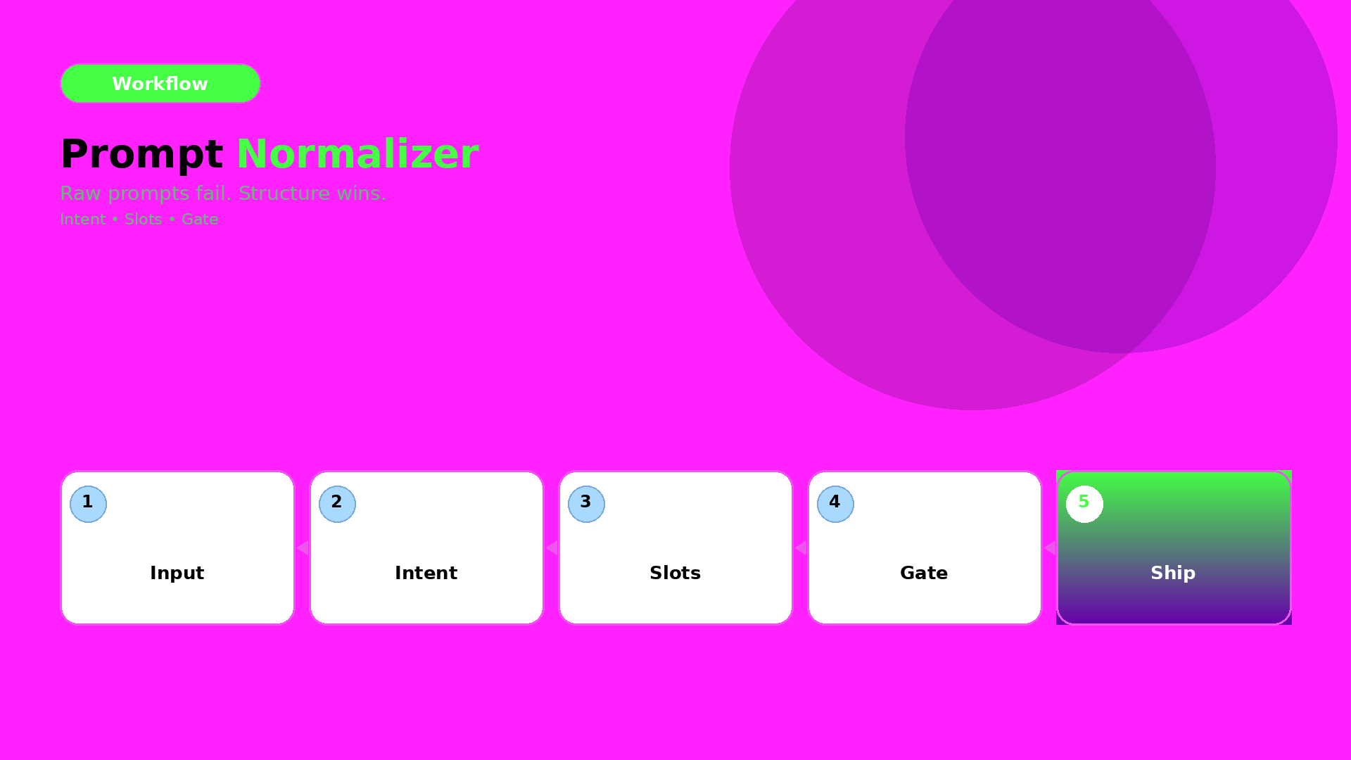
    1. Intent: what outcome it must achieve,
    2. Slots: what can vary vs what cannot,
    3. Constraints: QA gates rules (geometry, readability, world logic),
    4. Output routing: which model family fits the bottleneck.

    In other words, it is the briefing layer.

    What are raw creative prompts (exploration view)?

    Raw prompts are where you:

    • try a new visual twist,
    • adjust scene tone,
    • explore typography density,
    • test hook variations.

    Raw prompts are not wrong. They are just wrong for tasks that require alignment.

    The decision guide: choose by bottleneck

    Ask this:

    A) Are you missing alignment?

    If results drift in:

    • face/identity,
    • shadow family,
    • label clarity,
    • caption promise vs visuals,

    then you are missing rules. Use a prompt normalizer.

    B) Are you already aligned and just exploring?

    If identity is stable and only style options are unclear, then exploration is fine. Use raw creative prompts.

    A simple workflow that prevents waste

    Use this loop:

    1. Normalize the brief (intent + slots + constraints)
    2. Generate exploration variants inside the locked world kit
    3. Gate by QA checks
    4. Ship only the winners into your content system

    This is what “workflow mindset” means in prompting: you are building a reusable system, not repeating trials.

    What to do next

    If you want the brief template:

    If you want workflow routing:
  • The Consistency Trap: Beautiful AI Images, Broken Brand

    The Consistency Trap: Beautiful AI Images, Broken Brand

    Consistency is the one thing AI can’t “handle for free”.

    It can generate a beautiful frame every time. But your audience doesn’t buy frames. They buy recognition.

    And recognition only happens when your brand’s rules survive across scenes, formats, and drops.

    Key Takeaways

    – The consistency trap is thinking “pretty” equals “aligned”.

    – Visual identity needs rules (what must not change) and gates (how you verify it).

    – World kits turn many outputs into one recognisable brand.

    What the trap looks like (in production)

    You ship a lookbook or a set of ecommerce creatives.

    Everything looks fine… until:

    • faces feel slightly different across images,
    • shadows change style between scenes,
    • product texture looks inconsistent after resizing,
    • your captions promise a different “why” than the visuals show.

    Each issue is small. Together they train buyers to doubt the brand.

    The real cause: missing “brand rules”

    Most teams don’t define rules. They define prompts.

    Prompts are flexible. Rules are strict.

    If your workflow has no strict rules, the model will “solve” each output independently. That creates drift.

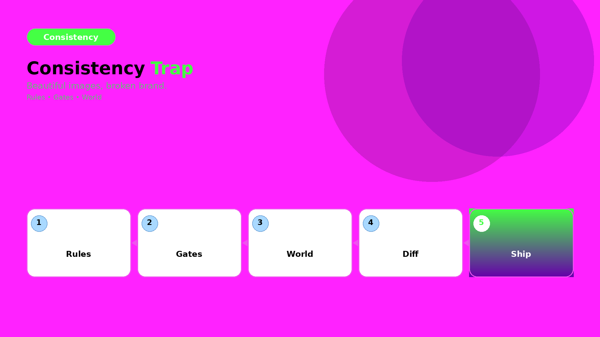
    Build a consistency system: Rules → Gates → World

    1) Rules (what must not change)

    Pick a small set of invariants:

    • face/character identity anchors (identity range, hair silhouette, skin tone logic),
    • texture/label clarity rules (what makes the product “real”),
    • shadow and light family (shadow style + color temperature range),
    • typography and CTA style (if text appears, it must follow the same rules).

    Rules define “identity space”. Everything outside that space gets rejected.

    2) Gates (how you verify identity quickly)

    Use QC gates that catch drift early:

    • geometry truth gate: edges + proportions within range,
    • readability gate: label/CTA still readable after resizing,
    • world gate: light family matches kit constraints,
    • promise gate: copy tone matches the visuals’ implied offer.

    Gates are checklists, not opinions.

    3) World kit (how rules become repeatable outputs)

    World kit is your consistency contract:

    • same world logic across scenes,
    • same role structure (hook / proof / offer),
    • the same routing rules for which model to use when bottlenecks change.

    Once your world kit exists, you can scale without losing recognition.

    What to do next

    Start with one brand rule set and one world kit:

    • lock identity anchors,
    • define light family,
    • build QC gates,
    • then generate and export.

    If you want supporting frameworks:

  • We Tested 3 AI Image Models for Product Shots — One Clear Winner

    We Tested 3 AI Image Models for Product Shots — One Clear Winner

    Most model comparisons fail because they do not compare the same bottleneck.

    They ask:

    “Which model looks best?”

    For ecommerce, the better question is:

    “Which model preserves product truth under our QA gates?”

    Key Takeaways

    – Stop ranking models by aesthetics.

    – Rank by geometry truth, texture fidelity, and label clarity.

    – Choose a model after creative direction—not before.

    Experiment design (so the result is real)

    1) Lock the direction

    Use one direction kit:

    • one world setup (light family + palette logic),
    • one angle brief (angles that answer buyer questions),
    • one QA checklist (what must not break).

    2) Generate with three models

    Run the same direction kit across three image model families.

    Do not change prompts between models.

    Let the test measure what matters.

    3) QA gates (where winners are decided)

    Check:

    • geometry stability (edges, proportions),
    • texture fidelity (fabric, material cues),
    • label readability (after resizing),
    • shadow family consistency.

    4) Export the same outputs

    Export comparable sizes:

    • feed-safe square,
    • ad-safe vertical,
    • and marketplace listing proof.

    If a model looks good on one size but fails on another, it is not your winner.

    What to do next

    If you want the framework:

    Then run this 3-model QA experiment whenever your bottleneck changes:

    • new product category,
    • new label density,
    • or new scene world.
  • Fake Studio vs Lifestyle AI Ads: Where to Draw the Line

    Fake Studio vs Lifestyle AI Ads: Where to Draw the Line

    AI makes it easy to generate “studio shots”.

    But studio shots are not a guarantee of trust.

    Sometimes the right world is the fake studio.

    Sometimes the right world is real lifestyle.

    The framework is simple:

    You do not choose by aesthetics. You choose by world truth—what the buyer expects before they decide.

    Key Takeaways

    – Fake studio is not “bad”. It is a tool with a job slot.

    – Lifestyle works when the offer depends on context and ritual.

    – QC is not “pretty”. QC is whether the scene keeps the same world promise.

    The decision framework (Promise → World → Scene)

    1) Promise (what you are trying to sell)

    Ask: what does the buyer need to believe?

    • Geometry truth (fit, labels, texture)? → studio-like proof frames can work.
    • Ritual truth (how it is used, felt, timed)? → lifestyle wins.

    2) World (the continuity system)

    World includes:

    • light family (shadow style and temperature),
    • background logic (real-world coherence),
    • and tone (premium, calm, energetic).

    If world rules are missing, both studio and lifestyle outputs drift.

    3) Scene roles (assign responsibilities)

    Scenes should have roles:

    • hook frame (value instantly),
    • proof frame (product truth),
    • offer close (CTA + tone).

    When you assign roles, you can mix studio-like proof with lifestyle context without contradiction.

    QC gates: how you prevent the “it feels wrong” moment

    Use gates that catch world mismatch:

    1. Shadow family gate: does the shadow style match the kit across scenes?
    2. Texture truth gate: do labels and textures stay readable after resizing?
    3. Context coherence gate: does the lifestyle setting make sense for the product’s promise?
    4. Offer tone gate: does the caption imply the same promise as the visuals?

    If one gate fails, you update the world kit. You do not “regenerate until it looks better”.

    What to do next

    Start with lifestyle context mapping for beauty and ritual-driven offers:

    Then expand the same framework to any category with:

    • proof frames (studio-like),
    • and story scenes (lifestyle-like).
  • Lookbooks Without Photographers: Opportunity and Risk for Small Brands

    Lookbooks Without Photographers: Opportunity and Risk for Small Brands

    Small brands remove photographers for one reason: cost.

    But the bigger truth is this:

    When you remove the studio, you also remove the continuity mechanism.

    AI can generate images. It cannot automatically preserve your brand identity across scenes, drops, and formats.

    That is the real risk—and the real opportunity.

    Key Takeaways

    – The opportunity: faster drops and lower production overhead.

    – The risk: identity drift (faces, shadows, texture logic, tone).

    – The fix: world kits + QC gates, not random regeneration.

    Why “no photographer” changes everything

    Studios do more than take pictures.

    They enforce consistency through:

    • stable light setups,
    • predictable composition rules,
    • and human curation.

    Without that system, “pretty” becomes the default objective.

    Then each new image feels like a new brand moment.

    The opportunity map (what improves)

    1) Speed to market

    You can plan drops by calendar instead of by availability.

    If your workflow has gates, you can scale safely.

    2) Coverage across channels

    Lookbooks are not only web pages.

    They feed ads, marketplace creatives, PDP visuals, and retargeting.

    No photographer means you need a pipeline that can reuse the same world rules.

    3) Iteration without sunk cost

    Studio reshoots are expensive.

    With AI production, iteration becomes a controlled creative loop.

    The risk map (what breaks)

    Identity drift

    Faces and character cues change when direction is missing.

    Even small shifts in shadow family or label readability train buyers to doubt the brand.

    World collapse

    Lookbooks fail when every scene is a new aesthetic.

    Your audience reads that as inconsistency—not experimentation.

    QA blindness

    If you only check “looks good”, you will ship wrong geometry and wrong offer tone.

    The QC gates that replace studio curation

    Treat your workflow like a continuity contract:

    1. Continuity anchors: identity + product geometry range
    2. Light family: shadow style must remain within the kit
    3. Scene roles: hook, proof, and offer must be assigned
    4. Offer safety: claims and CTA tone must repeat safely

    If a gate fails, do not regenerate blindly.

    Update the kit and regenerate only the affected outputs.

    What to do next

    If you are starting today, start with world-building:

    Then ship small: lock one world kit, generate 3 scenes, run gates, and expand.

  • Before/After: Phone Product Photo to Professional Banner (Real Workflow)

    Before/After: Phone Product Photo to Professional Banner (Real Workflow)

    Before/after is not a “wow” feature.

    It is a production test: if your workflow can explain the transformation, you can repeat it.

    Key Takeaways

    – Phone input is fine. The bottleneck is direction + QA gates, not device quality.

    – Treat the banner like a business slot: hook frame, proof frame, offer close.

    – Efficiency comes from rejecting failures early—before upscale and export.

    Experiment setup: what we start with

    Input:

    • one phone photo (acceptable lighting, readable product silhouette)
    • one direction brief (world + scene role)
    • one banner target (aspect ratio + safe zones)

    Constraints:

    • keep product geometry honest (no “almost” edges)
    • preserve label readability and design elements
    • use a stable shadow and background logic for the final banner cut

    The workflow (step-by-step)

    1) Direction kit (the real “before”)

    Compress the job into:

    1. what moves (pose/camera feel),
    2. what stays true (geometry, label readability),
    3. what the banner must do (hook + proof + offer).

    This is where you stop the prompt sprawl.

    2) Generation (produce candidates, not winners)

    Generate multiple candidates under the same direction kit.

    Your goal is coverage:

    • does the product look correct?
    • does the background logic match the banner slot?
    • does the hook frame read instantly?

    3) QA gates (reject drift early)

    Check:

    • edges: are they stable or warped?
    • text: is anything unreadable after resizing?
    • shadow family: does it match the banner’s light logic?

    Reject failures before you upscale.

    4) Export banner-ready

    After QA passes, export final banner variants:

    • feed version (1:1 or 4:5)
    • ad version (platform-safe)
    • marketplace listing support (consistent proof frame)

    What changes the most across the before/after?

    Not just “quality”.

    The biggest change is confidence:

    • the product truth survives resizing,
    • the hook frame communicates instantly,
    • and the world kit stays consistent across variants.

    That confidence is what converts.

    What to do next

    If you want a reusable workflow template, start here:

    Then apply the same direction kit + QA gate mindset to every new banner drop.

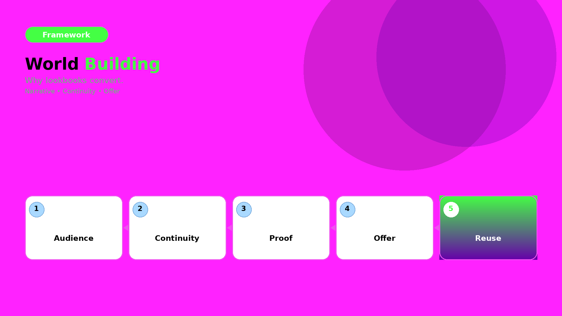
  • AI Lookbook World Building: Narrative Systems for Drops

    AI Lookbook World Building: Narrative Systems for Drops

    AI doesn’t break lookbooks because it’s “bad at images”.

    It breaks lookbooks because it treats every scene as a standalone moment.

    World-building fixes this by making every scene belong to the same fictional—and commercial—world.

    Key Takeaways

    – A lookbook world is a continuity system: rules that survive across scenes.

    – World-building turns “many images” into a repeatable drop calendar.

    – QA becomes measurable when you test continuity, not vibes.

    What is “lookbook world building”?

    World-building is the layer that defines:

    1. Continuity (what must stay identical)
    2. Scene roles (what each scene is responsible for)
    3. Offer repetition (how the buyer gets the same message safely)

    In production terms:

    • World rules create stability (light family, palette logic, texture truth)
    • Scene roles create clarity (hook frame, proof frame, offer close)
    • Offer repetition creates conversion consistency (CTA + claim tone)

    Why AI needs world rules (not just prompts)

    When you don’t define world rules, you get:

    • random shadow styles per scene,
    • character drift (face, hair, identity cues),
    • geometry “almost-right” that buyers feel as uncertainty,
    • captions that imply different promises in different formats.

    World rules are your answer.

    A simple world kit you can reuse

    Lock a small kit once, then reuse it:

    • Light family: morning-soft, editorial-hard, or evening-warm (pick one logic)
    • Palette logic: background tones and product accent colors stay within a range
    • Continuity anchors: product geometry, label readability, character silhouette
    • Claim safety rules: what you can promise repeatedly without overclaiming

    This is not an aesthetic moodboard. It is a set of constraints.

    Scene roles: assign responsibilities, not random scenes

    Use scene roles like a checklist:

    • Hook role: first frame tells value
    • Proof role: texture + details that justify claims
    • Offer role: CTA and close promise
    • Reuse role: later scenes that can be resized into ads without contradiction

    When every scene has a role, the drop feels like a system—not a scatter.

    QA gates (how you prevent world collapse)

    Before you export, verify:

    • Continuity anchors still match (identity + geometry range)
    • World light stays inside the light family
    • Offer tone stays consistent with the campaign claim

    If one gate fails, update the world kit—not the entire pipeline.

    What to do next

    Start by turning your lookbook into roles:

    • build 1 world kit,
    • generate 3 scenes,
    • run QA gates,
    • then scale to a full drop schedule.

    If you want the scene workflow, pair this with:

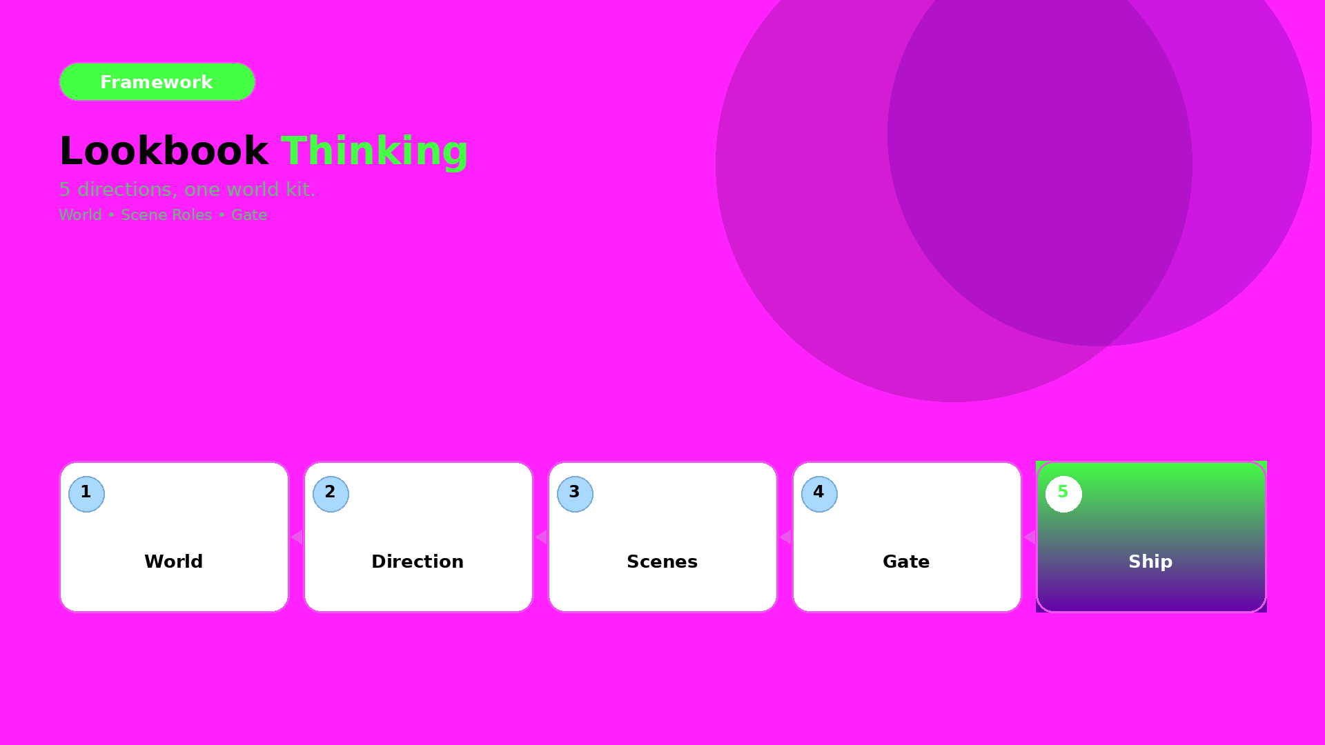
  • Lookbook Thinking: 5 Creative Directions Without a Studio

    Lookbook Thinking: 5 Creative Directions Without a Studio

    Most lookbooks fail with AI for one simple reason:

    They start from images instead of directions.

    Directions are your brand’s continuity contract. Once directions are locked, scenes become repeatable production jobs—not random aesthetic roulette.

    Key Takeaways

    – A lookbook needs creative directions (world + roles), not more variations.

    – Lock 5 directions, then map scenes, channels, and formats to the same world kit.

    – QA is not “does it look pretty?” QA is “does the world stay consistent?”

    What is a creative direction in a lookbook?

    A creative direction answers three questions:

    1. What is the world? (setting, light family, mood)
    2. Who are the roles? (character identity, behavior rules)
    3. What is the offer? (what the buyer should feel and do)

    Without roles, AI drifts. Without world rules, the drop looks like different seasons.

    The 5 directions that sell (and reuse easily)

    1) The Everyday Ritual

    Product as a habit. Calm pace, honest texture, soft proof.

    Use it for: skincare routines, casual apparel, “wear it daily” offers.

    2) The “Reveal” Story

    Before/after movement. The first frame must communicate the value instantly.

    Use it for: seasonal upgrades, styling transformations, upgrade-to-new-version messages.

    3) The Social Proof Frame

    Receipts before claims. Strong composition, minimal clutter, credible atmosphere.

    Use it for: bundles, limited drops, “most ordered” positioning, trust-building pages.

    4) The Location Mood

    Same product identity, different narrative location.

    Use it for: city traveler looks, vacation capsule wardrobes, lifestyle fit moments.

    5) The Product Truth Close

    Geometry and details first. Tight proof for texture, stitching, labels, and fit cues.

    Use it for: e-commerce PDP support, reseller listings, marketplace creatives.

    How do you apply directions to scenes?

    Treat each direction as a scene role template:

    • World rules stay stable (light family, palette logic)
    • Role rules stay stable (character identity, behavior)
    • Only the scene variable changes (location, outfit item, action)

    This is the same mindset behind:

    QA gates: what to check before you ship

    If you want directions to hold across formats, your QA checklist must include:

    • facial identity continuity (jawline, skin tone range, hair silhouette)
    • product geometry truth (no warped edges, stable label readability)
    • world continuity (shadow style and color temperature stay inside the kit)
    • offer continuity (CTA and claim tone match the direction’s “why”)

    What to do next

    If you’re planning a weekly drop, start with the smallest win:

    Lock one direction, generate 6–10 scenes, and enforce the QA gates.

    Then scale to five directions once your world kit passes.

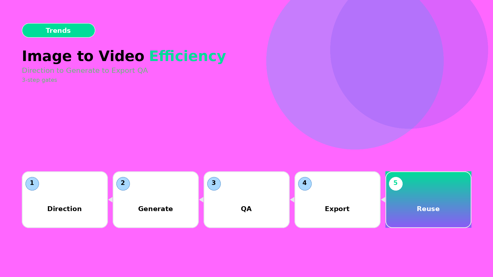
  • Image-to-Video Efficiency Workflow (2026): Stop Prompt Sprawl

    Image-to-Video Efficiency Workflow (2026): Stop Prompt Sprawl

    Most teams treat image-to-video like an exploration playground.

    That’s fun, but expensive.

    In production, you need efficiency: direction first, then gates, then export variants.

    Key Takeaways

    – Prompt sprawl kills efficiency. Fix it by creating a reusable direction kit.

    – The workflow is 3 steps: Direction → Generation → Crop/Resize QA.

    – “Looks good” is not QA. Product truth is QA.

    Step 1 — Direction (lock what must not change)

    Before you generate, decide your creative direction in one sentence:

    • what moves (pose, camera, light),
    • what stays true (geometry, label readability, brand palette),
    • what the ad outcome is (hook, proof, offer).

    Then attach constraints as rules (your kit):

    • color family (no palette drift),
    • typography rules (if text appears on frame),
    • “geometry no-go”: avoid warped edges and moving shadows that rewrite the product.

    This is the same upstream thinking as Choose the video model after creative direction.

    Step 2 — Generation (batch once, route outputs)

    Generate multiple variations, but route them immediately:

    1. Keep the best direction match candidates.
    2. Reject frames that break product truth early (don’t upscale first).
    3. Only after direction passes, upscale/correct resolution for the winners.

    Efficiency comes from rejecting failures before you spend compute and time on polish.

    Step 3 — Crop/Resize QA (make it channel-safe)

    Most wasted hours happen after generation:

    • wrong safe zones,
    • CTA text cropped out,
    • aspect ratio causing the product to “float”.

    So treat export like a gate:

    Channel QA focus
    1:1 / 4:5 feed readable product center + stable shadows
    9:16 reels hook frame clarity before motion noise
    Stories text safe zones + proof frame hold time

    This is where your workflow moves from “video experiment” to “ad system”.

    A practical mini-checklist (fast, repeatable)

    For each winner clip, verify:

    • label/brand element still readable,
    • product silhouette stable across frames,
    • motion doesn’t destroy the geometry (no stretching artifacts),
    • caption promise matches the first 1–2 seconds.

    If any item fails, don’t rewrite the whole prompt. Update the direction kit and regenerate only the affected part.

    Where to start

    If you’re already doing packshot angle planning, you’re ready.

    Start here:

    Then use this 3-step efficiency workflow for your weekly drops.

    Your goal is simple: ship a reusable graph, not a one-off video.

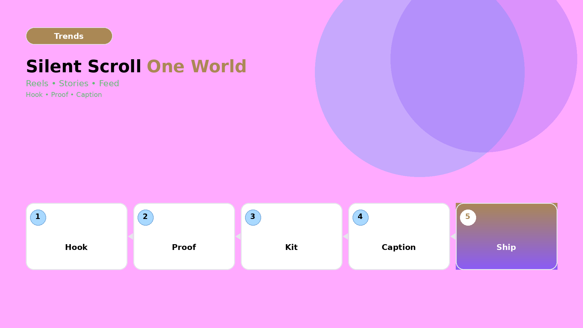
  • Instagram Video Ads in 2026: Silent Scroll + One World Kit

    Instagram Video Ads in 2026: Silent Scroll + One World Kit

    In 2026, “ads” are not just videos.

    They are micro-worlds: hook, attention cue, product truth, and a caption tone that doesn’t contradict the visuals.

    The safest way to ship is to design for the silent reality first.

    Key Takeaways

    – Silent scroll is a design constraint, not a platform setting.

    – Build one One World Kit (world + light + motion rules), then generate channel-safe variants.

    – Your QC checklist should verify attention readability and brand voice consistency, not just “looks good”.

    The silent scroll rule

    When people watch without sound, they evaluate your ad with three fast checks:

    1. Can I instantly tell what it is?
    2. Does the first second communicate value?
    3. Is the tone consistent with what I expect from this brand?

    If your hook relies on narration, you’re designing for a minority of viewers.

    One World Kit: what it includes

    Think of your kit as a set of rules shared by every cut:

    World rules (the “why”)

    • tone: calm, premium, playful, energetic
    • claim boundaries: what you can say safely
    • storyline: problem → transformation → offer

    Visual rules (the “how”)

    • product truth: no warped geometry
    • light family: shadow style stays within a range
    • motion language: what changes per scene vs what stays fixed

    If your world is unstable, your audience treats each output as a new brand. That’s exactly the failure mode behind the “brand consistency trap”.

    Scene planning for IG (reels, stories, feed)

    Use scene planning like a template system:

    Channel Primary goal Scene emphasis
    Reels Hook + fast value attention cue in first 1–2s
    Stories Continuation + clarity product truth before any stylization
    Feed Offer + credibility longer hold on proof frame

    This is where the SCENE method matters: you’re not generating “a video”, you’re generating a set of scenes with fixed roles.

    Hook structure that survives silent viewing

    Good hooks for silent scroll usually contain:

    • a visual transformation cue (before/after or “reveal” moment),
    • an on-frame value hint (short text, safe zones),
    • a rhythm rule (no waiting for narration).

    Even if you generate with AI, your hook should be designed, not discovered.

    QC checklist (the parts that actually fail)

    Before you ship, verify:

    1. First-second readability: can the product be recognized without motion blur?
    2. Text timing: does the value text appear before the scene gets busy?
    3. Caption tone: does the caption agree with the visual promise?
    4. Kit stability: is the face/character consistent across variants (if used)?

    If any item fails, you don’t “regenerate randomly”. You go back to the gate: update the world kit or lock the missing constraint.

    What to do next

    If you already have TikTok Shop scenes, you can reuse the mindset:

    But the IG upgrade is to prioritize silent readability and one-world kit stability.

    Ship weekly drops with templates:

    • Workflow Builder: https://orauria.com/workflow
    • Studio Guide: https://orauria.com/studio-guide