Category: Industry Playbooks

Applied AI creative thinking per industry — fashion, beauty, F&B, ecommerce, and creator workflows.

  • AI白底图过审的关键不是抠图而是光线与边缘

    AI白底图,结果页多半在卖“一键抠干净”。运营真正卡关的却是另一件事:主图放大后字糊、箔纸死白、边缘发毛、商品像贴在纸上——买家不信,客服开始解释“和实物略有差异”。

    白底图首先是摄影约束,其次才是生成。Orauria 适合在身份锁定后扩展场景与投放;本篇只讲白底这一环:什么必须来自实拍,什么绝不能靠模型脑补。

    Key Takeaways

    • AI白底图失败,多半是原图没有可用高光/边缘/印刷信息,模型在“猜”。
    • 过审与转化看三点:纯白干净、接触阴影自然、标签在手机上可读。
    • 玻璃、金属、烫金、透明液、细小饰品:英雄图优先实拍。
    • 白底合格后再谈场景图、卖点图、618/双11投放扩展。

    白底图搜索意图 ≠ 主图生成 ≠ 商品图套件

    你搜的词 真正任务 常见误用
    AI白底图 主图级干净白底 + 主体真实 当艺术风格图用
    AI主图生成 整套主图位策略 只有一张白底就停
    AI商品图生成 从一图到多渠道套件 忽略平台规范

    套件视角见 AI商品图生成;主图工具视角见 AI主图生成

    白底的胜负不在“扣得多干净”,而在物体边缘的光学是否还像照片

    平台白底最怕的三类“假照片”

    问题 手机端观感 生成前先修什么
    高光爆、烫金死白 廉价假货感 柔光;避开直射灯打箔
    无接触阴影或阴影过重 悬浮贴图 / 脏底 保留轻接触影;提高辅光
    小字/条码糊 详情信任崩 更近、更锐;文字区优先对焦

    锯齿边缘、灰底、Logo 被“美化”变形:直接弃图。那不是白底图,是合成痕迹。

    材质决定你能不能只靠 AI白底图

    材质 一张好原图后的 AI 扩展 必须实拍英雄图
    哑光纸盒、袋装
    不透明瓶+平面标 色差敏感款
    玻璃/透明液体 弱–中
    金属/电镀/烫金
    服饰平铺/挂拍 版型与垂感
    珠宝五金微小件 微距与闪光

    价值感靠光线在表面如何滑动 → 别赌提示词。价值感靠外形+印刷色块 → 窗边实拍(上海/杭州公寓亦可)+ 规范白底扩展,通常够日常上架;大促素材再叠场景。

    白底工作流(运营可执行)

    1. 实拍英雄 — 标签朝镜头、水平、无拖影;泡沫板补光比换模型更有效。
    2. 书面锁身份 — 盒色、Logo 禁变形、盖子材质、禁止“额外金箔”。
    3. 先过白底 QA — 100% 放大看字;缩略图三秒能否认出 SKU。
    4. 再扩展 — 场景、卖点、竖版投放;白底不过关就不要进 618 素材池。
    5. 拒绝静默改款 — 盖型被改、瓶身比例变了 = 退货隐患。

    Orauria 放在哪一步

    Orauria:商品营销 AI Creative Studio。一图 → 照片/广告/社媒/短视频 → campaign pack。你负责把白底光学做对;系统帮你在不漂 SKU 的前提下扩成套内容。

    创建第一套 Product Kit →

    FAQ

    只用抠图软件算 AI白底图吗?

    抠图只是去背景。完整白底图还要处理边缘光、阴影逻辑与印刷清晰度;缺一就会“假”。

    京东/淘宝对 AI 白底敏感吗?

    关键是是否如实表现商品与是否符合当时平台规范。光学造假和改款比“用没用 AI”更容易出纠纷。

    透明瓶怎么拍再交给 AI?

    英雄图实拍控高光与液面;AI 只做次要角度/场景,并禁止改瓶壁厚度与盖型。

    结论

    AI白底图当成摄影关卡:光线与边缘过关 → 身份锁定 → 再谈扩展。跳过第一关,后面所有“智能主图”都像贴图。

    Create Your First Product Kit →

  • AI主图生成:用一张实拍做出可过审、可投放的主图套件

    AI主图生成,你要的不是“好看的随机图”,而是:一张真实商品图 → 白底主图 + 场景 + 投放图,包装、Logo、颜色、外形始终一致。

    适合淘宝、天猫、京东、拼多多与抖音电商的 AI主图生成:手机实拍或白底图上传 → 输出可上架主图与多尺寸素材,不必上海棚拍,也不必每个 9:16 重做设计。

    Key Takeaways

    • 75% 消费者购买决策依赖商品图(Weebly,2026 汇总)。
    • 5–7 张(多角度 + 场景)通常优于单图(Statista / 2025–2026)。
    • 失败模式:艺术模型出图后硬套主图规范,缺少 商品套件
    • 清单:干净原图 → 身份锁 → 按任务出图 → 比例 1:1 · 4:5 · 3:4 · 9:16 · 16:9。

    AI主图生成 vs 普通 AI 绘图

    艺术向生成 AI主图生成(电商)
    输入 提示词 真实商品图
    输出 单张氛围图 主图/场景/广告套件
    约束 审美 商品身份
    成功 点赞 点击、转化、退货

    相关枢纽:AI商品图生成

    主图工具的胜负不在“模型名单”,而在能否一次产出 可过审、可投放、身份不漂 的成套图。

    为什么“精美主图”仍可能掉转化

    22% 退货与图物不符有关(Weebly / 行业)。Logo 糊、色差、比例变形,在京东/淘宝主图与客服纠纷里都是雷区。

    白底 + 场景相对纯白底,常见转化提升约 15–30%2026 A/B)。

    一张图 → 主图套件

    环节 任务 渠道
    白底主图 过审、主体清晰 淘宝/天猫/京东 1:1
    场景图 使用语境 详情、种草
    平台图 拼多多/抖音规格 各站
    投放图 停住滑动 信息流、短视频封面
    大促创意 618 / 双11 活动页、卖点图

    USP:One Product → Multiple Creatives · Keep Consistent · Built for Ecommerce · Photo to Ad · Multi Formats。

    五步做 AI主图生成

    1. 原图真实 — 光照均匀、标签可读(上海窗边手机图亦可)。
    2. 身份锁定 — 色、Logo、比例、禁改项。
    3. 按任务生成 — 不问“更好看”。
    4. 按比例导出 — 主图 1:1;抖音/小红书竖版;banner 16:9。
    5. 上架前 QA — 一眼认出商品、无虚假宣称。

    Orauria

    Orauria:商品营销 AI Creative Studio。一图 → 照片/广告/社媒/短视频 → campaign pack。不是又一个绘图器,而是 商品 → 电商内容系统

    创建第一套 Product Kit →

    FAQ

    淘宝/京东能用 AI 主图吗?

    能,前提是真实反映商品并遵守平台规范。主图保持主体清晰;AI 扩展场景与投放。

    和抠图有何不同?

    抠图只是一步。AI主图生成还要场景、多尺寸与整套身份一致。

    一定要会提示词吗?

    电商工作流(上传 → 选任务 → 生成)则不必。商业 brief 更重要。

    结论

    选爆款 SKU,按上表做 5 类图,主图 A/B 7–14 天。

    Create Your First Product Kit →

  • AI商品图生成:一张实拍图做出整套可上架素材

    AI商品图生成:一张实拍图做出整套可上架素材

    别用 AI 去「随便生成好看图」。要用 AI 生成能卖货的商品图

    AI商品图生成的正确含义是:上传一张真实商品图 → 产出白底主图、场景图、详情卖点图、投放广告图,同时保持包装、Logo、颜色和商品外形一致。不必在上海租棚,不必请杭州摄影师整天档期,也不必每做一个 9:16 抖音尺寸就重开一轮设计。

    Key Takeaways

    • 网购决策高度依赖视觉:约 75% 的消费者表示会根据商品图决定是否购买(Weebly,行业汇总 2026)。
    • 多图链接通常优于单图:从 1 张图做到 5–7 张(多角度 + 场景)时,行业数据常见转化提升(Statista / 2025–2026 汇总)。
    • 2026 年最常见翻车:把 Midjourney / Flux / GPT Image 当艺术工具,再硬套淘宝主图规范——而不是搭建 商品 → 内容套件
    • 胜出清单:干净原图 → 锁定商品身份 → 按任务出图(白底 / 场景 / 广告 / 平台)→ 按比例导出(1:1 · 4:5 · 3:4 · 9:16 · 16:9)。

    AI商品图生成是什么?

    AI商品图生成是指:以真实商品照片为输入,用 AI 扩展可上架、可投放的商业视觉——不是自由发挥的文生图艺术。

    艺术向生成(Midjourney、Flux…) 电商向 AI商品图生成
    输入 文案提示 / 氛围 真实商品图(手机或白底实拍)
    目标 好看 / 出圈 可上架、可投放素材
    约束 少——审美优先 保外形、标签、颜色、比例
    输出 零散单图 按渠道成套
    成功标准 点赞、审美 点击率、转化、退货率

    若要理解「电商设计 ≠ 随便出一张 AI 图」,可继续阅读 AI ecommerce design 不是 AI image

    国内卖家不缺模型。缺的是发布系统:一个 SKU 进去 → 多套渠道素材出来,商品身份始终一致。

    为什么「好看」的 AI 图照样卖不动?

    图美但和实物不一致 = 退货与差评。约 22% 的退货与「实物与图片不符」相关(Weebly / 行业汇总)。

    三类高频翻车:

    1. 身份漂移 — Logo 糊掉、包装色偏、瓶身比例变形(淘宝主图 / 京东主图审核与客诉雷区)。
    2. 一张图打天下 — 1:1 在拼多多还行,裁成抖音 9:16 就废构图。
    3. 没有角度体系 — 只有一张「精修英雄图」,缺细节、缺尺码参照、缺场景、缺信任图。

    白底图 + 场景图组合,相对「只有白底」常见转化提升约 15–30%2026 A/B 行业汇总)。你需要的是一套图,不是一张「特别高级」的渲染。

    一个商品 → 一整套内容套件

    Orauria 的定位——也适合所有要规模化出图的国内与跨境卖家:

    不要生成随机 AI 图。要生成准备好卖货的商品创意

    更短一句:为电商而生的 AI 商品摄影。

    One Product. An Entire Content Kit.

    上传一次商品。生成你在各渠道真正需要的图。

    流水线环节 图片任务 用在哪里
    白底 / 棚拍主图 干净、可控背景 淘宝/天猫/京东主图、目录
    场景图 放进可信使用环境 详情页、广告、种草
    平台图 适配各站规范 淘宝、京东、拼多多、抖音电商
    投放广告图 能停住滑动 信息流、短视频封面、小红书
    活动创意 统一品牌视觉 618、双11、年货节、详情卖点图

    主图区下方建议直接摆出的 USP:

    1. One Product → Multiple Creatives — 一张商品图做出整套销售素材。
    2. Keep Your Product Consistent — 包装、Logo、颜色、外形不跑偏。
    3. Built for Ecommerce — 淘宝、天猫、京东、拼多多、抖音、小红书、独立站与跨境亚马逊。
    4. From Product Photo to Ad — 白底 → 场景 → 海报 → 投放图。
    5. Multiple Formats — 1:1 · 4:5 · 3:4 · 9:16 · 16:9。

    如何做 AI商品图生成(5 步)

    第 1 步:准备「够真实」的原图

    原图质量决定上限。优先:

    • 光线均匀,标签不过曝
    • 正面 + 可选 45°
    • 无水印、无重度滤镜
    • 背景简单(白底 / 牛皮纸 / 干净桌面)

    上海公寓窗边的手机实拍、广州仓拍白底,都可以。棚拍不是必须,主图思维(packshot thinking)才是必须。参见 Packshot thinking:没有棚拍日也要够角度

    第 2 步:先锁定商品身份,再「变美」

    出场景图或广告图之前,先锁死:

    • 品牌色 / 包装色
    • Logo 与标签文字(不可乱编卖点)
    • 外形、比例、材质(哑光 / 高光 / 玻璃)
    • 明确禁止改动的项(SKU 变体、功效宣称、合规标识)

    不锁身份 = 每次生成都是「另一个商品」。

    第 3 步:按任务出图,不按感觉出图

    每个 SKU 至少准备:

    1. 1–2 张 白底主图(平台主图友好)
    2. 2–3 张 场景图(浴室镜柜、书桌、客厅沙发边——贴近中国家庭使用场景)
    3. 1 张 细节 / 材质
    4. 1 张 投放广告图(预留标题与 CTA 安全区)
    5. 1 张 活动 / 卖点海报(618、双11、店铺首页)

    别问 AI「再好看一点」。问:这张图回答买家哪个问题?(长什么样 / 怎么用 / 多大 / 和便宜货差在哪)

    第 4 步:按渠道比例导出

    渠道 建议比例 备注
    淘宝 / 天猫 / 京东主图 1:1(常见 800×800) 主体清晰、背景可控
    拼多多主图 1:1 或平台规定 主体更大、信息更直接
    详情首屏 / 卖点图 3:4 或竖版模块 卖点可读、勿堆字
    小红书笔记 3:4 / 1:1 种草场景优先
    抖音电商 / 短视频封面 9:16 或 3:4 避开 UI 安全区
    店铺 banner / 活动页 16:9 或站内规定 双11 / 618 主视觉

    一张「母图」盲目裁切常毁构图。从一开始就做 按比例生成。多裁切体系可参考 One product:feed、story、cover、marketplace banners

    第 5 步:上架前 QA(退货防火墙)

    60 秒检查清单:

    • [ ] 手机上一眼认出是该商品
    • [ ] Logo / 标签可读、不变形
    • [ ] 颜色贴近实物(不要「销售滤镜」)
    • [ ] 图内无虚假宣称(乱写赠品、折扣、认证)
    • [ ] 体积合适,详情页加载不拖垮
    • [ ] 与同链接其他图光影家族一致

    淘宝、京东、抖音、小红书怎么用同一套图

    中国卖家通常要在多战场保持同一 SKU 同一张脸

    • 淘宝 / 天猫: 白底主图 + 多角度 + 场景 + 详情卖点
    • 京东: 主图规范严格,身份一致性更关键
    • 拼多多: 主图冲击力强,仍不能改商品本体
    • 抖音电商: 仍需链接图 + 竖版投放素材
    • 小红书: 场景种草图优先,商品身份仍要对得上成交页
    • 跨境亚马逊: 白底主图 + A+;与国内站共用身份锁

    同一套件,避免「淘宝一个脸、抖音另一个脸」。大促(618、双11、双12、年货节)应复用身份做变体,而不是每次重造商品。

    更「中国」的场景,而不是假大空棚景

    • 护肤放在明亮洗手台镜柜前(不是欧式城堡大理石梗)
    • 咖啡器具放在深圳公寓木桌或杭州咖啡馆风台面
    • 户外装备放在周末营地或城市公园入口语境
    • 家居放在华北客厅午后窗光里

    场景卖向往。商品身份仍须匹配你从义乌仓或华南仓发出去的实物。

    什么时候真棚拍,什么时候用 AI

    场景 建议
    30–100 个 SKU 上新、预算紧 AI商品图生成 + 干净手机/白底原图
    618 / 双11 素材刷新 锁定白底后,用 AI 批量场景与海报变体
    全国大片、高难材质(镜面金属、玻璃、透视面料) 混合:真拍少量英雄图 + AI 扩量
    必须照片级真实的质感 / 容量 / 尺码证明 真图说真话;AI 只做语境,不编细节

    AI 替不掉每一次上海或广州棚拍。它替的是规模瓶颈:SKU × 渠道 × 大促节点,小团队手搓不过来的产量。

    Orauria:从商品图到 Campaign Pack

    Orauria 是面向商品营销的 AI Creative Studio:上传一张商品图 → 生成商品照片、广告图、社媒帖与短视频——再导出适用于多平台的 campaign pack

    我们不卖「又一个 AI 绘图工具」。我们卖 商品 → 电商内容系统

    • 一次上传 → 多套一致素材
    • 跨主图与广告保持商品身份
    • 按销售渠道准备好尺寸

    CTA: 创建你的第一套 Product Kit →

    想了解端到端创意工作区:Orauria 是什么?电商 AI 创意工作区

    FAQ — AI商品图生成

    淘宝 / 京东能用 AI 商品图吗?

    可以——前提是仍真实反映商品,并遵守平台当前图片与宣传规范。主图建议保持主体清晰、背景可控;用 AI 扩展场景、卖点与投放图,而不是换成另一个商品。

    和普通抠图 / 换背景有什么区别?

    抠图只是一步。AI商品图生成面向电商,还要场景图、广告图、多比例导出,以及整套图的身份锁定。

    一个链接要几张图?

    实践中 5–7 张(多角度 + 细节 + 场景)往往比单图或过长图集更均衡。以你自己的店铺流量做 A/B。

    一定要会写复杂提示词吗?

    若工具是电商工作流(上传商品 → 选图片任务 → 生成),不必。比提示词更重要的是商业 brief:渠道、图片任务、身份锁、尺寸。

    Midjourney 够不够做淘宝主图?

    能出漂亮单帧。通常缺少身份锁 + 多尺寸 + 平台流水线。把艺术模型当引擎层;上面仍需要 商品套件 / 卖货工作流

    结论

    AI商品图生成的胜负手是成交与链接信任——不是 Behance 上的「AI 感」。

    记住三件事:

    1. 用真实原图锁定身份
    2. 按任务出图(白底 → 场景 → 平台 → 投放)
    3. 按比例导出,上架前 QA

    下一步:选一个店铺爆款 SKU,按上表做出 一套 5 类图,主图 A/B 跑 7–14 天。

    Create Your First Product Kit →

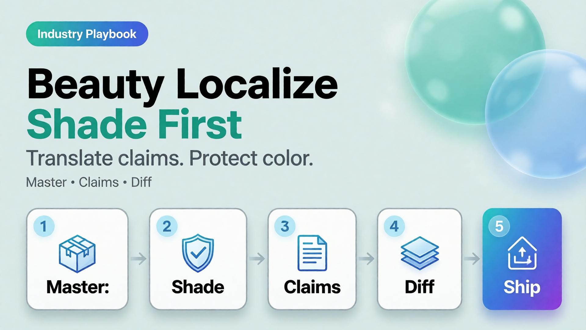
  • Beauty Catalogs Across Languages: Shade Truth First, Claims Second

    Beauty Catalogs Across Languages: Shade Truth First, Claims Second

    Beauty goes global faster than packaging teams can reshoot. The failure mode is familiar: regenerate the whole lifestyle for each language, watch the foundation shade drift, and discover marketplace complaints that “the bottle looked different.”

    AI beauty catalog localization extends cross-border image rules (ecommerce localization) with a beauty-specific law: shade and formula cues are sacred; marketing claims are what you translate.

    Key Takeaways

    >

    – Never “re-beautify” the SKU while translating overlays — color match is the product.

    – Keep ritual contexts from beauty lifestyle mapping; swap language layers, not bathrooms every market.

    – Claim sheets per locale beat prompt translation.

    – Upscale only after shade QA (upscale after QA).

    Why Is Beauty Localization Harder Than Soft Goods Copy?

    Because buyers purchase color and texture promises.

    Safe to localize Dangerous to regenerate
    Promo badges Foundation shade
    Hook lines Serum tone in bottle
    Units / legal lines Cap and label print fidelity
    Ingredient callouts (approved) “Glow” that changes undertone

    If localization changes undertone, you did not translate — you SKU-swapped.

    In beauty, mistranslation is annoying. Mishade is a return. Treat color like a regulatory asset.

    Beauty Localization Stack

    Master layer (global)

    • Packshot truth (packshot thinking)
    • Shade chip / arm swatch if used
    • Ritual scene family (morning mirror, bag, travel)

    Claim layer (per locale)

    • Hook, offer, disclaimer, unit system
    • Character limits per marketplace

    Gate

    • Side-by-side diff: bottle geometry + shade unchanged
    • Text accuracy reviewed by market owner

    Playbook: One Shade, Many Languages

    1. Approve shade-true master stills
    2. Build claim sheet EN → target locales
    3. Localize overlays in safe zones only
    4. Diff QA against master
    5. Attach locale packs to the brand kit for the next SKU drop
    6. Keep ritual contexts stable across languages unless culture blocks a scene

    Soft CTA

    Keep beauty catalogs coherent across markets: Ecommerce · Packshot

    Frequently Asked Questions

    How is this different from general ecommerce image localization?

    Same master-and-layer system — with stricter shade/texture gates and beauty ritual contexts.

    Can AI translate text on the physical label?

    High risk. Prefer real packaging photography for Truth; localize marketing frames separately.

    Should every market get new lifestyle bathrooms?

    Only when culture requires it. Default to one ritual kit + language layers.

    What should QA zoom on first?

    Shade, pump/cap geometry, then translated claims.

    Conclusion

    Translate claims. Protect shade.

    Master first. Locale layers second. Diff always. That is AI beauty catalog localization that grows markets without multiplying undertones.


    References

    1. Lumepixa, AI Product Photography Statistics 2026. https://lumepixa.app/blog/ai-product-photography-statistics
    2. Adobe, 2026 Creators’ Toolkit Report, June 16, 2026. https://news.adobe.com/news/2026/06/creators-toolkit-report-2026
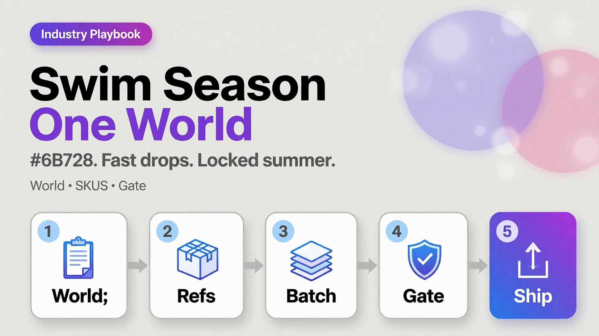
  • Seasonal Swim Campaigns with AI: Fast Drops Without Losing the World

    Seasonal Swim Campaigns with AI: Fast Drops Without Losing the World

    Swim drops do not wait for studio weather. Colors change weekly. Cuts multiply. The brand that regenerates a new beach every SKU looks like a stock site by mid-season.

    AI swimwear campaign images scale when you freeze a season world, swap garment refs, and gate fit — the same spine as a zero-budget lookbook, tuned for sun, water, and fabric cling.

    Key Takeaways

    >

    – Seasonal speed comes from one world × many SKUs, not one prompt × many worlds.

    – Swim fabrics exaggerate fit errors — treat try-on gates seriously (virtual try-on ads).

    – Map campaign scenes with SCENE: hero stand, waterline, detail, motion freeze, shade/lifestyle.

    – Keep batch kit rules for palette and light across the season.

    Why Do Seasonal AI Sets Look Cheap Mid-Campaign?

    Because time pressure invites world hopping.

    Fast bad habit Season-safe habit
    New beach per colorway One locked coast/pool kit
    New model per drop week One character family
    Explore-first always Refs-first after week one
    Publish every generate Curator gate on cling/fit

    Speed without a kit is just accelerated drift.

    Seasonal commerce rewards recognizable weather. Shoppers should feel “same summer, new cut” — not “new planet every Thursday.”

    Season World Checklist

    Lock before the first SKU batch:

    • Location class (pool / rocky coast / urban sun)
    • Time of day + light temperature
    • Water presence rules (wet fabric yes/no)
    • Prop kit (towel, chair) — minimal
    • Character / body anchors

    Write it in ten lines. Reuse all season.

    Playbook: Weekly Swim Drop

    Monday — Refs

    Photograph or flat-lay each new cut. Capture print scale.

    Tuesday — Generate in-world

    On-body + hero stills with garment lock. No new locations.

    Wednesday — Gates

    • Fit/cling accuracy
    • Print placement
    • Character continuity
    • World leak check (suddenly indoor marble)

    Thursday — Channel crops

    Feed / Story / Shop hooks from winners (scene jobs).

    Friday — Archive

    Winners enter the season kit for next colorway swaps.

    Soft CTA

    Ship seasonal listing and campaign stills from locked worlds: Listing Images · Photography

    Frequently Asked Questions

    How many scenes does a swim campaign need?

    Five strong in-world scenes beat fifteen unrelated beaches. Expand SKUs, not planets.

    Wet look — generate or shoot?

    If wet drape matters to the SKU story, brief it explicitly and QA cling. Do not invent wetness that misrepresents fabric.

    Can I reuse last year’s world?

    Yes if brand season identity continues. Update props lightly; keep light logic if it still matches the collection.

    What breaks swim AI images most?

    Print drift on small patterns and strap geometry errors. Zoom those first.

    Conclusion

    Seasonal swim is a world business.

    Lock summer once. Swap cuts weekly. Gate fit. Crop for channels. That is how AI swimwear campaign images stay fast without looking rented from a stock library.


    References

    1. Adobe, 2026 Creators’ Toolkit Report, June 16, 2026. https://news.adobe.com/news/2026/06/creators-toolkit-report-2026
    2. Lumepixa, AI Product Photography Statistics 2026. https://lumepixa.app/blog/ai-product-photography-statistics
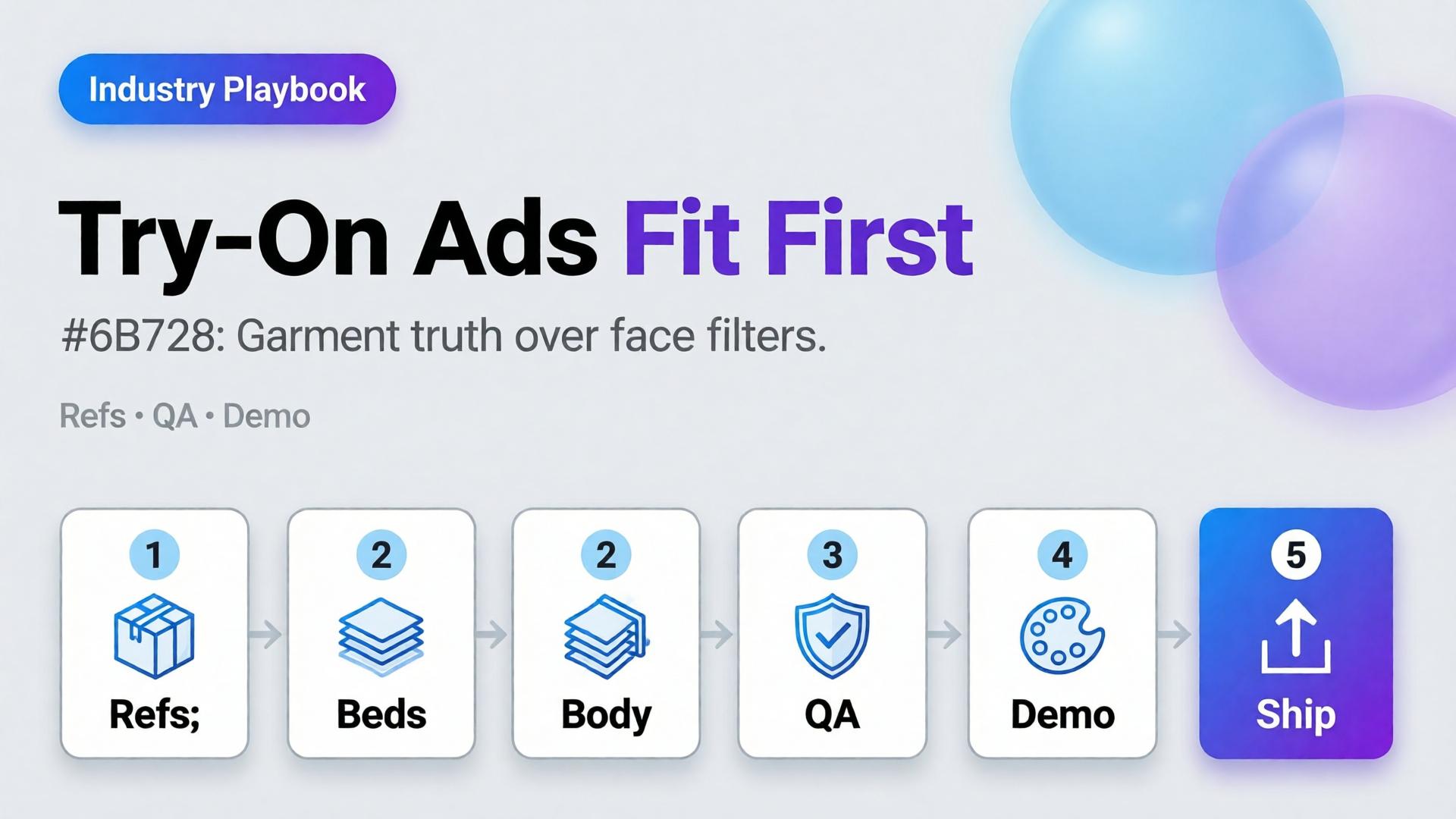
  • Virtual Try-On Ads: Fit Storytelling, Not Face Filters

    Virtual Try-On Ads: Fit Storytelling, Not Face Filters

    Virtual try-on promises “see it on me.” Too many AI ads deliver “see a stranger wearing almost your SKU.” Necklines drift. Sleeve lengths invent themselves. The face is gorgeous — and the garment is fiction.

    AI virtual try-on ads work when you treat try-on as fit storytelling: garment truth first, character second, filter effects never.

    Key Takeaways

    >

    – Try-on is a garment fidelity problem with a human in frame — not a beauty filter with clothes attached.

    – Lock garment refs like hard goods lock geometry (hard goods QA); lock faces like character design.

    – Use try-on for Demo / Proof jobs in Shop scene types — not as every hook.

    – Zero-reshoot colorways: swap garment refs inside one pose world (3-day lookbook).

    Why Do Try-On Ads Fail After the Click?

    Because the ad sold a face mood and the PDP shows a different garment.

    Ad promise PDP reality Result
    Perfect drape Stiffer fabric Return
    Shorter hem True length Distrust
    Model body match Size chart ignored Size chaos
    New face every frame Brand amnesia Low recall

    Try-on without gates burns paid traffic.

    Shoppers forgive AI skin. They do not forgive AI seam lines. Fit storytelling starts at the stitch, not the smile.

    What Must Be Locked for Honest Try-On?

    Garment bible

    • Silhouette, neckline, sleeve, length, closure
    • Print scale and placement
    • Fabric category (knit / woven / sheer)

    Character rules (if face/body shown)

    • One anchor identity across the set
    • Body proportions stable enough for size intuition
    • No “new cousin” every creative

    Scene job

    • Demo: on-body motion or turn
    • Proof: detail of fit at shoulder/waist
    • Hook: only after garment passes

    Playbook: Try-On Without Filter Energy

    1. Capture garment refs — flat + on-hanger + detail
    2. Approve a base on-body still reference-heavy
    3. Garment QA gate — zoom hems, necklines, prints
    4. Extend to ads — crop to 9:16 / 4:5; do not regenerate identity per ratio
    5. Colorway variants — swap garment ref only; keep pose/world
    6. Reject beauty-only winners that fail garment match

    Pair with lookbook world rules (lookbook needs a world).

    Soft CTA

    Build listing and on-body stills from real garment refs: Listing Images · Gallery

    Frequently Asked Questions

    What makes AI virtual try-on ads trustworthy?

    Garment fidelity under zoom, stable character, and clear Demo/Proof jobs — not maximal beauty scores.

    Do I need a different model for try-on vs packshots?

    Choose for the fidelity bottleneck after direction. Try-on usually needs stronger reference lock than lifestyle exploration.

    Can try-on replace size charts?

    No. It supports intuition. Charts and measurements remain mandatory.

    How many try-on frames per SKU?

    One approved on-body hero + one detail proof beats six drifted beauties.

    Conclusion

    Stop shipping face filters in dresses. Ship fit stories.

    Lock the garment. Gate the seams. Keep one character. Use try-on where Demo and Proof matter. That is how AI virtual try-on ads earn clicks that survive the PDP.


    References

    1. Adobe, 2026 Creators’ Toolkit Report, June 16, 2026. https://news.adobe.com/news/2026/06/creators-toolkit-report-2026
    2. Lumepixa, Product Image Statistics 2026. https://lumepixa.app/blog/ecommerce-product-image-statistics
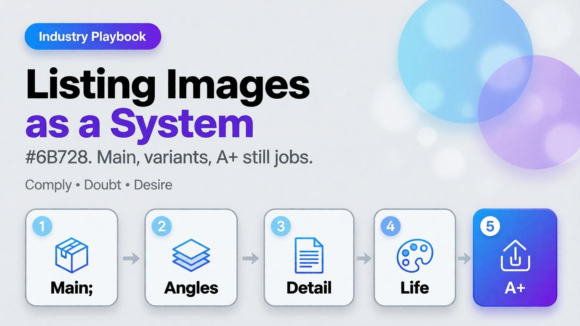
  • Amazon Listing Images as a System: Main, Variants, and A+ Still Logic

    Amazon Listing Images as a System: Main, Variants, and A+ Still Logic

    Amazon does not buy your moodboard. It buys slot performance: a compliant main image, a gallery that answers doubts, and A+ stills that explain without breaking catalog rules. Teams that AI-generate “seven pretty heroes” still lose the Buy Box war on clarity.

    AI Amazon listing images work when you treat the gallery as a system of jobs — not a folder of vibes.

    Key Takeaways

    >

    – Main image = compliance + recognition. Secondary slots = doubt removal. A+ = story without replacing Truth.

    – Listings with richer image sets convert more strongly in large studies (~50% higher with 5+ images vs thinner galleries in Catchlab-cited 2026 roundups).

    – Reuse packshot angle families and scene jobs — mapped to Amazon slots.

    – Upscale only after QA (upscale playbook).

    Why Do Random AI Galleries Underperform on Amazon?

    Because each thumbnail has a job in the purchase path.

    Slot Job Fail mode
    Main Recognize + comply Props, text, lifestyle bleed
    2–3 Form / angle truth Duplicate beauty shots
    4–5 Detail / texture / scale Unreadable macros
    6–7 Lifestyle / in-use Fantasy that fights main
    A+ Features / compare / story Walls of unread text

    If every file tries to be a campaign hero, none of them staff the gallery.

    Amazon creative is information architecture with pixels. AI should fill slots, not audition for a perfume ad.

    The Listing Image System

    Layer A — Compliance Truth

    • Main on approved background
    • True color, full product, no promotional overlays (follow current marketplace policy)
    • Geometry QA for hard goods

    Layer B — Doubt Removers

    • 45° / back / open-box / scale in hand
    • Detail of materials and controls

    Layer C — Desire / Context

    Layer D — A+ Stills

    • Feature callouts in clean layouts
    • Comparison charts as designed graphics (prefer controlled text, not hopeful in-image AI type)

    Playbook: One SKU, One System Day

    1. Write slot map — which file fills which job
    2. Shoot/generate Truth set reference-heavy
    3. QA geometry + typography
    4. Add one lifestyle only after Truth passes
    5. Build A+ frames from approved masters (crop + layout)
    6. Upscale delivery sizes once
    7. Contact-sheet review against competitor galleries in-category

    Ratio/adapt habits from marketplace banners still help for off-Amazon ads — but on Amazon, slot jobs beat ratio panic.

    Soft CTA

    Produce listing-ready packshots and gallery systems: Ecommerce · Packshot

    Frequently Asked Questions

    Can AI generate Amazon main images?

    Yes — if compliance and product fidelity pass. Treat main as the strictest Truth frame, not a creative playground.

    How many lifestyle images should an Amazon gallery include?

    Usually one or two. Fill remaining slots with doubt removers before stacking lifestyles.

    Is A+ a place for experimental AI worlds?

    Keep A+ clearer than experimental. Use approved product masters; add controlled graphics for features.

    How is this different from TikTok Shop scene types?

    TikTok optimizes scroll jobs (hook/demo). Amazon optimizes catalog jobs (compliance/doubt). Share masters; change the slot map.

    Conclusion

    Stop generating seven heroes. Staff seven jobs.

    Main for compliance. Variants for truth. Lifestyle for desire. A+ for explanation. Gate fidelity. Then deliver.

    That is an AI Amazon listing images system — built for the buy path, not the moodboard.


    References

    1. Lumepixa, AI Product Photography Statistics 2026 (Catchlab / Salsify citations). https://lumepixa.app/blog/ai-product-photography-statistics
    2. Adobe, 2026 Creators’ Toolkit Report, June 16, 2026. https://news.adobe.com/news/2026/06/creators-toolkit-report-2026
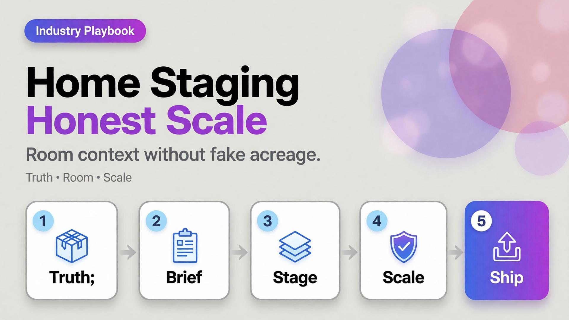
  • Home Product Staging with AI: Room Context Without Fake Square Footage

    Home Product Staging with AI: Room Context Without Fake Square Footage

    A sofa on pure white tells dimensions badly. A sofa in a cathedral living room tells lies well. Home and furniture ecommerce lives in that tension: buyers need context, but context that invents square footage creates “looked bigger online” returns.

    AI home product staging is the discipline of placing SKUs in believable rooms with scale honesty, locked light, and gates — not generating dream interiors that your warehouse cannot ship.

    Key Takeaways

    >

    – White-only home catalogs under-inform; fantasy rooms over-promise. Use dual-layer galleries like visual commerce 2026.

    – Stage with known scale anchors (door, outlet, side table) and real product dimensions in the brief.

    – Map rooms like beauty maps rituals — a context grid before generate (SCENE).

    – Geometry still matters for legs, seams, and hardware (hard goods QA when parts are precise).

    Why Does Home Staging Break Trust Online?

    Because furniture is purchased as space math.

    Staging sin Buyer consequence
    Oversized rooms “Tiny in real life” returns
    Wrong camera height Proportions feel off
    Mixed design eras Brand looks incoherent
    Soft rug hiding feet Leg style unknown
    Invented materials on props Cart confusion

    Lifestyle lift is real in ecommerce image research — but only when lifestyle stays honest.

    Home staging is not interior design porn. It is dimensional storytelling: how big, how it sits, how it lives with ordinary walls.

    Context Map for Home SKUs

    Borrow beauty’s context mapping mindset (beauty lifestyle contexts):

    Context Job Avoid
    Studio / white Spec + color truth Only image on PDP
    Apartment daylight Real-life scale Mansion windows
    Corner / tight wall Small-space proof Endless open plan
    Detail / fabric Material truth Fake weave
    Lifestyle lived-in Emotion Clutter that hides SKU

    Write 4–5 contexts per hero SKU. Reuse the room kit across the catalog (batch thinking).

    Playbook: Honest Room Extension

    1. Lock packshot truth — front, side, fabric detail
    2. Write room brief — room size class (studio / 1BR living), camera height, light (north window / warm lamp)
    3. Place scale anchors — known objects; state approximate room width in brief if critical
    4. Generate staging with product ref locked
    5. Scale QA — does the SKU dominate the room unrealistically?
    6. Ship dual layer — truth + staging for PDP; staging-heavy for ads

    Soft CTA

    Produce catalog truth and room contexts in one ecommerce creative system: Ecommerce · Photography

    Frequently Asked Questions

    What is AI home product staging?

    Placing furniture or home SKUs into room contexts with AI while preserving product fidelity and believable scale for ecommerce.

    Should every furniture PDP drop white backgrounds?

    Keep a truth layer. Add staging as secondary images and ads — same dual-layer logic as visual commerce guidance.

    How do I prevent “mansion staging”?

    Specify room class and camera height in the brief. Reject outputs where the SKU looks doll-sized or palace-scaled.

    Can staging replace dimensions in the listing?

    No. Staging supports intuition; specs remain mandatory.

    Conclusion

    Rooms sell home products. Fake acreage unsells them after delivery.

    Map contexts. Lock scale. Gate the fantasy. Keep a truth layer. That is AI home product staging that converts without breeding return tickets.


    References

    1. Lumepixa, Product Image Statistics 2026. https://lumepixa.app/blog/ecommerce-product-image-statistics
    2. Adobe, 2026 Creators’ Toolkit Report, June 16, 2026. https://news.adobe.com/news/2026/06/creators-toolkit-report-2026
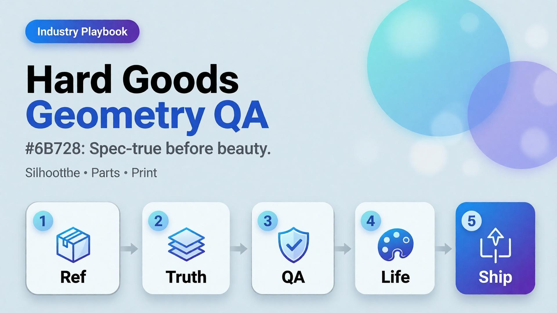
  • Hard Goods Need Geometry QA: Eyewear, Gadgets, and Spec-True AI Images

    Hard Goods Need Geometry QA: Eyewear, Gadgets, and Spec-True AI Images

    Beauty SKUs forgive a soft edge. Eyewear does not. A millimeter of temple warp, a lens reflection that invents a logo, a button row that gains an extra key — and the listing becomes a liability.

    AI hard goods product images fail when teams apply fashion/lifestyle prompting to precision objects. Hard goods need geometry QA as a first-class gate: silhouette, symmetry, ports, hinges, and print — before any lifestyle world.

    Key Takeaways

    >

    – Hard goods are spec products. Buyer trust is dimensional, not only emotional.

    – Run a geometry checklist before beauty, upscale, or lifestyle extension (packshot thinking).

    – Prefer reference-heavy generation; explore mode is for backgrounds after the object passes (reference vs explore).

    – Upscale only after QA (upscale after QA) — sharpening warped hinges makes rejects look confident.

    Why Do Lifestyle Prompts Break Hard Goods?

    Because soft prompts optimize for vibe. Hard goods optimize for match-to-unboxing.

    Soft-goods bias Hard-goods reality
    Fabric drape can vary Hinge angle cannot
    Skin tone mood Port count is binary
    “Premium glow” Specular lies on lenses/metal
    Approximate logo Exact wordmark + icon

    Eyewear, watches, earbuds, keyboards, tools, and small appliances sit on the hard side of that table.

    For hard goods, the hero image is a contract drawing with light — not a moodboard with a product stuck on top.

    Geometry QA Checklist (Pass Before Beauty)

    Silhouette

    • Outer shape matches reference
    • No melted corners, no missing tips (eyewear temples)

    Symmetry / alignment

    • Left-right balance on glasses, buds, paired objects
    • Button grids aligned

    Functional parts

    • Ports, hinges, switches, screws present and correct in count
    • No “extra USB” hallucinations

    Optics / materials

    • Lens transparency plausible (no opaque glass unless product is)
    • Metal vs plastic read correct

    Print / icons

    • Logos and iconography correct — or intentionally out of frame

    Fail any row → reject. Do not lifestyle it “to hide the error.”

    Playbook: Spec-True Then Scroll-Stopping

    1. Capture honest refs — front, 45°, detail of hinge/port
    2. Generate Truth angles reference-heavy (image model after direction)
    3. Geometry QA gate with zoom
    4. Optional lifestyle bridge — same approved object into a scene (desk, face for eyewear with character lock)
    5. Upscale + crop only on winners (node spine)

    For ads, keep scene jobs — but Truth frames carry the SKU.

    Category Notes

    Category Extra risk Extra gate
    Eyewear Lens reflections invent logos Check both lenses
    Earbuds / wearables Stem length drift Side-by-side with ref
    Keyboards / controllers Key count / layout Count visible keys
    Small appliances Cable / button myths Detail crop of controls

    Soft CTA

    Build spec-true packshots before campaign worlds: Packshot · Ecommerce

    Frequently Asked Questions

    What counts as hard goods for AI product images?

    Products where dimensional accuracy and part count matter to purchase and returns — eyewear, electronics, tools, precision accessories.

    Can I still use lifestyle scenes?

    Yes — after the object passes geometry QA. Lifestyle is extension, not repair.

    Should I use a different AI model for hard goods?

    Choose for fidelity bottleneck after direction — not because the category is trendy. See model-after-direction guidance.

    How many reference angles do I need?

    At least front + 45° + one detail of the failure-prone part (hinge, port, lens).

    Conclusion

    Hard goods do not need softer prompts. They need harder gates.

    Geometry first. Beauty second. Lifestyle third. Upscale last. That is how AI hard goods product images survive zoom, returns, and marketplace scrutiny.


    References

    1. Lumepixa, AI Product Photography Statistics 2026. https://lumepixa.app/blog/ai-product-photography-statistics
    2. Adobe, 2026 Creators’ Toolkit Report, June 16, 2026. https://news.adobe.com/news/2026/06/creators-toolkit-report-2026
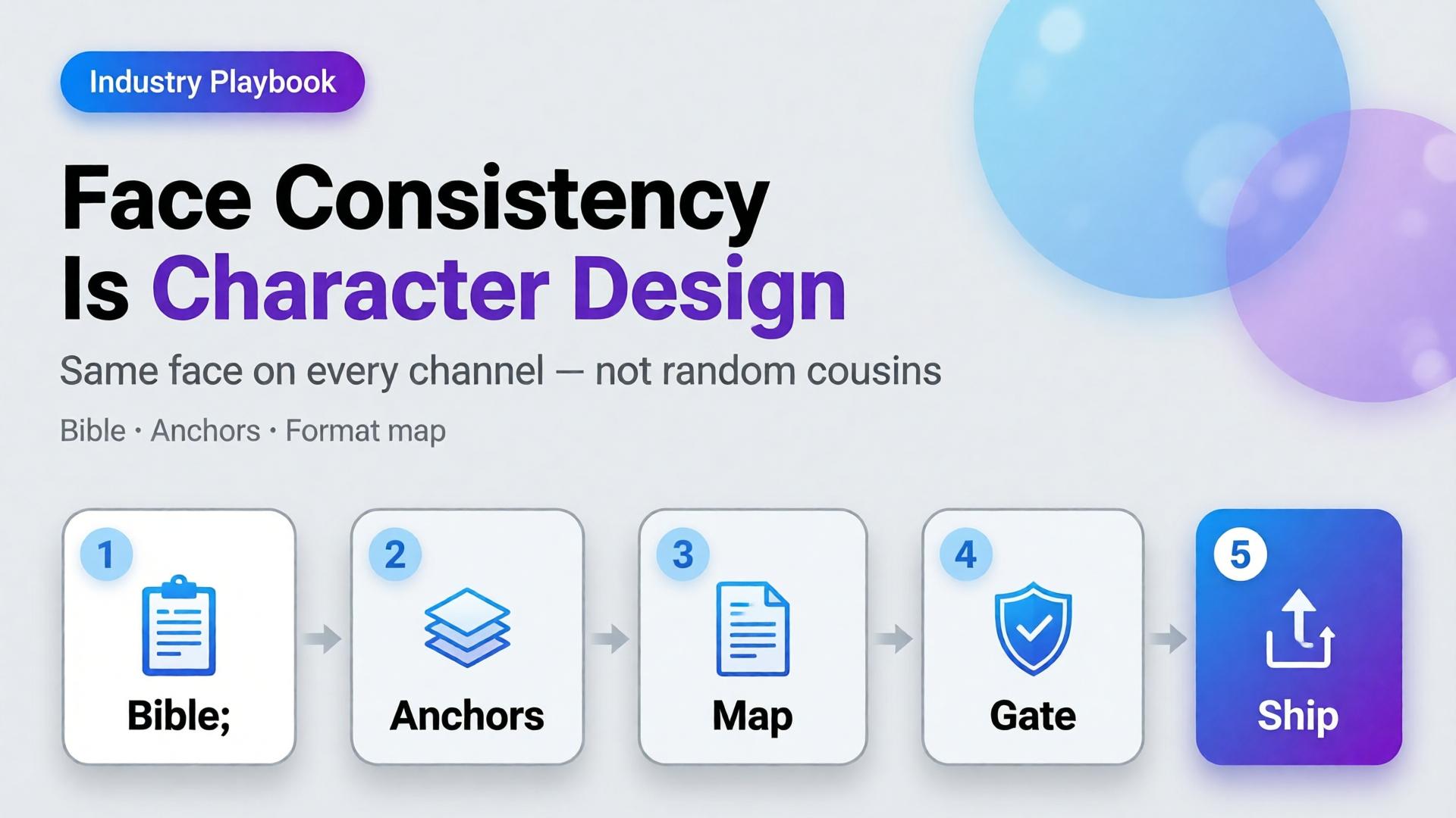
  • Face Consistency Across 12 Formats Is Character Design

    Face Consistency Across 12 Formats Is Character Design

    You generate a strong face for Tuesday’s Reel. Wednesday’s Story looks related. Thursday’s carousel looks like a cousin. By Friday’s marketplace banner, followers comment: is that a different person?

    That is not a model failure. That is a design failure.

    AI character consistency is not a filter you toggle after the prompt. It is character design — the same discipline animation studios and game teams use before a single frame ships. Creators who treat the face as a lucky seed will keep losing identity across formats. Creators who write a character bible first can ship the same person across twelve placements without the audience noticing the pipeline.

    Key Takeaways

    >

    – Face consistency across formats is a character design problem, not a prompt trick. Lock identity rules before you open the generator.

    – Adobe’s 2026 Creators’ Toolkit Report found 57% of creators say AI outputs need moderate or extensive editing before publish — and 42% say AI-generated work makes distinctive voices harder to surface (Adobe, 2026).

    – A workable kit has three layers: character bible, reference pack, format map (12 placements, one identity).

    – Curator gates beat more seeds. One approved face family scales; twenty “almost right” faces destroy trust.

    This is an industry playbook for creators, KOLs, and brand teams who put a human face in front of products. If you need the failure autopsy, read Brand Consistency Trap. If you need when to lock references versus explore, read Reference Images vs AI Explore. This article answers: how do you keep one face alive across twelve formats?

    Why Does Face Drift Break Creator Trust Faster Than Bad Lighting?

    Lighting mistakes look amateur. Face drift looks dishonest.

    Followers forgive a soft shadow. They do not forgive a jawline that migrates every post. The brain treats facial identity as a continuity contract. Break it and engagement does not just drop — recognition resets. You are introducing a new spokesperson every week without meaning to.

    Creators feel this as “the model changed my face again.” The deeper issue is upstream: there was no locked character. Every generation started from vibes instead of a bible.

    Audience trust for AI-assisted creators is not “was this generated?” It is “is this the same person I already know?” Face consistency is continuity, not aesthetics.

    What Is Character Design for AI Creators?

    Character design means deciding — in writing and in images — what must never change, what may change, and what is forbidden.

    Layer Lock forever Soft rules Never do
    Face geometry Eye distance, jaw, nose bridge Expression intensity Age jumps, ethnicity drift
    Hair Base cut + color family Styling for scene Random length each post
    Skin Undertone, freckle map Makeup level Plastic smoothness one day, heavy pores the next
    Wardrobe world Signature palette Outfit per format Brand-clash logos
    Age / era Apparent age band Season styling Teen ↔ mid-30s oscillation

    If you cannot fill this table in ten minutes, you are not ready to batch. You are ready to explore — once — then lock.

    Citation capsule: Distinctive creator voices are already under pressure. Adobe’s 2026 survey found 42% of creators believe AI-generated work makes it harder for distinctive voices to surface. Face drift accelerates that problem by dissolving the one asset audiences use to recognize you.

    The 12-Format Map: Same Face, Different Jobs

    Consistency does not mean identical crops. It means identical identity under different jobs.

    # Format Job Face rule
    1 Feed 1:1 Stop scroll Full face, strong eye contact
    2 Feed 4:5 Depth / product hold Face + product in same plane
    3 Story 9:16 Immersion Closer crop, same bone structure
    4 Reel cover Click Peak expression from approved set
    5 Thumbnail Search / browse High-contrast, readable at 120px
    6 Carousel keyframe Sequence Same lighting family across slides
    7 Live avatar / talking head Trust Strict reference lock
    8 Product demo still Proof Hands + face optional; no new identity
    9 Marketplace banner Store ID Smaller face, brand-safe crop
    10 Email hero Click-through Calm expression, clear silhouette
    11 Ad variant A/B Test hooks Same face, different props only
    12 Long-form cover Authority Most “portrait bible” accurate

    Write the map once. Every new campaign inherits it. That is how narrative systems stay coherent when volume rises.

    How Do You Build a Character Bible That Survives AI?

    Step 1 — Capture three anchor references

    Not twenty. Three:

    1. Neutral front (passport energy)
    2. Three-quarter with soft smile
    3. Profile or strong side light

    These become the identity spine. Everything else is a variation, not a rewrite.

    Step 2 — Write the non-negotiables in one paragraph

    Example: East Asian woman, apparent late 20s, warm undertone, soft freckles across nose bridge, straight dark hair to collarbone, almond eyes with slight monolid, no beauty marks, natural brows.

    If the paragraph is longer than six lines, you are over-specifying fashion and under-specifying face.

    Step 3 — Separate explore mode from production mode

    Exploration is allowed before lock — moodboards, casting tests, style worlds. After lock, switch to reference-heavy mode. Production is not the time to “see what the model invents.”

    Step 4 — Assign a curator gate

    Someone (you, or a teammate) must reject outputs that break identity even if they look prettier. Pretty-but-wrong is how brands wake up with twelve spokespersons.

    Gate Pass Fail
    Bone structure Matches anchors Soften / reshape
    Hair identity Same family New cut / color
    Age read Same band Younger/older leap
    Skin map Same marks / freckles Clean slate skin
    Expression Approved range New “character personality”

    Adobe’s finding that 57% of creators still edit AI outputs heavily is not a reason to skip direction. It is a reason to edit against a checklist, not against taste alone.

    What Breaks Face Consistency in Practice?

    Five patterns show up constantly in creator pipelines:

    1. Prompt adjective stacking — “beautiful, glamorous, cinematic, ultra detailed” invites the model to redesign the face toward a beauty average.
    2. Style refs stronger than face refs — a lighting moodboard overpowers identity when weights are wrong.
    3. Format panic — regenerating from scratch for 9:16 instead of cropping/extending an approved master.
    4. Multi-model hopping without re-locking — each model has a different face prior; hopping without anchors guarantees drift.
    5. Batch publishing without a set review — each image looks fine alone; the grid looks like a casting call.

    These map to the broader brand consistency trap. Face is simply the highest-stakes version.

    Playbook: Ship One Face Across a Week of Content

    1. Monday — Lock — approve three anchors + character paragraph
    2. Monday — Map — fill the 12-format table for the week
    3. Tuesday — Masters — generate 6–8 hero frames in one lighting family
    4. Wednesday — Adapt — crop/extend masters into Story, Reel cover, banner; regenerate only when crop fails
    5. Thursday — Curate — reject identity breaks; keep expression range tight
    6. Friday — Publish set — review the week as a contact sheet, not as singles
    7. Sunday — Archive — save winners into the character kit for next week

    This is the same spine freelancers use when one workflow serves five clients — swap the character kit, keep the gates.

    When Should You Redesign the Character on Purpose?

    Sometimes drift is a feature — new season, new brand deal, new persona arc. Redesign deliberately:

    • Announce the change in content (glow-up, season 2, brand collab era)
    • Rebuild anchors; do not “nudge” the old face into a new identity
    • Freeze the old kit; do not mix eras in the same week

    Accidental redesign reads as error. Intentional redesign reads as storytelling — which belongs in your narrative system.

    Soft CTA

    Build character kits and format maps inside a production system, not twelve disconnected tabs. Explore Orauria’s creative workflow for ecommerce and creator teams: Orauria solutions · Gallery

    Frequently Asked Questions

    What is AI character consistency?

    It is the practice of keeping the same facial identity, hair family, and age read across many generated images and formats. It is achieved with a character bible, reference anchors, and curator gates — not by hoping the next seed matches.

    How many reference images do I need for a stable face?

    Three strong anchors beat twenty weak ones. Add scene refs after identity is locked. More images help only when they reinforce the same person.

    Can I keep one face across different AI image models?

    Yes, if you re-lock with the same anchors in each model and treat the first approved outputs as the new production set. Hopping models mid-campaign without anchors is the fastest path to cousins.

    Should every format show the full face?

    No. Marketplace banners and some product demos may use smaller face presence or hands-only. The rule is: if a face appears, it must be the same face.

    How is this different from brand consistency?

    Brand consistency covers palette, light, and scene world. Character consistency is the human identity layer inside that brand. You need both; face drift can break a brand even when colors are perfect.

    What is the biggest mistake creators make with AI faces?

    Treating each post as a new casting session. Character design decides once, then produces many times.

    Conclusion

    Face consistency across twelve formats is not a prompt setting. It is character design — anchors, non-negotiables, format jobs, and a curator who rejects prettier lies.

    Write the bible. Lock three references. Map the twelve placements. Adapt masters before you regenerate. Review the week as a set.

    The creators who scale AI without losing their audience are not the ones with the luckiest seeds. They are the ones who decided who they are — then refused to renegotiate every Tuesday.


    References

    1. Adobe, 2026 Creators’ Toolkit Report, June 16, 2026. https://news.adobe.com/news/2026/06/creators-toolkit-report-2026
    2. Adobe, Inaugural Creators’ Toolkit Report (Adobe MAX 2025), October 28, 2025. https://news.adobe.com/news/2025/10/adobe-max-2025-creators-survey