Author: admin

  • AI白底图过审的关键不是抠图而是光线与边缘

    AI白底图,结果页多半在卖“一键抠干净”。运营真正卡关的却是另一件事:主图放大后字糊、箔纸死白、边缘发毛、商品像贴在纸上——买家不信,客服开始解释“和实物略有差异”。

    白底图首先是摄影约束,其次才是生成。Orauria 适合在身份锁定后扩展场景与投放;本篇只讲白底这一环:什么必须来自实拍,什么绝不能靠模型脑补。

    Key Takeaways

    • AI白底图失败,多半是原图没有可用高光/边缘/印刷信息,模型在“猜”。
    • 过审与转化看三点:纯白干净、接触阴影自然、标签在手机上可读。
    • 玻璃、金属、烫金、透明液、细小饰品:英雄图优先实拍。
    • 白底合格后再谈场景图、卖点图、618/双11投放扩展。

    白底图搜索意图 ≠ 主图生成 ≠ 商品图套件

    你搜的词 真正任务 常见误用
    AI白底图 主图级干净白底 + 主体真实 当艺术风格图用
    AI主图生成 整套主图位策略 只有一张白底就停
    AI商品图生成 从一图到多渠道套件 忽略平台规范

    套件视角见 AI商品图生成;主图工具视角见 AI主图生成

    白底的胜负不在“扣得多干净”,而在物体边缘的光学是否还像照片

    平台白底最怕的三类“假照片”

    问题 手机端观感 生成前先修什么
    高光爆、烫金死白 廉价假货感 柔光;避开直射灯打箔
    无接触阴影或阴影过重 悬浮贴图 / 脏底 保留轻接触影;提高辅光
    小字/条码糊 详情信任崩 更近、更锐;文字区优先对焦

    锯齿边缘、灰底、Logo 被“美化”变形:直接弃图。那不是白底图,是合成痕迹。

    材质决定你能不能只靠 AI白底图

    材质 一张好原图后的 AI 扩展 必须实拍英雄图
    哑光纸盒、袋装
    不透明瓶+平面标 色差敏感款
    玻璃/透明液体 弱–中
    金属/电镀/烫金
    服饰平铺/挂拍 版型与垂感
    珠宝五金微小件 微距与闪光

    价值感靠光线在表面如何滑动 → 别赌提示词。价值感靠外形+印刷色块 → 窗边实拍(上海/杭州公寓亦可)+ 规范白底扩展,通常够日常上架;大促素材再叠场景。

    白底工作流(运营可执行)

    1. 实拍英雄 — 标签朝镜头、水平、无拖影;泡沫板补光比换模型更有效。
    2. 书面锁身份 — 盒色、Logo 禁变形、盖子材质、禁止“额外金箔”。
    3. 先过白底 QA — 100% 放大看字;缩略图三秒能否认出 SKU。
    4. 再扩展 — 场景、卖点、竖版投放;白底不过关就不要进 618 素材池。
    5. 拒绝静默改款 — 盖型被改、瓶身比例变了 = 退货隐患。

    Orauria 放在哪一步

    Orauria:商品营销 AI Creative Studio。一图 → 照片/广告/社媒/短视频 → campaign pack。你负责把白底光学做对;系统帮你在不漂 SKU 的前提下扩成套内容。

    创建第一套 Product Kit →

    FAQ

    只用抠图软件算 AI白底图吗?

    抠图只是去背景。完整白底图还要处理边缘光、阴影逻辑与印刷清晰度;缺一就会“假”。

    京东/淘宝对 AI 白底敏感吗?

    关键是是否如实表现商品与是否符合当时平台规范。光学造假和改款比“用没用 AI”更容易出纠纷。

    透明瓶怎么拍再交给 AI?

    英雄图实拍控高光与液面;AI 只做次要角度/场景,并禁止改瓶壁厚度与盖型。

    结论

    AI白底图当成摄影关卡:光线与边缘过关 → 身份锁定 → 再谈扩展。跳过第一关,后面所有“智能主图”都像贴图。

    Create Your First Product Kit →

  • AI主图生成:用一张实拍做出可过审、可投放的主图套件

    AI主图生成,你要的不是“好看的随机图”,而是:一张真实商品图 → 白底主图 + 场景 + 投放图,包装、Logo、颜色、外形始终一致。

    适合淘宝、天猫、京东、拼多多与抖音电商的 AI主图生成:手机实拍或白底图上传 → 输出可上架主图与多尺寸素材,不必上海棚拍,也不必每个 9:16 重做设计。

    Key Takeaways

    • 75% 消费者购买决策依赖商品图(Weebly,2026 汇总)。
    • 5–7 张(多角度 + 场景)通常优于单图(Statista / 2025–2026)。
    • 失败模式:艺术模型出图后硬套主图规范,缺少 商品套件
    • 清单:干净原图 → 身份锁 → 按任务出图 → 比例 1:1 · 4:5 · 3:4 · 9:16 · 16:9。

    AI主图生成 vs 普通 AI 绘图

    艺术向生成 AI主图生成(电商)
    输入 提示词 真实商品图
    输出 单张氛围图 主图/场景/广告套件
    约束 审美 商品身份
    成功 点赞 点击、转化、退货

    相关枢纽:AI商品图生成

    主图工具的胜负不在“模型名单”,而在能否一次产出 可过审、可投放、身份不漂 的成套图。

    为什么“精美主图”仍可能掉转化

    22% 退货与图物不符有关(Weebly / 行业)。Logo 糊、色差、比例变形,在京东/淘宝主图与客服纠纷里都是雷区。

    白底 + 场景相对纯白底,常见转化提升约 15–30%2026 A/B)。

    一张图 → 主图套件

    环节 任务 渠道
    白底主图 过审、主体清晰 淘宝/天猫/京东 1:1
    场景图 使用语境 详情、种草
    平台图 拼多多/抖音规格 各站
    投放图 停住滑动 信息流、短视频封面
    大促创意 618 / 双11 活动页、卖点图

    USP:One Product → Multiple Creatives · Keep Consistent · Built for Ecommerce · Photo to Ad · Multi Formats。

    五步做 AI主图生成

    1. 原图真实 — 光照均匀、标签可读(上海窗边手机图亦可)。
    2. 身份锁定 — 色、Logo、比例、禁改项。
    3. 按任务生成 — 不问“更好看”。
    4. 按比例导出 — 主图 1:1;抖音/小红书竖版;banner 16:9。
    5. 上架前 QA — 一眼认出商品、无虚假宣称。

    Orauria

    Orauria:商品营销 AI Creative Studio。一图 → 照片/广告/社媒/短视频 → campaign pack。不是又一个绘图器,而是 商品 → 电商内容系统

    创建第一套 Product Kit →

    FAQ

    淘宝/京东能用 AI 主图吗?

    能,前提是真实反映商品并遵守平台规范。主图保持主体清晰;AI 扩展场景与投放。

    和抠图有何不同?

    抠图只是一步。AI主图生成还要场景、多尺寸与整套身份一致。

    一定要会提示词吗?

    电商工作流(上传 → 选任务 → 生成)则不必。商业 brief 更重要。

    结论

    选爆款 SKU,按上表做 5 类图,主图 A/B 7–14 天。

    Create Your First Product Kit →
  • AI商品图生成:一张实拍图做出整套可上架素材

    AI商品图生成:一张实拍图做出整套可上架素材

    别用 AI 去「随便生成好看图」。要用 AI 生成能卖货的商品图

    AI商品图生成的正确含义是:上传一张真实商品图 → 产出白底主图、场景图、详情卖点图、投放广告图,同时保持包装、Logo、颜色和商品外形一致。不必在上海租棚,不必请杭州摄影师整天档期,也不必每做一个 9:16 抖音尺寸就重开一轮设计。

    Key Takeaways

    • 网购决策高度依赖视觉:约 75% 的消费者表示会根据商品图决定是否购买(Weebly,行业汇总 2026)。
    • 多图链接通常优于单图:从 1 张图做到 5–7 张(多角度 + 场景)时,行业数据常见转化提升(Statista / 2025–2026 汇总)。
    • 2026 年最常见翻车:把 Midjourney / Flux / GPT Image 当艺术工具,再硬套淘宝主图规范——而不是搭建 商品 → 内容套件
    • 胜出清单:干净原图 → 锁定商品身份 → 按任务出图(白底 / 场景 / 广告 / 平台)→ 按比例导出(1:1 · 4:5 · 3:4 · 9:16 · 16:9)。

    AI商品图生成是什么?

    AI商品图生成是指:以真实商品照片为输入,用 AI 扩展可上架、可投放的商业视觉——不是自由发挥的文生图艺术。

    艺术向生成(Midjourney、Flux…) 电商向 AI商品图生成
    输入 文案提示 / 氛围 真实商品图(手机或白底实拍)
    目标 好看 / 出圈 可上架、可投放素材
    约束 少——审美优先 保外形、标签、颜色、比例
    输出 零散单图 按渠道成套
    成功标准 点赞、审美 点击率、转化、退货率

    若要理解「电商设计 ≠ 随便出一张 AI 图」,可继续阅读 AI ecommerce design 不是 AI image

    国内卖家不缺模型。缺的是发布系统:一个 SKU 进去 → 多套渠道素材出来,商品身份始终一致。

    为什么「好看」的 AI 图照样卖不动?

    图美但和实物不一致 = 退货与差评。约 22% 的退货与「实物与图片不符」相关(Weebly / 行业汇总)。

    三类高频翻车:

    1. 身份漂移 — Logo 糊掉、包装色偏、瓶身比例变形(淘宝主图 / 京东主图审核与客诉雷区)。
    2. 一张图打天下 — 1:1 在拼多多还行,裁成抖音 9:16 就废构图。
    3. 没有角度体系 — 只有一张「精修英雄图」,缺细节、缺尺码参照、缺场景、缺信任图。

    白底图 + 场景图组合,相对「只有白底」常见转化提升约 15–30%2026 A/B 行业汇总)。你需要的是一套图,不是一张「特别高级」的渲染。

    一个商品 → 一整套内容套件

    Orauria 的定位——也适合所有要规模化出图的国内与跨境卖家:

    不要生成随机 AI 图。要生成准备好卖货的商品创意

    更短一句:为电商而生的 AI 商品摄影。

    One Product. An Entire Content Kit.

    上传一次商品。生成你在各渠道真正需要的图。

    流水线环节 图片任务 用在哪里
    白底 / 棚拍主图 干净、可控背景 淘宝/天猫/京东主图、目录
    场景图 放进可信使用环境 详情页、广告、种草
    平台图 适配各站规范 淘宝、京东、拼多多、抖音电商
    投放广告图 能停住滑动 信息流、短视频封面、小红书
    活动创意 统一品牌视觉 618、双11、年货节、详情卖点图

    主图区下方建议直接摆出的 USP:

    1. One Product → Multiple Creatives — 一张商品图做出整套销售素材。
    2. Keep Your Product Consistent — 包装、Logo、颜色、外形不跑偏。
    3. Built for Ecommerce — 淘宝、天猫、京东、拼多多、抖音、小红书、独立站与跨境亚马逊。
    4. From Product Photo to Ad — 白底 → 场景 → 海报 → 投放图。
    5. Multiple Formats — 1:1 · 4:5 · 3:4 · 9:16 · 16:9。

    如何做 AI商品图生成(5 步)

    第 1 步:准备「够真实」的原图

    原图质量决定上限。优先:

    • 光线均匀,标签不过曝
    • 正面 + 可选 45°
    • 无水印、无重度滤镜
    • 背景简单(白底 / 牛皮纸 / 干净桌面)

    上海公寓窗边的手机实拍、广州仓拍白底,都可以。棚拍不是必须,主图思维(packshot thinking)才是必须。参见 Packshot thinking:没有棚拍日也要够角度

    第 2 步:先锁定商品身份,再「变美」

    出场景图或广告图之前,先锁死:

    • 品牌色 / 包装色
    • Logo 与标签文字(不可乱编卖点)
    • 外形、比例、材质(哑光 / 高光 / 玻璃)
    • 明确禁止改动的项(SKU 变体、功效宣称、合规标识)

    不锁身份 = 每次生成都是「另一个商品」。

    第 3 步:按任务出图,不按感觉出图

    每个 SKU 至少准备:

    1. 1–2 张 白底主图(平台主图友好)
    2. 2–3 张 场景图(浴室镜柜、书桌、客厅沙发边——贴近中国家庭使用场景)
    3. 1 张 细节 / 材质
    4. 1 张 投放广告图(预留标题与 CTA 安全区)
    5. 1 张 活动 / 卖点海报(618、双11、店铺首页)

    别问 AI「再好看一点」。问:这张图回答买家哪个问题?(长什么样 / 怎么用 / 多大 / 和便宜货差在哪)

    第 4 步:按渠道比例导出

    渠道 建议比例 备注
    淘宝 / 天猫 / 京东主图 1:1(常见 800×800) 主体清晰、背景可控
    拼多多主图 1:1 或平台规定 主体更大、信息更直接
    详情首屏 / 卖点图 3:4 或竖版模块 卖点可读、勿堆字
    小红书笔记 3:4 / 1:1 种草场景优先
    抖音电商 / 短视频封面 9:16 或 3:4 避开 UI 安全区
    店铺 banner / 活动页 16:9 或站内规定 双11 / 618 主视觉

    一张「母图」盲目裁切常毁构图。从一开始就做 按比例生成。多裁切体系可参考 One product:feed、story、cover、marketplace banners

    第 5 步:上架前 QA(退货防火墙)

    60 秒检查清单:

    • [ ] 手机上一眼认出是该商品
    • [ ] Logo / 标签可读、不变形
    • [ ] 颜色贴近实物(不要「销售滤镜」)
    • [ ] 图内无虚假宣称(乱写赠品、折扣、认证)
    • [ ] 体积合适,详情页加载不拖垮
    • [ ] 与同链接其他图光影家族一致

    淘宝、京东、抖音、小红书怎么用同一套图

    中国卖家通常要在多战场保持同一 SKU 同一张脸

    • 淘宝 / 天猫: 白底主图 + 多角度 + 场景 + 详情卖点
    • 京东: 主图规范严格,身份一致性更关键
    • 拼多多: 主图冲击力强,仍不能改商品本体
    • 抖音电商: 仍需链接图 + 竖版投放素材
    • 小红书: 场景种草图优先,商品身份仍要对得上成交页
    • 跨境亚马逊: 白底主图 + A+;与国内站共用身份锁

    同一套件,避免「淘宝一个脸、抖音另一个脸」。大促(618、双11、双12、年货节)应复用身份做变体,而不是每次重造商品。

    更「中国」的场景,而不是假大空棚景

    • 护肤放在明亮洗手台镜柜前(不是欧式城堡大理石梗)
    • 咖啡器具放在深圳公寓木桌或杭州咖啡馆风台面
    • 户外装备放在周末营地或城市公园入口语境
    • 家居放在华北客厅午后窗光里

    场景卖向往。商品身份仍须匹配你从义乌仓或华南仓发出去的实物。

    什么时候真棚拍,什么时候用 AI

    场景 建议
    30–100 个 SKU 上新、预算紧 AI商品图生成 + 干净手机/白底原图
    618 / 双11 素材刷新 锁定白底后,用 AI 批量场景与海报变体
    全国大片、高难材质(镜面金属、玻璃、透视面料) 混合:真拍少量英雄图 + AI 扩量
    必须照片级真实的质感 / 容量 / 尺码证明 真图说真话;AI 只做语境,不编细节

    AI 替不掉每一次上海或广州棚拍。它替的是规模瓶颈:SKU × 渠道 × 大促节点,小团队手搓不过来的产量。

    Orauria:从商品图到 Campaign Pack

    Orauria 是面向商品营销的 AI Creative Studio:上传一张商品图 → 生成商品照片、广告图、社媒帖与短视频——再导出适用于多平台的 campaign pack

    我们不卖「又一个 AI 绘图工具」。我们卖 商品 → 电商内容系统

    • 一次上传 → 多套一致素材
    • 跨主图与广告保持商品身份
    • 按销售渠道准备好尺寸

    CTA: 创建你的第一套 Product Kit →

    想了解端到端创意工作区:Orauria 是什么?电商 AI 创意工作区

    FAQ — AI商品图生成

    淘宝 / 京东能用 AI 商品图吗?

    可以——前提是仍真实反映商品,并遵守平台当前图片与宣传规范。主图建议保持主体清晰、背景可控;用 AI 扩展场景、卖点与投放图,而不是换成另一个商品。

    和普通抠图 / 换背景有什么区别?

    抠图只是一步。AI商品图生成面向电商,还要场景图、广告图、多比例导出,以及整套图的身份锁定。

    一个链接要几张图?

    实践中 5–7 张(多角度 + 细节 + 场景)往往比单图或过长图集更均衡。以你自己的店铺流量做 A/B。

    一定要会写复杂提示词吗?

    若工具是电商工作流(上传商品 → 选图片任务 → 生成),不必。比提示词更重要的是商业 brief:渠道、图片任务、身份锁、尺寸。

    Midjourney 够不够做淘宝主图?

    能出漂亮单帧。通常缺少身份锁 + 多尺寸 + 平台流水线。把艺术模型当引擎层;上面仍需要 商品套件 / 卖货工作流

    结论

    AI商品图生成的胜负手是成交与链接信任——不是 Behance 上的「AI 感」。

    记住三件事:

    1. 用真实原图锁定身份
    2. 按任务出图(白底 → 场景 → 平台 → 投放)
    3. 按比例导出,上架前 QA

    下一步:选一个店铺爆款 SKU,按上表做出 一套 5 类图,主图 A/B 跑 7–14 天。

    Create Your First Product Kit →
  • How to Use Image to Video with AI: Direction → Gates → Export

    How to Use Image to Video with AI: Direction → Gates → Export

    Image-to-video is deceptively easy.

    You convert one image, and you get motion. But production quality depends on one question:

    Did the direction preserve product truth?

    If yes, motion becomes proof. If no, motion becomes distortion.

    Key Takeaways

    – Image-to-video is efficient when you lock direction first.

    – Gates decide winners: geometry truth, identity stability, and caption/offer alignment.

    – Export variants should follow the same gate logic across channels.

    The 3-part workflow

    1) Direction kit (lock what must stay true)

    Define:

    • what moves (pose/camera feel),
    • what stays true (geometry, label readability, character identity cues),
    • what the scene must communicate (hook, proof, offer).

    This is the “creative direction” layer. Not another prompt.

    2) Generate candidates (then filter, fast)

    Generate multiple candidates under the same direction kit. Reject early with gates:

    • warped edges / warped proportions,
    • unstable identity cues,
    • text/label unreadability after resize.

    This prevents spending time on polish for failures.

    3) Export channel-safe variants (without rework)

    Export with rules:

    • correct aspect ratio,
    • stable safe zones for text and CTA,
    • consistent shadow family and background logic.

    Now your output becomes a reusable creative asset, not a one-off clip.

    What to do next

    If you want the deeper version of the same workflow, read:

    And if your bottleneck is “not enough angles”:

  • How to Convert Text to Videos with AI: Bottleneck-First Workflow

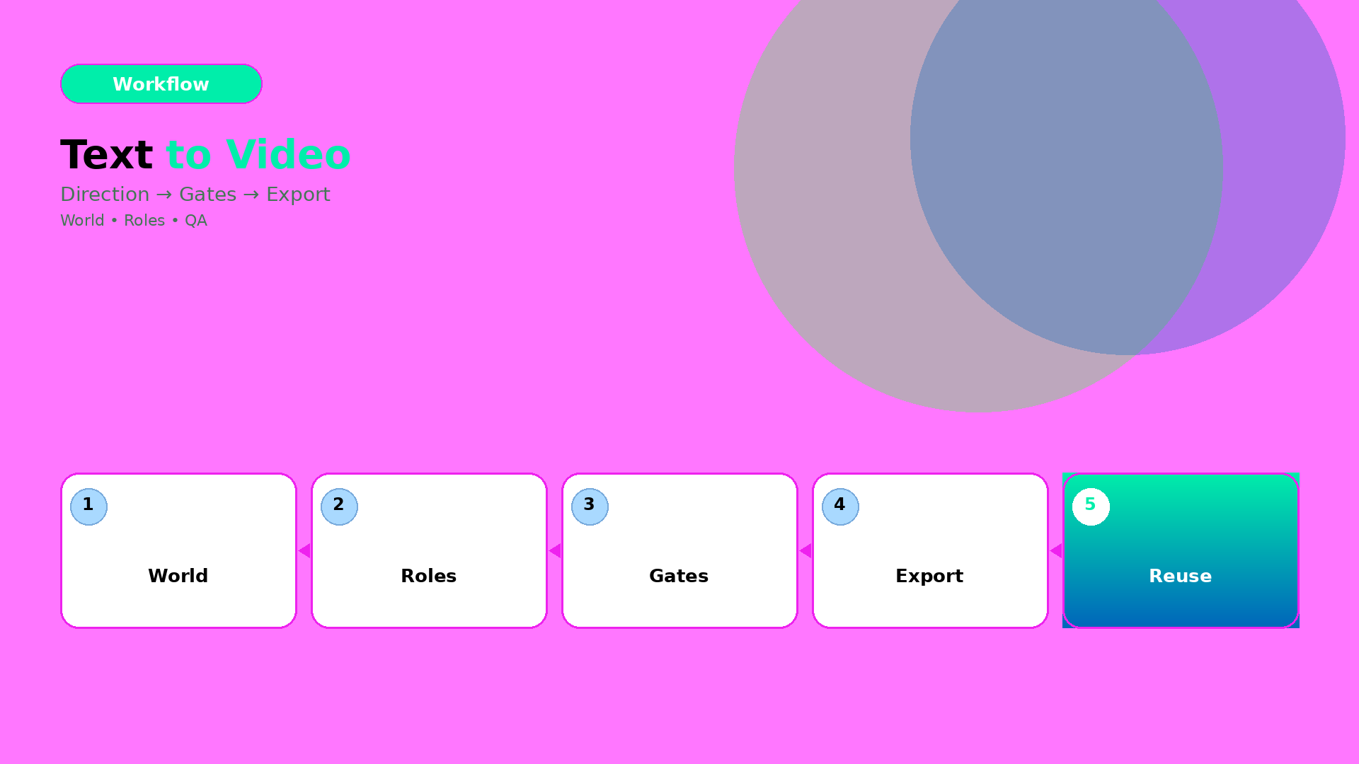
    How to Convert Text to Videos with AI: Bottleneck-First Workflow

    The common failure pattern in text-to-video is the same:

    People generate early, then discover late. They refine prompts while the world already drifted.

    The production fix is simple: stop treating text-to-video as a “prompt task”. Treat it as a workflow with gates.

    Key Takeaways

    – Text-to-video works when you lock direction before you generate.

    – The right QA gates prevent world drift (tone, shadow family, and identity continuity).

    – Efficiency improves when you route by bottleneck: geometry vs readability vs offer tone.

    Step 1: Turn text into direction (not a prompt)

    Start with one compressed direction brief:

    • World: the setting + light family + tone
    • Roles: what each scene must do (hook, proof, offer)
    • Constraints: what cannot drift (product truth, identity anchors, claim safety)

    If your direction brief can’t be spoken in 20–30 seconds, your video will splinter.

    Step 2: Generate under gates (batch, then filter)

    Generate more than you need. But do not “pick the best-looking”.

    Filter by pass/fail gates:

    1. World gate: does the light/tone stay consistent?
    2. Identity gate: does the character/product identity stay in range?
    3. Offer gate: does the visual imply the same promise as your copy?

    Any failure means you update the direction kit—not your luck.

    Step 3: Export variants channel-safe

    Text-to-video videos often die at export:

    • captions get cut
    • safe zones break
    • aspect ratio changes product proportions

    So export with the same gate logic:

    Channel Gate focus
    Reels (9:16) first-second readability
    Stories caption timing and proof hold
    Feed (1:1 / 4:5) product truth center framing

    Routing: which bottleneck decides your workflow?

    Use bottleneck-first routing:

    • if geometry is failing → choose direction/scene constraints that preserve edges and proportions,
    • if readability is failing → adjust label/typography rules before generation,
    • if offer tone is failing → align caption gate with scene roles.

    Model choice is downstream.

    What to do next

    If you want the workflow mindset:

  • Choosing an AI Image Model by Creative Direction (Not Hype)

    Choosing an AI Image Model by Creative Direction (Not Hype)

    Model choice is not a “which one is best” question.

    It is a routing question.

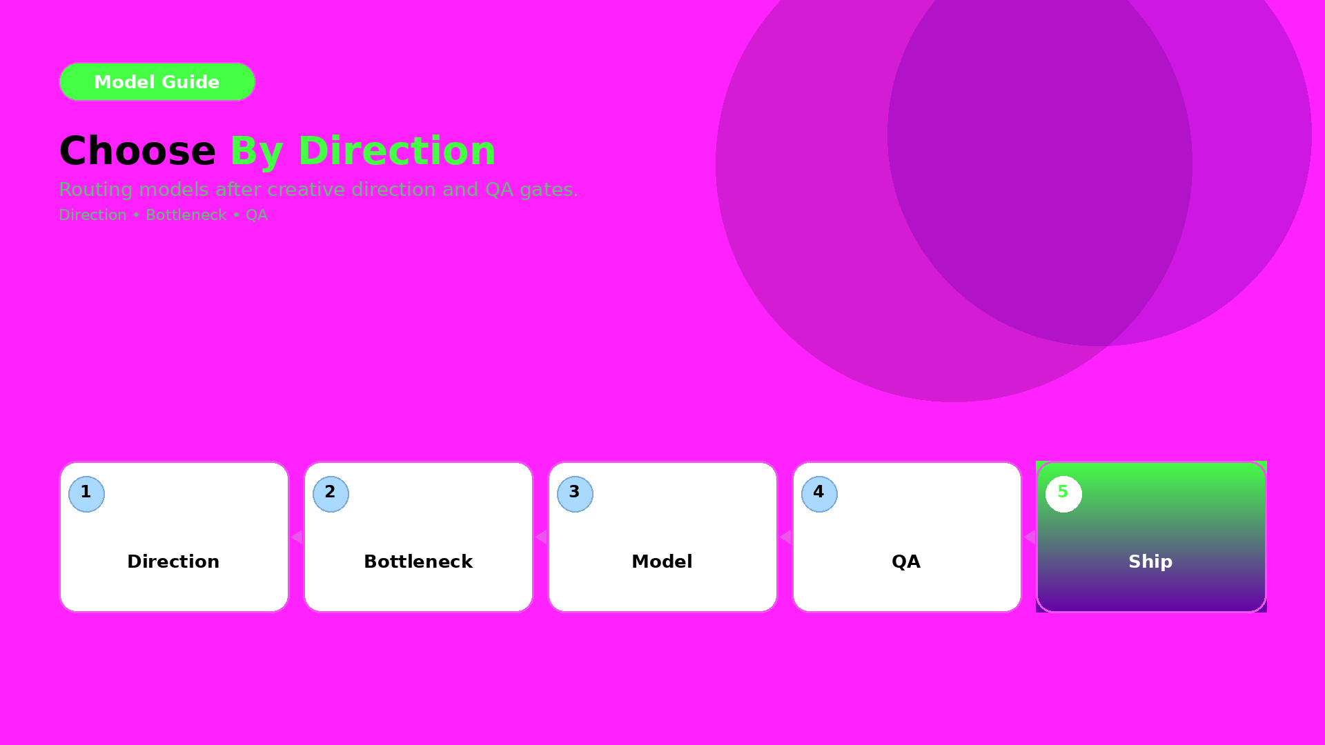
    Route by creative direction and bottleneck after your QA gates are defined. Then the model becomes an implementation detail—not a gamble.

    Key Takeaways

    – Creative direction defines what must stay true (world + roles + QC gates).

    – The bottleneck defines what the model must solve for you.

    – Pick the model after you lock direction—then test under the same gates.

    Step 1 — Lock direction first (inputs you must keep constant)

    Before you compare models, lock:

    • world promise (light family + palette logic),
    • identity anchors (faces/characters or texture cues),
    • and your QA gates (geometry truth + readability).

    If direction changes while models change, you learn nothing.

    Step 2 — Identify your bottleneck type

    Most ecommerce issues fall into one of three bottleneck types:

    1. Geometry bottleneck: edges, proportions, product silhouette
    2. Texture bottleneck: materials, labels, stitching cues
    3. Readability bottleneck: text/label clarity after resize

    Your model should be selected based on the bottleneck you actually see.

    Step 3 — Route outputs through QA gates

    Don’t decide by what the image “feels like”. Decide by pass/fail:

    • geometry truth gate,
    • readability gate,
    • world continuity gate (shadow family + tone),
    • and offer tone gate (if your copy implies a different promise).

    A practical routing checklist

    Use this checklist whenever a new model trend appears:

    1. What bottleneck are we solving today?
    2. Are direction + gates unchanged?
    3. Can we compare on the same output formats (1:1, 9:16, listing)?
    4. Are we rejecting failures early (before polish)?

    If yes: test models. If no: fix the direction kit first.

    What to do next

    Start with the direction-after rule:

    Then upgrade routing to bottleneck-first:

    • pick the model by QA evidence,
    • and keep your gates constant.
  • Orauria vs Canva + ChatGPT: Honest Comparison for Ecommerce Teams

    Orauria vs Canva + ChatGPT: Honest Comparison for Ecommerce Teams

    Many teams try this stack:

    • ChatGPT for briefs and copy,
    • Canva for layout and crops,
    • and “AI images from somewhere else” for visuals.

    It works—until you scale.

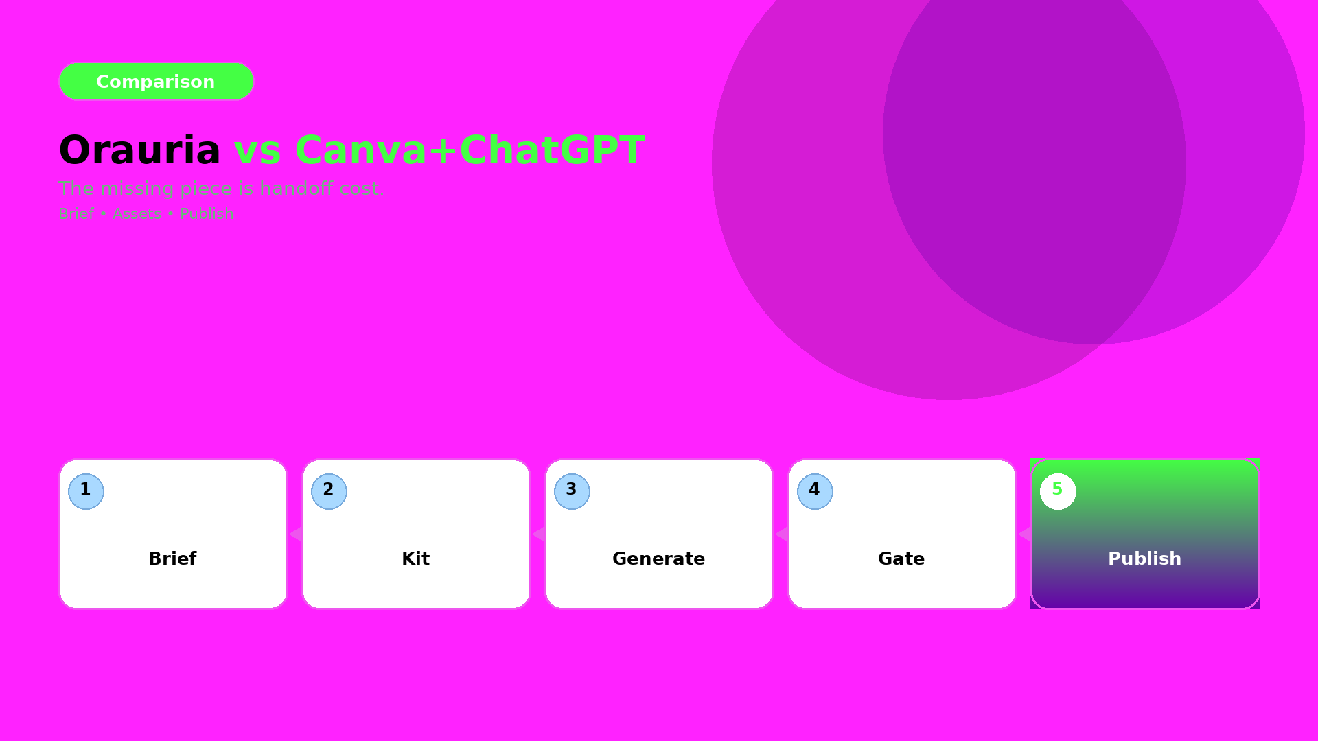
    The failure point is not output quality. It is handoff cost.

    Where Canva + ChatGPT excels

    Canva is great for:

    • quick crops,
    • fast social templates,
    • and design iteration when the direction is already locked.

    ChatGPT is great for:

    • brainstorming,
    • first drafts of captions,
    • and helping you write the brief.

    Where the stack breaks in ecommerce production

    When you go from one asset to a drop system, you need:

    • a shared brand kit,
    • consistent identity anchors,
    • and QA gates across formats.

    In a scattered stack, your system becomes “people remembering”. But production requires “rules enforcing”.

    Orauria’s advantage: workflow continuity

    Orauria is built around the loop:

    1. Brief (intent + constraints),
    2. Brand kit (rules that must not change),
    3. Gates (QC checks before you upscale/export),
    4. Generate and route variants,
    5. Publish-ready exports for ads and listings.

    This turns many outputs into one recognizable system.

    The decision rule (when Orauria wins)

    Orauria wins when:

    • you need 10+ assets per campaign,
    • you must preserve brand identity across sizes and channels,
    • and you don’t have time to manually re-explain the brief every run.

    If your process is “one designer, one asset, one export”, then Canva may be enough.

    What to do next

    If you are switching stacks, start with the mindset:

    • brief once,
    • lock kit once,
    • enforce gates,
    • then generate and publish.

    For a workflow blueprint:

  • Case: 30-SKU Shop, Zero Studio — Lookbook in 3 Days

    Case: 30-SKU Shop, Zero Studio — Lookbook in 3 Days

    This case is not about “fast rendering”. It is about fast decisions under constraints.

    A 30-SKU shop had no studio time. The goal was a lookbook that could also be reused for ads and marketplace listings.

    The bottleneck

    When you generate lookbook scenes quickly, your real failure modes are:

    • identity drift (faces/characters not stable),
    • world collapse (shadows and tone change scene to scene),
    • and QA blindness (geometry or label readability fails after resizing).

    So the case success is measured by: continuity + QA gates + reusable roles.

    Experiment setup (what we locked first)

    World kit

    • one light family (shadow logic stays inside a range),
    • one palette logic (background + product accents),
    • one continuity anchor set (identity + product geometry truth).

    Creative directions (roles)

    We used lookbook thinking:

    • hook role: first-second value,
    • proof role: texture + label readability,
    • offer role: CTA and promise tone,
    • reuse role: later export into ad-safe formats.

    Scene grid plan

    30 SKUs were not treated as 30 independent projects. They were mapped into a batch:

    • same world kit,
    • roles repeated across scenes,
    • only the SKU variable changes.

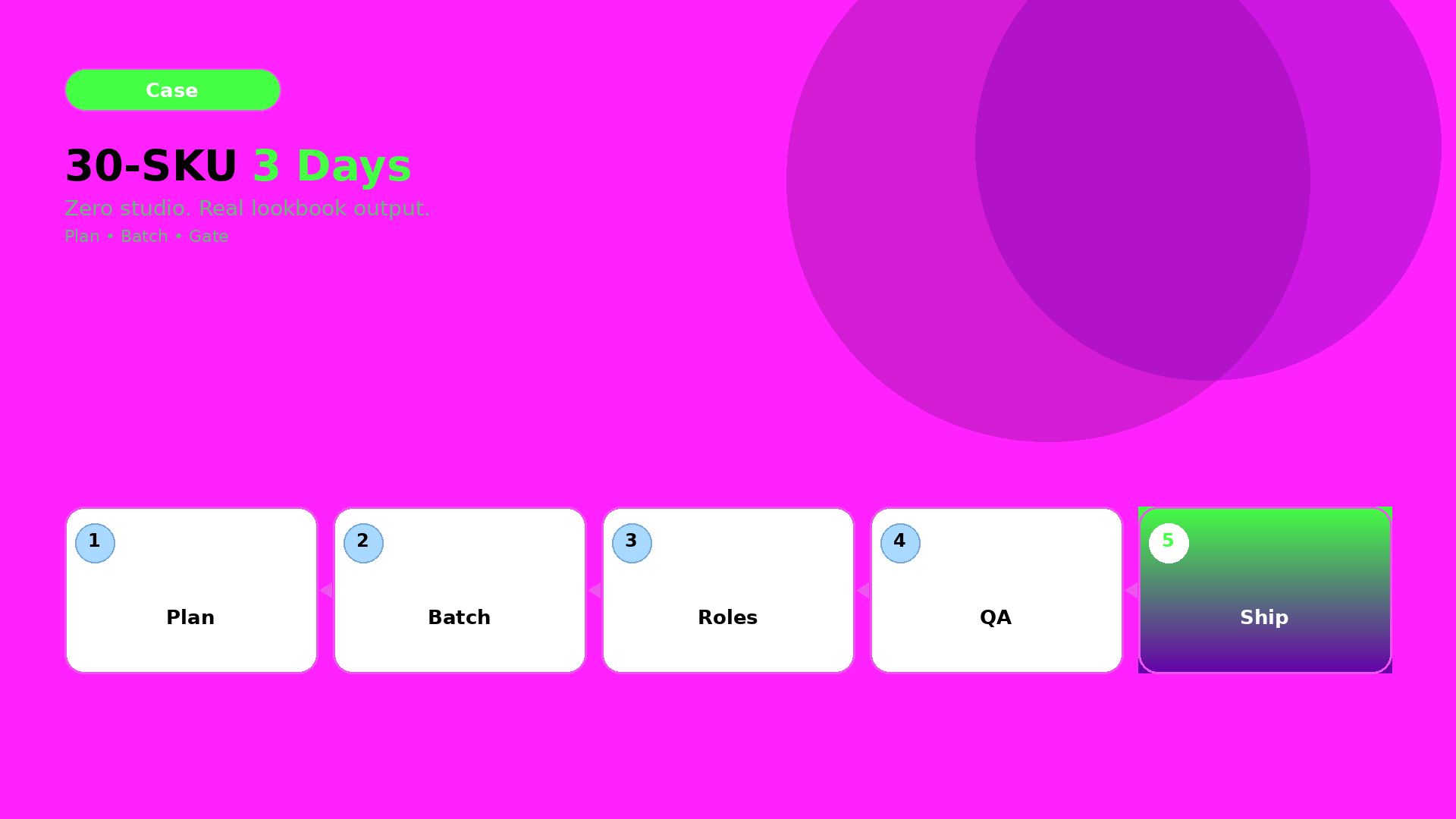
    The 3-day schedule (how speed actually happened)

    Day 1 — Plan + role map

    Lock directions and world kit. Write the QA checklist before any generation.

    Day 2 — Generate batches

    Generate scenes per role, not per SKU. Reject drift candidates early so we don’t waste polish time.

    Day 3 — QA gates + export

    Run the gates and export channel-safe variants:

    • lookbook page frames,
    • ad-ready crops,
    • marketplace listing support frames.

    QA gates used (what got checked every time)

    We used four gates:

    1. Identity gate: continuity anchors match across scenes.
    2. Geometry gate: edges and proportions stay stable.
    3. Readability gate: labels/CTA remain legible after resizing.
    4. Offer gate: captions imply the same promise as the visuals.

    If any gate fails, we update the kit (rules), then regenerate only affected outputs.

    What actually shipped

    • one coherent lookbook world,
    • consistent brand identity across many scenes,
    • and reusable exports for ads and listings.

    The result is not “many images”. The result is a production system the shop can rerun for future drops.

    What to do next

    If you want to build the same pipeline:

  • What Is Orauria? The AI Creative Workspace for Ecommerce

    What Is Orauria? The AI Creative Workspace for Ecommerce

    Orauria is not just another AI chat.

    It is a creative production workspace for ecommerce and marketing teams—built for the real bottleneck: turning an idea into a consistent set of assets that can be shipped, resized, and reused.

    The core idea: brief → kit → gates → publish

    Most content workflows fail because they treat AI outputs like standalone files.

    Orauria connects the steps:

    1. Brief: capture intent and constraints.
    2. Brand kit: lock palettes, light family, identity anchors, and rules.
    3. Gates (QC): reject drift before you upscale or export.
    4. Publish-ready exports: generate channel-safe variants without rebuilding from scratch.

    Why it matters for ecommerce

    Ecommerce needs recognition.

    Buyers expect the same product truth across:

    • listing visuals,
    • social feed and reels,
    • marketplace banners,
    • and ad campaigns.

    Orauria’s workflow mindset is designed to keep that recognition stable.

    What you do in Orauria (in one sentence)

    You build a reusable creative system, then generate assets that stay inside the same world promise.

    If you want the workflow blueprint, start with:

    What to read next

    If you want the thinking behind the system:

  • When to Use Prompt Normalizer vs Raw Creative Prompts

    When to Use Prompt Normalizer vs Raw Creative Prompts

    Most teams treat “prompting” as one skill. It isn’t.

    For ecommerce production, prompting is actually two different jobs:

    • turning a messy idea into a structured intent (normalizer),
    • and pushing style choices inside a locked direction (raw creative prompt).

    If you mix these jobs, you get inconsistent outputs and wasted iterations.

    Key Takeaways

    – Raw prompts are good for exploration.

    – Normalizers are good for alignment and repeatability.

    – Your workflow should choose the tool by bottleneck, not by preference.

    What is a prompt normalizer (production view)?

    A normalizer takes input like:

    • “make it premium”,
    • “use the same model”,
    • “make it look like our brand”,
    • “turn this into an ad”.

    And converts it into a structured brief:

    1. Intent: what outcome it must achieve,
    2. Slots: what can vary vs what cannot,
    3. Constraints: QA gates rules (geometry, readability, world logic),
    4. Output routing: which model family fits the bottleneck.

    In other words, it is the briefing layer.

    What are raw creative prompts (exploration view)?

    Raw prompts are where you:

    • try a new visual twist,
    • adjust scene tone,
    • explore typography density,
    • test hook variations.

    Raw prompts are not wrong. They are just wrong for tasks that require alignment.

    The decision guide: choose by bottleneck

    Ask this:

    A) Are you missing alignment?

    If results drift in:

    • face/identity,
    • shadow family,
    • label clarity,
    • caption promise vs visuals,

    then you are missing rules. Use a prompt normalizer.

    B) Are you already aligned and just exploring?

    If identity is stable and only style options are unclear, then exploration is fine. Use raw creative prompts.

    A simple workflow that prevents waste

    Use this loop:

    1. Normalize the brief (intent + slots + constraints)
    2. Generate exploration variants inside the locked world kit
    3. Gate by QA checks
    4. Ship only the winners into your content system

    This is what “workflow mindset” means in prompting: you are building a reusable system, not repeating trials.

    What to do next

    If you want the brief template:

    If you want workflow routing: