Search AI chụp ảnh sản phẩm thường dẫn tới tool hứa “không cần chụp”. Thực tế seller Shopee/Lazada/TikTok Shop vẫn thua vì một lý do cũ: ảnh gốc thiếu thông tin ánh sáng và chữ trên bao bì, rồi AI bị ép “đoán” ra ảnh chính.
Bài này không bán fantasy prompt. Bài này nói phần chụp: cái gì phải lấy từ hàng thật, cái gì AI được phép mở rộng sau khi identity đã khóa.
Key Takeaways
AI chụp ảnh sản phẩm thất bại khi nguồn thiếu cạnh, thiếu chữ, thiếu highlight — AI không “phục hồi” sự thật chưa từng có trong file.
Ảnh chính nền trắng là kỷ luật ánh sáng (lóa logo, bóng tiếp xúc, chữ đọc được), không phải nút xóa phông.
Thủy tinh, foil, kim loại, trang sức, vải nhăn: ưu tiên chụp thật hoặc nguồn macro tốt.
AI để mở rộng góc/scene/ads sau khi khóa identity; studio/film brand giữ riêng.
Câu hỏi đúng: Photon nào vẫn phải lấy từ hộp hàng trước khi AI được đụng file?
Nền trắng Shopee: AI hay che ba lỗi chụp
Lỗi
Buyer thấy gì trên mobile
Xử lý trước AI
Lóa mạnh trên logo/foil
Hàng “ảo”, bóng nhựa
Khuếch tán đèn; đổi góc
Bóng chân quá đen
SP “chìm” vào nền
Fill nhẹ; giữ bóng tiếp xúc mềm
Chữ nhãn vỡ khi zoom
Tin kém, dễ hoàn
Chụp gần hơn; nét vào typography
Nếu output “AI nền trắng” còn viền răng cưa, nền xám, barcode/chữ chảy — model đang đoán. Đoán không phải chụp. Chụp lại.
Độ khó theo loại hàng (seller VN hay gặp)
Nhóm
Mở rộng AI sau 1 nguồn tốt
Nên chụp thật
Hộp mờ, túi, sachet
Mạnh
Ít
Chai nhựa nhãn phẳng
Mạnh
SKU lệch màu hay claim
Thủy tinh / dung dịch trong
Yếu–TB
Hero luôn
Metal / chrome / ép kim
Yếu
Hero luôn
Thời trang treo/flat lay
TB
Form & drap vải
Mỹ phẩm nắp bóng + chữ nhỏ
Yếu–TB
Macro chữ
Tín hiệu bán nằm ở cách sáng chạy trên bề mặt (kiếng, kim loại, lụa) → đừng tin prompt. Tín hiệu nằm ở hình khối + in + khối màu → phone packshot sạch + AI mở rộng thường đủ listing/ads flash sale 9.9 / 11.11.
Kế hoạch hybrid cho kho / căn hộ
Một hero trung thực — góc bạn dám duyệt như studio: mặt nhãn đọc được, không rung. Cửa sổ + foam trắng được nếu vật lý đúng.
Khóa identity bằng chữ — màu hộp, logo không méo, “không thêm foil”, nắp phải đúng chất liệu.
Orauria = AI Creative Studio for Product Marketing: 1 ảnh SP → photos, ads, social, video → campaign pack. Bạn mang capture trung thực; hệ thống giúp dựng bộ commercial mà không lệch SKU.
Catalog hộp mờ / biến thể ads: thường được sau 1 nguồn tốt. Kiếng, kim loại, film brand: giữ chụp thật. Hybrid là câu trả lời trưởng thành.
Vì sao nền trắng AI trông “nhựa”?
Thường lóa và mép sáng sai từ gốc, hoặc model bịa highlight. Sửa hình học ánh sáng trước khi generate lại.
Brief identity nên ghi gì?
Màu bao bì, logo không warp, tỉ lệ khóa, chất liệu không được “làm đẹp”, claim lifestyle không được bịa.
Kết luận
AI chụp ảnh sản phẩm = chuỗi: bắt sự thật → khóa identity → mở rộng frame bán → QA như photographer. Bỏ mắt xích đầu thì mọi “ảnh AI” phía sau chỉ là cosplay.
Khi search tạo ảnh sản phẩm bằng AI, bạn không cần tool “vẽ đẹp ngẫu nhiên”. Bạn cần quy trình: một ảnh SP thật → bộ ảnh listing + ads vẫn đúng bao bì, logo, màu và hình dáng.
Tạo ảnh sản phẩm bằng AI đúng cho seller VN: upload ảnh điện thoại hoặc packshot → ra ảnh chính Shopee, lifestyle, banner và creative Facebook/TikTok — không cần studio, không cần crop mù mỗi tỉ lệ.
Key Takeaways
Khoảng 75% shopper dựa vào ảnh SP khi quyết định mua (Weebly, tổng hợp 2026).
Bộ 5–7 ảnh (góc + lifestyle) thường convert tốt hơn 1 ảnh (Statista / 2025–2026).
Sai phổ biến: prompt lung tung rồi vá lên Shopee — thiếu product kit.
Orauria = AI Creative Studio for Product Marketing: 1 ảnh SP → photos, ads, social, video → campaign pack. Không phải “generator art”. Là product → ecommerce content system.
Đừng dùng AI để “vẽ ảnh đẹp ngẫu nhiên”. Dùng AI để tạo ảnh sản phẩm sẵn bán — đúng hình, đúng format, đủ kênh.
AI tạo ảnh sản phẩm đúng nghĩa là: upload một ảnh SP thật → ra cả bộ packshot, lifestyle, banner sàn và social ad, vẫn giữ bao bì, logo, màu và hình dáng sản phẩm. Không cần studio, photographer hay workflow thiết kế phức tạp.
Key Takeaways
Người mua online phụ thuộc mạnh vào hình ảnh: khoảng 75% shopper dựa vào ảnh sản phẩm khi quyết định mua (Weebly, tổng hợp 2026).
Listing có nhiều ảnh chất lượng thường convert tốt hơn ảnh đơn: dữ liệu ngành ghi nhận lift rõ khi chuyển từ 1 ảnh sang bộ 5–7 ảnh góc + lifestyle (Statista / tổng hợp 2025–2026).
Sai phổ biến nhất năm 2026: dùng Midjourney / Flux / GPT Image như art tool, rồi “vá” sang Shopee — thay vì xây product → content kit.
AI tạo ảnh sản phẩm là quy trình dùng AI để tạo / mở rộng hình ảnh thương mại từ ảnh sản phẩm thật — phục vụ listing, ads và social — chứ không phải text-to-image nghệ thuật tự do.
Seller không thiếu model AI. Seller thiếu hệ xuất bản: một sản phẩm vào → nhiều creative ra, cùng một identity.
Vì sao ảnh AI “đẹp” vẫn không bán được?
Ảnh đẹp nhưng lệch SP thật = tăng return và mất trust. Khoảng 22% return liên quan đến việc hàng thực tế khác với ảnh (Weebly / tổng hợp ngành).
Ba lỗi hay gặp khi “prompt lung tung”:
Identity drift — logo chảy, màu bao bì lệch, tỉ lệ chai/hộp sai.
Một file cho mọi kênh — crop 1:1 đẹp trên Shopee nhưng chết trên Reels 9:16.
Thiếu hệ góc — chỉ có hero đẹp, thiếu close-up, scale, lifestyle và proof.
Lifestyle kèm packshot thường lift conversion khoảng 15–30% so với chỉ nền trắng (tổng hợp A/B ngành 2026). Nghĩa là bạn cần bộ ảnh, không phải một render “xịn”.
Một sản phẩm → cả bộ content kit
Định vị đúng cho Orauria (và cho mọi seller muốn scale):
Don’t generate random AI images. Generate product creatives that are ready to sell.
Hoặc ngắn hơn: AI Product Photography, Built for Ecommerce — phiên bản tiếng Việt: AI tạo ảnh sản phẩm, dựng cho bán hàng.
One Product. An Entire Content Kit.
Upload sản phẩm một lần. Generate đúng ảnh bạn cần để bán trên mọi kênh.
Bước pipeline
Job của ảnh
Dùng ở đâu
Studio / Packshot
Ảnh sạch, premium, nền kiểm soát
Ảnh chính listing, catalog
Lifestyle Scene
Đặt SP vào môi trường thật
PDP, ads, social
Marketplace Image
Visual tối ưu sàn
Shopee, Lazada, TikTok Shop, Amazon
Social Ad
Creative dừng scroll
Facebook, Instagram, TikTok
Campaign Creative
Banner / promo nhất quán brand
Flash sale, landing, A+
Đây chính là USP nên đưa ngay dưới hero khi bạn viết landing hoặc bài pillar:
One Product → Multiple Creatives — từ một ảnh SP ra cả bộ ảnh bán hàng.
Keep Your Product Consistent — giữ bao bì, logo, màu, hình dáng.
Built for Ecommerce — Shopify, Amazon, TikTok Shop, Shopee, website, social.
From Product Photo to Ad — packshot → lifestyle → banner → social ad.
Hero campaign lớn, vật liệu cực khó (kim loại gương, trong suốt)
Hybrid: studio vài hero + AI scale biến thể
Cần chứng minh texture / size cực kỳ pháp lý
Ảnh thật + AI chỉ làm context, không bịa chi tiết
AI không thay mọi buổi chụp. AI thay nút thắt scale: số lượng creative / SKU / kênh mà team nhỏ không kịp làm tay.
Orauria: từ ảnh sản phẩm thành product kit
Orauria định vị là AI Creative Studio for Product Marketing: upload một ảnh sản phẩm → tạo product photos, ads, social posts và short videos — rồi ship campaign pack cho Shopify, Amazon, TikTok Shop, Shopee, Lazada, WooCommerce.
Không bán “thêm một AI image generator”. Bán product → ecommerce content system:
AI tạo ảnh sản phẩm có được dùng trên Shopee không?
Được, nếu ảnh vẫn thể hiện đúng hàng thật và tuân policy sàn. Nên giữ ảnh gốc người bán đăng kèm; dùng AI để nâng studio look, lifestyle và creative — không thay SP bằng object khác.
Khác gì xóa phông / đổi nền thông thường?
Xóa phông chỉ là một bước. AI tạo ảnh sản phẩm theo hướng ecommerce còn cần lifestyle, ads, banner, nhiều tỉ lệ và khóa identity xuyên bộ ảnh.
Cần bao nhiêu ảnh cho một listing?
Thực tiễn hay gặp: 5–7 ảnh (góc + detail + lifestyle) thường cân bằng hơn 1 ảnh hoặc gallery quá dài gây mệt quyết định. Đo trên traffic thật của shop bạn.
Có cần biết prompt kỹ không?
Không bắt buộc nếu tool có workflow ecommerce (upload SP → chọn job ảnh → generate). Quan trọng hơn prompt là brief thương mại: kênh, job ảnh, identity lock, format.
Midjourney có đủ để làm ảnh bán hàng không?
Có thể ra frame đẹp, nhưng thường thiếu pipeline identity + multi-format + marketplace. Dùng art model làm “engine”, vẫn cần lớp product kit / workflow bán hàng phía trên.
Kết luận
AI tạo ảnh sản phẩm thắng khi bạn đo bằng doanh số và độ tin listing — không bằng độ “AI-looking” của một frame.
Nhớ 3 việc:
Khóa identity từ ảnh gốc thật
Generate theo job (studio → lifestyle → marketplace → social ad)
Export đúng format, QA trước khi đăng
Bước tiếp theo: lấy 1 SKU bán chạy nhất, dựng một product kit đủ 5 loại ảnh ở bảng trên, rồi A/B ảnh chính trong 7–14 ngày.
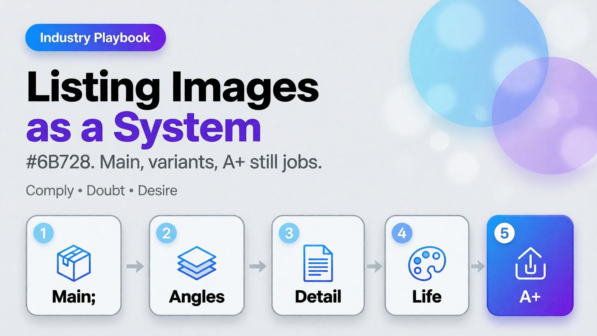
Amazon does not buy your moodboard. It buys slot performance: a compliant main image, a gallery that answers doubts, and A+ stills that explain without breaking catalog rules. Teams that AI-generate “seven pretty heroes” still lose the Buy Box war on clarity.
AI Amazon listing images work when you treat the gallery as a system of jobs — not a folder of vibes.
Key Takeaways
>
– Main image = compliance + recognition. Secondary slots = doubt removal. A+ = story without replacing Truth.
– Listings with richer image sets convert more strongly in large studies (~50% higher with 5+ images vs thinner galleries in Catchlab-cited 2026 roundups).
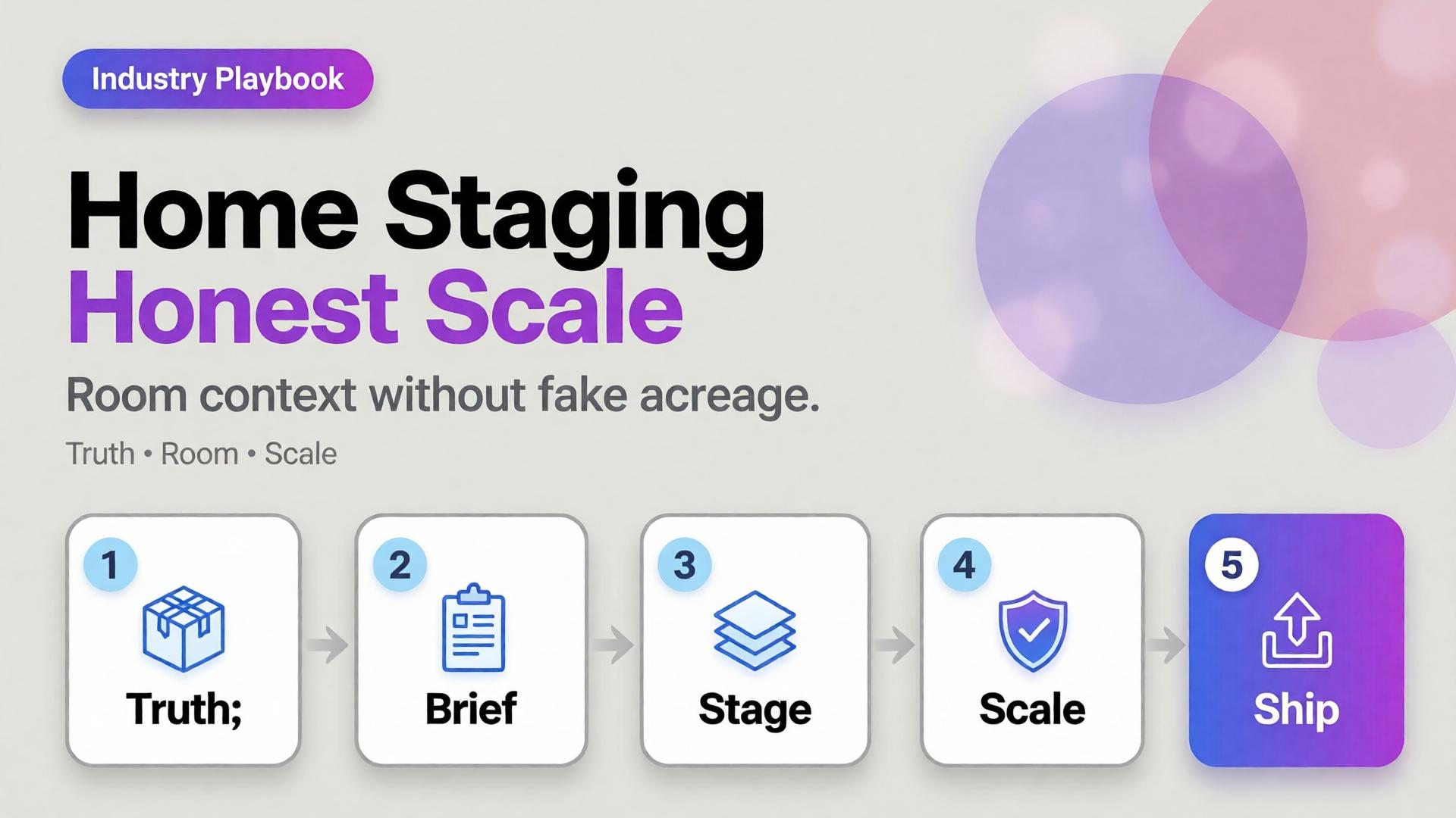
A sofa on pure white tells dimensions badly. A sofa in a cathedral living room tells lies well. Home and furniture ecommerce lives in that tension: buyers need context, but context that invents square footage creates “looked bigger online” returns.
AI home product staging is the discipline of placing SKUs in believable rooms with scale honesty, locked light, and gates — not generating dream interiors that your warehouse cannot ship.
Key Takeaways
>
– White-only home catalogs under-inform; fantasy rooms over-promise. Use dual-layer galleries like visual commerce 2026.
– Stage with known scale anchors (door, outlet, side table) and real product dimensions in the brief.
– Map rooms like beauty maps rituals — a context grid before generate (SCENE).
– Geometry still matters for legs, seams, and hardware (hard goods QA when parts are precise).
Why Does Home Staging Break Trust Online?
Because furniture is purchased as space math.
Staging sin
Buyer consequence
Oversized rooms
“Tiny in real life” returns
Wrong camera height
Proportions feel off
Mixed design eras
Brand looks incoherent
Soft rug hiding feet
Leg style unknown
Invented materials on props
Cart confusion
Lifestyle lift is real in ecommerce image research — but only when lifestyle stays honest.
Home staging is not interior design porn. It is dimensional storytelling: how big, how it sits, how it lives with ordinary walls.
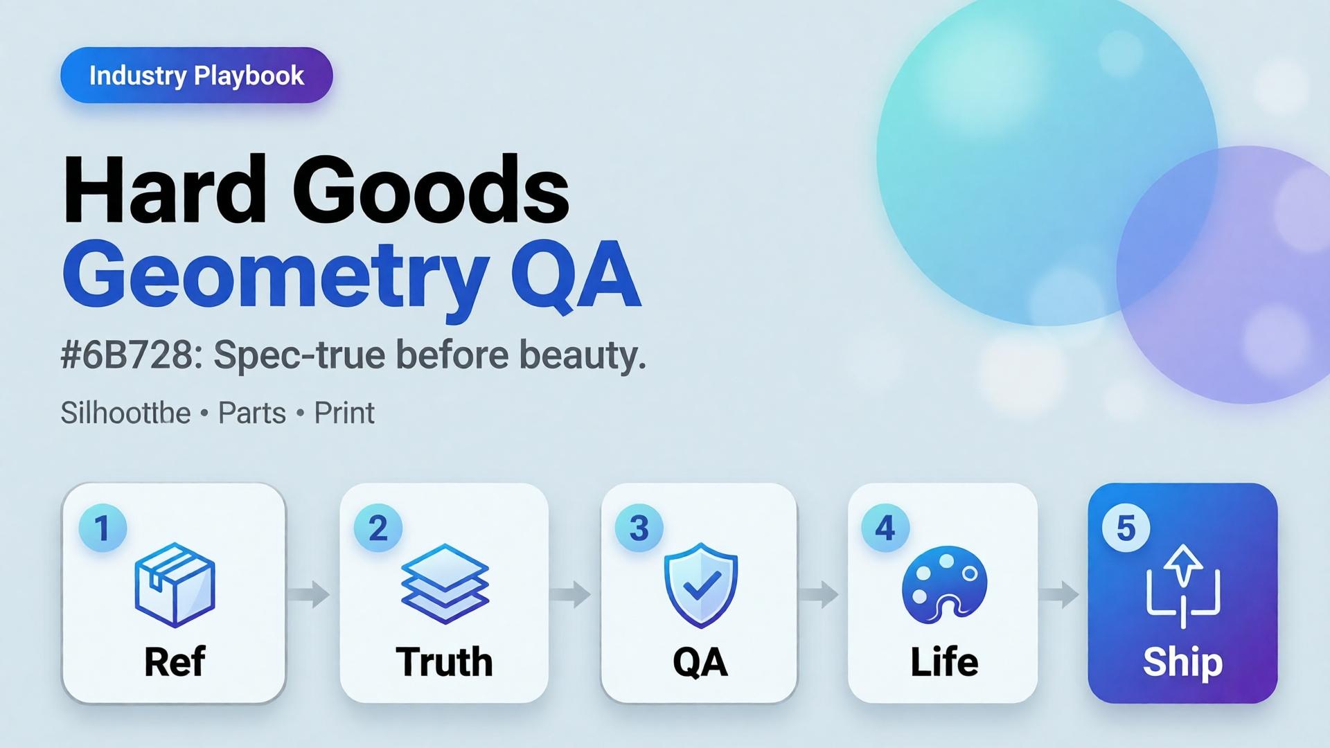
Beauty SKUs forgive a soft edge. Eyewear does not. A millimeter of temple warp, a lens reflection that invents a logo, a button row that gains an extra key — and the listing becomes a liability.
AI hard goods product images fail when teams apply fashion/lifestyle prompting to precision objects. Hard goods need geometry QA as a first-class gate: silhouette, symmetry, ports, hinges, and print — before any lifestyle world.
Key Takeaways
>
– Hard goods are spec products. Buyer trust is dimensional, not only emotional.
– Run a geometry checklist before beauty, upscale, or lifestyle extension (packshot thinking).
– Prefer reference-heavy generation; explore mode is for backgrounds after the object passes (reference vs explore).
– Upscale only after QA (upscale after QA) — sharpening warped hinges makes rejects look confident.
Why Do Lifestyle Prompts Break Hard Goods?
Because soft prompts optimize for vibe. Hard goods optimize for match-to-unboxing.
Soft-goods bias
Hard-goods reality
Fabric drape can vary
Hinge angle cannot
Skin tone mood
Port count is binary
“Premium glow”
Specular lies on lenses/metal
Approximate logo
Exact wordmark + icon
Eyewear, watches, earbuds, keyboards, tools, and small appliances sit on the hard side of that table.
For hard goods, the hero image is a contract drawing with light — not a moodboard with a product stuck on top.
Geometry QA Checklist (Pass Before Beauty)
Silhouette
Outer shape matches reference
No melted corners, no missing tips (eyewear temples)
Symmetry / alignment
Left-right balance on glasses, buds, paired objects
Button grids aligned
Functional parts
Ports, hinges, switches, screws present and correct in count
No “extra USB” hallucinations
Optics / materials
Lens transparency plausible (no opaque glass unless product is)
Metal vs plastic read correct
Print / icons
Logos and iconography correct — or intentionally out of frame
Fail any row → reject. Do not lifestyle it “to hide the error.”
Playbook: Spec-True Then Scroll-Stopping
Capture honest refs — front, 45°, detail of hinge/port
For ads, keep scene jobs — but Truth frames carry the SKU.
Category Notes
Category
Extra risk
Extra gate
Eyewear
Lens reflections invent logos
Check both lenses
Earbuds / wearables
Stem length drift
Side-by-side with ref
Keyboards / controllers
Key count / layout
Count visible keys
Small appliances
Cable / button myths
Detail crop of controls
Soft CTA
Build spec-true packshots before campaign worlds: Packshot · Ecommerce
Frequently Asked Questions
What counts as hard goods for AI product images?
Products where dimensional accuracy and part count matter to purchase and returns — eyewear, electronics, tools, precision accessories.
Can I still use lifestyle scenes?
Yes — after the object passes geometry QA. Lifestyle is extension, not repair.
Should I use a different AI model for hard goods?
Choose for fidelity bottleneck after direction — not because the category is trendy. See model-after-direction guidance.
How many reference angles do I need?
At least front + 45° + one detail of the failure-prone part (hinge, port, lens).
Conclusion
Hard goods do not need softer prompts. They need harder gates.
Geometry first. Beauty second. Lifestyle third. Upscale last. That is how AI hard goods product images survive zoom, returns, and marketplace scrutiny.
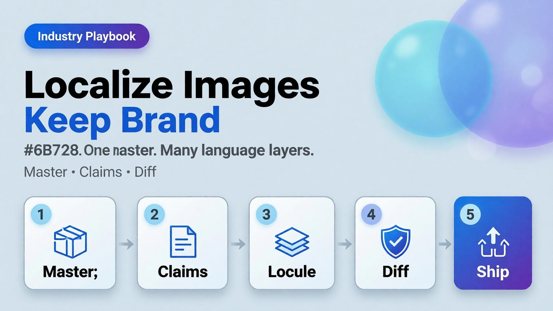
You launch in one language. Then marketplace ops asks for EN, VI, TH, and ID versions of the same banner by Friday. Someone regenerates the whole scene four times. The bottle changes shape. The light shifts. The brand kit quietly dies.
AI ecommerce image localization is not “translate and pray.” It is a production rule: one visual master, many language layers — with gates that protect SKU truth and brand identity across borders.
Key Takeaways
>
– Rebuild-per-language is how catalogs fracture. Localize text and claims, not the entire world, unless the market truly needs a new scene.
– High-quality product imagery remains a conversion lever in 2026 roundups (Salsify-cited lifts vs weak photos); localization must not destroy that quality (Lumepixa, 2026).
– Treat localization as a node after Brand Style + Generate — never as a fresh creative brief.
– Legal claims, units, and badge rules are market-specific gates — not prompt adjectives.
Why Do Per-Language Regenerations Break Brands?
Because generation optimizes for a new pretty frame, not for identity continuity.
Rebuild-per-language
Master + localize
New light each market
Same light family
Label drift risk × N
One Truth gate
Four art directions
One kit
Slow QA
Diff-check text regions
Cross-border teams do not need more models. They need batch thinking applied to locales.
Localization fails when teams translate campaign vibes instead of translating claims. Vibes can stay global. Claims must go local.
What Should Stay Global vs Go Local?
Keep global (master layer)
Product geometry and packshot truth
Brand palette and light logic
Scene world / lifestyle context (unless culturally wrong)
Character identity if a face is used
Localize deliberately
In-image headlines and CTAs
Promotional badges and price callouts
Measurement units and regulatory lines
Marketplace-required disclaimers
Redesign only when required
Cultural taboo in scene
Model casting rules by market
Category compliance that forbids the original composition
If you redesign every time, you do not have a localization system. You have N brands.
Playbook: Master → Locale Pack
Step 1 — Ship a language-agnostic master
Prefer compositions with clear text safe zones (marketplace banner thinking). Avoid burning essential claims into tiny packaging type you cannot legally alter.
Step 2 — Extract a claim sheet per market
Field
EN
VI
Notes
Hook line
…
…
Char limit
Offer badge
…
…
Color locked
Unit line
oz
ml
Compliance
Disclaimer
…
…
Legal review
Step 3 — Localize as a gated node
Input: approved master + claim sheet. Output: locale variants. Gate: geometry unchanged, brand kit intact, text correct, no new product.
Step 4 — Diff review, not vibes review
Flip EN ↔ VI on the same crop. If the bottle moved, reject — even if Vietnamese typography looks nicer.
Step 5 — Archive locale packs with the kit
Next drop swaps SKU refs, reuses locale claim templates. That is how cross-border catalogs scale.
Where AI Helps — and Where It Lies
Helps: rapid text replacement in safe zones, layout fitting, bulk varianting after master lock.
Lies: rewriting packaging legal text “to look native,” inventing certificates, changing ingredient panels, or “improving” the product silhouette while translating.
Packshot honesty still applies (packshot thinking). A localized ad that misrepresents the SKU creates returns in every language.
It is the practice of adapting in-image text and market claims on a locked visual master so catalogs stay consistent across languages and marketplaces.
Should every market get a unique lifestyle scene?
Only when culture or compliance demands it. Default to one world, many language layers.
Can AI translate text printed on the product package?
Treat package print as high risk. Prefer accurate photography of the real SKU for Truth frames; localize marketing overlays separately.
How do I QA localized images quickly?
Side-by-side diff against the master. Check geometry first, typography second, claim accuracy third.
Where does this sit in a workflow builder?
After Generate and before Upscale/Crop variants — localization should not invent a new product.
Conclusion
Cross-border growth should multiply locales, not multiply identities.
Lock a master. Write claim sheets. Localize as a node. Diff-check like a skeptic. Keep the bottle the same bottle.
That is AI ecommerce image localization that scales — without quietly founding a new brand in every language.
The listing looks soft on mobile zoom. Someone drops the file into an upscaler. Edges crisp. The logo grows new serifs. A seam appears that the product does not have. The marketplace still rejects the crop — or worse, accepts it and returns spike later.
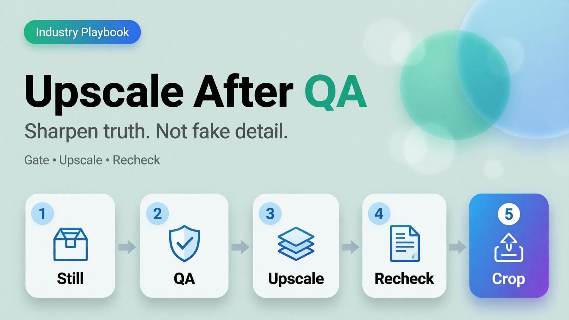
AI product image upscale is not a magic “make HD” button. It is the Upscale node in a workflow: sharpen only what already passed geometry and label QA.
Key Takeaways
>
– Upscale amplifies truth and lies equally. QA before sharpen.
– Products with high-quality photos convert far better than weak imagery in 2026 roundups (Salsify-cited ~94% lift vs low-quality) — but “sharp fakes” are not high quality (Lumepixa, 2026).
– Place Upscale after Generate gates in node thinking — never as forgiveness for a bad reference.
– Marketplace min resolution is a delivery constraint, not a creative strategy.
Why Do Teams Upscale Too Early?
Because resolution is measurable and fidelity is judgment.
Early upscale habit
What actually happens
Soft phone photo → 4K
Soft lies become sharp lies
Rejected AI still → upscale
Warped type becomes confident warped type
Every crop upscaled
Hours spent polishing variants that should die
Upscale instead of reshoot/ref
Reference problem becomes production debt
Phone-to-campaign discipline still starts with a usable reference (workflow mindset). Upscale cannot invent a better capture — only a bolder one.
Marketplace buyers do not reward megapixels. They reward zoom that still matches the unboxing. Upscale without QA is how you fail that contract in high resolution.
The QA Gate Before Upscale
Run this checklist on the winner still only:
Geometry
Silhouette matches physical SKU
No melted corners, stretched labels, floating caps
Typography / print
Brand wordmarks readable and correct
No invented ingredients, seals, or stars
Material
Fabric / plastic / glass reads plausible
No “plastic skin” or fake micro-contrast
Compliance
Background rules for the target marketplace
Required margins for the crop job
Fail any row → regenerate or recapture. Do not upscale.
TikTok Shop does not reward “pretty product on marble.” It rewards readable intent in the first second — then enough truth that a tap does not feel like a trap.
Most AI ecommerce batches fail here: every frame is a vague lifestyle. The hook looks like the demo. The demo looks like the offer. The offer looks like stock. Buyers scroll. You regenerate. Nothing compounds.
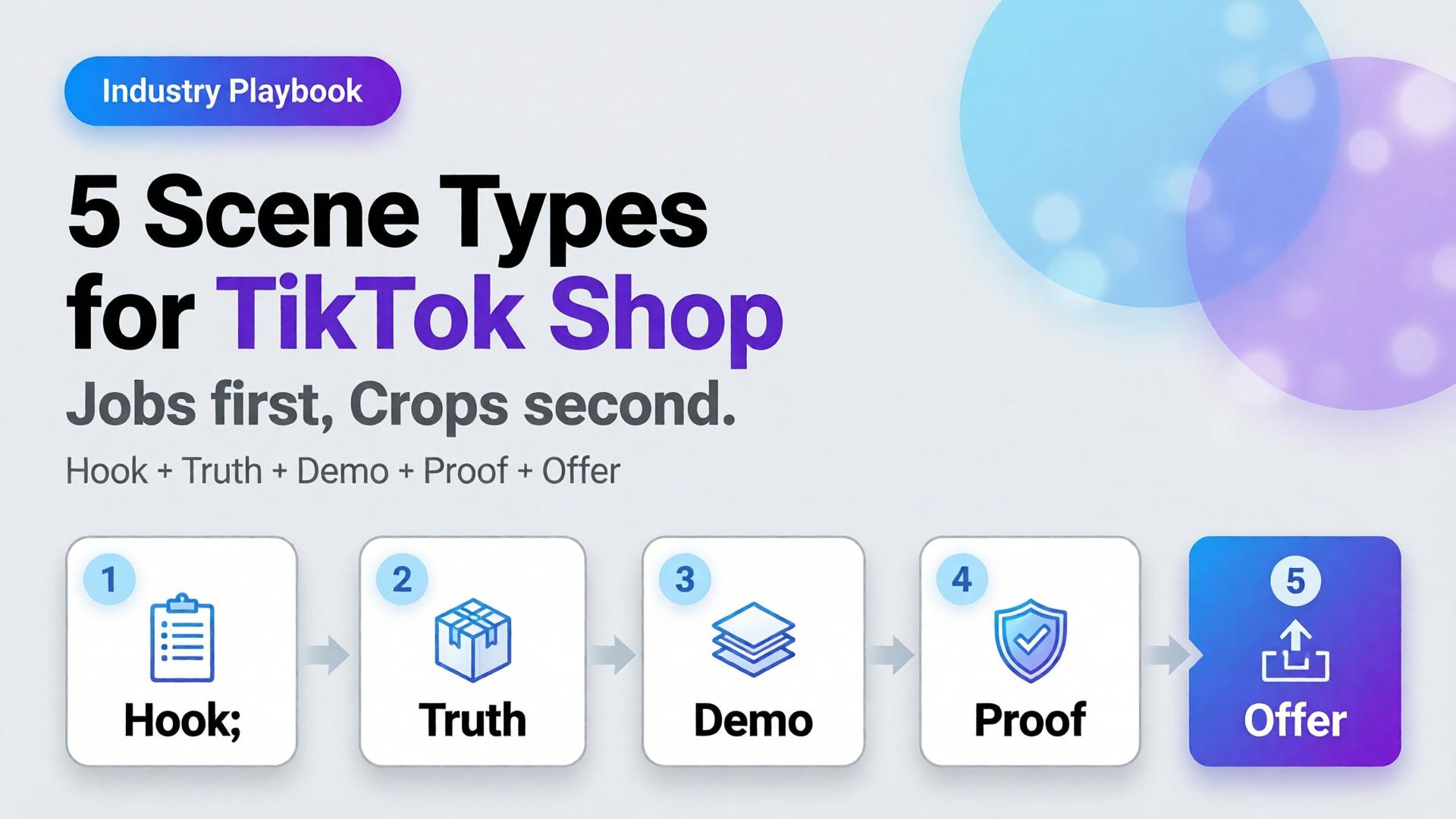
AI TikTok Shop product images work when you cast scenes by job, not by aesthetic. Five scene types cover almost every SKU drop: hook, truth, demo, proof, offer.
Key Takeaways
>
– Treat TikTok Shop creative as a scene system, not a single hero crop.
– Listings and ads with richer visual coverage convert more strongly — large listing studies show 5+ images correlating with ~50% higher conversion versus thin galleries (Catchlab via 2026 image stats roundups).
– High-quality product photography still shows outsized lifts versus weak imagery in Salsify-cited analyses (~94% better conversion vs low-quality photos in 2026 roundups).
– Pair scene types with ratio families (1:1, 4:5, 9:16) — scene job first, crop second.
Images assigned to clear jobs — hook, truth, demo, proof, offer — with locked product fidelity and consistent brand kit across ratios.
Do I need video if I have strong still scene types?
Stills still matter for Shop cards, carousels, and ads. Video helps demo and hook; it does not replace Truth and Proof frames.
How many scenes should I generate per SKU?
Start with one winner per type (five). Expand variants only after the five jobs pass a set review.
Is this the same as marketplace banner thinking?
Banner thinking solves ratios. Scene types solve narrative jobs. You need both: job first, then crop.
Can AI lifestyle replace packshots on TikTok Shop?
No. Lifestyle without Truth increases returns and distrust. Keep a truth layer even when the hook is cinematic.
What is the biggest AI mistake on TikTok Shop creatives?
Generating twelve “nice” lifestyles with no demo verb and no label-true hero — volume without jobs.
Conclusion
TikTok Shop does not buy your moodboard. It buys scenes that do jobs.
Hook to earn the pause. Truth to earn trust. Demo to earn understanding. Proof to remove fear. Offer to invite the tap. Crop each winner into the ratios the channel demands.
That is how AI TikTok Shop product images stop looking like stock — and start behaving like a sales system.
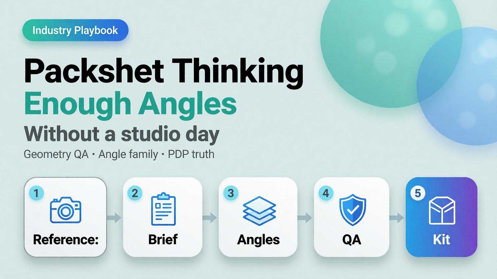
Editorial cover for Packshot Thinking: Enough Angles without a studio day
Most ecommerce teams still treat a packshot as a single file: product centered, white background, “good enough for the listing.” Then returns spike because buyers never saw the hinge, the texture, or the size relative to a hand. The problem was never the camera. The problem was packshot thinking — treating product photography as one pretty frame instead of a system of angles that answers buyer questions.
AI packshot work in 2026 is not “make the bottle prettier.” It is: from one honest reference, produce enough commercial angles that a stranger on a phone can decide without calling support.
Key Takeaways
A packshot is a question-answering set, not a hero beauty shot. Front, 45°, detail, scale, and packaging are different jobs.
Adobe’s 2026 Creators’ Toolkit Report found 57% of creative AI outputs still need moderate or extensive editing before publish — packshot QA fails for the same reason: geometry and label fidelity, not “vibe.”
Studio days buy control. Packshot thinking buys coverage: enough angles to list, retarget, and reuse without booking another shoot.
Orauria’s Packshot Studio and Ecommerce solutions are built for this job — reference in, angle family out — inside one creative workspace.
If you have already read AI Ecommerce Design Is Not AI Image, this post is the product-layer version of that idea. Ecommerce design is the system. Packshot thinking is how the SKU itself survives marketplace scrutiny.
What Is Packshot Thinking?
Packshot thinking means you plan product images the way a merchandiser plans a shelf talker: every frame must close a doubt.
Angle
Buyer question it answers
Fail mode if missing
Front hero
What is this product?
Listing looks empty or “stock”
45° / 3/4
What is the form in space?
Flat, toy-like, hard to trust
Detail / macro
What is the material / print / finish?
“Looks cheap online” returns
Scale
How big is it?
Size shock after delivery
Packaging / in-box
What arrives?
Unboxing disappointment
Lifestyle bridge(optional)
Where does it live?
Cold catalog, weak ads
White-background front shots are not “dead” — they are incomplete. Visual Commerce 2026 argued that white-only feeds underperform when every competitor ships context. Packshot thinking agrees — and adds a rule: lifestyle does not replace geometry. You still need the honest product block.
A studio day gives you control. Packshot thinking gives you coverage. Coverage is what marketplaces and media buyers actually buy.
Why Do Teams Still Book Studio Days for Simple SKUs?
Three reasons — all rational, all incomplete.
1. Fear of label drift. AI that “improves” a bottle often invents typography. Media buyers then reject the export because the listing hero and the ad disagree. The fix is not “never use AI.” The fix is reference-first packshots with a QA checklist that scores geometry before beauty.
2. Habit of one hero. Designers deliver one approved beauty shot. Marketing asks for six crops Friday afternoon. Nobody owned the angle family. From Phone Photo to Campaign names this as a workflow failure, not a photography failure.
3. Confusion between packshot and campaign. Campaign images sell aspiration. Packshots sell truth. Mixing the briefs produces images that are neither listable nor scroll-stopping.
Adobe’s 2025–2026 creator surveys show most teams already juggle more than one creative AI tool in a quarter. That sprawl is exactly what packshot thinking tries to prevent: one reference, one brand kit, one angle plan — then generate.
How Many Angles Are “Enough”?
Enough is not a fixed number. Enough is coverage of buyer doubt for that category.
Category
Minimum useful set
Notes
Supplements / beauty bottles
Front + 45° + label detail + scale
Label fidelity is the QA bottleneck
Electronics / gadgets
Front + ports/detail + in-hand scale + packaging
Ports and buttons must stay readable
Apparel accessories
Front + texture + on-model or flat scale
Texture sells more than logo
Home / hard goods
Front + 45° + material detail + room bridge
Staging is secondary to form
If you only ship one angle, you are optimizing for the photographer’s portfolio — not the PDP.
How to Build a Packshot Angle Family with AI
This is a thinking workflow, not a button tour. Use any capable image model inside Orauria Studio; the discipline matters more than the model name.
Step 1 — Lock the reference, not the vibe
Upload a clean product photo: label facing camera, product centered, minimum ~1000×1000 px if you can. Phone photos work as references if focus holds on the label — see the phone-to-campaign mindset post.
Write what must not change: bottle height, cap color, logo placement, material finish. That list is your Brand Style guardrail, not a moodboard.
Step 2 — Write the angle brief before prompts
Borrow the SCENE method only for lifestyle bridges. For pure packshots, write a shorter table:
Angle name
Buyer question
Background rule (white / soft gray / none)
Crop rule (full product vs detail)
Do not invent scene poetry until the front and 45° pass QA.
Step 3 — Generate the geometry set first
Produce front and 45° before lifestyle. Score each export on:
Does the SKU still read as the SKU?
Is type on the label still legible at phone width?
Do proportions match the reference (no “stretched bottle”)?
If an export fails geometry, regenerate. Do not “fix in Photoshop for an hour” and pretend the system worked.
Step 4 — Add detail, scale, then optional lifestyle
Detail and scale close returns. Lifestyle bridges feed ads and social. Keep them in that order so campaign beauty never overwrites listing truth.
Step 5 — Publish the family into a reusable kit
Store approved angles with the SKU ID. When batch thinking across 100 SKUs starts, you reuse the angle plan — not reinvent prompts per product.
For the productized path — shot planner plus studio generation — see Orauria’s AI Packshot landing and the broader ecommerce hub.
Packshot QA Checklist (Traffic-Ready)
Use this before anything leaves the folder:
[ ] Front hero matches listing color and silhouette
[ ] 45° does not invent new branding
[ ] Detail crop shows real texture / print / seam
[ ] Scale cue is honest (hand, coin, known object — or stated dimensions in copy)
[ ] No burned-in promo text unless the ad brief requires it
[ ] All angles feel like one SKU, not three product lines
Adobe’s finding that 57% of AI creative still needs editing before publish is not a reason to avoid AI. It is a reason to budget QA as part of packshot thinking.
How Does Packshot Thinking Connect to Ads and Marketplaces?
Packshots feed three surfaces:
Marketplace PDPs — geometry and trust
Prospecting statics — same product block, new scenes and ratios
Workflow reuse — nodes that cut, upscale, and re-crop without re-shooting
The next post in this cluster — One Product → Feed, Story, Cover — covers ratio families for Meta, TikTok, and marketplace banners. Packshot thinking is the source of truth. Banner thinking is the channel adaptation.
Inside Orauria, that handoff lives in one workspace: Packshot for angles, Banner Ads / marketplace tools for sizes, Workflow for cleanup — instead of exporting to three vendors and losing brand coherence.
Frequently Asked Questions
Is an AI packshot good enough for Amazon or Shopee listings?
It can be — if geometry and label fidelity pass human QA. Marketplaces punish misleading imagery. Treat AI as a production system for angles, not a license to invent product features.
Should lifestyle images replace white-background packshots?
No. Lifestyle answers context; packshots answer form. Strong catalogs use both. See Visual Commerce 2026.
What if I only have a messy phone photo?
Start with phone-to-campaign workflow mindset. Clean the reference enough that the label is readable, then build the angle family. Do not expect a blurry label to become sharp legal type.
Which AI image model is best for packshots?
The model that holds product geometry under your QA checklist. Choose the model after the angle brief — not before. That decision framework is covered in Choose the Image Model After Creative Direction.
How is this different from a full studio day?
A studio day maximizes control for hero campaigns. Packshot thinking maximizes coverage and reuse for catalogs and weekly ads. Many teams need both — just not for every SKU every week.
Soft next step
If your bottleneck is “we never have enough angles,” open Orauria Packshot and plan the angle family before you chase another model trend. For the full ecommerce loop — listing through social reuse — start at solutions/ecommerce.