Category: Industry Playbooks

Applied AI creative thinking per industry — fashion, beauty, F&B, ecommerce, and creator workflows.

  • From Shelf Photo to Hero Shot: F&B Creative Direction with AI

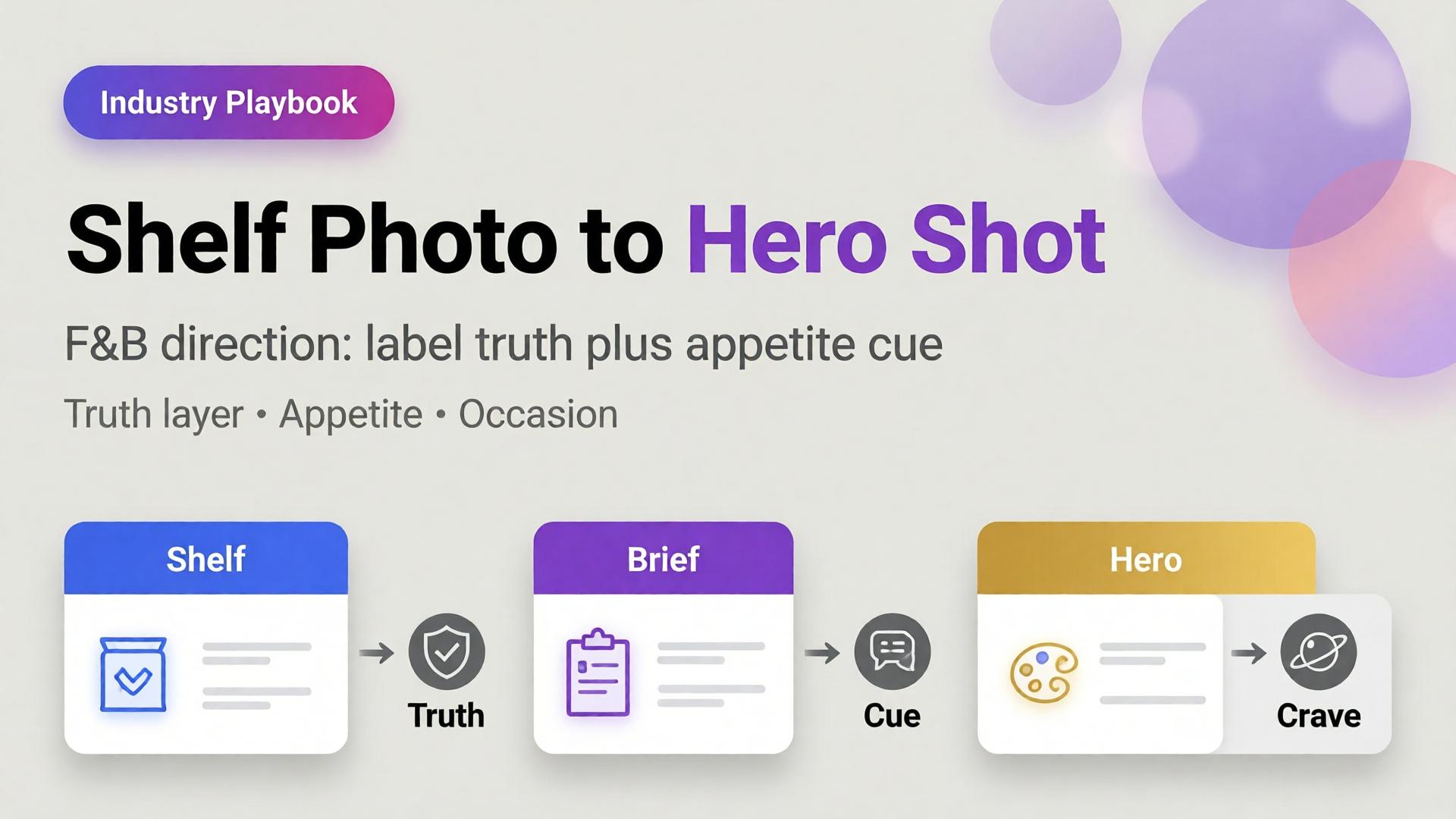
    From Shelf Photo to Hero Shot: F&B Creative Direction with AI

    The photo starts on a phone, under fluorescent aisle light, next to three competing labels. By Friday someone asks for a “hero shot” for the PDP and a lifestyle scene for ads. The team pastes the shelf photo into an AI tool and prompts make it professional food photography. What comes back looks expensive — and wrong. Condensation in the wrong place. A label that almost matches. Steam that belongs to another dish.

    AI food product photography does not fail because shelf photos are low quality. It fails because teams skip creative direction: what job the hero must do, which appetite cues are non-negotiable, and which truths the label must keep.

    Key Takeaways

    >

    – Shelf photos are reference truth, not final creative. Treat them as geometry + label fidelity inputs.

    – Products with high-quality photos convert dramatically better than weak imagery — Salsify analysis cited across 2026 roundups puts the lift near 94% versus low-quality photos (Lumepixa / Salsify, 2026).

    – Listings with 5+ images show about 50% higher conversion than thinner galleries in large listing studies (Catchlab, via 2026 image stats roundups).

    – F&B heroes need a dual layer: compliance/clarity + appetite scene. White-only catalogs leave money on the table; fantasy-only heroes break trust.

    This is the F&B sibling of Lifestyle Context Mapping for Beauty. Parent frame: AI Ecommerce Design Is Not AI Image. Packshot discipline: Packshot Thinking.

    Why Do Shelf Photos Fail as Heroes?

    A shelf photo answers one question: what is on the shelf?

    A hero shot answers another: why should I crave this now?

    Shelf photo job Hero shot job
    Identify SKU Create appetite
    Show real packaging Stage desire + truth
    Survive fluorescent light Sell a moment
    Capture available angles Own the PDP first impression

    AI that “beautifies” without a brief usually invents a third job: look like stock food. That third job converts poorly because it belongs to no brand and no meal occasion.

    In F&B, the hero is not a prettier packshot. It is a negotiated truth: label fidelity plus appetite fiction that the product can still keep.

    What Creative Direction Does F&B Need Before AI?

    Borrow SCENE, then specialize:

    SCENE part F&B translation Example
    Story Meal occasion Weeknight reset, weekend brunch, post-gym
    Context Surface + vessel Ceramic bowl, iced glass, picnic board
    Emotion Appetite cue Crunch, melt, chill, steam, pour
    Narrative PDP role Hero, ingredient proof, serve suggestion
    Extension Channel crop 1:1 feed, 9:16 Story, wide banner

    Write this before generation. The shelf photo becomes the SKU reference. The SCENE brief becomes the world.

    The Dual-Layer F&B Gallery

    F&B teams that win online run two layers — same logic as visual commerce 2026:

    Layer A — Truth / compliance

    • Front label readable
    • Color true to SKU
    • Cap, seal, and fill level honest
    • Marketplace-safe background when required

    Layer B — Appetite / conversion

    • Condensation, pour, steam, crumb, melt — only if true to product physics
    • Hand or utensil for scale
    • Plating that matches the real serve
    • Light that matches the occasion (morning juice ≠ late-night chocolate)

    Lifestyle additions commonly lift conversion in the 15–30% range over packshot-only layouts in industry A/B aggregates (2025–2026 ecommerce photography roundups). F&B is especially sensitive because appetite is emotional and returns are visual — items that “look different in person” remain a top return driver across categories.

    From Phone Shelf Photo to Hero: A 7-Step Playbook

    1. Shoot for reference, not Instagram

    Straight-on label. Avoid heavy tilt. Include one 3/4 if the package has depth. Capture the barcode side only if needed for ops — not for the hero.

    2. Write the non-negotiable label truths

    Logo lockup, flavor name, regulatory marks, claim badges. If AI rewrites a word, the asset is dead for marketplaces.

    3. Choose one appetite cue

    Not five. Pick pour, steam, bite, condensation, or plating. Multiple cues usually look like a food-magazine collage.

    4. Lock light logic

    Cold drinks: cooler key, specular highlights. Bakery: warmer key, soft shadow. Spicy / savory: deeper contrast. Changing light mid-batch is how catalogs look like three restaurants.

    5. Generate heroes from reference + brief

    Use the shelf photo as product lock. Use the SCENE brief as world lock. If the model invents a new label, reject — do not “fix in Photoshop later” as a habit.

    6. Build the five-image minimum

    Catchlab-style listing research consistently favors richer galleries. A practical F&B set:

    1. Clarity hero (truth)
    2. Appetite hero (desire)
    3. Serve / pour moment
    4. Ingredient or texture macro
    5. Lifestyle or table context

    7. Channel-adapt before you regenerate

    Crop the approved hero into Story and banner jobs. Regeneration is for new angles — not new identities of the same bottle. Same mindset as phone-to-campaign workflow.

    What Must Never Drift in AI Food Imagery?

    Element Why it matters Fail signal
    Label typography Legal + brand Misspellings, melted letters
    Package geometry Recognition Warped bottle / can proportions
    Fill level / contents Trust Soup that looks empty; chips that look inflated
    Allergen / claim badges Compliance Missing or invented marks
    Food physics Appetite credibility Steam on iced drinks; melt on shelf-stable

    Studio food photography still costs hundreds per SKU once styling and retouching enter the quote; AI compresses unit cost when direction is clear — industry writeups in 2026 routinely cite 60–80% cost reductions versus traditional shoots for catalog-scale work. Cost only helps if rejected assets stay rejected.

    Occasion Mapping for F&B (Beauty’s Sister Grid)

    Beauty maps rituals. F&B maps occasions:

    Occasion Hero cue Avoid
    Breakfast Soft daylight, simple plate Nightlife bokeh
    Desk lunch Compact, clean, portable Banquet excess
    Dinner share Family board, steam Clinical white only
    Gym / recovery Condensation, citrus, motion Heavy garnish clutter
    Gift / premium Material, ribbon, quiet luxury Street-food grit

    Map 4–6 occasions for the brand, not per SKU. Then swap the product reference through the same worlds — batch thinking for catalogs that keep growing.

    When Should You Still Book a Real Food Shoot?

    AI direction wins for:

    • Catalog scale and seasonal flavor swaps
    • Channel crops and ad variants
    • Background / lifestyle exploration after label lock

    Real shoots still win for:

    • Flagship hero campaigns where texture is the product (artisanal crumb, fresh seafood sheen)
    • Regulatory edge cases and packaging redesign launches
    • Hero SKUs where returns risk is extreme if appetite oversells

    Hybrid is the default mature strategy — not ideology.

    Soft CTA

    Turn shelf references into directed packshots and heroes inside one workflow: Orauria Packshot · Studio Guide

    Frequently Asked Questions

    Can AI turn a phone shelf photo into a marketplace-ready hero?

    Yes — if label truth is locked and the brief defines the hero job. Without those, AI produces pretty stock that fails compliance or trust.

    How many images should an F&B PDP show?

    Aim for at least five: clarity, appetite, serve, texture, context. Richer galleries correlate with stronger conversion in large listing studies.

    What is the biggest AI mistake in food photography?

    Inventing appetite cues the product cannot keep — fake steam, impossible melt, or garnishes that imply a different recipe.

    Should every F&B SKU get a lifestyle scene?

    Every hero SKU should. Long-tail SKUs can inherit occasion templates with swapped references once the brand kit is locked.

    How is F&B different from beauty context mapping?

    Beauty maps daily rituals on the same face/body. F&B maps meal occasions and food physics. Both need a grid before generation; the rows differ.

    Do I need white-background shots for food marketplaces?

    Often yes for the main image. Treat white as Layer A. Appetite scenes belong in secondary slots and ads — not as a replacement for truth.

    Conclusion

    Shelf photos are not the enemy. Undirected AI is.

    Write the occasion. Lock the label. Pick one appetite cue. Build dual-layer galleries. Adapt approved heroes before you regenerate. Reject physics lies even when they look delicious.

    AI food product photography becomes a growth system when creative direction arrives before the model — not after the disappointment.


    References

    1. Lumepixa, AI Product Photography Statistics 2026 (citing Salsify / Business Dasher; Catchlab listing study). https://lumepixa.app/blog/ai-product-photography-statistics
    2. Lumepixa, Product Image Statistics 2026. https://lumepixa.app/blog/ecommerce-product-image-statistics
    3. Adobe, 2026 Creators’ Toolkit Report, June 16, 2026. https://news.adobe.com/news/2026/06/creators-toolkit-report-2026
  • Creator Playbook: Narrative Systems, Not One-Off Posts

    Creator Playbook: Narrative Systems, Not One-Off Posts

    Most creator burnout with AI is not about tools. It is about starting from zero every post.

    New hook. New face almost. New lighting world. New caption energy. The algorithm may reward the spike. The audience cannot form a memory. You become a content lottery — occasionally brilliant, never cumulative.

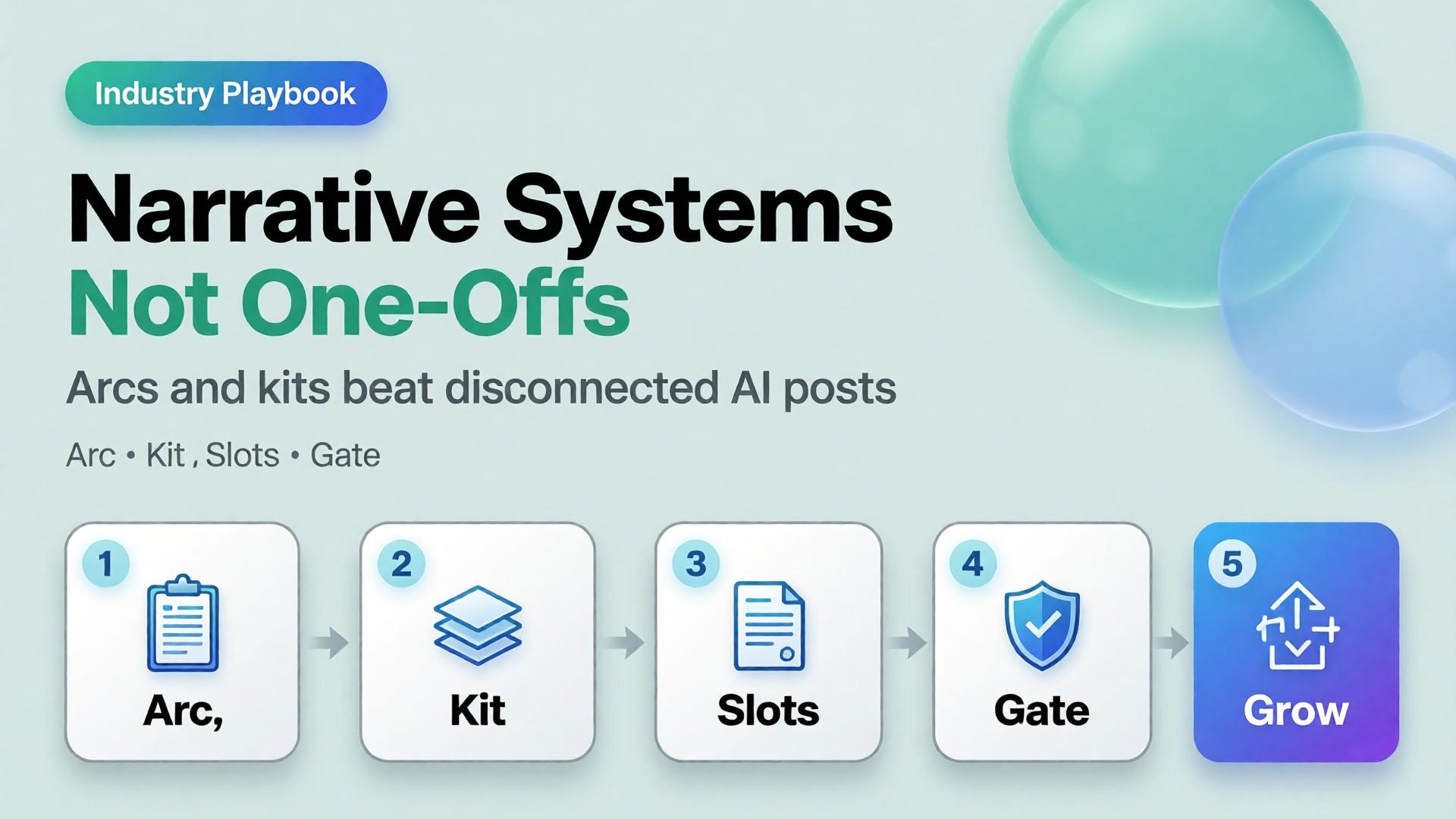
    An AI content creator workflow that scales is a narrative system: a small set of arcs, a locked character/world kit, format slots that repeat, and weekly gates that protect coherence. One-off posts are expenses. Narrative systems are assets.

    Key Takeaways

    >

    – Buffer’s 26-week study of 100K+ users found creators who posted in 20+ weeks saw about 450% more engagement per post than those who posted in four weeks or fewer (Buffer, 2025–2026).

    – Consistency compounds more than heroic volume. Moving from sporadic to a steady weekly rhythm is the steepest gain curve.

    – A narrative system has four parts: arc, character/world kit, format slots, curator gate.

    – AI accelerates production inside the system. Without the system, AI accelerates sameness and drift.

    This playbook sits with Face Consistency Is Character Design and The 3-Line Brief. Freelancers serving multiple brands can map the same spine across clients — see One Workflow Template for Five Clients.

    Why Do One-Off AI Posts Feel Busy but Flat?

    Because each upload asks the audience to re-learn who you are.

    One-off habit Narrative system habit
    New world every post Recurring worlds
    New face energy Locked character kit
    Hook without sequel Arcs with episodes
    Random formats Slot map
    Publish then forget Weekly set review

    Buffer’s consistency research is blunt: showing up across weeks beats rare spikes. Creators who posted consistently for 5–19 weeks still earned about 3.4× more engagement per post than the least consistent group. AI does not change that math. It only makes it easier to produce volume that still fails to compound.

    Algorithms distribute posts. Audiences distribute memory. Narrative systems optimize for memory; one-offs optimize for the next upload anxiety.

    What Is a Narrative System for Creators?

    A narrative system is a reusable production architecture:

    1. Arc — the story season (4–8 weeks)
    2. Kit — character, palette, light, product rules
    3. Slots — repeating format jobs (feed, Story, Reel, banner…)
    4. Gate — who can reject “pretty but off-brand”

    It is SCENE at calendar scale. Each episode gets a brief. The season gets a bible.

    Build the Arc Before the Prompt

    Pick one season thesis (one sentence)

    Examples:

    • 30 days of desk-lunch upgrades for busy founders
    • One outfit, eight lives — wardrobe as world-building
    • From shelf photo to craving — F&B education for DTC buyers

    If you cannot say the thesis without commas, you have three arcs pretending to be one.

    Define episode types (not topics)

    Episode type Job Cadence
    Hook New viewer entry 1–2× / week
    Proof Trust / demo 1× / week
    Depth Save / share 1× / week
    Soft CTA Convert 1× / week
    Community Reply / stitch fuel ongoing

    Topics rotate inside types. Types stay stable. That is how an AI content creator workflow stays recognizable when tools change.

    The Kit: What Must Repeat So Stories Can Change

    Without a kit, every episode renegotiates identity — the brand consistency trap in creator form.

    Minimum kit:

    • Character anchors (if a face appears) — see face consistency playbook
    • Palette + light logic
    • Three recurring locations / sets
    • Product handling rules
    • Caption voice (sentence length, POV, CTA style)

    Adobe’s 2026 Creators’ Toolkit Report found 57% of creators still edit AI outputs moderately or extensively before publish. Editing inside a kit is craft. Editing without a kit is damage control.

    Format Slots: Produce Once, Ship Many

    Do not invent a new production for every ratio. Assign jobs:

    Slot Ratio Narrative job
    Feed 1:1 or 4:5 Episode poster
    Story 9:16 Behind-the-arc / poll
    Reel 9:16 Motion beat of the episode
    Carousel multi Proof sequence
    Banner / email wide Season reminder
    Marketplace / store compliance + brand Always-on identity

    This is the creator version of marketplace banner thinking — one master, many jobs — not twelve unrelated renders.

    Weekly Operating Rhythm

    A sustainable default for most creators in 2026 is not “post until collapse.” Buffer and industry frequency guides cluster meaningful gains around steady weekly presence, with many teams landing near 3–5 posts/week as a quality-safe band depending on platform.

    Example week inside a narrative system

    Day System action Output
    Mon Arc check + 3-line briefs 4 episode briefs
    Tue Generate masters in one kit 6–10 frames
    Wed Adapt slots (crop/extend) Feed + Story + Reel covers
    Thu Curator gate Kill drift / keep winners
    Fri Publish + reply block Posts + community
    Sun Set review + archive Update kit with winners

    Notice what is missing: “open AI and hope.” Hope is not a workflow stage.

    How AI Fits Without Taking Over the Story

    Use AI for:

    • Variant volume inside a locked kit
    • Format adaptation
    • Background / set exploration before lock
    • First drafts of captions you will voice-edit

    Do not use AI for:

    • Replacing the season thesis
    • Recasting your face every episode
    • Inventing a new brand world mid-arc
    • Publishing without a set review

    Model choice comes after direction — same rule as choose the image model after creative direction.

    Soft CTA

    Design narrative systems as workflows, not vibes: Orauria Workflow · Gallery

    Frequently Asked Questions

    What is an AI content creator workflow?

    It is a repeatable system for planning, generating, adapting, and publishing creator content with AI — built around arcs and kits, not isolated prompts.

    How is a narrative system different from a content calendar?

    A calendar schedules dates. A narrative system defines what must stay the same so scheduled posts accumulate meaning. You need both; calendar without system is a to-do list.

    How long should a creator arc run?

    Four to eight weeks is a practical season. Shorter arcs rarely compound. Longer arcs need mid-season kit reviews to prevent drift.

    Do I need to post every day?

    No. Buffer’s data emphasizes consistent weeks over extreme daily volume. A sustainable rhythm you can keep beats a heroic week you abandon.

    Can freelancers use narrative systems for clients?

    Yes — keep the system spine fixed and swap kits per client. That is the core of multi-client workflow templates.

    What kills narrative systems fastest?

    Publishing exceptions without updating the bible — “just this one off-brand Reel.” Exceptions become the new default in two weeks.

    Conclusion

    One-off AI posts spend attention. Narrative systems invest it.

    Write a season thesis. Lock a kit. Define episode types. Fill format slots from masters. Gate the week as a set. Let AI multiply inside the rules — not rewrite the rules nightly.

    The creators who win with AI in 2026 will not be the ones who generate the most. They will be the ones whose audience can finish the sentence: this is another chapter of…


    References

    1. Buffer, Buffer Data — consistency study (100K+ users, 26 weeks). https://buffer.com/resources/buffer-data/
    2. Buffer, How to Grow on Social Media in 2026. https://buffer.com/resources/creator-growth-playbook/
    3. Buffer, How Often to Post on Social Media in 2026. https://buffer.com/resources/social-media-frequency-guide/
    4. Adobe, 2026 Creators’ Toolkit Report, June 16, 2026. https://news.adobe.com/news/2026/06/creators-toolkit-report-2026
  • Upscale After QA: Marketplace Image Sharpening Without Fake Detail

    Upscale After QA: Marketplace Image Sharpening Without Fake Detail

    The listing looks soft on mobile zoom. Someone drops the file into an upscaler. Edges crisp. The logo grows new serifs. A seam appears that the product does not have. The marketplace still rejects the crop — or worse, accepts it and returns spike later.

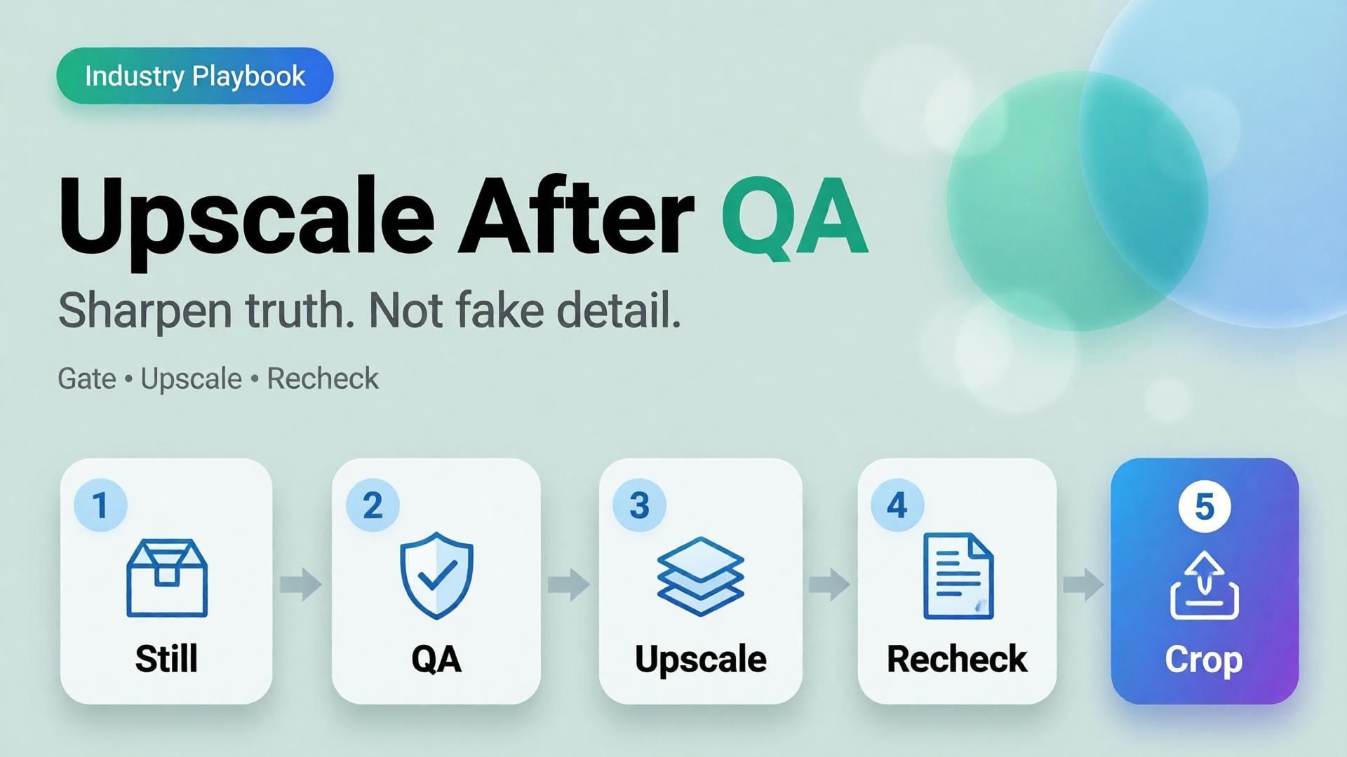
    AI product image upscale is not a magic “make HD” button. It is the Upscale node in a workflow: sharpen only what already passed geometry and label QA.

    Key Takeaways

    >

    – Upscale amplifies truth and lies equally. QA before sharpen.

    – Products with high-quality photos convert far better than weak imagery in 2026 roundups (Salsify-cited ~94% lift vs low-quality) — but “sharp fakes” are not high quality (Lumepixa, 2026).

    – Place Upscale after Generate gates in node thinking — never as forgiveness for a bad reference.

    – Marketplace min resolution is a delivery constraint, not a creative strategy.

    Why Do Teams Upscale Too Early?

    Because resolution is measurable and fidelity is judgment.

    Early upscale habit What actually happens
    Soft phone photo → 4K Soft lies become sharp lies
    Rejected AI still → upscale Warped type becomes confident warped type
    Every crop upscaled Hours spent polishing variants that should die
    Upscale instead of reshoot/ref Reference problem becomes production debt

    Phone-to-campaign discipline still starts with a usable reference (workflow mindset). Upscale cannot invent a better capture — only a bolder one.

    Marketplace buyers do not reward megapixels. They reward zoom that still matches the unboxing. Upscale without QA is how you fail that contract in high resolution.

    The QA Gate Before Upscale

    Run this checklist on the winner still only:

    Geometry

    • Silhouette matches physical SKU
    • No melted corners, stretched labels, floating caps

    Typography / print

    • Brand wordmarks readable and correct
    • No invented ingredients, seals, or stars

    Material

    • Fabric / plastic / glass reads plausible
    • No “plastic skin” or fake micro-contrast

    Compliance

    • Background rules for the target marketplace
    • Required margins for the crop job

    Fail any row → regenerate or recapture. Do not upscale.

    This is the same honesty bar as packshot thinking.

    Where Upscale Belongs in the Graph

    Upload → Brand Style → Generate → QA gateUpscale → Crop / Localize

    Node Allowed to change
    Generate Scene within brief
    QA Nothing — only pass/fail
    Upscale Apparent resolution / mild denoise
    Crop Framing only

    If Upscale changes identity, your tool is not upscaling — it is regenerating without permission.

    Playbook: Marketplace Delivery Without Fake Detail

    1. Approve master at working resolution (enough to judge label truth)
    2. Run QA checklist with a second pair of eyes when claims are legal-sensitive
    3. Upscale once to the strictest channel need (do not chain 2× → 2× → 2× blindly)
    4. Re-check typography at 100% zoom after upscale
    5. Crop for feed / PDP / cover from the upscaled master
    6. Archive both pre- and post-upscale for dispute / rollback

    For multi-market text, localize on the approved master path (image localization) and re-QA text regions after any sharpening.

    When Not to Upscale

    • Source is already sharp enough for the channel
    • Detail is mostly AI hallucination risk (tiny badges, dense nutrition panels)
    • You need a new angle — shoot/generate the angle instead
    • The soft look is intentional mood (then deliver mood at native res)

    Soft CTA

    Build honest packshots before you sharpen them: Packshot · Ecommerce

    Frequently Asked Questions

    Does AI upscaling improve conversion?

    Only when it improves clarity of a true product image. Sharp false detail can hurt trust and increase returns.

    Should every SKU be upscaled?

    No. Upscale when the channel requires resolution you lack after QA. Skip when native resolution already clears the bar.

    Upscale before or after cropping?

    Usually upscale the approved master, then crop — so all ratios share one sharpened truth. Re-QA critical text after crop if glyphs sit near edges.

    How is this different from choosing a higher-tier image model?

    Model choice happens at Generate. Upscale is a delivery node. Do not confuse them — see choose image model after direction.

    What is the biggest upscale mistake on marketplaces?

    Using upscale to “save” a failed label. Marketplaces and buyers both punish confident errors.

    Conclusion

    Sharpen after you trust.

    QA the still. Upscale once. Re-check the type. Crop for channels. Never ask an upscaler to invent honesty.

    That is how AI product image upscale supports marketplace growth — without shipping beautiful fiction.


    References

    1. Lumepixa, AI Product Photography Statistics 2026. https://lumepixa.app/blog/ai-product-photography-statistics
    2. Lumepixa, Product Image Statistics 2026. https://lumepixa.app/blog/ecommerce-product-image-statistics
    3. Adobe, 2026 Creators’ Toolkit Report, June 16, 2026. https://news.adobe.com/news/2026/06/creators-toolkit-report-2026
  • Cross-Border Catalogs: Localize Product Images Without Breaking Brand

    Cross-Border Catalogs: Localize Product Images Without Breaking Brand

    You launch in one language. Then marketplace ops asks for EN, VI, TH, and ID versions of the same banner by Friday. Someone regenerates the whole scene four times. The bottle changes shape. The light shifts. The brand kit quietly dies.

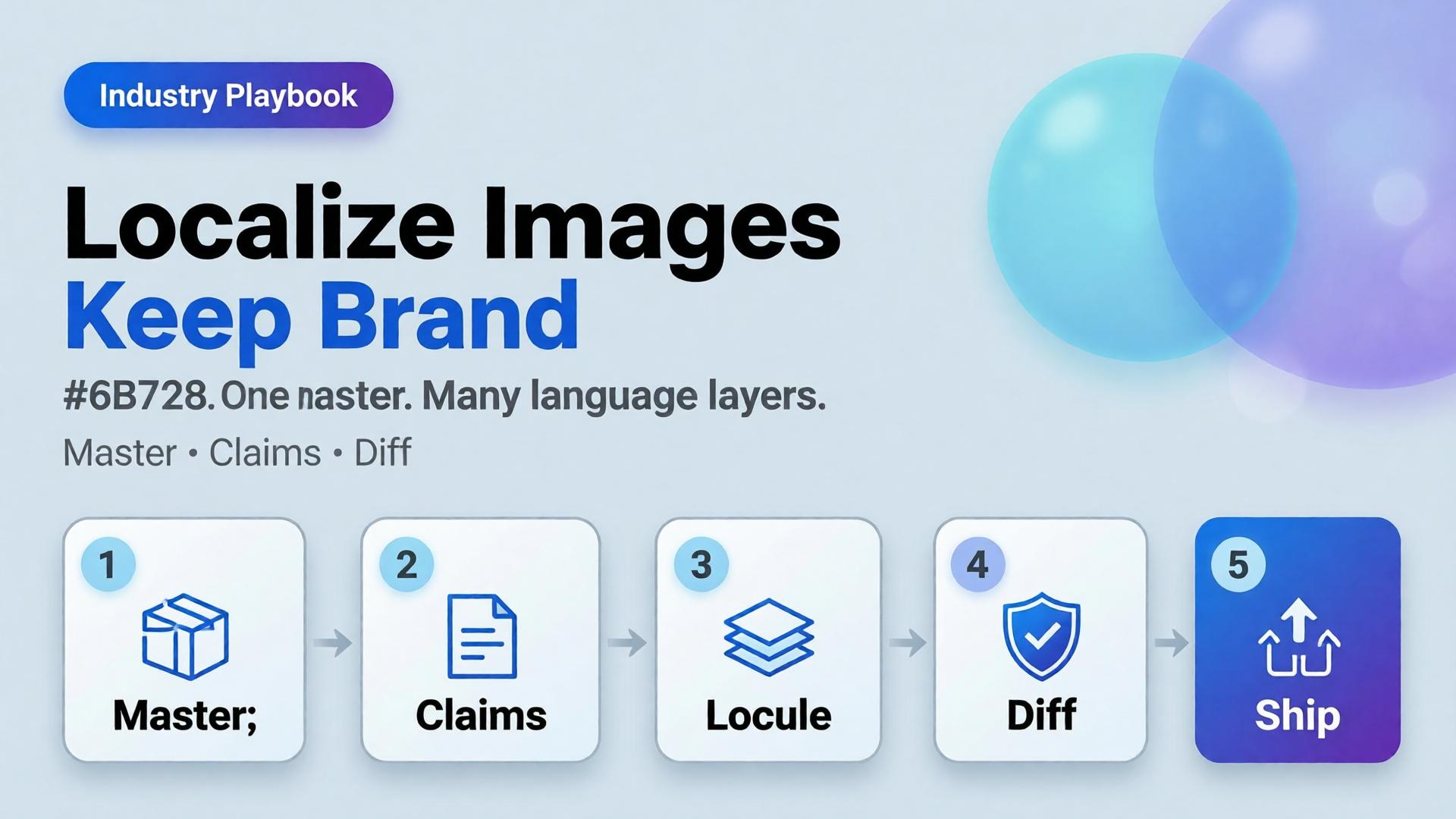
    AI ecommerce image localization is not “translate and pray.” It is a production rule: one visual master, many language layers — with gates that protect SKU truth and brand identity across borders.

    Key Takeaways

    >

    – Rebuild-per-language is how catalogs fracture. Localize text and claims, not the entire world, unless the market truly needs a new scene.

    – High-quality product imagery remains a conversion lever in 2026 roundups (Salsify-cited lifts vs weak photos); localization must not destroy that quality (Lumepixa, 2026).

    – Treat localization as a node after Brand Style + Generate — never as a fresh creative brief.

    – Legal claims, units, and badge rules are market-specific gates — not prompt adjectives.

    Why Do Per-Language Regenerations Break Brands?

    Because generation optimizes for a new pretty frame, not for identity continuity.

    Rebuild-per-language Master + localize
    New light each market Same light family
    Label drift risk × N One Truth gate
    Four art directions One kit
    Slow QA Diff-check text regions

    Cross-border teams do not need more models. They need batch thinking applied to locales.

    Localization fails when teams translate campaign vibes instead of translating claims. Vibes can stay global. Claims must go local.

    What Should Stay Global vs Go Local?

    Keep global (master layer)

    • Product geometry and packshot truth
    • Brand palette and light logic
    • Scene world / lifestyle context (unless culturally wrong)
    • Character identity if a face is used

    Localize deliberately

    • In-image headlines and CTAs
    • Promotional badges and price callouts
    • Measurement units and regulatory lines
    • Marketplace-required disclaimers

    Redesign only when required

    • Cultural taboo in scene
    • Model casting rules by market
    • Category compliance that forbids the original composition

    If you redesign every time, you do not have a localization system. You have N brands.

    Playbook: Master → Locale Pack

    Step 1 — Ship a language-agnostic master

    Prefer compositions with clear text safe zones (marketplace banner thinking). Avoid burning essential claims into tiny packaging type you cannot legally alter.

    Step 2 — Extract a claim sheet per market

    Field EN VI Notes
    Hook line Char limit
    Offer badge Color locked
    Unit line oz ml Compliance
    Disclaimer Legal review

    Step 3 — Localize as a gated node

    Input: approved master + claim sheet. Output: locale variants. Gate: geometry unchanged, brand kit intact, text correct, no new product.

    Step 4 — Diff review, not vibes review

    Flip EN ↔ VI on the same crop. If the bottle moved, reject — even if Vietnamese typography looks nicer.

    Step 5 — Archive locale packs with the kit

    Next drop swaps SKU refs, reuses locale claim templates. That is how cross-border catalogs scale.

    Where AI Helps — and Where It Lies

    Helps: rapid text replacement in safe zones, layout fitting, bulk varianting after master lock.

    Lies: rewriting packaging legal text “to look native,” inventing certificates, changing ingredient panels, or “improving” the product silhouette while translating.

    Packshot honesty still applies (packshot thinking). A localized ad that misrepresents the SKU creates returns in every language.

    Soft CTA

    Keep one ecommerce creative system across markets: Ecommerce solutions · Marketplace Banners

    Frequently Asked Questions

    What is AI ecommerce image localization?

    It is the practice of adapting in-image text and market claims on a locked visual master so catalogs stay consistent across languages and marketplaces.

    Should every market get a unique lifestyle scene?

    Only when culture or compliance demands it. Default to one world, many language layers.

    Can AI translate text printed on the product package?

    Treat package print as high risk. Prefer accurate photography of the real SKU for Truth frames; localize marketing overlays separately.

    How do I QA localized images quickly?

    Side-by-side diff against the master. Check geometry first, typography second, claim accuracy third.

    Where does this sit in a workflow builder?

    After Generate and before Upscale/Crop variants — localization should not invent a new product.

    Conclusion

    Cross-border growth should multiply locales, not multiply identities.

    Lock a master. Write claim sheets. Localize as a node. Diff-check like a skeptic. Keep the bottle the same bottle.

    That is AI ecommerce image localization that scales — without quietly founding a new brand in every language.


    References

    1. Lumepixa, AI Product Photography Statistics 2026. https://lumepixa.app/blog/ai-product-photography-statistics
    2. Adobe, 2026 Creators’ Toolkit Report, June 16, 2026. https://news.adobe.com/news/2026/06/creators-toolkit-report-2026
  • Fashion Lookbook on Zero Budget: A 3-Day Playbook for Small Brands

    Fashion Lookbook on Zero Budget: A 3-Day Playbook for Small Brands

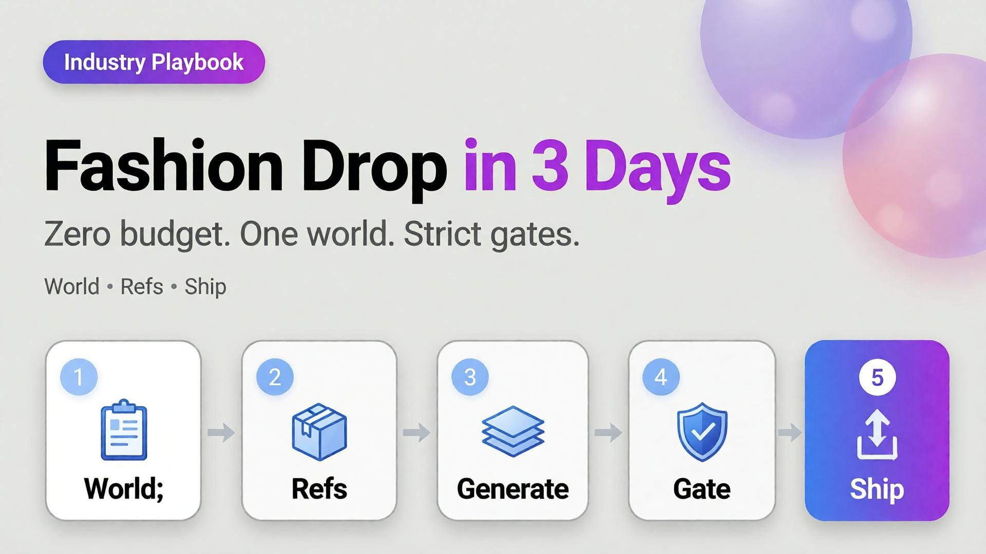
    You have twelve SKUs, one phone, no studio booking, and a drop date that will not move. The agency quote is a fantasy. The Instagram moodboard is a trap. What you need is not “more AI fashion.” You need a three-day playbook that produces a coherent lookbook without a budget line for production.

    AI fashion lookbook small brand success is almost never about the prettiest single render. It is about one world, honest garment references, and curator gates that kill cousins before they publish.

    Key Takeaways

    >

    – Zero budget does not mean zero direction. It means world + refs + gates instead of studio days.

    – Pillar idea still holds: a lookbook needs a world, not a studio.

    – Adobe’s 2026 report: 57% of creators say AI outputs need moderate or extensive editing before publish — plan curator time into the three days (Adobe, 2026).

    – Reuse one character / light family across outfits; change garments, not identity — see face consistency when a model face repeats.

    This is the SME fashion spoke under lookbook thinking. Experiment sibling: 1 outfit × 8 scenes.

    What Does “Zero Budget” Actually Mean?

    It means you will not buy:

    • Studio day
    • Pro model booking (optional: founder / friend as anchor face)
    • Agency art direction retainer

    It does not mean you skip:

    • A written world paragraph
    • Flat-lay or on-hanger garment refs
    • A reject pile

    Zero budget without gates produces a folder of beautiful strangers wearing almost-your-clothes.

    Small brands fail AI lookbooks when they try to buy agency aesthetics with scrap references. The fix is fewer scenes, stricter world, better refs — not a bigger model.

    The 3-Day Playbook

    Day 1 — World, kit, references (no heavy generating)

    Morning — Write the world (10 lines max)

    • Place (rooftop golden hour / concrete stair / apartment window)
    • Season and light logic
    • Emotion (sharp calm / weekend ease / night out)
    • No-go (neon cyber, beach club, marble bathroom if off-brand)

    This is lookbook thinking compressed — world before wardrobe.

    Afternoon — Capture garment truth

    For each SKU:

    • Front flat or hanger
    • Back / detail if print or hardware matters
    • Color in daylight if possible

    Phone is enough. Crooked is okay. Lying labels are not.

    Evening — Lock character decision

    Gate end of Day 1: world paragraph approved, refs named, face decision frozen.

    Day 2 — Generate inside the world (not across the planet)

    Morning — Scene map (not 30 ideas)

    Pick 6–8 scenes max for the drop:

    Scene Job
    Hero standing Catalog recognition
    Walk / motion freeze Life in garment
    Detail crop Fabric / stitch truth
    Seated / lean Attitude
    Pairing / layer Styling story
    Wide environmental World proof

    Use SCENE in one line per scene — skip novel-length prompts.

    Afternoon — Reference-heavy generation

    • Garment ref always on
    • World locked
    • Explore mode only for background micro-variants after one hero scene passes

    Read reference vs explore before you “just try something wild.”

    Evening — Hard curator pass

    Reject:

    • Wrong sleeve length / neckline
    • Fabric that turned into another mill
    • Face cousins
    • World leaks (suddenly beach)

    Adobe’s 57% edit rate is your calendar: leave hours for rejects, not only for generates.

    Day 3 — Adapt, sequence, ship

    Morning — Build the lookbook sequence

    Order matters: world establish → hero SKUs → detail breaths → closer.

    Afternoon — Channel crops

    • Lookbook PDF / site grid
    • 4:5 feed
    • 9:16 story/reel covers

    Same masters; different jobs — do not regenerate a new identity per ratio.

    Evening — Publish set review

    View the full set as one brand. If SKU seven looks like a different label, it does not ship.

    Clothes Variants Without a Reshoot

    When you need a second colorway:

    1. Keep pose / world / character locked
    2. Swap only the garment reference
    3. Gate color accuracy against the real SKU
    4. Do not “prompt the color” from memory

    That is the small-brand version of zero-reshoot varianting — still honesty-first.

    What to Skip on Purpose

    Skip Why
    20 scene ideas Dilutes world
    New face per outfit Breaks memory
    Luxury stock locations you cannot own Feels rented
    Text-heavy fashion posters in hero frames AI typography risk
    Publishing every “good enough” frame Volume ≠ lookbook

    Batch thinking still applies: one kit, many SKUs — not one prompt per hanger.

    Soft CTA

    Build listing and lookbook stills from real garment refs in one creative workspace: Listing Images · Gallery

    Frequently Asked Questions

    Can a small brand really ship an AI fashion lookbook in three days?

    Yes — if Day 1 is discipline (world + refs), Day 2 is gated generation, and Day 3 is sequence and crops. Skipping Day 1 guarantees chaos.

    How is this different from general AI lookbook thinking?

    The pillar explains why world beats studio. This playbook is the calendar for SMEs with no budget line.

    Do I need a professional model?

    No. Hands-only or one consistent anchor face often reads more honest for small brands than a rotating cast of AI faces.

    How many outfits can I cover in three days?

    Typically one drop family (8–15 SKUs) if refs are ready. More SKUs need the same world but extra curator hours — not extra worlds.

    What if garment fidelity keeps failing?

    Improve references and lighting truth before changing models. Most “model problems” are ref problems.

    Should I mix AI looks with real phone photos?

    Yes — phone truth for ecom details, AI for world extension, clearly sequenced. Hybrid sets often feel more trustworthy than all-AI fantasy.

    Conclusion

    Zero budget is not a creative death sentence. It is a constraint that forces lookbook thinking.

    Day 1: world and refs. Day 2: generate inside gates. Day 3: sequence and ship. Change outfits, not identity. Reject cousins. Crop masters instead of reinventing them.

    That is how a small brand ships an AI fashion lookbook that looks like a brand — not like a weekend with a random image model.


    References

    1. Adobe, 2026 Creators’ Toolkit Report, June 16, 2026. https://news.adobe.com/news/2026/06/creators-toolkit-report-2026
    2. Adobe, Inaugural Creators’ Toolkit Report (Adobe MAX 2025), October 28, 2025. https://news.adobe.com/news/2025/10/adobe-max-2025-creators-survey
  • E-commerce Ad Creative: 5 Scene Types That Convert on TikTok Shop

    E-commerce Ad Creative: 5 Scene Types That Convert on TikTok Shop

    TikTok Shop does not reward “pretty product on marble.” It rewards readable intent in the first second — then enough truth that a tap does not feel like a trap.

    Most AI ecommerce batches fail here: every frame is a vague lifestyle. The hook looks like the demo. The demo looks like the offer. The offer looks like stock. Buyers scroll. You regenerate. Nothing compounds.

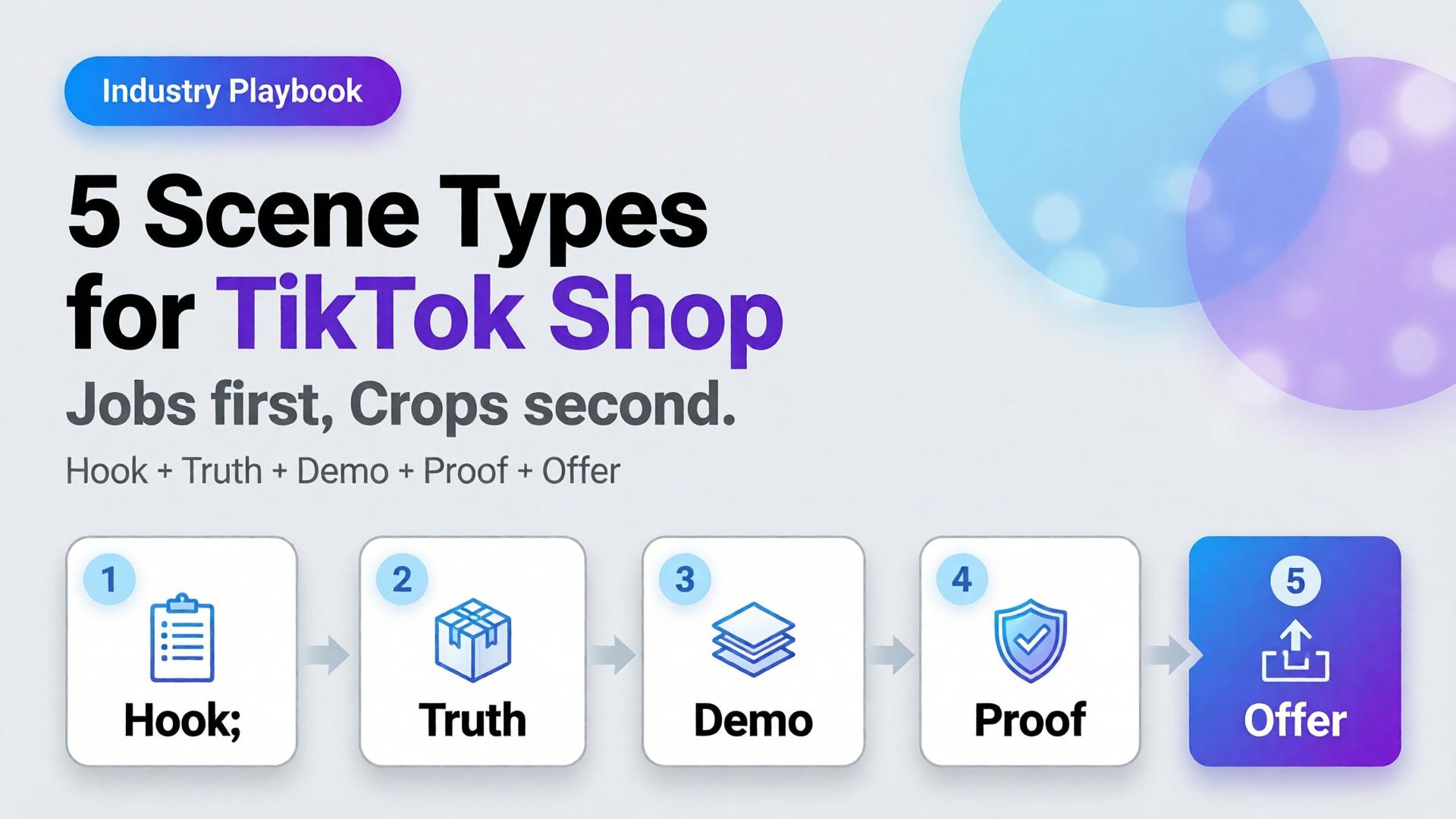
    AI TikTok Shop product images work when you cast scenes by job, not by aesthetic. Five scene types cover almost every SKU drop: hook, truth, demo, proof, offer.

    Key Takeaways

    >

    – Treat TikTok Shop creative as a scene system, not a single hero crop.

    – Listings and ads with richer visual coverage convert more strongly — large listing studies show 5+ images correlating with ~50% higher conversion versus thin galleries (Catchlab via 2026 image stats roundups).

    – High-quality product photography still shows outsized lifts versus weak imagery in Salsify-cited analyses (~94% better conversion vs low-quality photos in 2026 roundups).

    – Pair scene types with ratio families (1:1, 4:5, 9:16) — scene job first, crop second.

    Sibling to marketplace banner thinking. Parent frame: AI Ecommerce Design Is Not AI Image. Story structure: SCENE.

    Why Do Random Lifestyle Renders Underperform on TikTok Shop?

    Because the feed is a conversation, not a catalog wall.

    Buyer second Question If your image answers nothing
    0–1s Why pause? Scroll
    1–3s What is it really? Distrust
    3–8s How does it work / look on me / in use? Bounce
    CTA Why buy now? Save for later forever

    A single “aesthetic” AI frame usually answers only the pause — and sometimes not even that. Scene types map to the questions in order.

    On TikTok Shop, clarity is a growth hack. Aspiration without truth reads as dropship. Truth without a hook never gets seen.

    The 5 Scene Types (Jobs, Not Vibes)

    1. Hook — stop the scroll

    Job: Pattern interrupt that still belongs to your brand.

    • Strong silhouette, motion freeze, unexpected scale, bold color block
    • Product recognizable within one beat
    • No tiny label text as the hook

    Fail mode: generic luxury room that could sell anyone’s bottle.

    2. Truth — show the real SKU

    Job: Marketplace-grade honesty. Geometry, label, color.

    This is packshot thinking inside the ad system — front / 45° / detail as needed.

    Fail mode: AI-rewritten typography, warped proportions, beauty that lies.

    3. Demo — show the use

    Job: Hands, pour, wear, open, apply — the verb of the product.

    • One action per frame
    • Match real physics (no fake steam on shelf-stable drinks)

    Fail mode: model posing beside product with zero interaction.

    4. Proof — reduce risk

    Job: Texture macro, size reference, kit contents, before/after only if honest.

    Proof is not fake UGC. It is visual evidence the PDP will keep.

    Fail mode: invented reviews as image text; exaggerated results.

    5. Offer — carry the deal without killing trust

    Job: Price, bundle, or urgency laid on a still-true product frame.

    • Safe zones for text
    • Same product identity as Truth scene

    Fail mode: redesigning the product to make room for a sticker.

    How Do Scene Types Map to Ratios?

    Use banner thinking — one master direction, many crops:

    Scene Best first ratio Also ship
    Hook 9:16 4:5
    Truth 1:1 4:5
    Demo 9:16 4:5
    Proof 1:1 4:5
    Offer 9:16 + 1:1 cover/wide if store needs

    Do not invent five unrelated worlds. Invent five jobs inside one brand kit.

    Playbook: One SKU, One Day

    1. Write the five jobs in one line each (hook idea, truth angle, demo verb, proof detail, offer frame)
    2. Lock reference — phone or studio plate that survives Truth gate
    3. Generate Hook + Demo in explore-limited mode after kit lock
    4. Generate Truth + Proof reference-heavy — reject label drift
    5. Build Offer from Truth master + text safe zone
    6. Crop to 9:16 / 4:5 / 1:1 from winners (node: Crop)
    7. Contact-sheet review — do the five still look like one brand?

    This is the TikTok Shop version of phone → campaign.

    What Changes by Category?

    Category Hook bias Demo bias Proof bias
    Beauty Texture / glow ritual Application Shade / skin-safe honesty
    Fashion Outfit world On-body movement Fabric macro / fit
    F&B Condensation / pour Serve moment Ingredient / label truth
    Gadgets Scale / unbox silhouette Feature in hand Port / detail accuracy

    Beauty teams already map rituals in lifestyle context mapping. TikTok Shop simply forces the order of jobs into the feed.

    Soft CTA

    Produce Shop-ready scene families and ratio sets in one workspace: Marketplace Banners · Ecommerce

    Frequently Asked Questions

    What are the best AI TikTok Shop product images?

    Images assigned to clear jobs — hook, truth, demo, proof, offer — with locked product fidelity and consistent brand kit across ratios.

    Do I need video if I have strong still scene types?

    Stills still matter for Shop cards, carousels, and ads. Video helps demo and hook; it does not replace Truth and Proof frames.

    How many scenes should I generate per SKU?

    Start with one winner per type (five). Expand variants only after the five jobs pass a set review.

    Is this the same as marketplace banner thinking?

    Banner thinking solves ratios. Scene types solve narrative jobs. You need both: job first, then crop.

    Can AI lifestyle replace packshots on TikTok Shop?

    No. Lifestyle without Truth increases returns and distrust. Keep a truth layer even when the hook is cinematic.

    What is the biggest AI mistake on TikTok Shop creatives?

    Generating twelve “nice” lifestyles with no demo verb and no label-true hero — volume without jobs.

    Conclusion

    TikTok Shop does not buy your moodboard. It buys scenes that do jobs.

    Hook to earn the pause. Truth to earn trust. Demo to earn understanding. Proof to remove fear. Offer to invite the tap. Crop each winner into the ratios the channel demands.

    That is how AI TikTok Shop product images stop looking like stock — and start behaving like a sales system.


    References

    1. Lumepixa, AI Product Photography Statistics 2026 (Salsify / Catchlab citations). https://lumepixa.app/blog/ai-product-photography-statistics
    2. Lumepixa, Product Image Statistics 2026. https://lumepixa.app/blog/ecommerce-product-image-statistics
    3. Adobe, 2026 Creators’ Toolkit Report, June 16, 2026. https://news.adobe.com/news/2026/06/creators-toolkit-report-2026
  • One Product → Feed, Story, Cover: Marketplace Banner Thinking

    One Product → Feed, Story, Cover: Marketplace Banner Thinking

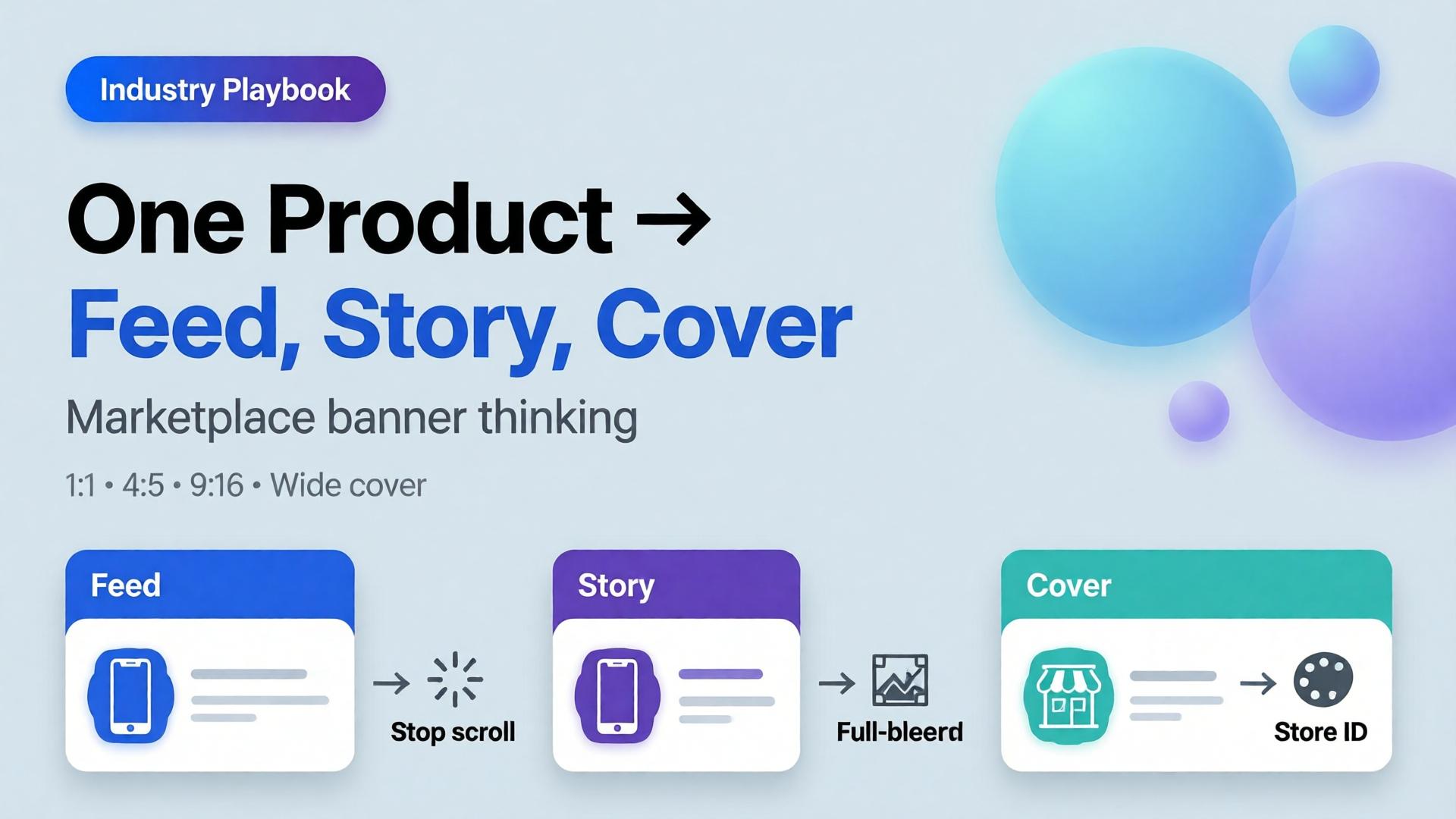
    Editorial cover for One Product to Feed Story Cover marketplace banner thinking
    Editorial cover for One Product to Feed Story Cover marketplace banner thinking

    Friday afternoon, media buying Slack: “Need the 1:1, 4:5, 9:16, and the store cover by tonight.” Someone crops the hero. The logo clips. The product drifts off-center on story. The cover looks like a different brand. Nobody “failed design.” They used resize thinking when the job was marketplace banner thinking.

    AI marketplace banners are not a folder of stretched JPEGs. They are one creative direction expressed as a ratio family — feed, story, cover — that still reads as one campaign when a buyer sees all three in the same hour.

    Key Takeaways

    • Resize thinking crops a finished hero. Banner thinking re-composes for safe zones, hook placement, and platform habits.
    • Adobe’s 2026 Creators’ Toolkit Report: 57% of creative AI outputs still need moderate or extensive editing before publish — ratio failures are a top silent cause.
    • Build from a packshot-true product block, then adapt scene and layout per size — not the other way around.
    • Orauria’s Marketplace Banners path is built for feed / story / cover families inside the same Studio workspace as packshot and workflow cleanup.

    This spoke sits next to Packshot Thinking: packshots answer “what is the product?”; banner thinking answers “how does that product survive every placement?”

    What Is Marketplace Banner Thinking?

    Marketplace and paid social surfaces share a brutal constraint: the same SKU must look intentional at three different aspect ratios.

    Surface Typical job What breaks if you only resize
    Feed (1:1 / 4:5) Stop the scroll with product + hook Crowded center; type too small
    Story / Reels static (9:16) Full-bleed mobile interruption Product crushed; empty sky wasted
    Cover / banner (wide) Store or campaign identity Product postage-stamp; brand unread

    Banner thinking starts with a composition brief per ratio, not with Photoshop’s crop tool.

    A multi-size export is not automation of cropping. It is automation of layout decisions you already made — if you never made them, AI will invent three different campaigns.

    Why Multi-Size Tools Fail Without a Direction

    Feature pages love to promise “one click, all sizes.” That only works when three inputs already exist:

    1. A true product block (packshot-grade reference)
    2. A three-line creative direction (how to write one)
    3. Safe-zone rules per platform (logo, CTA, face/product keepout)

    Without those, batch generation produces volume. With them, it produces a system. That is the same distinction as AI ecommerce design vs AI image.

    Adobe’s surveys show creators already hop between multiple AI tools in a quarter. Multi-size chaos is what happens when each tool owns a ratio and nobody owns the campaign.

    The Feed → Story → Cover Pipeline

    1. Lock the product block

    Use an approved front or 45° packshot. If you do not have one, stop and build it first — packshot thinking. Banner AI cannot fix a false product.

    2. Write one campaign line, three layout notes

    Example for an electrolyte pouch:

    • Campaign line: Gym-bag fuel, no sugar crash.
    • Feed: Product lower-third; sweaty bottle silhouette optional; hook in primary text, not burned in.
    • Story: Product mid-frame; vertical negative space for sticker UI.
    • Cover: Product left or right third; brand wordmark in safe zone; no tiny legal type.

    3. Generate per ratio — do not clone crops

    Ask for a re-compose, not a stretch. The product scale, horizon, and negative space should change on purpose.

    4. QA the family together

    Open 1:1, 4:5, and 9:16 side by side. Fail the set if:

    • Cap color drifts between ratios
    • Logo treatment changes personality
    • Product “grows” or “shrinks” unrealistically
    • Any ratio needs a different brand story to make sense

    5. Hand off to workflow cleanup

    Remove leftover backgrounds, upscale for cover width, crop for marketplace specs — ideally in one Workflow path rather than three downloads. Background removal belongs here when catalog cutouts are required.

    Ratio Cheat Sheet (Practical, Not Dogma)

    Ratio Primary use Composition bias
    1:1 Meta feed, many marketplace tiles Centered or rule-of-thirds product; short hook
    4:5 Vertical feed Slightly larger product; less wasted side space
    9:16 Stories, TikTok static companions Vertical stacking; UI keepout top/bottom
    1.91:1 / wide Covers, some display Landscape brand field; product as anchor, not speck
    728×90 / classic banners Legacy display Extreme simplification — often type + logo only

    Exact pixels change by platform and year. The thinking does not: each ratio is a layout problem.

    Where Orauria Fits (Without Turning This Into a Manual)

    On Orauria you keep the loop inside one creative system:

    Brand Style and Character Library keep color and talent consistent when the same campaign spans static and short video stills. Prompt Library stores the ratio briefs so freelancers do not reinvent Friday panic — see also one workflow template for five clients.

    Common Failure Modes

    Failure Symptom Fix
    Stretch culture Distorted bottles Re-generate layout; never free-transform product
    Text-in-pixel addiction Unreadable claims on story Move claims to platform text; keep art clean
    Hero monopoly One beauty shot forced into all sizes Build ratio family from brief
    SKU drift Ads disagree with PDP Packshot QA before banner batch
    Tool sprawl Each size from a different app One workspace + Brand Style

    Frequently Asked Questions

    Can I just upload one image and auto-generate every size?

    You can generate volume that way. Campaign-quality families still need a direction, a true product block, and side-by-side QA. Automation amplifies a brief — it does not invent one.

    Should marketplace banners match my PDP packshot exactly?

    The product should match. The scene and crop should adapt. Exact pixel clones across ratios usually look wrong on mobile.

    How is this different from Canva resizing?

    Canva resizing moves pixels. Banner thinking redesigns hierarchy for each surface. AI helps when it recomposes; it hurts when it only stretches.

    Do I need video if I have strong static ratios?

    Not always. Many prospecting tests still win on static. When you do move to motion, keep the same product block and Brand Style so the still and the video feel like one system — inside Orauria’s image + video workspace rather than a separate avatar stack.

    What should I do first if my ads look “off-brand” across sizes?

    Audit Brand Style (color, type, photography rules), then rebuild one SKU’s ratio family correctly before scaling to 100 SKUs.

    Soft next step

    If your bottleneck is “every size looks like a different campaign,” start with Marketplace Banners on Orauria and lock feed → story → cover for a single SKU this week. Pair it with a true packshot so the product block never lies.

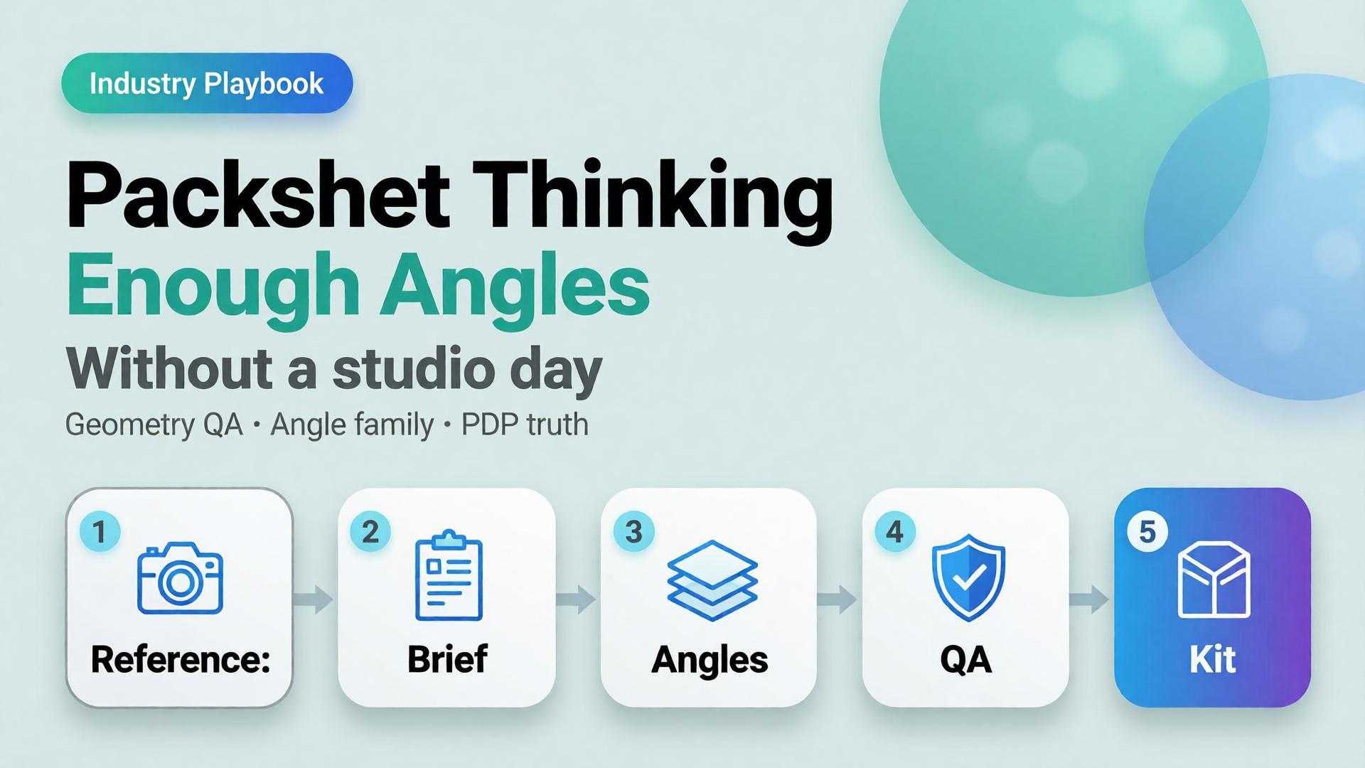
  • Packshot Thinking: Enough Angles Without a Studio Day

    Packshot Thinking: Enough Angles Without a Studio Day

    Editorial cover for Packshot Thinking: Enough Angles without a studio day
    Editorial cover for Packshot Thinking: Enough Angles without a studio day

    Most ecommerce teams still treat a packshot as a single file: product centered, white background, “good enough for the listing.” Then returns spike because buyers never saw the hinge, the texture, or the size relative to a hand. The problem was never the camera. The problem was packshot thinking — treating product photography as one pretty frame instead of a system of angles that answers buyer questions.

    AI packshot work in 2026 is not “make the bottle prettier.” It is: from one honest reference, produce enough commercial angles that a stranger on a phone can decide without calling support.

    Key Takeaways

    • A packshot is a question-answering set, not a hero beauty shot. Front, 45°, detail, scale, and packaging are different jobs.
    • Adobe’s 2026 Creators’ Toolkit Report found 57% of creative AI outputs still need moderate or extensive editing before publish — packshot QA fails for the same reason: geometry and label fidelity, not “vibe.”
    • Studio days buy control. Packshot thinking buys coverage: enough angles to list, retarget, and reuse without booking another shoot.
    • Orauria’s Packshot Studio and Ecommerce solutions are built for this job — reference in, angle family out — inside one creative workspace.

    If you have already read AI Ecommerce Design Is Not AI Image, this post is the product-layer version of that idea. Ecommerce design is the system. Packshot thinking is how the SKU itself survives marketplace scrutiny.

    What Is Packshot Thinking?

    Packshot thinking means you plan product images the way a merchandiser plans a shelf talker: every frame must close a doubt.

    Angle Buyer question it answers Fail mode if missing
    Front hero What is this product? Listing looks empty or “stock”
    45° / 3/4 What is the form in space? Flat, toy-like, hard to trust
    Detail / macro What is the material / print / finish? “Looks cheap online” returns
    Scale How big is it? Size shock after delivery
    Packaging / in-box What arrives? Unboxing disappointment
    Lifestyle bridge (optional) Where does it live? Cold catalog, weak ads

    White-background front shots are not “dead” — they are incomplete. Visual Commerce 2026 argued that white-only feeds underperform when every competitor ships context. Packshot thinking agrees — and adds a rule: lifestyle does not replace geometry. You still need the honest product block.

    A studio day gives you control. Packshot thinking gives you coverage. Coverage is what marketplaces and media buyers actually buy.

    Why Do Teams Still Book Studio Days for Simple SKUs?

    Three reasons — all rational, all incomplete.

    1. Fear of label drift. AI that “improves” a bottle often invents typography. Media buyers then reject the export because the listing hero and the ad disagree. The fix is not “never use AI.” The fix is reference-first packshots with a QA checklist that scores geometry before beauty.

    2. Habit of one hero. Designers deliver one approved beauty shot. Marketing asks for six crops Friday afternoon. Nobody owned the angle family. From Phone Photo to Campaign names this as a workflow failure, not a photography failure.

    3. Confusion between packshot and campaign. Campaign images sell aspiration. Packshots sell truth. Mixing the briefs produces images that are neither listable nor scroll-stopping.

    Adobe’s 2025–2026 creator surveys show most teams already juggle more than one creative AI tool in a quarter. That sprawl is exactly what packshot thinking tries to prevent: one reference, one brand kit, one angle plan — then generate.

    How Many Angles Are “Enough”?

    Enough is not a fixed number. Enough is coverage of buyer doubt for that category.

    Category Minimum useful set Notes
    Supplements / beauty bottles Front + 45° + label detail + scale Label fidelity is the QA bottleneck
    Electronics / gadgets Front + ports/detail + in-hand scale + packaging Ports and buttons must stay readable
    Apparel accessories Front + texture + on-model or flat scale Texture sells more than logo
    Home / hard goods Front + 45° + material detail + room bridge Staging is secondary to form

    If you only ship one angle, you are optimizing for the photographer’s portfolio — not the PDP.

    How to Build a Packshot Angle Family with AI

    This is a thinking workflow, not a button tour. Use any capable image model inside Orauria Studio; the discipline matters more than the model name.

    Step 1 — Lock the reference, not the vibe

    Upload a clean product photo: label facing camera, product centered, minimum ~1000×1000 px if you can. Phone photos work as references if focus holds on the label — see the phone-to-campaign mindset post.

    Write what must not change: bottle height, cap color, logo placement, material finish. That list is your Brand Style guardrail, not a moodboard.

    Step 2 — Write the angle brief before prompts

    Borrow the SCENE method only for lifestyle bridges. For pure packshots, write a shorter table:

    • Angle name
    • Buyer question
    • Background rule (white / soft gray / none)
    • Crop rule (full product vs detail)

    Do not invent scene poetry until the front and 45° pass QA.

    Step 3 — Generate the geometry set first

    Produce front and 45° before lifestyle. Score each export on:

    1. Does the SKU still read as the SKU?
    2. Is type on the label still legible at phone width?
    3. Do proportions match the reference (no “stretched bottle”)?

    If an export fails geometry, regenerate. Do not “fix in Photoshop for an hour” and pretend the system worked.

    Step 4 — Add detail, scale, then optional lifestyle

    Detail and scale close returns. Lifestyle bridges feed ads and social. Keep them in that order so campaign beauty never overwrites listing truth.

    Step 5 — Publish the family into a reusable kit

    Store approved angles with the SKU ID. When batch thinking across 100 SKUs starts, you reuse the angle plan — not reinvent prompts per product.

    For the productized path — shot planner plus studio generation — see Orauria’s AI Packshot landing and the broader ecommerce hub.

    Packshot QA Checklist (Traffic-Ready)

    Use this before anything leaves the folder:

    • [ ] Front hero matches listing color and silhouette
    • [ ] 45° does not invent new branding
    • [ ] Detail crop shows real texture / print / seam
    • [ ] Scale cue is honest (hand, coin, known object — or stated dimensions in copy)
    • [ ] No burned-in promo text unless the ad brief requires it
    • [ ] Background removal / cutout edges are clean for marketplace upload (background removal workflows)
    • [ ] All angles feel like one SKU, not three product lines

    Adobe’s finding that 57% of AI creative still needs editing before publish is not a reason to avoid AI. It is a reason to budget QA as part of packshot thinking.

    How Does Packshot Thinking Connect to Ads and Marketplaces?

    Packshots feed three surfaces:

    1. Marketplace PDPs — geometry and trust
    2. Prospecting statics — same product block, new scenes and ratios
    3. Workflow reuse — nodes that cut, upscale, and re-crop without re-shooting

    The next post in this cluster — One Product → Feed, Story, Cover — covers ratio families for Meta, TikTok, and marketplace banners. Packshot thinking is the source of truth. Banner thinking is the channel adaptation.

    Inside Orauria, that handoff lives in one workspace: Packshot for angles, Banner Ads / marketplace tools for sizes, Workflow for cleanup — instead of exporting to three vendors and losing brand coherence.

    Frequently Asked Questions

    Is an AI packshot good enough for Amazon or Shopee listings?

    It can be — if geometry and label fidelity pass human QA. Marketplaces punish misleading imagery. Treat AI as a production system for angles, not a license to invent product features.

    Should lifestyle images replace white-background packshots?

    No. Lifestyle answers context; packshots answer form. Strong catalogs use both. See Visual Commerce 2026.

    What if I only have a messy phone photo?

    Start with phone-to-campaign workflow mindset. Clean the reference enough that the label is readable, then build the angle family. Do not expect a blurry label to become sharp legal type.

    Which AI image model is best for packshots?

    The model that holds product geometry under your QA checklist. Choose the model after the angle brief — not before. That decision framework is covered in Choose the Image Model After Creative Direction.

    How is this different from a full studio day?

    A studio day maximizes control for hero campaigns. Packshot thinking maximizes coverage and reuse for catalogs and weekly ads. Many teams need both — just not for every SKU every week.

    Soft next step

    If your bottleneck is “we never have enough angles,” open Orauria Packshot and plan the angle family before you chase another model trend. For the full ecommerce loop — listing through social reuse — start at solutions/ecommerce.

  • Batch Thinking: 1 Brand Kit × 100 SKUs Without Losing Soul

    Batch Thinking: 1 Brand Kit × 100 SKUs Without Losing Soul

    Your merchandising team drops one hundred SKUs next Friday. Your creative lead has three days, one freelancer, and a folder of packshots. The obvious move? Open the AI tool and write one prompt per product. By SKU forty, every image looks like a different brand. By SKU seventy, someone asks why the light keeps changing. By SKU one hundred, you have volume, and zero soul.

    AI ecommerce batch content does not fail because models are weak. It fails because teams treat scale as one hundred separate creative decisions instead of one brand kit multiplied by SKU-specific references. Batch thinking fixes that. One spine. Many products. Creative direction that survives the drop.

    Key Takeaways

    >

    Batch thinking means one locked brand kit (palette, light logic, no-go rules) applied across hero SKU families, not one bespoke prompt per product.

    – Adobe’s 2026 Creators’ Toolkit Report found 57% of creators say AI outputs need moderate or extensive editing before publish. Most of that rework traces to missing batch structure, not bad luck (Adobe Creators’ Toolkit Report, 2026).

    – Group SKUs by scene family, not category tree. Reference-heavy mode at scale beats exploratory prompting once direction is locked.

    – Soul survives scale through curator gates: explorer generates, approver enforces kit, slot map assigns channel jobs before render.

    If you have read AI Ecommerce Design Is Not AI Image, you know commercial creative is a system. This playbook answers the scaling question inside that system: how does one brand kit cover a hundred SKUs without the gallery looking like a stock-site accident?

    Ecommerce creative director reviewing unified brand kit applied across multiple product SKU scenes One kit, many SKUs: batch thinking is multiplication, not repetition.

    Why Does Scaling 100 SKUs With AI Feel Like 100 Different Brands?

    Because prompt-per-SKU workflows optimize for individual frames, not set coherence. Each new product invites a fresh adjective stack, a new scene guess, a new light mood. The model complies. The catalog fractures.

    Adobe surveyed more than 16,000 creators globally in 2026 and found 75% describe creative AI as integrated or essential. Yet the same report shows 42% believe AI-generated work makes it harder for distinctive voices to surface (Adobe Creators’ Toolkit Report, 2026). That is not a model problem. That is a direction problem wearing a volume badge.

    The math is simple. One hundred SKUs times three scene types equals three hundred generation jobs. Without a brand kit spine, you are running three hundred micro-briefs. With batch thinking, you run one kit times three scene templates times SKU references. Same output count. One world.

    Citation capsule: Scaling AI ecommerce batch content fails when teams prompt per SKU. Adobe’s 2026 data shows 57% of creators still edit AI outputs heavily before publish. Batch structure reduces that rework by locking direction before generation starts.

    What Is Batch Thinking, and How Is It Different From Batch Generating?

    Batch generating is a button. You queue one hundred jobs, walk away, hope the folder looks on-brand. Batch thinking is a design decision made before the queue opens.

    Batch generating Batch thinking
    One prompt per SKU One brand kit per drop
    Scene invented at render time Scene families defined upfront
    References optional SKU references mandatory
    Curator reviews output Curator approves kit first
    Success = file count Success = set coherence

    Batch thinking borrows from how studios shoot lookbooks: one lighting setup, one set family, many products walked through the same world. AI does not change that logic. It amplifies the cost of skipping it.

    The SCENE method still applies (Story, Context, Emotion, Narrative, Extension), but at batch scale, SCENE rows attach to scene templates, not individual SKUs. SKUs inherit the template and swap only what must change: product geometry, colorway, label legibility.

    Soul is not a vibe word. It is creative direction that survives multiplication. When every SKU shares light logic and palette enforcement, the buyer feels one brand made one hundred considered choices, not one algorithm rolled dice one hundred times.

    Side-by-side comparison of chaotic per-SKU AI prompts versus organized brand kit batch workflow Batch generating fills folders. Batch thinking fills a world.

    What Belongs in the Brand Kit Spine?

    The brand kit is the non-negotiable layer every SKU inherits. Think of it as the creative contract the model cannot negotiate away.

    Palette and color behavior

    Lock primary, secondary, and accent hex values. Define how product colorways interact with environment neutrals. State whether backgrounds warm or cool relative to skin and packaging. Without this, SKU seventeen drifts mint while SKU eighty-two goes sage. Both read “green.” Neither is yours.

    Light logic

    One sentence beats ten adjectives. Example: Late-morning window light, 5200K, soft shadow falloff, no harsh rim. Every scene family in the drop repeats that sentence. Light logic is where the brand consistency trap hides when teams scale fast.

    No-go rules

    List what never appears: competitor visual tropes, off-brand props, wrong era furniture, illegible label blur, hands without grooming rules. No-go lists are boring to write and expensive to skip.

    Character rules (when faces matter)

    If the drop uses models, define age band, styling lane, expression range, and casting consistency. Character is not “a woman in her thirties.” Character is one approved casting lane referenced across hero families, same as a studio would book one talent day.

    Slot map (channel jobs)

    Before rendering, assign which scene types serve which slots: marketplace hero, PDP gallery row two, paid social vertical, email hero. The visual commerce 2026 split still applies: compliance truth plus lifestyle story. Batch thinking names those slots before SKU one renders.

    Brand kit document showing palette swatches light logic notes and no-go rules for ecommerce batch production The kit is short. The enforcement is daily.

    How Do Hero SKU Families Replace Category-Tree Thinking?

    Merchandising organizes by category: tops, bottoms, accessories, home, beauty. Creative direction organizes by scene type: tabletop ritual, on-body movement, shelf context, outdoor carry, detail macro.

    Hero SKU families group products by which scene template they walk through, not which nav tab they sit under.

    Example family map for a mixed apparel-and-accessories drop:

    Hero family Scene template Example SKUs
    Morning flatlay Bathroom marble, soft steam Serums, scarves, small leather goods
    Commute carry Street light, bag scale shot Totes, crossbodies, laptop sleeves
    On-body movement Walking frame, natural stride Dresses, outerwear, sneakers
    Detail proof Macro texture, stitch or grain Knitwear, leather, ceramics
    Compliance hero Pure white, 85%+ frame fill All marketplace main images

    A linen dress and a ceramic mug may share the morning flatlay family if the buyer moment matches: quiet ritual, not product taxonomy. That is how you cover one hundred SKUs with twelve scene templates instead of one hundred invented rooms.

    Fashion teams discovered this through lookbook thinking. Ecommerce batch drops use the same move at warehouse scale.

    Citation capsule: Hero SKU families group products by shared scene templates (morning flatlay, commute carry, on-body movement), not by merchandising category trees. One brand kit can cover 100 SKUs with roughly 10-15 scene families instead of 100 unique prompts.

    When Should You Switch to Reference-Heavy Mode at Scale?

    Exploration is for discovery. Reference-heavy mode is for production.

    When to Use Reference Images vs Let AI Explore draws the line: explore when the world is unknown; reference when the world is locked. A hundred-SKU drop is never the moment to explore.

    At scale, every generation job carries:

    1. Brand kit block: palette, light, no-go (pasted identically)
    2. Scene template reference: one approved frame per hero family
    3. SKU reference: packshot or phone capture of the actual product
    4. SCENE row: story and emotion for that family only

    The SKU reference handles geometry, label, and colorway truth. The scene template handles world coherence. The brand kit handles identity. Prompt text becomes assembly, not invention.

    Adobe’s 2025 survey found 52% of creators use creative AI primarily for asset generation, while 48% use it for ideation (Adobe MAX 2025, 2025). Batch drops belong in the generation lane. Ideation already happened when the kit and families were approved.

    [CHART: Bar comparison – rework hours per 100-SKU drop: prompt-per-SKU workflow vs brand-kit batch workflow – illustrative workflow efficiency data]

    What Does the Curator Workflow Look Like for a 100-SKU Drop?

    Volume without curation is how distinctive brands become generic ones. A 100-SKU drop needs gates, not hope.

    Gate 1: Kit approval (before any SKU)

    Creative lead signs off palette, light logic, no-go list, and slot map. No generation until this passes. One meeting. One document.

    Gate 2: Family template approval (per hero family)

    Generate three to five explorations per family once. Pick one winning template per family. That template becomes the reference for every SKU in the family.

    Gate 3: SKU batch review (per family, not per SKU)

    Run ten to twenty SKUs through the same family template. Review as a set at thumbnail grid scale. Ask: do these look like one brand shot one afternoon?

    Gate 4: Slot compliance check

    Marketplace heroes against white-background rules. PDP lifestyle against emotion brief. Social crops against safe zones. The phone-to-campaign mindset applies: shoot (or reference) once, adapt to slots. Do not re-invent per channel.

    Gate 5: Publish set curation

    Ship three to five images per SKU, not twenty “good enough” frames. Adobe reports 85% of creators insist the final creative decision must remain theirs (2026). Curator gates protect that judgment instead of drowning it in volume.

    Freelancers running multiple clients should save the kit-plus-family structure as a reusable template, the same move described in One Workflow Template for Five Clients.

    Curator reviewing thumbnail grid of AI generated product images for brand consistency across SKU batch Curators judge sets, not singles. The grid tells the truth.

    What Breaks When Batch Thinking Is Missing?

    Four failure modes appear in almost every distressed 100-SKU drop.

    Brand drift

    Individual images pass review. The collection fails it. Light warms on SKU twelve. Shadows harden on SKU sixty-one. Accent colors creep toward model defaults. This is the brand consistency trap at warehouse scale. Fix it by returning to the kit, not by re-prompting adjectives.

    Orphan scenes

    A beautiful kitchen frame for a product that never belongs in a kitchen. Orphan scenes happen when prompts invent context per SKU instead of inheriting family templates. They convert like wallpaper: pretty, purposeless.

    No slot map

    The team renders cinematic landscapes, then discovers marketplace needs RGB 255 white heroes and paid social needs vertical safe zones. Rework doubles. The global visual commerce platform market is projected to grow from $4.6 billion in 2025 to $13.8 billion by 2034 at a 12.8% CAGR (DataIntelo, 2025). That growth rewards teams who plan slots before pixels, not after.

    Prompt-per-SKU fatigue

    By SKU fifty, whoever writes prompts starts cutting corners. Adjectives compress. References drop off. Quality variance becomes visible to buyers scrolling the catalog. Fatigue is a workflow bug, not a talent bug.

    Aggregated ecommerce A/B data commonly shows lifestyle context additions lifting conversion 15–30% over packshot-only galleries when scenes share coherent world logic (industry aggregates, 2025–2026). Incoherent batches waste that uplift.

    What Is the 5-Step Batch Thinking Playbook?

    Copy this sequence for the next drop.

    Step 1: Write the brand kit (one page). Palette, light logic, no-go rules, character lane if needed, slot map. Approve before opening any model.

    Step 2: Map hero SKU families. List every SKU. Assign each to a scene family by buyer moment, not category tree. Target ten to fifteen families for a hundred-SKU mixed drop.

    Step 3: Lock family templates. Explore three to five options per family. Curator picks one reference frame per family. No SKU work until templates hold.

    Step 4: Run reference-heavy batches. Each job = kit block + family template + SKU reference + SCENE row. Batch by family, not by merchandising sort order.

    Step 5: Curate publish sets. Review at grid scale. Enforce slot compliance. Ship three to five frames per SKU. Save the kit and family map as next season’s template.

    Teams consolidating tools should read Orauria vs a Scattered AI Stack for why batch thinking needs one workflow surface, not six tabs with six different light moods.

    Five-step batch thinking playbook flowchart from brand kit through hero families to curated publish set Five steps, one world. The playbook is thinking, not clicking.


    Run your next 100-SKU drop on Orauria: Try Orauria

    Frequently Asked Questions

    Is batch thinking only for large catalogs?

    No. The same logic applies to twenty-SKU seasonal drops. Batch thinking scales down cleanly: one kit, three families, curated sets. The failure mode (prompt-per-SKU drift) hurts small drops too; it just arrives faster.

    How many hero families do I need for 100 SKUs?

    Plan ten to fifteen families for a mixed catalog. Fewer if the drop is single-category (eight families for apparel-only). More than twenty families usually means you are back to per-SKU invention wearing a taxonomy costume.

    Can I still explore creatively inside a batch drop?

    Yes, but only at Gate 2 (family template approval). Exploration is bounded, intentional, and once per family. Production SKUs inherit the winner. That is how soul survives scale without killing discovery.

    What if SKUs need genuinely different contexts?

    Split the SKU into a second family with its own template. Do not write a one-off prompt. If a product truly needs a unique world, it is a new family row, not an exception that breaks the kit.

    Does batch thinking replace white-background marketplace heroes?

    No. Compliance heroes are a slot, not a scene family competitor. The visual commerce 2026 dual-layer model still applies: white truth for marketplaces, lifestyle families for brand channels. One kit governs both.

    How do freelancers charge for 100-SKU batch work?

    Price the kit, family map, and curation system, not per-image generation. Clients who buy volume without direction buy rework. Adobe’s 2026 data shows 57% of creators already edit AI outputs heavily; batch structure is billable creative direction, not a discount line item.

    Conclusion

    One hundred SKUs is not one hundred prompts. It is one brand kit, ten to fifteen hero families, reference-heavy production, and curator gates that protect the final call.

    Batch thinking is how ai ecommerce batch content keeps soul at scale. The kit holds identity. Families hold coherence. References hold product truth. Curators hold judgment.

    Write the kit before SKU one. Group by scene, not category. Explore once per family, then multiply. Review the grid, not the single.

    That is not slower than prompt-per-SKU chaos. It is the only speed that ships a catalog buyers trust.


    References

    1. Adobe, 2026 Creators’ Toolkit Report, June 16, 2026. https://news.adobe.com/news/2026/06/creators-toolkit-report-2026
    2. Adobe, Inaugural Creators’ Toolkit Report (Adobe MAX 2025), October 28, 2025. https://news.adobe.com/news/2025/10/adobe-max-2025-creators-survey
    3. DataIntelo, Global Visual E-Commerce Platform Market Report, 2025. https://dataintelo.com/report/global-visual-e-commerce-platform-market
    4. Amazon Seller Central, Product Image Requirements, 2025. https://sellercentral.amazon.com/help/hub/reference/G1881
    5. acceleroi, Shopify Beauty & Skincare Conversion Rate Benchmark 2026. https://www.acceleroi.com/posts/benchmarks/shopify-beauty-skincare-conversion-rate
  • Lifestyle Context Mapping: Why Beauty Ads Need Scenes, Not White Backgrounds

    Lifestyle Context Mapping: Why Beauty Ads Need Scenes, Not White Backgrounds

    Lifestyle Context Mapping: Why Beauty Ads Need Scenes, Not White Backgrounds

    A serum bottle on white tells a shopper what the product looks like. It does not tell them whether it belongs in their morning, their skin concern, their bathroom shelf beside the things they already trust. Beauty is not sold through isolation. It is sold through recognition — the moment a viewer thinks, that looks like my routine.

    That is why the most effective AI beauty ads are not prettier packshots. They are lifestyle context maps: deliberate grids of scenes that place the same product inside believable moments — morning light, gym bag, hotel sink, pre-event mirror — without breaking brand coherence.

    Key Takeaways

    • Beauty shoppers convert on context and proof, not white-background clarity alone. Aggregated Shopify beauty benchmarks put median DTC conversion around 3.2%, with top performers using mixed visual strategies above 3.5% (acceleroi, 2026).
    • Lifestyle context mapping is the pre-render step: list every life moment your buyer inhabits, then assign one scene per context before any AI image generates.
    • Pair studio clarity (texture, shade, scale) with lifestyle scenes (ritual, application, environment). Hybrid PDP layouts routinely outperform single-style galleries.
    • The SCENE method turns context maps into repeatable briefs — Story, Context, Emotion, Narrative, Extension — for every SKU.

    This is an industry playbook, not a software tutorial. If you need the parent framework, read AI Ecommerce Design Is Not AI Image first. If you need the storytelling structure, read The SCENE Method. This article answers the beauty-specific question: which scenes matter, and in what order?

    Skincare and beauty products in warm lifestyle bathroom setting
    Beauty converts in context — bathroom light, ritual, and recognition beat sterile isolation.

    Why Do White-Background Beauty Ads Underperform?

    White backgrounds solve a logistics problem. They satisfy marketplace rules, show true color, and scale cleanly across catalogs. They do not solve a psychology problem.

    Beauty buyers ask three silent questions in the first two seconds:

    1. Will this work for someone like me?
    2. Where does this fit in my routine?
    3. Does this brand feel credible or generic?

    A floating bottle on seamless white answers none of them. It is catalog infrastructure — necessary, but not persuasive.

    In 2026, aggregated beauty ecommerce data shows that customer before-after results and authentic social proof on product pages can lift conversion 40–70% compared to lifestyle imagery alone (acceleroi beauty benchmark, 2026). Lifestyle scenes alone are not enough either. The winning structure is layered: clarity shots for trust, lifestyle scenes for desire, proof for friction removal.

    Bathroom shelf skincare morning ritual lifestyle scene
    Morning ritual is the highest-frequency context for skincare — map it before you render.

    What Is Lifestyle Context Mapping?

    Lifestyle context mapping is a pre-production grid. For each hero SKU, you list the physical and emotional environments your buyer actually inhabits — then assign one visual scene per context before generating anything.

    Step Action Output
    1 Define buyer persona + primary concern One sentence: who, skin type, main worry
    2 List 5–7 real-life contexts Morning, commute, gym, office, travel, evening, event
    3 Assign emotion per context Calm, confidence, recovery, glamour, etc.
    4 Map narrative order Which scene opens, which proves, which closes
    5 Plan format extension PDP, Reels, TikTok Shop, email, marketplace

    This is SCENE applied as a category playbook. Story and Context become rows in the grid. Emotion becomes the column that keeps scenes from feeling interchangeable.

    Which Lifestyle Contexts Matter Most for Beauty?

    Not every context deserves a render. Start with the high-frequency moments your buyer repeats weekly.

    Core context library (beauty & skincare)

    Context Physical setting Buyer mindset Best for
    Morning ritual Bathroom shelf, window light Reset, preparation Serums, SPF, cleansers
    Pre-event prep Vanity mirror, evening glow Confidence, transformation Makeup, highlight, fragrance
    Gym / active Locker, minimal kit Performance, simplicity Sweat-proof, minimal skincare
    Workday desk Office bathroom, compact bag Discretion, refresh Lip tint, hand cream, mist
    Travel Hotel sink, carry-on Continuity, TSA-friendly Travel sizes, multi-use
    Wind-down Nightstand, soft lamp Recovery, care Retinol, night cream, masks
    Social / gift Wrapped box, linen surface Generosity, discovery Sets, limited editions

    You do not need all seven for every SKU. A vitamin C serum might own morning ritual, travel, and pre-event prep. A lip product might own workday desk, pre-event, and social gift.

    Vanity mirror makeup preparation pre-event lifestyle context
    Pre-event prep: confidence and transformation — a core context row for makeup and fragrance.

    The 4-scene minimum for a beauty launch

    For a hero SKU launch week, map at least four contexts:

    1. Clarity — texture swatch, shade, or dropper macro (studio logic)
    2. Ritual — product in use inside a believable routine
    3. Proof — application sequence or result implication (not fake clinical)
    4. Extension — travel, gift, or second routine moment

    Four scenes. One product story. Enough range for PDP gallery, paid social, and email — without aesthetic drift.

    How Do You Build a Context Map for a Hero SKU?

    Walk through a vitamin C brightening serum for urban women 25–40, primary concern: dullness and uneven tone.

    Context map example

    # Context Story (one sentence) Emotion Channel
    1 Morning ritual First light on the shelf; she reaches for serum before sunscreen Calm renewal PDP gallery slot 2
    2 Texture proof Dropper mid-application, skin close-up, honest light Trust, clarity PDP macro + marketplace
    3 Pre-event prep Mirror glow before dinner; serum already absorbed Confident radiance Instagram Reels
    4 Travel essential Hotel bathroom, compact bag, same bottle Capable, cared-for TikTok Shop, email

    Notice: scene 2 is not "lifestyle" in the aspirational sense. It is proof context — still a scene, still a story, still emotion (trust). Beauty context maps include studio-adjacent moments. They are not only living rooms and cafés.

    Skincare serum texture and application close-up proof shot
    Proof context: texture and application build trust — not every scene needs a full lifestyle set.

    Mapping makeup differently

    A soft matte lipstick might shift contexts:

    Context Why it matters
    Morning coffee Everyday identity — "my default face"
    Office elevator mirror Quick refresh, professional polish
    Evening restaurant Color depth under warm light
    Gift unboxing Discovery, shareability

    Same SCENE logic. Different rows because the buyer moment changes.

    What Visual Rules Keep Beauty Scenes Credible?

    Beauty AI ads fail when scenes feel like stock photo agencies — too perfect, too generic, wrong skin logic. Guard with four rules:

    1. Light logic must match the context. Morning bathroom = soft directional window light. Pre-event = warmer, lower angle. Gym = flatter, cooler overhead. Break light logic and the set feels pasted together.

    2. Skin texture stays honest. In 2026, Adobe found 75% of creators believe audiences can detect meaningful AI involvement in creative work (Adobe Creators' Toolkit Report, 2026). Over-smoothed skin reads as fake faster than any watermark. Aim for credible texture — not clinical sterility, not plastic perfection.

    3. Product scale stays consistent. A serum bottle should not change size between scenes. Use reference images for bottle geometry across the map.

    4. Palette pulls from brand kit. Bathroom tile, towel, and background tones should echo brand colors — not model defaults. This is where AI ecommerce design meets beauty: Brand Style guardrails stop drift across a 20-image batch.

    When drift appears, read Brand Consistency Trap: 5 Times AI Broke Your Visual Identity (coming soon).

    How Does Context Mapping Connect to Channel Strategy?

    Each context row should ship with a format intention — not just a pretty picture.

    Channel Context types that win Format note
    PDP gallery Clarity + ritual + proof Hero often stays white/compliant; scenes fill slots 2–6
    Instagram / Reels Ritual, pre-event, application Vertical, motion-friendly, 3-second hook
    TikTok Shop Honest routine, texture, result hint Native, not overly polished
    Email hero Single strongest emotion scene One frame, one feeling
    Marketplace main Clarity / compliance first Lifestyle in secondary slots only

    Adobe's 2025 survey found 72% of creators frequently create content on mobile (Adobe MAX 2025, 2025). Map contexts for thumb-stop moments — not only desktop gallery browsing.

    Woman applying makeup on mobile social beauty content
    Channel column matters: the same context must survive vertical crop and thumb-stop scroll.

    What Is the Difference Between Context Mapping and Random Lifestyle Prompts?

    Random prompting: "serum in a luxury bathroom," "serum on marble," "serum with plants." Three pretty images. Zero narrative.

    Context mapping: predefined rows tied to buyer frequency, emotion, and channel job. Every scene answers why it exists.

    Random lifestyle Context mapping
    Aesthetic variety Buyer-moment coverage
    Each prompt standalone Rows connect as chapters
    No format plan Channel assigned per row
    Drift likely Brand rules enforced upfront

    The SCENE method Extension dimension is where you list formats before rendering — preventing the Friday panic when paid social needs a vertical crop nobody planned.

    A Playbook Workflow (Thinking, Not Clicking)

    For beauty SMEs and creators running AI-assisted production:

    1. Persona + concern — one sentence buyer definition
    2. Context library — pick 4–6 rows from the core table
    3. SCENE brief per row — story, context, emotion, narrative role
    4. Moodboard gate — lock light temperature and palette before batch
    5. Generate per row — explore freely, curate one winner per context
    6. Adapt per channel — crop, resize, motion extract where needed
    7. Save map as template — next SKU swaps product, keeps contexts

    Fashion teams use a parallel playbook in lookbook thinking. F&B brands will get theirs in From Shelf Photo to Hero Shot (coming soon). Beauty's difference is ritual frequency — the same face, the same mirror, the same concern, repeated daily.

    When Should Beauty Brands Still Use White Backgrounds?

    Always — for clarity jobs:

    • Marketplace main image compliance
    • Shade matching and color accuracy
    • Texture macro and ingredient implication
    • Comparison layouts (shade range, size reference)

    White is not the enemy. White-only is the trap. The playbook is deliberate alternation: clarity establishes trust, lifestyle establishes desire, proof removes doubt.

    Aggregated ecommerce photography data consistently shows hybrid galleries — studio plus lifestyle — outperforming single-style pages, with uplifts commonly cited in the 15–30% range for lifestyle additions over packshot-only layouts (industry A/B aggregates, 2025–2026).


    Map your next beauty campaign on Orauria: Try Orauria

    Frequently Asked Questions

    How many lifestyle scenes does a skincare PDP need?

    Start with four: one clarity/texture shot, one morning ritual, one proof/application moment, and one extension context (travel or gift). Expand to six only after brand rules and light logic are locked.

    Can AI beauty ads replace UGC and before-after content?

    No — and they should not try. Lifestyle context maps handle aspiration and routine. Customer proof handles "will it work for me?" The strongest beauty PDPs layer both. Data from beauty DTC benchmarks consistently ranks authentic customer results among the highest conversion levers in the category.

    Which AI beauty ad contexts work best for TikTok Shop?

    Honest routine moments outperform luxury fantasy on TikTok: real bathroom light, application texture, compact desk refresh. Contexts that feel native to how users film themselves — not catalog reshoots.

    Do I need a model in every beauty scene?

    No. Hands, bathroom environments, vanity surfaces, and product-in-context still tell strong stories. Use faces when identity and aspiration are the sell; skip them when texture, shade, or ritual is the sell.

    How does context mapping work with the SCENE method?

    Context mapping is the grid. SCENE is the brief per row. Map contexts first, then write Story, Context, Emotion, Narrative role, and Extension for each line before generating.

    What is the biggest mistake in AI beauty lifestyle ads?

    Generating "luxury bathroom" prompts without defining which buyer moment the scene represents. Without a moment, you get generic spa imagery that converts like wallpaper.

    Conclusion

    Beauty ads do not need more marble counters. They need mapped moments — the morning reach, the pre-event mirror, the hotel sink, the gym bag zip.

    Lifestyle context mapping turns those moments into a production grid before AI opens. Pair clarity with ritual. Assign emotion per scene. Plan the channel. Enforce brand rules across the batch.

    White backgrounds are still necessary. They are no longer sufficient. The brands that win in AI-assisted beauty creative are not the ones with the prettiest single render. They are the ones who mapped the life first — then filled it with scenes that feel true.


    References

    1. acceleroi, Shopify Beauty & Skincare Conversion Rate Benchmark 2026. https://www.acceleroi.com/posts/benchmarks/shopify-beauty-skincare-conversion-rate
    2. Adobe, 2026 Creators' Toolkit Report, June 16, 2026. https://news.adobe.com/news/2026/06/creators-toolkit-report-2026
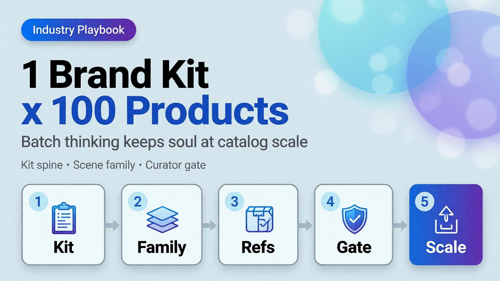
    3. Adobe, Inaugural Creators' Toolkit Report (Adobe MAX 2025), October 28, 2025. https://news.adobe.com/news/2025/10/adobe-max-2025-creators-survey
    4. Idukki, UGC Statistics 2026 — Beauty + Cosmetics Vertical, Q1 2026. https://www.idukki.io/resources/ugc-statistics