Blog

  • AI 상품 사진이 스튜디오를 대체하려면 원본 빛부터 맞아야 한다

    AI 상품 사진을 검색하면 “촬영 없이 완성”이 먼저 보입니다. 쿠팡·스마트스토어 운영자가 실제로 깨지는 지점은 다릅니다: 원본에 빛·모서리·라벨 정보가 없는데 AI가 메인을 “예쁘게” 만들어 버리는 순간입니다.

    이 글은 생성 도구 소개가 아닙니다. 촬영 관점입니다. 실물에서 무엇을 남겨야 하고, 무엇은 AI가 상상하면 안 되는지.

    Key Takeaways

    • AI 상품 사진 실패의 대부분은 원본 데이터 부족(하이라이트/엣지/문자)이다.
    • 화이트 메인은 배경 제거가 아니라 조명 규율이다.
    • 유리·메탈·박·주얼리·구김 원단은 히어로 실사를 우선한다.
    • 아이덴티티 락 이후에만 각도·라이프스타일·광고 확장을 한다.

    “상품 사진” 검색은 생성기 검색과 다르다

    검색어 실제 과제 흔한 실수
    AI 상품 사진 카탈로그 촬영 대체 / 폰 조명 보정 Midjourney를 카메라로 씀
    AI 상품 이미지 생성 툴·워크플로 QA 없이 업로드
    AI 제품 사진 채널 키트 한 장으로 전 채널

    키트 프레임: AI 제품 사진. 툴 프레임: AI 상품 이미지 생성.

    질문은 “AI가 찍어주나?”가 아니라 실물에서 어떤 광자를 남긴 뒤에 AI를 허용할 것인가이다.

    화이트 메인이 ‘가짜’로 보이는 세 가지

    문제 모바일 체감 AI 전 조치
    로고/박 과노출 싸구려 플라스틱감 확산광; 반사각 변경
    접촉 그림자 없거나 과함 떠 있거나 지저분 소프트 필 + 약한 접촉영
    라벨 문자 뭉개짐 신뢰·리뷰 리스크 더 가까이; 문자 우선 포커스

    톱니 엣지, 회색 배경, 로고 “미화” 변형 → 폐기. 그건 사진이 아니라 합성 티다.

    재질별: AI 확장 vs 실사

    재질 좋은 원본 후 AI 확장 히어로 실사
    무광 박스·파우치 드묾
    불투명 보틀+평면 라벨 색 민감 SKU
    유리/투명 액체 약–중 필수
    메탈/크롬/박 필수
    의류 플랫/행거 핏·드레이프
    주얼리·소형 하드웨어 매크로

    가치 신호가 표면 위 빛의 움직임이면 실사. 실루엣+인쇄 색면이면 서울 창가 폰샷+화이트 규율로도 리스팅·광고가 가능한 경우가 많다.

    하이브리드 촬영 순서

    1. 정직한 히어로 (라벨 가독, 수평, 흔들림 없음)
    2. 문서로 아이덴티티 락
    3. 화이트 QA 통과 후에만 확장
    4. 뚜껑 실루엣/로고 변형 거부
    5. 썸네일 3초 인식 테스트 후 쿠팡 반영

    Orauria의 위치

    Product Marketing용 AI Creative Studio. 상품 한 장 → 사진·광고·소셜·숏폼 → campaign pack. 진실한 캡처는 판매자 몫, SKU 드리프트 없는 확장은 시스템 몫.

    첫 Product Kit 만들기 →

    FAQ

    스튜디오를 완전히 없앨 수 있나?

    무광 카탈로그·광고 변형은 종종 가능. 유리·메탈·브랜드 필름은 실사 유지. 하이브리드가 정답에 가깝다.

    AI 화이트가 ‘플라스틱’처럼 보이는 이유는?

    원본 스펙큘러/엣지 라이트가 틀렸거나 모델이 하이라이트를 지어낸 경우. 재생성 전에 촬영 기하부터 고친다.

    아이덴티티 브리프에 무엇을 적나?

    박스 색, 로고 무왜곡, 비율 고정, 미화 금지 재질, 라이프스타일에서 암시하면 안 되는 클레임.

    결론

    AI 상품 사진 = 진실 캡처 → 락 → 상업 프레임 확장 → 포토 리드식 QA. 첫 고리를 건너뛰면 뒤의 AI 사진은 코스프레다.

    Create Your First Product Kit →

  • AI 상품 이미지 생성: 랜덤 아트가 아니라 판매용 이미지 키트

    AI 상품 이미지 생성을 찾는다면, 또 다른 아트 툴이 아니라 실물 SKU를 지키는 생성 시스템이 필요합니다.

    한 장의 폰/팩샷 업로드 → 쿠팡·스마트스토어 메인, 라이프스타일, 인스타·카카오 광고 컷까지. 패키지·로고·색·형태는 고정. 성수 스튜디오 일정이 없어도 됩니다.

    Key Takeaways

    • 쇼핑객 약 75%가 구매 결정에 상품 사진을 의존 (Weebly, 2026).
    • 5–7장(각도+라이프스타일)이 1장보다 유리한 경우가 많음 (Statista / 2025–2026).
    • 실패: Midjourney 감성 컷을 오픈마켓 메인에 억지 적용.
    • 체크: 원본 → 아이덴티티 락 → job별 생성 → 1:1 · 4:5 · 3:4 · 9:16 · 16:9.

    AI 상품 이미지 생성이 해야 할 일

    아트 생성 이커머스 AI 상품 이미지 생성
    입력 프롬프트 실물 사진
    출력 예쁜 한 장 채널 키트
    제약 미학 상품 아이덴티티
    성공 좋아요 CTR, ROAS, 반품

    관련: AI 제품 사진.

    “생성”의 단위는 파일이 아니라 등록 가능한 세트여야 합니다.

    예쁜 생성이 쿠팡에서 깨지는 이유

    반품 약 22%가 사진·실물 불일치 (Weebly). 로고 뭉개짐·색 오차는 CS 비용입니다.

    화이트+라이프스타일은 화이트만 대비 전환 15–30% 리프트 사례가 많음 (2026 A/B).

    한 번 업로드 → 키트

    단계 Job 채널
    화이트/팩샷 메인 쿠팡, 스마트스토어
    라이프스타일 사용 맥락 상세, 광고
    마켓 규격 11번가 등
    소셜 광고 스크롤 정지 인스타, 카카오, 틱톡
    캠페인 설/추석/연말 기획전

    USP 5가지(ART 공통) 유지.

    5단계

    1. 정직한 원본 (서울 창가 폰샷 OK)
    2. 아이덴티티 락
    3. Job 단위 생성
    4. 비율별보내기
    5. 게시 전 QA

    Orauria

    Product Marketing용 AI Creative Studio. 상품 한 장 → 사진·광고·소셜·숏폼 → campaign pack. 또 하나의 생성기가 아니라 상품 → 이커머스 콘텐츠 시스템.

    첫 Product Kit 만들기 →

    FAQ

    쿠팡·스마트스토어에 써도 되나?

    실물 표현 + 정책 준수 시 가능. 메인은 클린 컷, AI는 확장용.

    배경 제거와 차이는?

    제거는 한 단계. AI 상품 이미지 생성은 세트·다비율·아이덴티티 락까지.

    프롬프트가 필수인가?

    업로드 → job 선택 → 생성이면 아님. 상업 브리프가 우선.

    결론

    베스트 SKU로 5종 키트 만들고 메인 A/B 7–14일.

    Create Your First Product Kit →

  • AI 제품 사진: 한 장으로 판매용 콘텐츠 키트 만들기

    AI 제품 사진: 한 장으로 판매용 콘텐츠 키트 만들기

    랜덤 AI 이미지를 만들지 마세요. 바로 팔 수 있는 제품 크리에이티브를 만드세요.

    AI 제품 사진의 의미는 이렇습니다. 실제 상품 사진 한 장을 올리면 → 화이트 배경 팩샷, 라이프스타일 장면, 상세·배너·SNS 광고 소재가 나오고, 패키지·로고·색·형태는 그대로 유지됩니다. 서울 성수 스튜디오 일정이 없어도, 포토그래퍼 데이레이가 없어도, 릴스용 9:16을 만들 때마다 디자인툴을 다시 열 필요가 없습니다.

    Key Takeaways

    • 온라인 구매는 시각에 크게 의존합니다. 약 75%의 쇼핑객이 구매 결정 시 상품 사진에 의존한다고 답했습니다 (Weebly, 2026 업계 종합).
    • 다중 이미지 리스팅은 단일 이미지보다 전환이 좋은 경우가 많습니다. 1장에서 5–7장(각도 + 라이프스타일)으로 갈 때 업계 데이터에서 리프트가 보고됩니다 (Statista / 2025–2026 종합).
    • 2026년 흔한 실패: Midjourney·Flux·GPT Image를 아트 툴처럼 쓴 뒤 쿠팡 메인 이미지에 억지로 맞추기 — 상품 → 콘텐츠 키트를 만들지 않는 것.
    • 승리 체크리스트: 깨끗한 원본 → 아이덴티티 락 → 작업별 출력(스튜디오/라이프스타일/광고/마켓플레이스) → 비율별 내보내기(1:1 · 4:5 · 3:4 · 9:16 · 16:9).

    AI 제품 사진이란?

    AI 제품 사진은 실제 상품 사진을 입력으로, 리스팅·광고·SNS에 쓸 상업 비주얼을 확장하는 과정입니다. 자유 문장 프롬프트로 그리는 아트 생성이 아닙니다.

    아트 생성기 (Midjourney, Flux…) 이커머스 AI 제품 사진
    입력 텍스트 프롬프트 / 무드 실제 상품 사진(폰 또는 팩샷)
    목표 예쁜 / 바이럴 프레임 등록·집행 가능한 에셋
    제약 적음 — 미학 우선 형태·라벨·색·비율 유지
    출력 흩어진 단일 파일 채널별 키트
    성공 지표 좋아요, 미감 클릭률, ROAS, 반품 감소

    「이커머스 디자인 ≠ AI 이미지 한 장」의 큰 틀은 AI ecommerce design is not AI image를 참고하세요.

    한국 셀러에게 부족한 것은 모델이 아닙니다. 퍼블리싱 시스템입니다. SKU 하나 들어가면 → 여러 채널 크리에이티브가 나오고, 상품 아이덴티티는 같아야 합니다.

    ‘예쁜’ AI 사진이 쿠팡에서 안 팔리는 이유

    실물과 다른 예쁜 컷은 신뢰와 반품을 깎습니다. 반품의 약 22%가 사진과 실물 불일치와 관련됩니다 (Weebly / 업계 종합).

    세 가지 흔한 실패:

    1. 아이덴티티 드리프트 — 로고 뭉개짐, 패키지 색 오차, 병 비율 왜곡(오픈마켓 메인·상세에서 치명적).
    2. 한 장으로 전 채널 — 스마트스토어 1:1은 괜찮은데 릴스 9:16 크롭에서 구도 붕괴.
    3. 각도 체계 부재 — 히어로만 있고 디테일·스케일·라이프스타일·증명 컷이 없음.

    화이트 배경만 쓸 때보다 라이프스타일을 함께 두면 전환이 약 15–30% 오르는 경우가 많습니다 (2026 A/B 업계 종합). 필요한 것은 세트이지, ‘고급’ 렌더 한 장이 아닙니다.

    상품 하나 → 콘텐츠 키트 전체

    Orauria의 포지셔닝 — 그리고 스케일하려는 국내 셀러의 브리프:

    Don’t generate random AI images. Generate product creatives that are ready to sell.

    짧게: 이커머스를 위한 AI 제품 사진.

    One Product. An Entire Content Kit.

    상품을 한 번 업로드하세요. 팔기 위해 필요한 이미지를 생성하세요.

    파이프라인 이미지 역할 어디에 쓰나
    스튜디오 / 팩샷 깨끗하고 프리미엄한 통제 배경 쿠팡·스마트스토어 메인, 카탈로그
    라이프스타일 실제 사용 맥락 상세, 광고, SNS
    마켓플레이스 리스팅 최적화 쿠팡, 11번가, 지마켓, 스마트스토어
    소셜 광고 스크롤을 멈추는 컷 인스타, 페이스북, 틱톡, 카카오
    캠페인 브랜드 일관 프로모 기획전, 설/추석, 블랙프라이데이, 상세 배너

    히어로 아래에 바로 둘 USP:

    1. One Product → Multiple Creatives — 상품 한 장으로 판매 이미지 세트.
    2. Keep Your Product Consistent — 패키지·로고·색·형태 유지.
    3. Built for Ecommerce — 쿠팡, 스마트스토어, 자사몰, 인스타·카카오 광고.
    4. From Product Photo to Ad — 팩샷 → 라이프스타일 → 배너 → 소셜 광고.
    5. Multiple Formats — 1:1 · 4:5 · 3:4 · 9:16 · 16:9.

    AI 제품 사진 만드는 법 (5단계)

    1단계: ‘충분히 진짜’인 원본 준비

    원본이 천장입니다.

    • 고른 조명 — 라벨 하이라이트 과다 금지
    • 정면 + 선택적 45°
    • 워터마크·강한 필터 없음
    • 단순한 배경(화이트 / 크래프트 / 깔끔한 책상)

    서울 아파트 창가 폰 사진, 파주·이천 물류 화이트 컷도 충분합니다. 스튜디오는 선택, 팩샷 사고는 필수입니다. Packshot thinking을 참고하세요.

    2단계: 예쁘게 만들기 전에 아이덴티티 락

    라이프스타일·광고 전에 고정:

    • 브랜드/패키지 색
    • 로고·라벨 문구(허위 문구 금지)
    • 형태·비율·재질(무광/유광/유리)
    • 변경 금지 항목(SKU 변형, 효능 표기, 인증 배지)

    락이 없으면 생성할 때마다 ‘다른 상품’이 됩니다.

    3단계: 바이브가 아니라 작업(job)으로 생성

    SKU당 최소:

    1. 화이트/스튜디오 1–2장 (메인 이미지)
    2. 라이프스타일 2–3장 (욕실 선반, 책상, 거실 — 한국 가정 맥락)
    3. 디테일/텍스처 1장
    4. 소셜 광고 1장 (카피·CTA 여백)
    5. 배너/기획전 1장 (설 연휴, 연말, 브랜드위크)

    AI에게 「더 예쁘게」라고 묻지 마세요. 이 컷이 어떤 구매 질문에 답하나? (생김새 / 사용법 / 크기 / 싼 제품과 차이)

    4단계: 한국 채널 비율로보내기

    채널 권장 비율 메모
    쿠팡 / 스마트스토어 메인 1:1 피사체 명확, 배경 통제
    상세 썸네일·추가 이미지 1:1 또는 세로 각도·디테일
    인스타 / 페이스북 피드 1:1 또는 4:5 라이프스타일·광고
    릴스 / 숏츠 / 스토리 9:16 UI 세이프존
    상세 배너 / 기획전 16:9 또는 몰 규격 시즌 캠페인
    자사몰 PDP 1:1 또는 4:5 히어로 + 갤러리

    마스터 한 장을 맹목적 크롭하면 구도가 깨집니다. 처음부터 비율 인식 생성. 멀티 크롭은 One product: feed, story, cover, marketplace banners를 보세요.

    5단계: 게시 전 QA (반품 방화벽)

    60초 체크:

    • [ ] 모바일에서 1초 안에 상품 인지
    • [ ] 로고/라벨 읽힘, 왜곡 없음
    • [ ] 색이 실물과 맞음(판매용 필터 금지)
    • [ ] 프레임 안 허위 혜택·인증 없음
    • [ ] 용량·로딩 무리 없음
    • [ ] 갤러리 전체 조명 패밀리 일치

    쿠팡·스마트스토어·자사몰에서 같은 키트 쓰기

    국내 셀러는 보통 같은 SKU를 여러 전선에 올립니다.

    • 쿠팡: 클린 메인 + 각도 + 라이프스타일
    • 네이버 스마트스토어: 메인·추가 이미지 + 상세 상단 비주얼
    • 11번가 / 지마켓 등: 카탈로그 일관성
    • 자사몰(카페24·Shopify 등): PDP 히어로 + 신뢰 컷
    • 인스타·카카오·틱톡 광고: 각도·배경 변형으로 테스트

    키트 하나로 몰마다 ‘얼굴’이 바뀌지 않게 하세요. 설·추석·연말·브랜드 위크는 아이덴티티를 재사용해 변주하세요.

    ‘한국스럽게’ 읽히는 라이프스타일

    • 스킨케어: 밝은 욕실 거울 선반(유럽 대리석 클리셰 대신)
    • 커피 기기: 성수·홍대 감성 원목 테이블 또는 아파트 주방
    • 아웃도어: 주말 캠핑·한강/근교 공원 맥락
    • 홈: 남향 거실 오후 창빛

    장면은 동기를 팔고, 상품 아이덴티티는 파주·군포 풀필먼트에서 나가는 실물과 같아야 합니다.

    실사 스튜디오 vs AI

    상황 선택
    SKU 30–100 런칭, 예산 타이트 AI 제품 사진 + 깨끗한 폰/팩샷 원본
    시즌·기획전 소재 리프레시 락된 팩샷에서 AI로 라이프스타일·배너 변형
    전국 캠페인, 난이도 높은 재질(크롬·유리·시스루) 하이브리드: 히어로 실사 소수 + AI 스케일
    텍스처·용량·사이즈가 법적/CS 이슈 실사로 진실 전달, AI는 맥락만 — 디테일 조작 금지

    AI는 모든 성수·을지로 촬영을 대체하지 않습니다. 스케일 병목(SKU × 채널 × 시즌)을 대체합니다.

    Orauria: 제품 사진에서 캠페인 팩으로

    Orauria는 Product Marketing용 AI Creative Studio입니다. 상품 이미지 한 장 → 제품 사진, 광고, 소셜, 숏폼까지 만들고 campaign pack으로보냅니다.

    또 하나의 AI 이미지 생성기가 아닙니다. 상품 → 이커머스 콘텐츠 시스템입니다.

    • 한 번 업로드 → 일관된 다수 크리에이티브
    • 리스팅과 광고에서 아이덴티티 유지
    • 판매 채널 포맷 준비

    CTA: 첫 Product Kit 만들기 →

    워크스페이스 소개: Orauria란? 이커머스 AI 크리에이티브 워크스페이스.

    FAQ — AI 제품 사진

    쿠팡·스마트스토어에 AI 제품 사진을 써도 되나요?

    실물을 정확히 보여주고 플랫폼 이미지·광고 정책을 지키면 됩니다. 메인은 주체가 분명한 클린 컷을, AI는 라이프스타일·추가·광고 확장에 쓰는 편이 안전합니다. 다른 상품으로 바꾸면 안 됩니다.

    배경 제거와 뭐가 다른가요?

    배경 제거는 한 단계입니다. AI 제품 사진은 라이프스타일, 광고, 배너, 다중 비율, 세트 전체 아이덴티티 락까지 포함합니다.

    리스팅에 몇 장이 좋은가요?

    실무에서는 5–7장(각도 + 디테일 + 라이프스타일)이 한 장이나 과다 갤러리보다 균형인 경우가 많습니다. 자사 트래픽으로 측정하세요.

    프롬프트를 잘해야 하나요?

    이커머스 워크플로(업로드 → 이미지 job 선택 → 생성)면 필수는 아닙니다. 채널·job·아이덴티티 락·비율이 담긴 상업 브리프가 더 중요합니다.

    Midjourney만으로 충분할까요?

    예쁜 프레임은 나옵니다. 아이덴티티 락·멀티 포맷·마켓플레이스 파이프라인은 부족한 경우가 많습니다. 아트 모델은 엔진 층, 위에는 상품 키트 / 판매 워크플로가 필요합니다.

    결론

    AI 제품 사진은 Behance식 ‘AI 느낌’이 아니라, 판매와 리스팅 신뢰로 이깁니다.

    세 가지만 기억하세요.

    1. 실제 원본으로 아이덴티티 락
    2. job 단위 생성(스튜디오 → 라이프스타일 → 마켓 → 소셜 광고)
    3. 비율보내기 + 게시 전 QA

    다음 단계: 쿠팡·스마트스토어 베스트 SKU 하나로 위 표의 5종 키트를 만들고, 메인 이미지를 7–14일 A/B 하세요.

    Create Your First Product Kit →

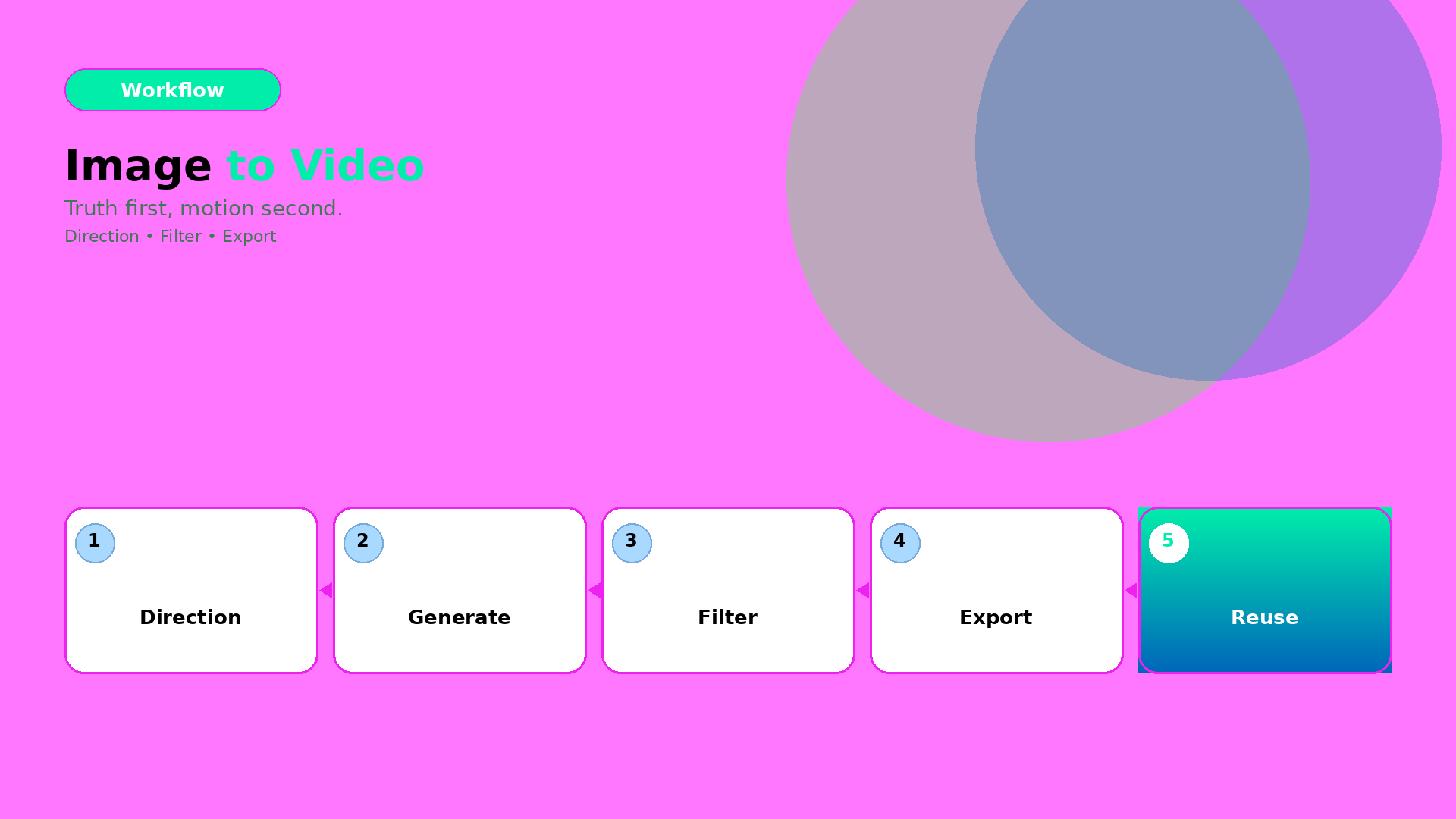
  • How to Use Image to Video with AI: Direction → Gates → Export

    How to Use Image to Video with AI: Direction → Gates → Export

    Image-to-video is deceptively easy.

    You convert one image, and you get motion. But production quality depends on one question:

    Did the direction preserve product truth?

    If yes, motion becomes proof. If no, motion becomes distortion.

    Key Takeaways

    – Image-to-video is efficient when you lock direction first.

    – Gates decide winners: geometry truth, identity stability, and caption/offer alignment.

    – Export variants should follow the same gate logic across channels.

    The 3-part workflow

    1) Direction kit (lock what must stay true)

    Define:

    • what moves (pose/camera feel),
    • what stays true (geometry, label readability, character identity cues),
    • what the scene must communicate (hook, proof, offer).

    This is the “creative direction” layer. Not another prompt.

    2) Generate candidates (then filter, fast)

    Generate multiple candidates under the same direction kit. Reject early with gates:

    • warped edges / warped proportions,
    • unstable identity cues,
    • text/label unreadability after resize.

    This prevents spending time on polish for failures.

    3) Export channel-safe variants (without rework)

    Export with rules:

    • correct aspect ratio,
    • stable safe zones for text and CTA,
    • consistent shadow family and background logic.

    Now your output becomes a reusable creative asset, not a one-off clip.

    What to do next

    If you want the deeper version of the same workflow, read:

    And if your bottleneck is “not enough angles”:

  • How to Convert Text to Videos with AI: Bottleneck-First Workflow

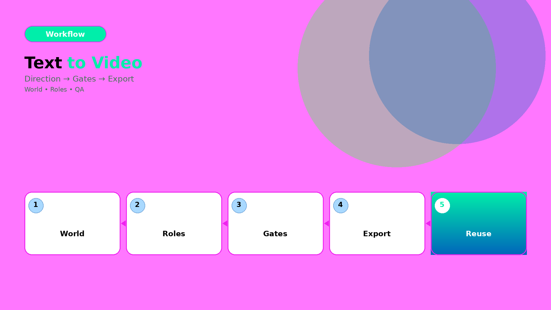
    How to Convert Text to Videos with AI: Bottleneck-First Workflow

    The common failure pattern in text-to-video is the same:

    People generate early, then discover late. They refine prompts while the world already drifted.

    The production fix is simple: stop treating text-to-video as a “prompt task”. Treat it as a workflow with gates.

    Key Takeaways

    – Text-to-video works when you lock direction before you generate.

    – The right QA gates prevent world drift (tone, shadow family, and identity continuity).

    – Efficiency improves when you route by bottleneck: geometry vs readability vs offer tone.

    Step 1: Turn text into direction (not a prompt)

    Start with one compressed direction brief:

    • World: the setting + light family + tone
    • Roles: what each scene must do (hook, proof, offer)
    • Constraints: what cannot drift (product truth, identity anchors, claim safety)

    If your direction brief can’t be spoken in 20–30 seconds, your video will splinter.

    Step 2: Generate under gates (batch, then filter)

    Generate more than you need. But do not “pick the best-looking”.

    Filter by pass/fail gates:

    1. World gate: does the light/tone stay consistent?
    2. Identity gate: does the character/product identity stay in range?
    3. Offer gate: does the visual imply the same promise as your copy?

    Any failure means you update the direction kit—not your luck.

    Step 3: Export variants channel-safe

    Text-to-video videos often die at export:

    • captions get cut
    • safe zones break
    • aspect ratio changes product proportions

    So export with the same gate logic:

    Channel Gate focus
    Reels (9:16) first-second readability
    Stories caption timing and proof hold
    Feed (1:1 / 4:5) product truth center framing

    Routing: which bottleneck decides your workflow?

    Use bottleneck-first routing:

    • if geometry is failing → choose direction/scene constraints that preserve edges and proportions,
    • if readability is failing → adjust label/typography rules before generation,
    • if offer tone is failing → align caption gate with scene roles.

    Model choice is downstream.

    What to do next

    If you want the workflow mindset:

  • Choosing an AI Image Model by Creative Direction (Not Hype)

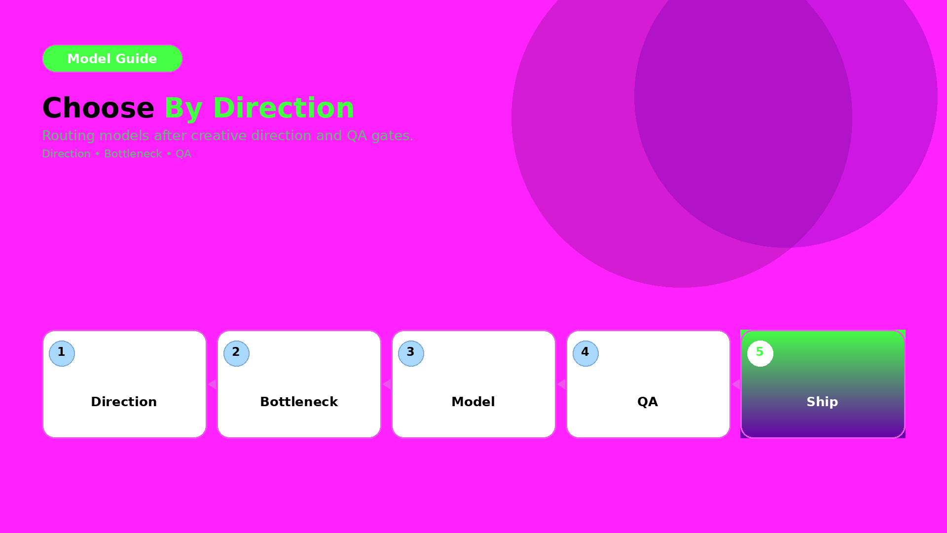
    Choosing an AI Image Model by Creative Direction (Not Hype)

    Model choice is not a “which one is best” question.

    It is a routing question.

    Route by creative direction and bottleneck after your QA gates are defined. Then the model becomes an implementation detail—not a gamble.

    Key Takeaways

    – Creative direction defines what must stay true (world + roles + QC gates).

    – The bottleneck defines what the model must solve for you.

    – Pick the model after you lock direction—then test under the same gates.

    Step 1 — Lock direction first (inputs you must keep constant)

    Before you compare models, lock:

    • world promise (light family + palette logic),
    • identity anchors (faces/characters or texture cues),
    • and your QA gates (geometry truth + readability).

    If direction changes while models change, you learn nothing.

    Step 2 — Identify your bottleneck type

    Most ecommerce issues fall into one of three bottleneck types:

    1. Geometry bottleneck: edges, proportions, product silhouette
    2. Texture bottleneck: materials, labels, stitching cues
    3. Readability bottleneck: text/label clarity after resize

    Your model should be selected based on the bottleneck you actually see.

    Step 3 — Route outputs through QA gates

    Don’t decide by what the image “feels like”. Decide by pass/fail:

    • geometry truth gate,
    • readability gate,
    • world continuity gate (shadow family + tone),
    • and offer tone gate (if your copy implies a different promise).

    A practical routing checklist

    Use this checklist whenever a new model trend appears:

    1. What bottleneck are we solving today?
    2. Are direction + gates unchanged?
    3. Can we compare on the same output formats (1:1, 9:16, listing)?
    4. Are we rejecting failures early (before polish)?

    If yes: test models. If no: fix the direction kit first.

    What to do next

    Start with the direction-after rule:

    Then upgrade routing to bottleneck-first:

    • pick the model by QA evidence,
    • and keep your gates constant.
  • Orauria vs Canva + ChatGPT: Honest Comparison for Ecommerce Teams

    Orauria vs Canva + ChatGPT: Honest Comparison for Ecommerce Teams

    Many teams try this stack:

    • ChatGPT for briefs and copy,
    • Canva for layout and crops,
    • and “AI images from somewhere else” for visuals.

    It works—until you scale.

    The failure point is not output quality. It is handoff cost.

    Where Canva + ChatGPT excels

    Canva is great for:

    • quick crops,
    • fast social templates,
    • and design iteration when the direction is already locked.

    ChatGPT is great for:

    • brainstorming,
    • first drafts of captions,
    • and helping you write the brief.

    Where the stack breaks in ecommerce production

    When you go from one asset to a drop system, you need:

    • a shared brand kit,
    • consistent identity anchors,
    • and QA gates across formats.

    In a scattered stack, your system becomes “people remembering”. But production requires “rules enforcing”.

    Orauria’s advantage: workflow continuity

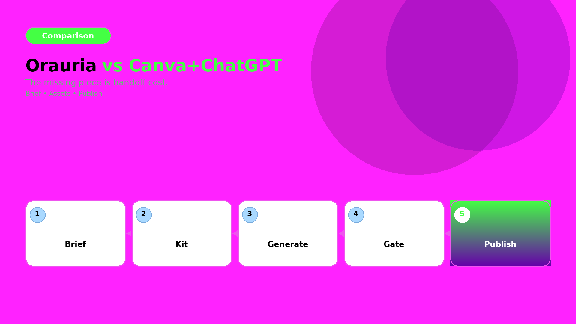
    Orauria is built around the loop:

    1. Brief (intent + constraints),
    2. Brand kit (rules that must not change),
    3. Gates (QC checks before you upscale/export),
    4. Generate and route variants,
    5. Publish-ready exports for ads and listings.

    This turns many outputs into one recognizable system.

    The decision rule (when Orauria wins)

    Orauria wins when:

    • you need 10+ assets per campaign,
    • you must preserve brand identity across sizes and channels,
    • and you don’t have time to manually re-explain the brief every run.

    If your process is “one designer, one asset, one export”, then Canva may be enough.

    What to do next

    If you are switching stacks, start with the mindset:

    • brief once,
    • lock kit once,
    • enforce gates,
    • then generate and publish.

    For a workflow blueprint:

  • Case: 30-SKU Shop, Zero Studio — Lookbook in 3 Days

    Case: 30-SKU Shop, Zero Studio — Lookbook in 3 Days

    This case is not about “fast rendering”. It is about fast decisions under constraints.

    A 30-SKU shop had no studio time. The goal was a lookbook that could also be reused for ads and marketplace listings.

    The bottleneck

    When you generate lookbook scenes quickly, your real failure modes are:

    • identity drift (faces/characters not stable),
    • world collapse (shadows and tone change scene to scene),
    • and QA blindness (geometry or label readability fails after resizing).

    So the case success is measured by: continuity + QA gates + reusable roles.

    Experiment setup (what we locked first)

    World kit

    • one light family (shadow logic stays inside a range),
    • one palette logic (background + product accents),
    • one continuity anchor set (identity + product geometry truth).

    Creative directions (roles)

    We used lookbook thinking:

    • hook role: first-second value,
    • proof role: texture + label readability,
    • offer role: CTA and promise tone,
    • reuse role: later export into ad-safe formats.

    Scene grid plan

    30 SKUs were not treated as 30 independent projects. They were mapped into a batch:

    • same world kit,
    • roles repeated across scenes,
    • only the SKU variable changes.

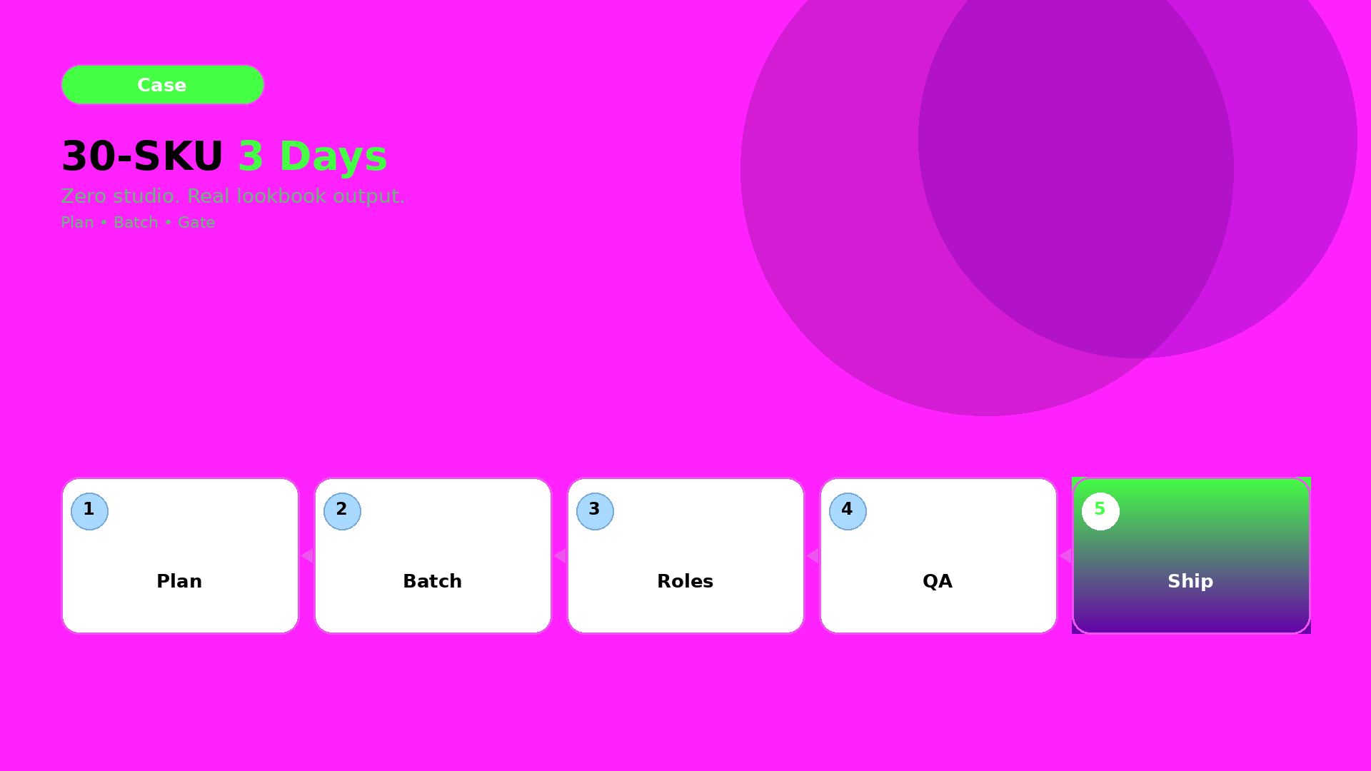
    The 3-day schedule (how speed actually happened)

    Day 1 — Plan + role map

    Lock directions and world kit. Write the QA checklist before any generation.

    Day 2 — Generate batches

    Generate scenes per role, not per SKU. Reject drift candidates early so we don’t waste polish time.

    Day 3 — QA gates + export

    Run the gates and export channel-safe variants:

    • lookbook page frames,
    • ad-ready crops,
    • marketplace listing support frames.

    QA gates used (what got checked every time)

    We used four gates:

    1. Identity gate: continuity anchors match across scenes.
    2. Geometry gate: edges and proportions stay stable.
    3. Readability gate: labels/CTA remain legible after resizing.
    4. Offer gate: captions imply the same promise as the visuals.

    If any gate fails, we update the kit (rules), then regenerate only affected outputs.

    What actually shipped

    • one coherent lookbook world,
    • consistent brand identity across many scenes,
    • and reusable exports for ads and listings.

    The result is not “many images”. The result is a production system the shop can rerun for future drops.

    What to do next

    If you want to build the same pipeline:

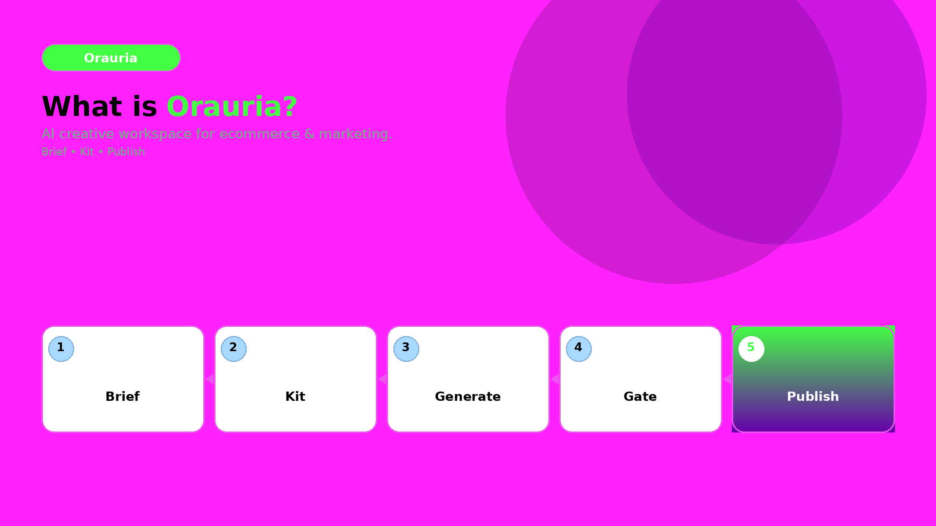
  • What Is Orauria? The AI Creative Workspace for Ecommerce

    What Is Orauria? The AI Creative Workspace for Ecommerce

    Orauria is not just another AI chat.

    It is a creative production workspace for ecommerce and marketing teams—built for the real bottleneck: turning an idea into a consistent set of assets that can be shipped, resized, and reused.

    The core idea: brief → kit → gates → publish

    Most content workflows fail because they treat AI outputs like standalone files.

    Orauria connects the steps:

    1. Brief: capture intent and constraints.
    2. Brand kit: lock palettes, light family, identity anchors, and rules.
    3. Gates (QC): reject drift before you upscale or export.
    4. Publish-ready exports: generate channel-safe variants without rebuilding from scratch.

    Why it matters for ecommerce

    Ecommerce needs recognition.

    Buyers expect the same product truth across:

    • listing visuals,
    • social feed and reels,
    • marketplace banners,
    • and ad campaigns.

    Orauria’s workflow mindset is designed to keep that recognition stable.

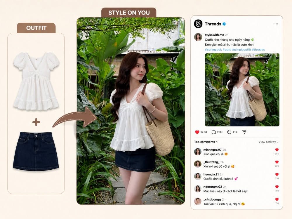
    What you do in Orauria (in one sentence)

    You build a reusable creative system, then generate assets that stay inside the same world promise.
    If you want the workflow blueprint, start with:

    What to read next

    If you want the thinking behind the system:

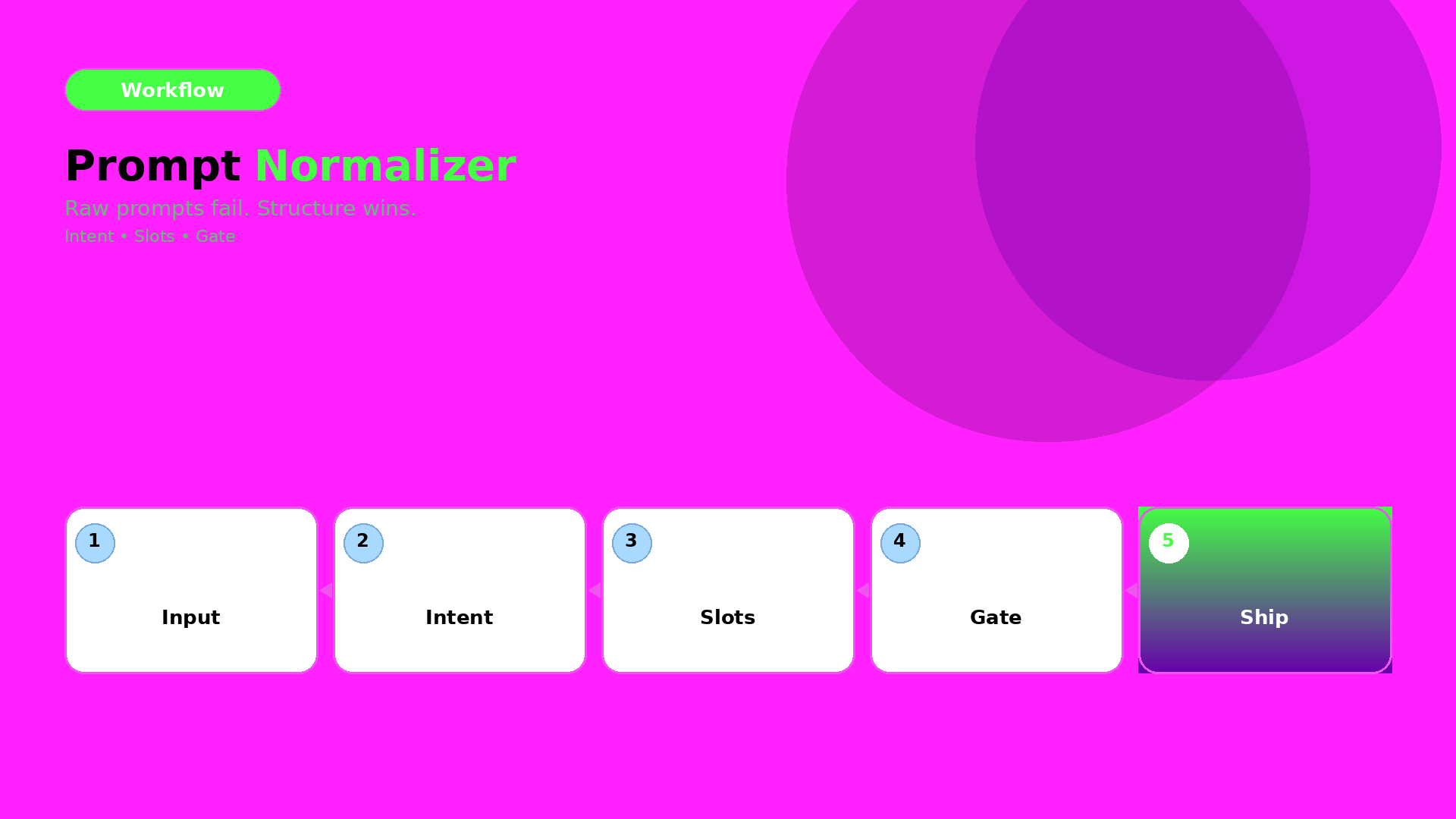
  • When to Use Prompt Normalizer vs Raw Creative Prompts

    When to Use Prompt Normalizer vs Raw Creative Prompts

    Most teams treat “prompting” as one skill. It isn’t.

    For ecommerce production, prompting is actually two different jobs:

    • turning a messy idea into a structured intent (normalizer),
    • and pushing style choices inside a locked direction (raw creative prompt).

    If you mix these jobs, you get inconsistent outputs and wasted iterations.

    Key Takeaways

    – Raw prompts are good for exploration.

    – Normalizers are good for alignment and repeatability.

    – Your workflow should choose the tool by bottleneck, not by preference.

    What is a prompt normalizer (production view)?

    A normalizer takes input like:

    • “make it premium”,
    • “use the same model”,
    • “make it look like our brand”,
    • “turn this into an ad”.

    And converts it into a structured brief:

    1. Intent: what outcome it must achieve,
    2. Slots: what can vary vs what cannot,
    3. Constraints: QA gates rules (geometry, readability, world logic),
    4. Output routing: which model family fits the bottleneck.

    In other words, it is the briefing layer.

    What are raw creative prompts (exploration view)?

    Raw prompts are where you:

    • try a new visual twist,
    • adjust scene tone,
    • explore typography density,
    • test hook variations.

    Raw prompts are not wrong. They are just wrong for tasks that require alignment.

    The decision guide: choose by bottleneck

    Ask this:

    A) Are you missing alignment?

    If results drift in:

    • face/identity,
    • shadow family,
    • label clarity,
    • caption promise vs visuals,

    then you are missing rules. Use a prompt normalizer.

    B) Are you already aligned and just exploring?

    If identity is stable and only style options are unclear, then exploration is fine. Use raw creative prompts.

    A simple workflow that prevents waste

    Use this loop:

    1. Normalize the brief (intent + slots + constraints)
    2. Generate exploration variants inside the locked world kit
    3. Gate by QA checks
    4. Ship only the winners into your content system

    This is what “workflow mindset” means in prompting: you are building a reusable system, not repeating trials.

    What to do next

    If you want the brief template:

    If you want workflow routing: