Category: E-commerce

  • AI商品画像で白抜きが偽物に見えるのは光とエッジの問題だ

    AI商品画像で検索すると「撮影不要」が並びます。Amazon.co.jp・楽天で実際に壊れるのは別の点です。原画にハイライト・輪郭・ラベル情報が足りないのに、AIがメインを“きれいに”作ってしまう瞬間です。

    本記事はツール紹介ではありません。撮影の話です。実物から何を残し、何をAIに想像させてはいけないか。

    Key Takeaways

    • AI商品画像の失敗の多くは原画データの欠落(ハイライト/エッジ/文字)。
    • 白抜きは切り抜きではなく 照明の規律
    • ガラス・メタル・箔・ジュエリー・シワの出る生地はヒーロー実写を優先。
    • アイデンティティ固定のあとにだけ角度・シーン・広告を拡張する。

    「商品画像」検索はジェネレーター検索と違う

    検索語 本当の仕事 よくある誤り
    AI商品画像 カタログ撮影の代替/スマホ光の補正 Midjourneyをカメラ扱い
    AI商品写真 撮影パイプライン QAなしで出品
    AI商品画像生成 チャネル一式 1枚で全媒体

    キット視点: AI商品画像生成。撮影パイプライン: AI商品写真

    問うべきは「AIが撮れるか」ではなく、実物のどの光子を残してからAIを許すかだ。

    白抜きが安く・偽物に見える3点

    問題 スマホでの見え方 AI前の対処
    ロゴ/箔の過露出 安っぽいプラ感 拡散光;反射角を変える
    接地影なし/強すぎ 浮く/汚れる 弱い接地影+ソフトフィル
    ラベル文字つぶれ 信頼・レビューリスク 寄り;文字優先フォーカス

    ギザギザ縁、グレー背景、ロゴの“美化”変形 → 破棄。写真ではなく合成の痕跡です。

    材質別:AI拡張 vs 実写

    材質 良い原画後のAI拡張 ヒーロー実写
    マット箱・パウチ
    不透明ボトル+平面ラベル 色差に厳しいSKU
    ガラス/透明液体 弱〜中 必須
    メタル/メッキ/箔 必須
    アパレル平置き/ハンガー シルエットとドレープ
    ジュエリー・小物金具 マクロ

    価値信号が表面を走る光なら実写。外形+印刷色面なら東京の窓辺スマホ+白抜き規律で出品・広告まで行けることが多い。

    ハイブリッド手順

    1. 正直なヒーロー(ラベル可読・水平・ぶれなし)
    2. 文書でアイデンティティ固定
    3. 白抜きQA通過後にだけ拡張
    4. 蓋シルエット/ロゴ改変は拒否
    5. サムネ3秒認識テスト後にAmazon/楽天反映

    Orauriaの位置

    Product Marketing向け AI Creative Studio。商品1枚 → 写真・広告・SNS・ショート → campaign pack。真実のキャプチャは出品者側、SKUドリフトのない拡張はシステムの側。

    最初のProduct Kitを作る →

    FAQ

    スタジオは完全に不要?

    マット系カタログと広告バリエーションはしばしば可。ガラス・メタル・ブランドフィルムは実写。ハイブリッドが現実的。

    AI白抜きがプラスチックっぽい理由は?

    原画のスペキュラ/エッジライトが違うか、モデルがハイライトを捏造。再生成の前に撮影幾何を直す。

    アイデンティティブリーフに書くことは?

    箱色、ロゴ無歪み、比率固定、美化禁止材質、シーンで暗示してはいけない訴求。

    結論

    AI商品画像=真実キャプチャ → 固定 → 商業フレーム拡張 → 写真リード式QA。最初の環を飛ばせば、後段のAI画像はコスプレだ。

    Create Your First Product Kit →

  • AI商品写真:きれいな一枚ではなく、売れる写真セットを作る

    AI商品写真を探すなら、ランダムなアート生成ではなく、実物SKUを守る撮影システムが必要です。

    スマホまたは白抜き1枚 → Amazonメイン、楽天サブ、Shopify PDP、Instagram広告まで。パッケージ・ロゴ・色・形状は固定。渋谷スタジオの日程は不要です。

    Key Takeaways

    • 75% の買い物客が購入判断で商品写真に依存(Weebly, 2026)。
    • 5〜7枚(角度+シーン)が1枚より有利なことが多い(Statista / 2025–2026)。
    • 失敗:Midjourney感のカットをAmazon白抜きルールに無理当て。
    • チェック:原画 → アイデンティティ固定 → ジョブ別生成 → 1:1 · 4:5 · 3:4 · 9:16 · 16:9。

    AI商品写真が果たすべき役割

    アート生成 EC向け AI商品写真
    入力 プロンプト 実物写真
    出力 きれいな一枚 チャネル一式
    制約 審美 商品アイデンティティ
    成功 いいね CTR、ROAS、返品減

    関連:AI商品画像生成

    「写真」の単位はファイルではなく、出品できるセットであるべきです。

    きれいなAI写真がAmazonで落ちる理由

    返品の約 22% が写真と実物の不一致(Weebly)。ロゴ崩れ・色ずれは信頼とCSを削ります。

    白背景+ライフスタイルは白のみ比で転換 15–30% リフト例が多い(2026 A/B)。

    1回のアップロード → キット

    段階 Job チャネル
    白抜き/スタジオ メイン Amazon.co.jp、楽天
    シーン 使用文脈 PDP、広告
    モール 規定 Yahoo!ショッピング等
    ソーシャル広告 スクロール停止 IG、TikTok、FB
    キャンペーン 年末年始・セール LP、A+

    USP 5(ART共通)を維持。

    5ステップ

    1. 正直な原画(東京の窓辺スマホOK)
    2. アイデンティティ固定
    3. ジョブ単位で生成
    4. 比率別書き出し
    5. 公開前QA

    Orauria

    Product Marketing向け AI Creative Studio。商品1枚 → 写真・広告・SNS・ショート → campaign pack。別のジェネレーターではなく 商品 → ECコンテンツシステム

    最初のProduct Kitを作る →

    FAQ

    Amazon・楽天でAI商品写真は使える?

    実物表現+ポリシー遵守なら可。メインはクリーン、AIは拡張用。

    背景削除との違いは?

    削除は一工程。AI商品写真はセット・多比率・アイデンティティ固定まで。

    高度なプロンプトは必要?

    アップロード → ジョブ選択 → 生成なら不要。商業ブリーフ優先。

    結論

    売れ筋SKUで5種キットを作り、メインを7〜14日A/B。

    Create Your First Product Kit →

  • AI商品画像生成:1枚の商品写真から売れるクリエイティブ一式へ

    AI商品画像生成:1枚の商品写真から売れるクリエイティブ一式へ

    ランダムなAI画像を作らないでください。売れる状態の商品クリエイティブを作ってください。

    AI商品画像生成とは、実物の商品写真を1枚アップロードすると → 白抜きメイン、シーン画像、広告・SNS素材が揃い、パッケージ・ロゴ・色・形状はそのまま保たれる、という流れです。渋谷のスタジオ日程も、カメラマン日当も、Reels用9:16のたびにCanvaを開き直す必要もありません。

    Key Takeaways

    • オンライン購買はビジュアル依存が強い:約 75% の買い物客が購入判断で商品写真に頼ると回答(Weebly、2026業界まとめ)。
    • 複数画像の出品は単一画像より転換しやすいことが多い。1枚から 5〜7枚(角度+ライフスタイル)へ増やすと業界データでリフトが報告される(Statista / 2025–2026まとめ)。
    • 2026年の典型的な失敗:Midjourney / Flux / GPT Imageをアートツールとして使い、Amazonメイン画像ルールに無理やり当てはめる——商品 → コンテンツキットを作らないこと。
    • 勝ち筋チェック:きれいな原画 → アイデンティティ固定 → 役割別出力(スタジオ/シーン/広告/モール)→ 比率別書き出し(1:1 · 4:5 · 3:4 · 9:16 · 16:9)。

    AI商品画像生成とは?

    AI商品画像生成は、実物写真を入力に、出品・広告・SNS向けの商用ビジュアルを拡張するプロセスです。自由文プロンプトのアート生成ではありません。

    アート生成(Midjourney、Flux…) EC向け AI商品画像生成
    入力 テキスト / ムード 実物写真(スマホまたは白抜き)
    目的 きれい / バズ 出品・出稿できる素材
    制約 少ない——審美優先 形状・ラベル・色・比率を保持
    出力 ばらばらの単発 チャネル一式
    成功指標 いいね、美観 CTR、ROAS、返品減

    「ECデザイン ≠ AI画像1枚」の大きな枠は AI ecommerce design is not AI image を参照。

    日本のセラーに足りないのはモデルではありません。公開システムです。SKUが1つ入れば → 複数チャネルのクリエイティブが出て、商品アイデンティティは同じであるべきです。

    「きれいな」AI画像がAmazonで売れない理由

    実物とずれたきれいなカットは信頼と返品を削ります。返品の約 22% が写真と実物の不一致に関連(Weebly / 業界まとめ)。

    よくある3つの失敗:

    1. アイデンティティドリフト — ロゴ崩れ、箱色ずれ、ボトル比率の歪み(Amazonメイン・楽天画像で致命的)。
    2. 1枚で全チャネル — 楽天の1:1は良いが、リール9:16クロップで構図崩壊。
    3. 角度の体系がない — ヒーローだけ、ディテール・スケール・シーン・証拠カットがない。

    白背景のみよりライフスタイル併用で転換が約 15–30% 上がるケースが多い(2026 A/B業界まとめ)。必要なのはセットであり、「高級」レンダリング1枚ではありません。

    商品1つ → コンテンツキット一式

    Orauriaのポジショニング——スケールしたい日本・越境セラーのブリーフ:

    Don’t generate random AI images. Generate product creatives that are ready to sell.

    短く:ECのためのAI商品写真。

    One Product. An Entire Content Kit.

    商品を一度アップロード。売るために必要な画像を生成。

    パイプライン 画像の役割 使い先
    スタジオ / 白抜き 清潔でプレミアム、背景制御 Amazonメイン、楽天、カタログ
    シーン画像 実使用コンテキスト 商品ページ、広告、SNS
    モール向け 出品最適化 Amazon、楽天、Yahoo!ショッピング
    ソーシャル広告 スクロールを止める Instagram、Facebook、TikTok、X
    キャンペーン ブランド一貫の販促 年末年始、セール、A+、LP

    ヒーロー直下のUSP:

    1. One Product → Multiple Creatives — 商品1枚から販売画像セット。
    2. Keep Your Product Consistent — パッケージ・ロゴ・色・形状を維持。
    3. Built for Ecommerce — Amazon、楽天、Shopify、Yahoo!、SNS広告。
    4. From Product Photo to Ad — 白抜き → シーン → バナー → ソーシャル広告。
    5. Multiple Formats — 1:1 · 4:5 · 3:4 · 9:16 · 16:9。

    AI商品画像生成の進め方(5ステップ)

    ステップ1:十分に「本物」な原画を用意

    原画が天井です。

    • 均等な光——ラベルの白飛びなし
    • 正面+任意で45°
    • 透かし・強いフィルタなし
    • シンプル背景(白 / クラフト / きれいな机)

    東京のマンション窓辺のスマホ写真、大阪倉庫の白抜きでも足ります。スタジオは任意、パックショット思考は必須。Packshot thinking を参照。

    ステップ2:きれいにする前にアイデンティティを固定

    シーンや広告の前にロック:

    • ブランド / パッケージ色
    • ロゴ・ラベル文言(虚偽表現禁止)
    • 形状・比率・材質(マット/グロス/ガラス)
    • 変更禁止項目(SKUバリアント、効能表示、認証)

    ロックなし=生成のたびに「別商品」になります。

    ステップ3:バイブではなくジョブで生成

    SKUあたり最低:

    1. 白抜き/スタジオ 1〜2(メイン向け)
    2. シーン 2〜3(洗面台、デスク、リビング——日本の生活文脈)
    3. ディテール/テクスチャ 1
    4. ソーシャル広告 1(コピー・CTA余白)
    5. バナー/キャンペーン 1(セール、年末年始)

    AIに「もっときれいに」と聞かない。このカットはどの購買質問に答えるか?(見た目 / 使い方 / サイズ / 安い商品との差)

    ステップ4:日本チャネルの比率で書き出し

    チャネル 推奨比率 メモ
    Amazonメイン 1:1(白背景) 現行Amazon画像ルールに沿う
    楽天市場 1:1 などモール規定 メイン+サブ
    Shopify PDP 1:1 または 4:5 ヒーロー+ギャラリー
    Yahoo!ショッピング モール規定 カタログ一貫
    Instagram / Facebook 1:1 または 4:5 シーン・広告
    Reels / TikTok / Stories 9:16 UIセーフゾーン
    A+ / バナー 16:9 など 季節キャンペーン

    マスター1枚の盲目クロップは構図を壊します。最初から比率対応生成One product: feed, story, cover, marketplace banners も参照。

    ステップ5:公開前QA(返品ファイアウォール)

    60秒チェック:

    • [ ] モバイルで1秒で商品を認識
    • [ ] ロゴ/ラベルが読める、歪みなし
    • [ ] 色が実物に近い(販売用フィルタ禁止)
    • [ ] フレーム内の虚偽特典・認証なし
    • [ ] 容量・読み込みが妥当
    • [ ] ギャラリー全体の光ファミリーが一致

    Amazon・楽天・Shopifyで同じキットを使う

    日本のブランドは通常、同じSKUを複数戦線に載せます。

    • Amazon.co.jp: 白抜きメイン+サブ角度+A+
    • 楽天市場: メイン・サブ、店舗バナー
    • Yahoo!ショッピング: カタログ一貫
    • Shopify / 自社EC: PDPヒーロー+信頼カット
    • Meta / TikTok広告: 角度・背景のバリアントでテスト

    キット一つでモールごとに「顔」が変わらないように。セール・年末年始はアイデンティティを再利用して変奏します。

    「日本らしく」読めるシーン

    • スキンケア:明るい洗面台ミラー周り(欧州大理石の定番ネタではない)
    • コーヒー器具:木製テーブル、マンションキッチン
    • アウトドア:週末キャンプ・近郊公園の文脈
    • ホーム:南向きリビングの午後の窓光

    シーンは欲求を売り、商品アイデンティティは千葉・埼玉の物流から出る実物と一致している必要があります。

    実写スタジオ vs AI

    状況 選択
    SKU 30〜100発売、予算タイト AI商品画像生成+きれいなスマホ/白抜き原画
    セール・季節の素材リフレッシュ 固定白抜きからAIでシーン・バナー変奏
    全国キャンペーン、難材質(クロム・ガラス・シアー) ハイブリッド:ヒーロー実写少数+AIで量産
    質感・容量・サイズがCS/法令に関わる 実写で真実、AIは文脈のみ——ディテール改変禁止

    AIはすべての東京・大阪スタジオを代替しません。スケールのボトルネック(SKU×チャネル×季節)を代替します。

    Orauria:商品写真からキャンペーンパックへ

    OrauriaはProduct Marketing向けAI Creative Studioです。商品画像1枚 → 商品写真、広告、SNS、ショート動画まで作り、campaign packとして出します。

    もう一つのAI画像ジェネレーターではありません。商品 → ECコンテンツシステムです。

    • 一度のアップロード → 一貫した多数クリエイティブ
    • 出品と広告でアイデンティティ維持
    • 販売チャネル向けフォーマット

    CTA: 最初のProduct Kitを作る →

    ワークスペース紹介:Orauriaとは?EC向けAIクリエイティブワークスペース

    FAQ — AI商品画像生成

    Amazon・楽天でAI商品画像は使えますか?

    実物を正しく示し、各モールの画像・広告ポリシーに従えば可能です。メインは主体が明確なクリーンカット、AIはシーン・サブ・広告拡張に使うのが安全です。別商品に差し替えてはいけません。

    背景削除と何が違いますか?

    背景削除は一工程です。AI商品画像生成はシーン、広告、バナー、多比率、セット全体のアイデンティティ固定まで含みます。

    出品に何枚が良いですか?

    実務では 5〜7枚(角度+ディテール+シーン)が、1枚や過長ギャラリーよりバランス良いことが多いです。自社トラフィックで測ってください。

    高度なプロンプトは必要ですか?

    ECワークフロー(アップロード → 画像ジョブ選択 → 生成)なら必須ではありません。チャネル・ジョブ・アイデンティティ固定・比率を含む商業ブリーフの方が重要です。

    Midjourneyだけで足りますか?

    きれいなフレームは出ます。アイデンティティ固定・マルチフォーマット・モール向けパイプラインは足りないことが多いです。アートモデルはエンジン層、上に商品キット / 販売ワークフローが必要です。

    結論

    AI商品画像生成はBehance的な「AI感」ではなく、売上と出品信頼で勝ちます。

    3つだけ:

    1. 実物原画でアイデンティティ固定
    2. ジョブ単位で生成(スタジオ → シーン → モール → ソーシャル広告)
    3. 比率書き出し+公開前QA

    次の一歩:Amazonまたは楽天の売れ筋SKUで上表の5種キットを作り、メイン画像を7〜14日A/Bしてください。

    Create Your First Product Kit →

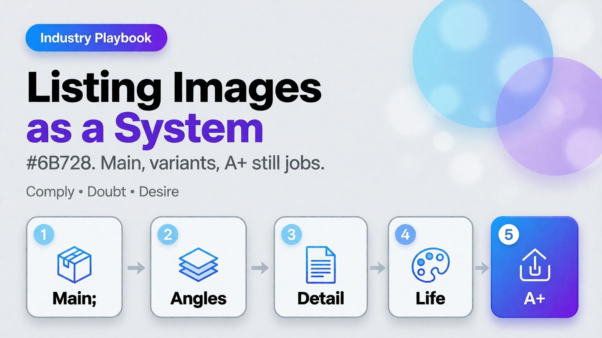
  • Amazon Listing Images as a System: Main, Variants, and A+ Still Logic

    Amazon Listing Images as a System: Main, Variants, and A+ Still Logic

    Amazon does not buy your moodboard. It buys slot performance: a compliant main image, a gallery that answers doubts, and A+ stills that explain without breaking catalog rules. Teams that AI-generate “seven pretty heroes” still lose the Buy Box war on clarity.

    AI Amazon listing images work when you treat the gallery as a system of jobs — not a folder of vibes.

    Key Takeaways

    >

    – Main image = compliance + recognition. Secondary slots = doubt removal. A+ = story without replacing Truth.

    – Listings with richer image sets convert more strongly in large studies (~50% higher with 5+ images vs thinner galleries in Catchlab-cited 2026 roundups).

    – Reuse packshot angle families and scene jobs — mapped to Amazon slots.

    – Upscale only after QA (upscale playbook).

    Why Do Random AI Galleries Underperform on Amazon?

    Because each thumbnail has a job in the purchase path.

    Slot Job Fail mode
    Main Recognize + comply Props, text, lifestyle bleed
    2–3 Form / angle truth Duplicate beauty shots
    4–5 Detail / texture / scale Unreadable macros
    6–7 Lifestyle / in-use Fantasy that fights main
    A+ Features / compare / story Walls of unread text

    If every file tries to be a campaign hero, none of them staff the gallery.

    Amazon creative is information architecture with pixels. AI should fill slots, not audition for a perfume ad.

    The Listing Image System

    Layer A — Compliance Truth

    • Main on approved background
    • True color, full product, no promotional overlays (follow current marketplace policy)
    • Geometry QA for hard goods

    Layer B — Doubt Removers

    • 45° / back / open-box / scale in hand
    • Detail of materials and controls

    Layer C — Desire / Context

    Layer D — A+ Stills

    • Feature callouts in clean layouts
    • Comparison charts as designed graphics (prefer controlled text, not hopeful in-image AI type)

    Playbook: One SKU, One System Day

    1. Write slot map — which file fills which job
    2. Shoot/generate Truth set reference-heavy
    3. QA geometry + typography
    4. Add one lifestyle only after Truth passes
    5. Build A+ frames from approved masters (crop + layout)
    6. Upscale delivery sizes once
    7. Contact-sheet review against competitor galleries in-category

    Ratio/adapt habits from marketplace banners still help for off-Amazon ads — but on Amazon, slot jobs beat ratio panic.

    Soft CTA

    Produce listing-ready packshots and gallery systems: Ecommerce · Packshot

    Frequently Asked Questions

    Can AI generate Amazon main images?

    Yes — if compliance and product fidelity pass. Treat main as the strictest Truth frame, not a creative playground.

    How many lifestyle images should an Amazon gallery include?

    Usually one or two. Fill remaining slots with doubt removers before stacking lifestyles.

    Is A+ a place for experimental AI worlds?

    Keep A+ clearer than experimental. Use approved product masters; add controlled graphics for features.

    How is this different from TikTok Shop scene types?

    TikTok optimizes scroll jobs (hook/demo). Amazon optimizes catalog jobs (compliance/doubt). Share masters; change the slot map.

    Conclusion

    Stop generating seven heroes. Staff seven jobs.

    Main for compliance. Variants for truth. Lifestyle for desire. A+ for explanation. Gate fidelity. Then deliver.

    That is an AI Amazon listing images system — built for the buy path, not the moodboard.


    References

    1. Lumepixa, AI Product Photography Statistics 2026 (Catchlab / Salsify citations). https://lumepixa.app/blog/ai-product-photography-statistics
    2. Adobe, 2026 Creators’ Toolkit Report, June 16, 2026. https://news.adobe.com/news/2026/06/creators-toolkit-report-2026
  • Home Product Staging with AI: Room Context Without Fake Square Footage

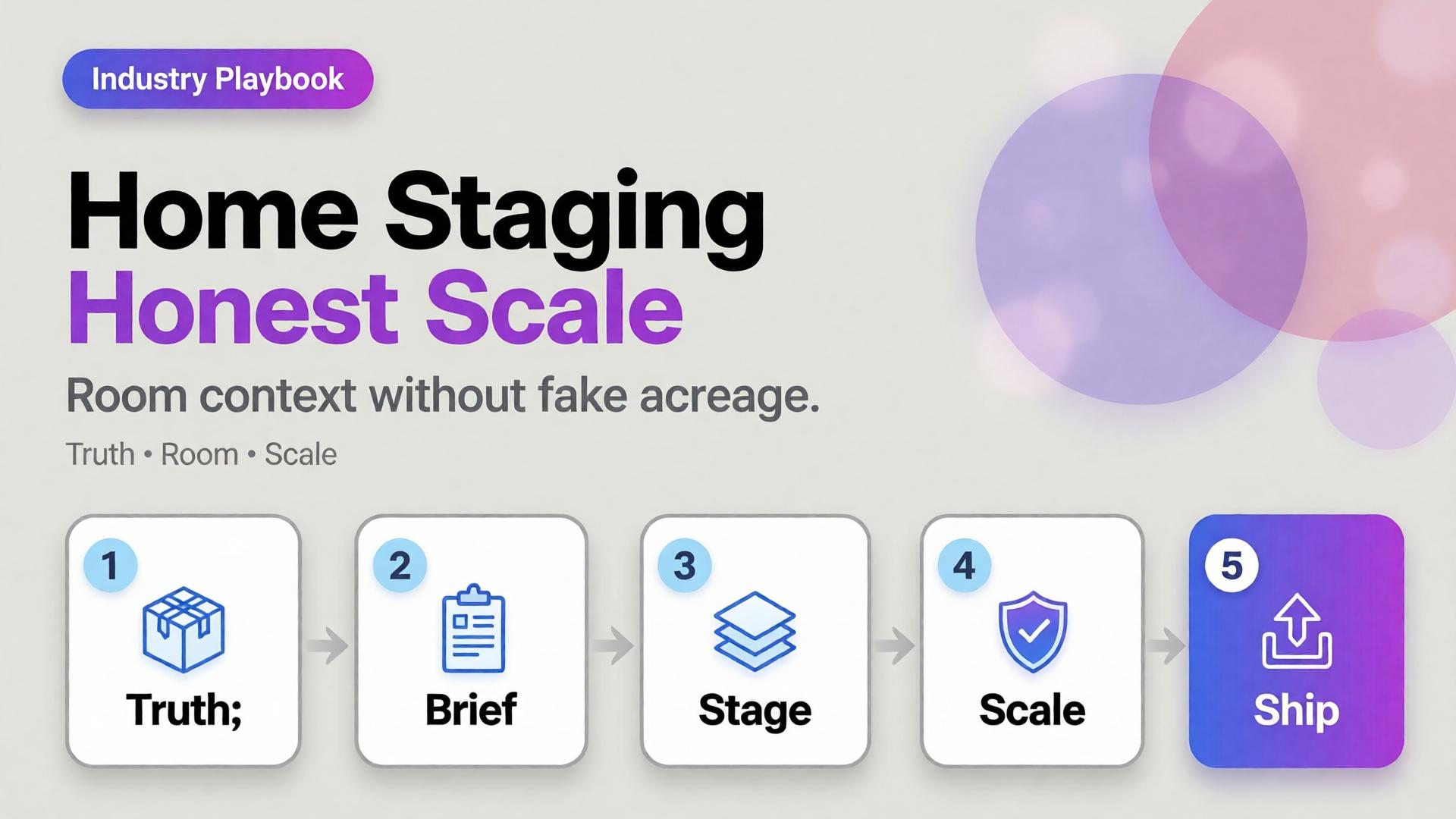
    Home Product Staging with AI: Room Context Without Fake Square Footage

    A sofa on pure white tells dimensions badly. A sofa in a cathedral living room tells lies well. Home and furniture ecommerce lives in that tension: buyers need context, but context that invents square footage creates “looked bigger online” returns.

    AI home product staging is the discipline of placing SKUs in believable rooms with scale honesty, locked light, and gates — not generating dream interiors that your warehouse cannot ship.

    Key Takeaways

    >

    – White-only home catalogs under-inform; fantasy rooms over-promise. Use dual-layer galleries like visual commerce 2026.

    – Stage with known scale anchors (door, outlet, side table) and real product dimensions in the brief.

    – Map rooms like beauty maps rituals — a context grid before generate (SCENE).

    – Geometry still matters for legs, seams, and hardware (hard goods QA when parts are precise).

    Why Does Home Staging Break Trust Online?

    Because furniture is purchased as space math.

    Staging sin Buyer consequence
    Oversized rooms “Tiny in real life” returns
    Wrong camera height Proportions feel off
    Mixed design eras Brand looks incoherent
    Soft rug hiding feet Leg style unknown
    Invented materials on props Cart confusion

    Lifestyle lift is real in ecommerce image research — but only when lifestyle stays honest.

    Home staging is not interior design porn. It is dimensional storytelling: how big, how it sits, how it lives with ordinary walls.

    Context Map for Home SKUs

    Borrow beauty’s context mapping mindset (beauty lifestyle contexts):

    Context Job Avoid
    Studio / white Spec + color truth Only image on PDP
    Apartment daylight Real-life scale Mansion windows
    Corner / tight wall Small-space proof Endless open plan
    Detail / fabric Material truth Fake weave
    Lifestyle lived-in Emotion Clutter that hides SKU

    Write 4–5 contexts per hero SKU. Reuse the room kit across the catalog (batch thinking).

    Playbook: Honest Room Extension

    1. Lock packshot truth — front, side, fabric detail
    2. Write room brief — room size class (studio / 1BR living), camera height, light (north window / warm lamp)
    3. Place scale anchors — known objects; state approximate room width in brief if critical
    4. Generate staging with product ref locked
    5. Scale QA — does the SKU dominate the room unrealistically?
    6. Ship dual layer — truth + staging for PDP; staging-heavy for ads

    Soft CTA

    Produce catalog truth and room contexts in one ecommerce creative system: Ecommerce · Photography

    Frequently Asked Questions

    What is AI home product staging?

    Placing furniture or home SKUs into room contexts with AI while preserving product fidelity and believable scale for ecommerce.

    Should every furniture PDP drop white backgrounds?

    Keep a truth layer. Add staging as secondary images and ads — same dual-layer logic as visual commerce guidance.

    How do I prevent “mansion staging”?

    Specify room class and camera height in the brief. Reject outputs where the SKU looks doll-sized or palace-scaled.

    Can staging replace dimensions in the listing?

    No. Staging supports intuition; specs remain mandatory.

    Conclusion

    Rooms sell home products. Fake acreage unsells them after delivery.

    Map contexts. Lock scale. Gate the fantasy. Keep a truth layer. That is AI home product staging that converts without breeding return tickets.


    References

    1. Lumepixa, Product Image Statistics 2026. https://lumepixa.app/blog/ecommerce-product-image-statistics
    2. Adobe, 2026 Creators’ Toolkit Report, June 16, 2026. https://news.adobe.com/news/2026/06/creators-toolkit-report-2026
  • Hard Goods Need Geometry QA: Eyewear, Gadgets, and Spec-True AI Images

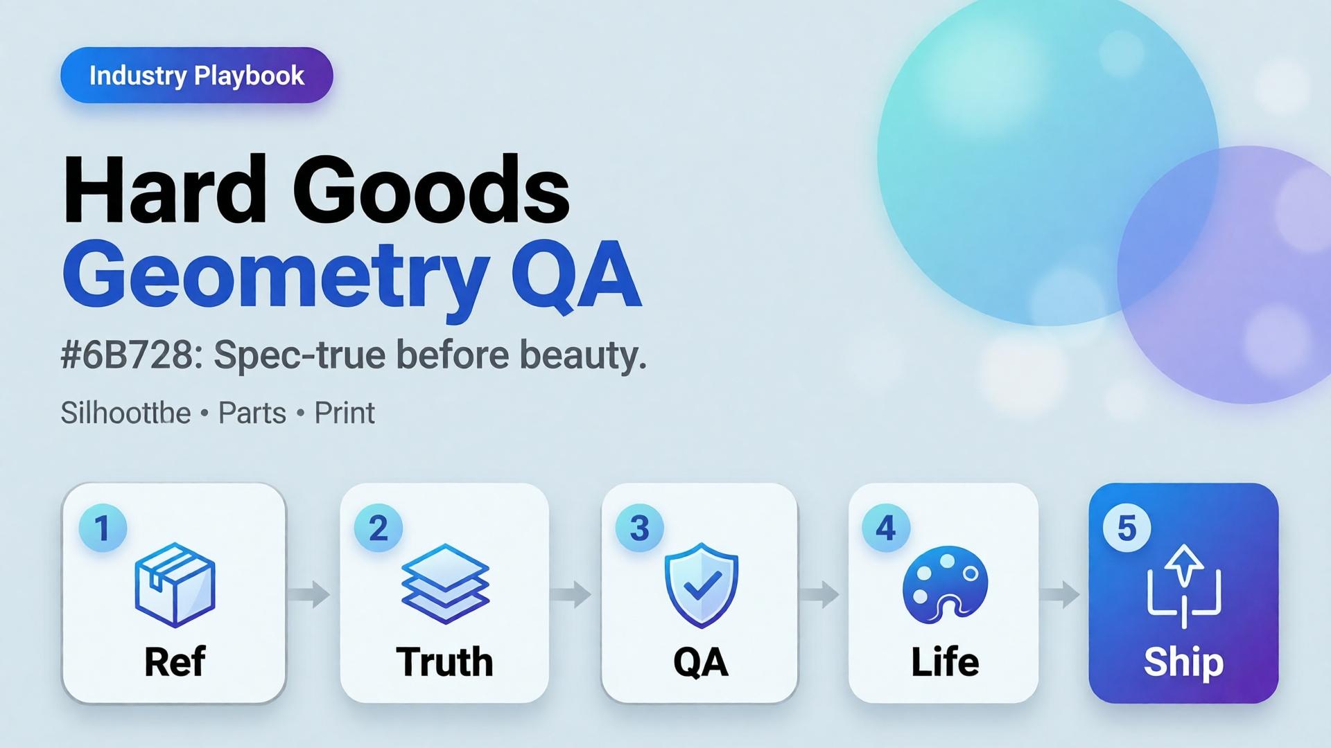
    Hard Goods Need Geometry QA: Eyewear, Gadgets, and Spec-True AI Images

    Beauty SKUs forgive a soft edge. Eyewear does not. A millimeter of temple warp, a lens reflection that invents a logo, a button row that gains an extra key — and the listing becomes a liability.

    AI hard goods product images fail when teams apply fashion/lifestyle prompting to precision objects. Hard goods need geometry QA as a first-class gate: silhouette, symmetry, ports, hinges, and print — before any lifestyle world.

    Key Takeaways

    >

    – Hard goods are spec products. Buyer trust is dimensional, not only emotional.

    – Run a geometry checklist before beauty, upscale, or lifestyle extension (packshot thinking).

    – Prefer reference-heavy generation; explore mode is for backgrounds after the object passes (reference vs explore).

    – Upscale only after QA (upscale after QA) — sharpening warped hinges makes rejects look confident.

    Why Do Lifestyle Prompts Break Hard Goods?

    Because soft prompts optimize for vibe. Hard goods optimize for match-to-unboxing.

    Soft-goods bias Hard-goods reality
    Fabric drape can vary Hinge angle cannot
    Skin tone mood Port count is binary
    “Premium glow” Specular lies on lenses/metal
    Approximate logo Exact wordmark + icon

    Eyewear, watches, earbuds, keyboards, tools, and small appliances sit on the hard side of that table.

    For hard goods, the hero image is a contract drawing with light — not a moodboard with a product stuck on top.

    Geometry QA Checklist (Pass Before Beauty)

    Silhouette

    • Outer shape matches reference
    • No melted corners, no missing tips (eyewear temples)

    Symmetry / alignment

    • Left-right balance on glasses, buds, paired objects
    • Button grids aligned

    Functional parts

    • Ports, hinges, switches, screws present and correct in count
    • No “extra USB” hallucinations

    Optics / materials

    • Lens transparency plausible (no opaque glass unless product is)
    • Metal vs plastic read correct

    Print / icons

    • Logos and iconography correct — or intentionally out of frame

    Fail any row → reject. Do not lifestyle it “to hide the error.”

    Playbook: Spec-True Then Scroll-Stopping

    1. Capture honest refs — front, 45°, detail of hinge/port
    2. Generate Truth angles reference-heavy (image model after direction)
    3. Geometry QA gate with zoom
    4. Optional lifestyle bridge — same approved object into a scene (desk, face for eyewear with character lock)
    5. Upscale + crop only on winners (node spine)

    For ads, keep scene jobs — but Truth frames carry the SKU.

    Category Notes

    Category Extra risk Extra gate
    Eyewear Lens reflections invent logos Check both lenses
    Earbuds / wearables Stem length drift Side-by-side with ref
    Keyboards / controllers Key count / layout Count visible keys
    Small appliances Cable / button myths Detail crop of controls

    Soft CTA

    Build spec-true packshots before campaign worlds: Packshot · Ecommerce

    Frequently Asked Questions

    What counts as hard goods for AI product images?

    Products where dimensional accuracy and part count matter to purchase and returns — eyewear, electronics, tools, precision accessories.

    Can I still use lifestyle scenes?

    Yes — after the object passes geometry QA. Lifestyle is extension, not repair.

    Should I use a different AI model for hard goods?

    Choose for fidelity bottleneck after direction — not because the category is trendy. See model-after-direction guidance.

    How many reference angles do I need?

    At least front + 45° + one detail of the failure-prone part (hinge, port, lens).

    Conclusion

    Hard goods do not need softer prompts. They need harder gates.

    Geometry first. Beauty second. Lifestyle third. Upscale last. That is how AI hard goods product images survive zoom, returns, and marketplace scrutiny.


    References

    1. Lumepixa, AI Product Photography Statistics 2026. https://lumepixa.app/blog/ai-product-photography-statistics
    2. Adobe, 2026 Creators’ Toolkit Report, June 16, 2026. https://news.adobe.com/news/2026/06/creators-toolkit-report-2026
  • Cross-Border Catalogs: Localize Product Images Without Breaking Brand

    Cross-Border Catalogs: Localize Product Images Without Breaking Brand

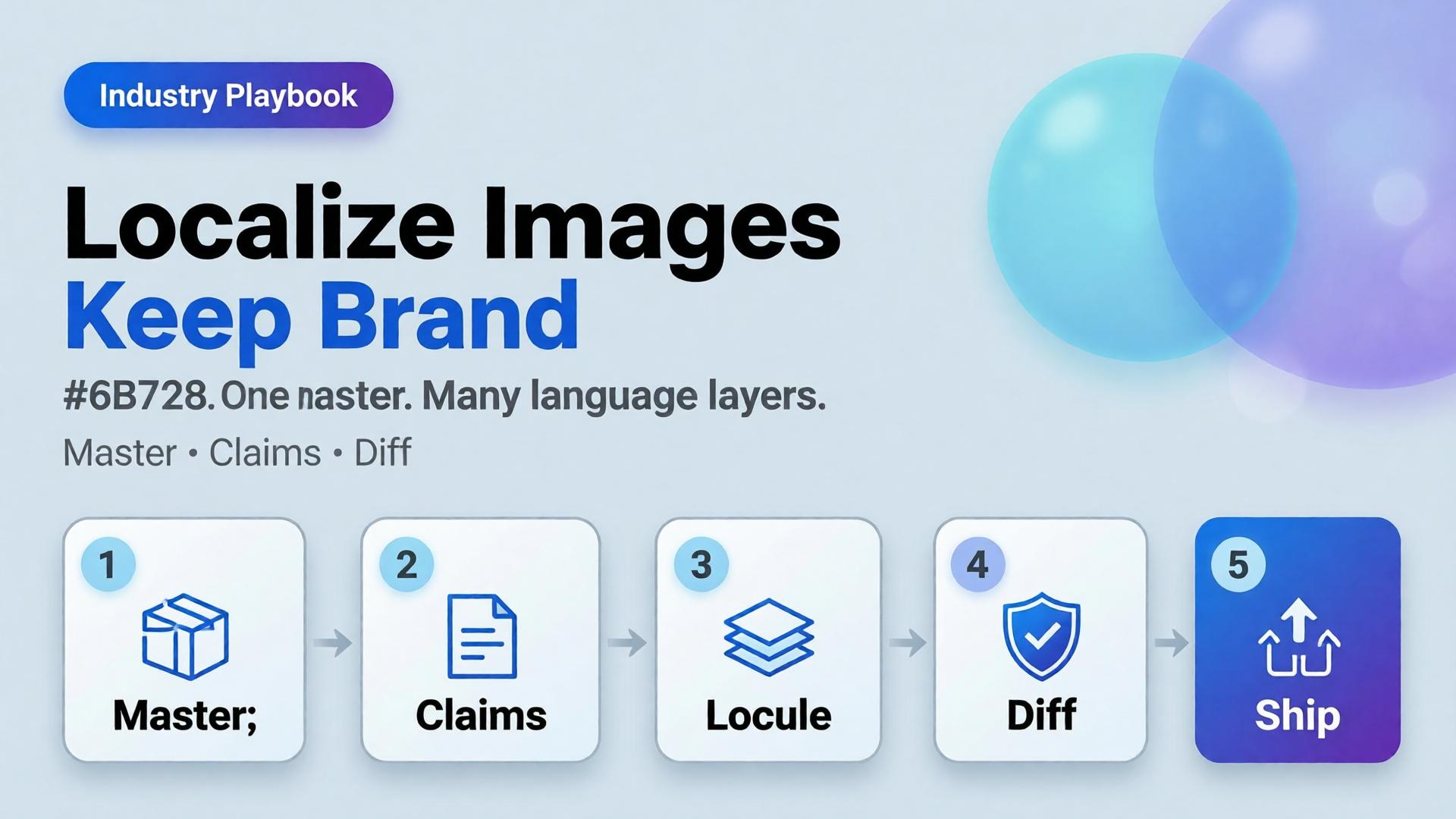
    You launch in one language. Then marketplace ops asks for EN, VI, TH, and ID versions of the same banner by Friday. Someone regenerates the whole scene four times. The bottle changes shape. The light shifts. The brand kit quietly dies.

    AI ecommerce image localization is not “translate and pray.” It is a production rule: one visual master, many language layers — with gates that protect SKU truth and brand identity across borders.

    Key Takeaways

    >

    – Rebuild-per-language is how catalogs fracture. Localize text and claims, not the entire world, unless the market truly needs a new scene.

    – High-quality product imagery remains a conversion lever in 2026 roundups (Salsify-cited lifts vs weak photos); localization must not destroy that quality (Lumepixa, 2026).

    – Treat localization as a node after Brand Style + Generate — never as a fresh creative brief.

    – Legal claims, units, and badge rules are market-specific gates — not prompt adjectives.

    Why Do Per-Language Regenerations Break Brands?

    Because generation optimizes for a new pretty frame, not for identity continuity.

    Rebuild-per-language Master + localize
    New light each market Same light family
    Label drift risk × N One Truth gate
    Four art directions One kit
    Slow QA Diff-check text regions

    Cross-border teams do not need more models. They need batch thinking applied to locales.

    Localization fails when teams translate campaign vibes instead of translating claims. Vibes can stay global. Claims must go local.

    What Should Stay Global vs Go Local?

    Keep global (master layer)

    • Product geometry and packshot truth
    • Brand palette and light logic
    • Scene world / lifestyle context (unless culturally wrong)
    • Character identity if a face is used

    Localize deliberately

    • In-image headlines and CTAs
    • Promotional badges and price callouts
    • Measurement units and regulatory lines
    • Marketplace-required disclaimers

    Redesign only when required

    • Cultural taboo in scene
    • Model casting rules by market
    • Category compliance that forbids the original composition

    If you redesign every time, you do not have a localization system. You have N brands.

    Playbook: Master → Locale Pack

    Step 1 — Ship a language-agnostic master

    Prefer compositions with clear text safe zones (marketplace banner thinking). Avoid burning essential claims into tiny packaging type you cannot legally alter.

    Step 2 — Extract a claim sheet per market

    Field EN VI Notes
    Hook line Char limit
    Offer badge Color locked
    Unit line oz ml Compliance
    Disclaimer Legal review

    Step 3 — Localize as a gated node

    Input: approved master + claim sheet. Output: locale variants. Gate: geometry unchanged, brand kit intact, text correct, no new product.

    Step 4 — Diff review, not vibes review

    Flip EN ↔ VI on the same crop. If the bottle moved, reject — even if Vietnamese typography looks nicer.

    Step 5 — Archive locale packs with the kit

    Next drop swaps SKU refs, reuses locale claim templates. That is how cross-border catalogs scale.

    Where AI Helps — and Where It Lies

    Helps: rapid text replacement in safe zones, layout fitting, bulk varianting after master lock.

    Lies: rewriting packaging legal text “to look native,” inventing certificates, changing ingredient panels, or “improving” the product silhouette while translating.

    Packshot honesty still applies (packshot thinking). A localized ad that misrepresents the SKU creates returns in every language.

    Soft CTA

    Keep one ecommerce creative system across markets: Ecommerce solutions · Marketplace Banners

    Frequently Asked Questions

    What is AI ecommerce image localization?

    It is the practice of adapting in-image text and market claims on a locked visual master so catalogs stay consistent across languages and marketplaces.

    Should every market get a unique lifestyle scene?

    Only when culture or compliance demands it. Default to one world, many language layers.

    Can AI translate text printed on the product package?

    Treat package print as high risk. Prefer accurate photography of the real SKU for Truth frames; localize marketing overlays separately.

    How do I QA localized images quickly?

    Side-by-side diff against the master. Check geometry first, typography second, claim accuracy third.

    Where does this sit in a workflow builder?

    After Generate and before Upscale/Crop variants — localization should not invent a new product.

    Conclusion

    Cross-border growth should multiply locales, not multiply identities.

    Lock a master. Write claim sheets. Localize as a node. Diff-check like a skeptic. Keep the bottle the same bottle.

    That is AI ecommerce image localization that scales — without quietly founding a new brand in every language.


    References

    1. Lumepixa, AI Product Photography Statistics 2026. https://lumepixa.app/blog/ai-product-photography-statistics
    2. Adobe, 2026 Creators’ Toolkit Report, June 16, 2026. https://news.adobe.com/news/2026/06/creators-toolkit-report-2026
  • Upscale After QA: Marketplace Image Sharpening Without Fake Detail

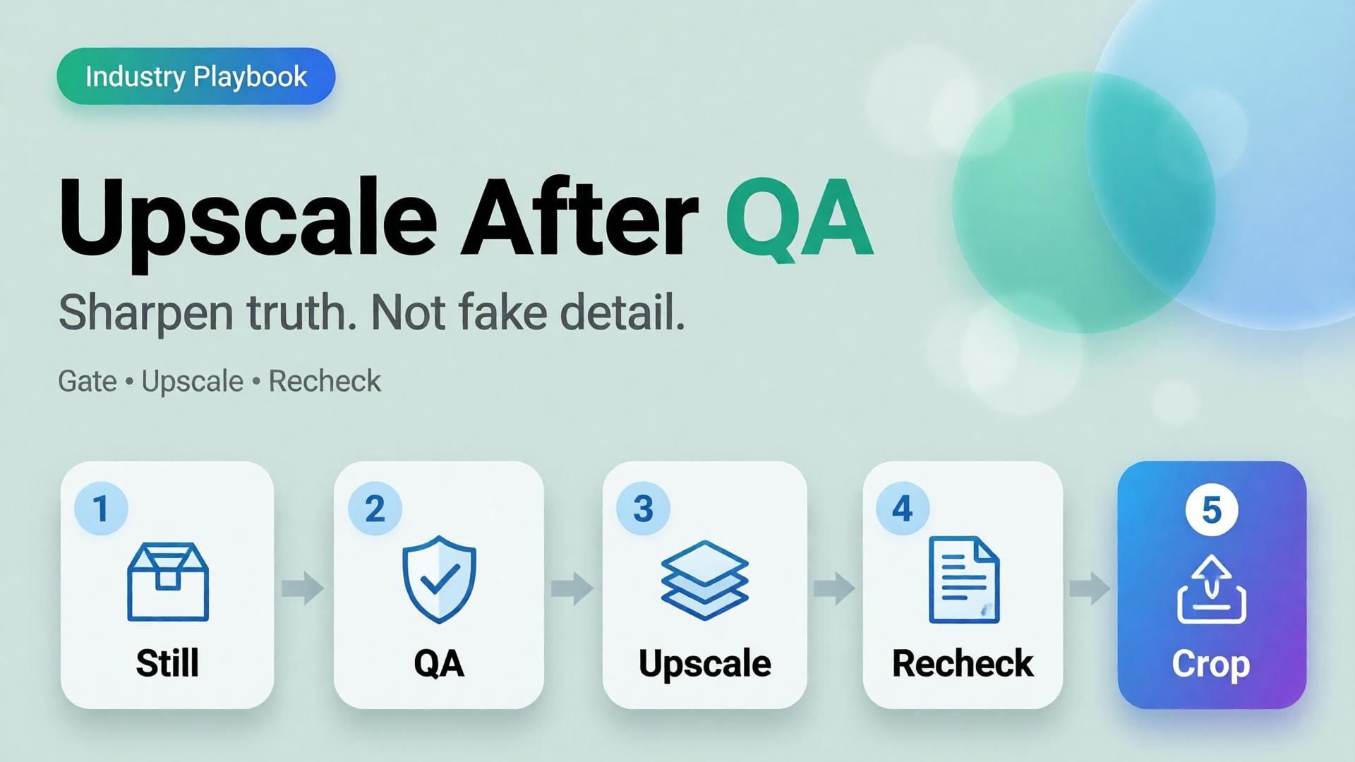
    Upscale After QA: Marketplace Image Sharpening Without Fake Detail

    The listing looks soft on mobile zoom. Someone drops the file into an upscaler. Edges crisp. The logo grows new serifs. A seam appears that the product does not have. The marketplace still rejects the crop — or worse, accepts it and returns spike later.

    AI product image upscale is not a magic “make HD” button. It is the Upscale node in a workflow: sharpen only what already passed geometry and label QA.

    Key Takeaways

    >

    – Upscale amplifies truth and lies equally. QA before sharpen.

    – Products with high-quality photos convert far better than weak imagery in 2026 roundups (Salsify-cited ~94% lift vs low-quality) — but “sharp fakes” are not high quality (Lumepixa, 2026).

    – Place Upscale after Generate gates in node thinking — never as forgiveness for a bad reference.

    – Marketplace min resolution is a delivery constraint, not a creative strategy.

    Why Do Teams Upscale Too Early?

    Because resolution is measurable and fidelity is judgment.

    Early upscale habit What actually happens
    Soft phone photo → 4K Soft lies become sharp lies
    Rejected AI still → upscale Warped type becomes confident warped type
    Every crop upscaled Hours spent polishing variants that should die
    Upscale instead of reshoot/ref Reference problem becomes production debt

    Phone-to-campaign discipline still starts with a usable reference (workflow mindset). Upscale cannot invent a better capture — only a bolder one.

    Marketplace buyers do not reward megapixels. They reward zoom that still matches the unboxing. Upscale without QA is how you fail that contract in high resolution.

    The QA Gate Before Upscale

    Run this checklist on the winner still only:

    Geometry

    • Silhouette matches physical SKU
    • No melted corners, stretched labels, floating caps

    Typography / print

    • Brand wordmarks readable and correct
    • No invented ingredients, seals, or stars

    Material

    • Fabric / plastic / glass reads plausible
    • No “plastic skin” or fake micro-contrast

    Compliance

    • Background rules for the target marketplace
    • Required margins for the crop job

    Fail any row → regenerate or recapture. Do not upscale.

    This is the same honesty bar as packshot thinking.

    Where Upscale Belongs in the Graph

    Upload → Brand Style → Generate → QA gateUpscale → Crop / Localize

    Node Allowed to change
    Generate Scene within brief
    QA Nothing — only pass/fail
    Upscale Apparent resolution / mild denoise
    Crop Framing only

    If Upscale changes identity, your tool is not upscaling — it is regenerating without permission.

    Playbook: Marketplace Delivery Without Fake Detail

    1. Approve master at working resolution (enough to judge label truth)
    2. Run QA checklist with a second pair of eyes when claims are legal-sensitive
    3. Upscale once to the strictest channel need (do not chain 2× → 2× → 2× blindly)
    4. Re-check typography at 100% zoom after upscale
    5. Crop for feed / PDP / cover from the upscaled master
    6. Archive both pre- and post-upscale for dispute / rollback

    For multi-market text, localize on the approved master path (image localization) and re-QA text regions after any sharpening.

    When Not to Upscale

    • Source is already sharp enough for the channel
    • Detail is mostly AI hallucination risk (tiny badges, dense nutrition panels)
    • You need a new angle — shoot/generate the angle instead
    • The soft look is intentional mood (then deliver mood at native res)

    Soft CTA

    Build honest packshots before you sharpen them: Packshot · Ecommerce

    Frequently Asked Questions

    Does AI upscaling improve conversion?

    Only when it improves clarity of a true product image. Sharp false detail can hurt trust and increase returns.

    Should every SKU be upscaled?

    No. Upscale when the channel requires resolution you lack after QA. Skip when native resolution already clears the bar.

    Upscale before or after cropping?

    Usually upscale the approved master, then crop — so all ratios share one sharpened truth. Re-QA critical text after crop if glyphs sit near edges.

    How is this different from choosing a higher-tier image model?

    Model choice happens at Generate. Upscale is a delivery node. Do not confuse them — see choose image model after direction.

    What is the biggest upscale mistake on marketplaces?

    Using upscale to “save” a failed label. Marketplaces and buyers both punish confident errors.

    Conclusion

    Sharpen after you trust.

    QA the still. Upscale once. Re-check the type. Crop for channels. Never ask an upscaler to invent honesty.

    That is how AI product image upscale supports marketplace growth — without shipping beautiful fiction.


    References

    1. Lumepixa, AI Product Photography Statistics 2026. https://lumepixa.app/blog/ai-product-photography-statistics
    2. Lumepixa, Product Image Statistics 2026. https://lumepixa.app/blog/ecommerce-product-image-statistics
    3. Adobe, 2026 Creators’ Toolkit Report, June 16, 2026. https://news.adobe.com/news/2026/06/creators-toolkit-report-2026
  • E-commerce Ad Creative: 5 Scene Types That Convert on TikTok Shop

    E-commerce Ad Creative: 5 Scene Types That Convert on TikTok Shop

    TikTok Shop does not reward “pretty product on marble.” It rewards readable intent in the first second — then enough truth that a tap does not feel like a trap.

    Most AI ecommerce batches fail here: every frame is a vague lifestyle. The hook looks like the demo. The demo looks like the offer. The offer looks like stock. Buyers scroll. You regenerate. Nothing compounds.

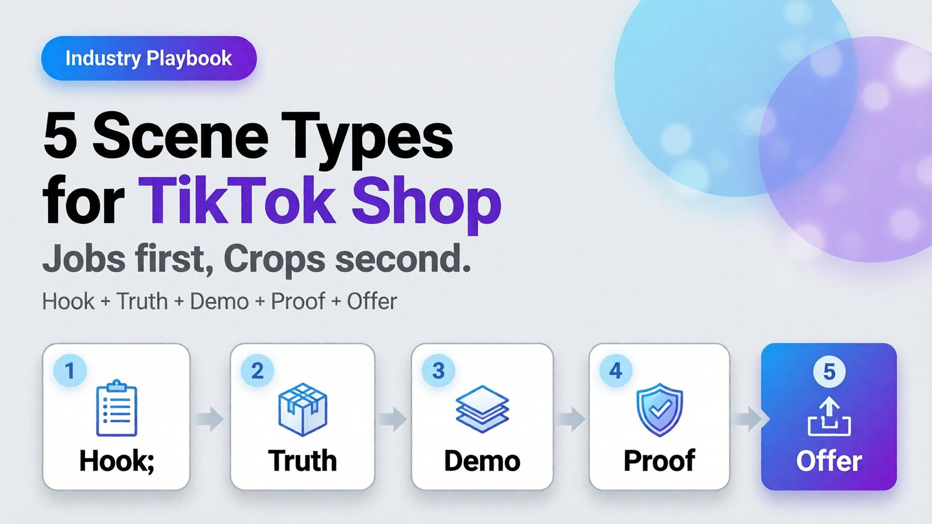
    AI TikTok Shop product images work when you cast scenes by job, not by aesthetic. Five scene types cover almost every SKU drop: hook, truth, demo, proof, offer.

    Key Takeaways

    >

    – Treat TikTok Shop creative as a scene system, not a single hero crop.

    – Listings and ads with richer visual coverage convert more strongly — large listing studies show 5+ images correlating with ~50% higher conversion versus thin galleries (Catchlab via 2026 image stats roundups).

    – High-quality product photography still shows outsized lifts versus weak imagery in Salsify-cited analyses (~94% better conversion vs low-quality photos in 2026 roundups).

    – Pair scene types with ratio families (1:1, 4:5, 9:16) — scene job first, crop second.

    Sibling to marketplace banner thinking. Parent frame: AI Ecommerce Design Is Not AI Image. Story structure: SCENE.

    Why Do Random Lifestyle Renders Underperform on TikTok Shop?

    Because the feed is a conversation, not a catalog wall.

    Buyer second Question If your image answers nothing
    0–1s Why pause? Scroll
    1–3s What is it really? Distrust
    3–8s How does it work / look on me / in use? Bounce
    CTA Why buy now? Save for later forever

    A single “aesthetic” AI frame usually answers only the pause — and sometimes not even that. Scene types map to the questions in order.

    On TikTok Shop, clarity is a growth hack. Aspiration without truth reads as dropship. Truth without a hook never gets seen.

    The 5 Scene Types (Jobs, Not Vibes)

    1. Hook — stop the scroll

    Job: Pattern interrupt that still belongs to your brand.

    • Strong silhouette, motion freeze, unexpected scale, bold color block
    • Product recognizable within one beat
    • No tiny label text as the hook

    Fail mode: generic luxury room that could sell anyone’s bottle.

    2. Truth — show the real SKU

    Job: Marketplace-grade honesty. Geometry, label, color.

    This is packshot thinking inside the ad system — front / 45° / detail as needed.

    Fail mode: AI-rewritten typography, warped proportions, beauty that lies.

    3. Demo — show the use

    Job: Hands, pour, wear, open, apply — the verb of the product.

    • One action per frame
    • Match real physics (no fake steam on shelf-stable drinks)

    Fail mode: model posing beside product with zero interaction.

    4. Proof — reduce risk

    Job: Texture macro, size reference, kit contents, before/after only if honest.

    Proof is not fake UGC. It is visual evidence the PDP will keep.

    Fail mode: invented reviews as image text; exaggerated results.

    5. Offer — carry the deal without killing trust

    Job: Price, bundle, or urgency laid on a still-true product frame.

    • Safe zones for text
    • Same product identity as Truth scene

    Fail mode: redesigning the product to make room for a sticker.

    How Do Scene Types Map to Ratios?

    Use banner thinking — one master direction, many crops:

    Scene Best first ratio Also ship
    Hook 9:16 4:5
    Truth 1:1 4:5
    Demo 9:16 4:5
    Proof 1:1 4:5
    Offer 9:16 + 1:1 cover/wide if store needs

    Do not invent five unrelated worlds. Invent five jobs inside one brand kit.

    Playbook: One SKU, One Day

    1. Write the five jobs in one line each (hook idea, truth angle, demo verb, proof detail, offer frame)
    2. Lock reference — phone or studio plate that survives Truth gate
    3. Generate Hook + Demo in explore-limited mode after kit lock
    4. Generate Truth + Proof reference-heavy — reject label drift
    5. Build Offer from Truth master + text safe zone
    6. Crop to 9:16 / 4:5 / 1:1 from winners (node: Crop)
    7. Contact-sheet review — do the five still look like one brand?

    This is the TikTok Shop version of phone → campaign.

    What Changes by Category?

    Category Hook bias Demo bias Proof bias
    Beauty Texture / glow ritual Application Shade / skin-safe honesty
    Fashion Outfit world On-body movement Fabric macro / fit
    F&B Condensation / pour Serve moment Ingredient / label truth
    Gadgets Scale / unbox silhouette Feature in hand Port / detail accuracy

    Beauty teams already map rituals in lifestyle context mapping. TikTok Shop simply forces the order of jobs into the feed.

    Soft CTA

    Produce Shop-ready scene families and ratio sets in one workspace: Marketplace Banners · Ecommerce

    Frequently Asked Questions

    What are the best AI TikTok Shop product images?

    Images assigned to clear jobs — hook, truth, demo, proof, offer — with locked product fidelity and consistent brand kit across ratios.

    Do I need video if I have strong still scene types?

    Stills still matter for Shop cards, carousels, and ads. Video helps demo and hook; it does not replace Truth and Proof frames.

    How many scenes should I generate per SKU?

    Start with one winner per type (five). Expand variants only after the five jobs pass a set review.

    Is this the same as marketplace banner thinking?

    Banner thinking solves ratios. Scene types solve narrative jobs. You need both: job first, then crop.

    Can AI lifestyle replace packshots on TikTok Shop?

    No. Lifestyle without Truth increases returns and distrust. Keep a truth layer even when the hook is cinematic.

    What is the biggest AI mistake on TikTok Shop creatives?

    Generating twelve “nice” lifestyles with no demo verb and no label-true hero — volume without jobs.

    Conclusion

    TikTok Shop does not buy your moodboard. It buys scenes that do jobs.

    Hook to earn the pause. Truth to earn trust. Demo to earn understanding. Proof to remove fear. Offer to invite the tap. Crop each winner into the ratios the channel demands.

    That is how AI TikTok Shop product images stop looking like stock — and start behaving like a sales system.


    References

    1. Lumepixa, AI Product Photography Statistics 2026 (Salsify / Catchlab citations). https://lumepixa.app/blog/ai-product-photography-statistics
    2. Lumepixa, Product Image Statistics 2026. https://lumepixa.app/blog/ecommerce-product-image-statistics
    3. Adobe, 2026 Creators’ Toolkit Report, June 16, 2026. https://news.adobe.com/news/2026/06/creators-toolkit-report-2026
  • Packshot Thinking: Enough Angles Without a Studio Day

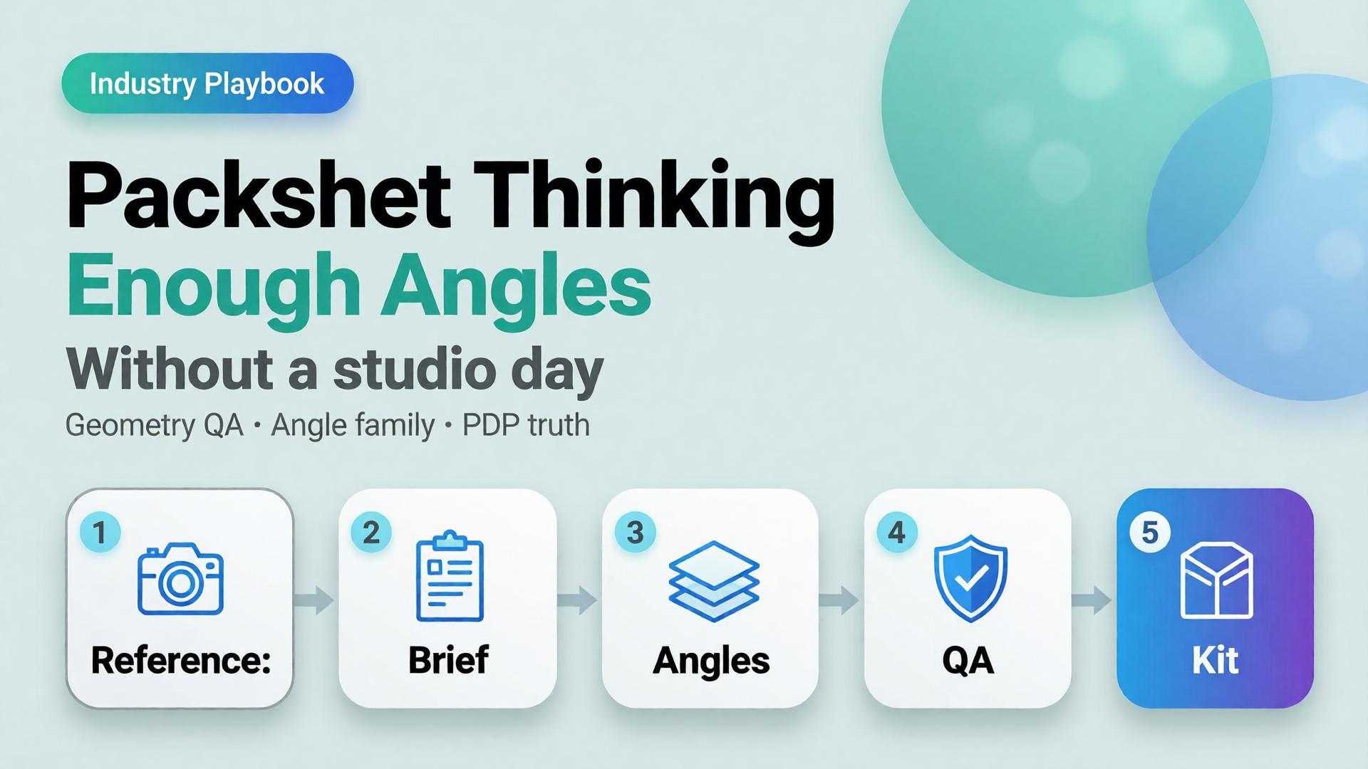
    Packshot Thinking: Enough Angles Without a Studio Day

    Editorial cover for Packshot Thinking: Enough Angles without a studio day
    Editorial cover for Packshot Thinking: Enough Angles without a studio day

    Most ecommerce teams still treat a packshot as a single file: product centered, white background, “good enough for the listing.” Then returns spike because buyers never saw the hinge, the texture, or the size relative to a hand. The problem was never the camera. The problem was packshot thinking — treating product photography as one pretty frame instead of a system of angles that answers buyer questions.

    AI packshot work in 2026 is not “make the bottle prettier.” It is: from one honest reference, produce enough commercial angles that a stranger on a phone can decide without calling support.

    Key Takeaways

    • A packshot is a question-answering set, not a hero beauty shot. Front, 45°, detail, scale, and packaging are different jobs.
    • Adobe’s 2026 Creators’ Toolkit Report found 57% of creative AI outputs still need moderate or extensive editing before publish — packshot QA fails for the same reason: geometry and label fidelity, not “vibe.”
    • Studio days buy control. Packshot thinking buys coverage: enough angles to list, retarget, and reuse without booking another shoot.
    • Orauria’s Packshot Studio and Ecommerce solutions are built for this job — reference in, angle family out — inside one creative workspace.

    If you have already read AI Ecommerce Design Is Not AI Image, this post is the product-layer version of that idea. Ecommerce design is the system. Packshot thinking is how the SKU itself survives marketplace scrutiny.

    What Is Packshot Thinking?

    Packshot thinking means you plan product images the way a merchandiser plans a shelf talker: every frame must close a doubt.

    Angle Buyer question it answers Fail mode if missing
    Front hero What is this product? Listing looks empty or “stock”
    45° / 3/4 What is the form in space? Flat, toy-like, hard to trust
    Detail / macro What is the material / print / finish? “Looks cheap online” returns
    Scale How big is it? Size shock after delivery
    Packaging / in-box What arrives? Unboxing disappointment
    Lifestyle bridge (optional) Where does it live? Cold catalog, weak ads

    White-background front shots are not “dead” — they are incomplete. Visual Commerce 2026 argued that white-only feeds underperform when every competitor ships context. Packshot thinking agrees — and adds a rule: lifestyle does not replace geometry. You still need the honest product block.

    A studio day gives you control. Packshot thinking gives you coverage. Coverage is what marketplaces and media buyers actually buy.

    Why Do Teams Still Book Studio Days for Simple SKUs?

    Three reasons — all rational, all incomplete.

    1. Fear of label drift. AI that “improves” a bottle often invents typography. Media buyers then reject the export because the listing hero and the ad disagree. The fix is not “never use AI.” The fix is reference-first packshots with a QA checklist that scores geometry before beauty.

    2. Habit of one hero. Designers deliver one approved beauty shot. Marketing asks for six crops Friday afternoon. Nobody owned the angle family. From Phone Photo to Campaign names this as a workflow failure, not a photography failure.

    3. Confusion between packshot and campaign. Campaign images sell aspiration. Packshots sell truth. Mixing the briefs produces images that are neither listable nor scroll-stopping.

    Adobe’s 2025–2026 creator surveys show most teams already juggle more than one creative AI tool in a quarter. That sprawl is exactly what packshot thinking tries to prevent: one reference, one brand kit, one angle plan — then generate.

    How Many Angles Are “Enough”?

    Enough is not a fixed number. Enough is coverage of buyer doubt for that category.

    Category Minimum useful set Notes
    Supplements / beauty bottles Front + 45° + label detail + scale Label fidelity is the QA bottleneck
    Electronics / gadgets Front + ports/detail + in-hand scale + packaging Ports and buttons must stay readable
    Apparel accessories Front + texture + on-model or flat scale Texture sells more than logo
    Home / hard goods Front + 45° + material detail + room bridge Staging is secondary to form

    If you only ship one angle, you are optimizing for the photographer’s portfolio — not the PDP.

    How to Build a Packshot Angle Family with AI

    This is a thinking workflow, not a button tour. Use any capable image model inside Orauria Studio; the discipline matters more than the model name.

    Step 1 — Lock the reference, not the vibe

    Upload a clean product photo: label facing camera, product centered, minimum ~1000×1000 px if you can. Phone photos work as references if focus holds on the label — see the phone-to-campaign mindset post.

    Write what must not change: bottle height, cap color, logo placement, material finish. That list is your Brand Style guardrail, not a moodboard.

    Step 2 — Write the angle brief before prompts

    Borrow the SCENE method only for lifestyle bridges. For pure packshots, write a shorter table:

    • Angle name
    • Buyer question
    • Background rule (white / soft gray / none)
    • Crop rule (full product vs detail)

    Do not invent scene poetry until the front and 45° pass QA.

    Step 3 — Generate the geometry set first

    Produce front and 45° before lifestyle. Score each export on:

    1. Does the SKU still read as the SKU?
    2. Is type on the label still legible at phone width?
    3. Do proportions match the reference (no “stretched bottle”)?

    If an export fails geometry, regenerate. Do not “fix in Photoshop for an hour” and pretend the system worked.

    Step 4 — Add detail, scale, then optional lifestyle

    Detail and scale close returns. Lifestyle bridges feed ads and social. Keep them in that order so campaign beauty never overwrites listing truth.

    Step 5 — Publish the family into a reusable kit

    Store approved angles with the SKU ID. When batch thinking across 100 SKUs starts, you reuse the angle plan — not reinvent prompts per product.

    For the productized path — shot planner plus studio generation — see Orauria’s AI Packshot landing and the broader ecommerce hub.

    Packshot QA Checklist (Traffic-Ready)

    Use this before anything leaves the folder:

    • [ ] Front hero matches listing color and silhouette
    • [ ] 45° does not invent new branding
    • [ ] Detail crop shows real texture / print / seam
    • [ ] Scale cue is honest (hand, coin, known object — or stated dimensions in copy)
    • [ ] No burned-in promo text unless the ad brief requires it
    • [ ] Background removal / cutout edges are clean for marketplace upload (background removal workflows)
    • [ ] All angles feel like one SKU, not three product lines

    Adobe’s finding that 57% of AI creative still needs editing before publish is not a reason to avoid AI. It is a reason to budget QA as part of packshot thinking.

    How Does Packshot Thinking Connect to Ads and Marketplaces?

    Packshots feed three surfaces:

    1. Marketplace PDPs — geometry and trust
    2. Prospecting statics — same product block, new scenes and ratios
    3. Workflow reuse — nodes that cut, upscale, and re-crop without re-shooting

    The next post in this cluster — One Product → Feed, Story, Cover — covers ratio families for Meta, TikTok, and marketplace banners. Packshot thinking is the source of truth. Banner thinking is the channel adaptation.

    Inside Orauria, that handoff lives in one workspace: Packshot for angles, Banner Ads / marketplace tools for sizes, Workflow for cleanup — instead of exporting to three vendors and losing brand coherence.

    Frequently Asked Questions

    Is an AI packshot good enough for Amazon or Shopee listings?

    It can be — if geometry and label fidelity pass human QA. Marketplaces punish misleading imagery. Treat AI as a production system for angles, not a license to invent product features.

    Should lifestyle images replace white-background packshots?

    No. Lifestyle answers context; packshots answer form. Strong catalogs use both. See Visual Commerce 2026.

    What if I only have a messy phone photo?

    Start with phone-to-campaign workflow mindset. Clean the reference enough that the label is readable, then build the angle family. Do not expect a blurry label to become sharp legal type.

    Which AI image model is best for packshots?

    The model that holds product geometry under your QA checklist. Choose the model after the angle brief — not before. That decision framework is covered in Choose the Image Model After Creative Direction.

    How is this different from a full studio day?

    A studio day maximizes control for hero campaigns. Packshot thinking maximizes coverage and reuse for catalogs and weekly ads. Many teams need both — just not for every SKU every week.

    Soft next step

    If your bottleneck is “we never have enough angles,” open Orauria Packshot and plan the angle family before you chase another model trend. For the full ecommerce loop — listing through social reuse — start at solutions/ecommerce.