Blog

  • AI商品画像で白抜きが偽物に見えるのは光とエッジの問題だ

    AI商品画像で検索すると「撮影不要」が並びます。Amazon.co.jp・楽天で実際に壊れるのは別の点です。原画にハイライト・輪郭・ラベル情報が足りないのに、AIがメインを“きれいに”作ってしまう瞬間です。

    本記事はツール紹介ではありません。撮影の話です。実物から何を残し、何をAIに想像させてはいけないか。

    Key Takeaways

    • AI商品画像の失敗の多くは原画データの欠落(ハイライト/エッジ/文字)。
    • 白抜きは切り抜きではなく 照明の規律
    • ガラス・メタル・箔・ジュエリー・シワの出る生地はヒーロー実写を優先。
    • アイデンティティ固定のあとにだけ角度・シーン・広告を拡張する。

    「商品画像」検索はジェネレーター検索と違う

    検索語 本当の仕事 よくある誤り
    AI商品画像 カタログ撮影の代替/スマホ光の補正 Midjourneyをカメラ扱い
    AI商品写真 撮影パイプライン QAなしで出品
    AI商品画像生成 チャネル一式 1枚で全媒体

    キット視点: AI商品画像生成。撮影パイプライン: AI商品写真

    問うべきは「AIが撮れるか」ではなく、実物のどの光子を残してからAIを許すかだ。

    白抜きが安く・偽物に見える3点

    問題 スマホでの見え方 AI前の対処
    ロゴ/箔の過露出 安っぽいプラ感 拡散光;反射角を変える
    接地影なし/強すぎ 浮く/汚れる 弱い接地影+ソフトフィル
    ラベル文字つぶれ 信頼・レビューリスク 寄り;文字優先フォーカス

    ギザギザ縁、グレー背景、ロゴの“美化”変形 → 破棄。写真ではなく合成の痕跡です。

    材質別:AI拡張 vs 実写

    材質 良い原画後のAI拡張 ヒーロー実写
    マット箱・パウチ
    不透明ボトル+平面ラベル 色差に厳しいSKU
    ガラス/透明液体 弱〜中 必須
    メタル/メッキ/箔 必須
    アパレル平置き/ハンガー シルエットとドレープ
    ジュエリー・小物金具 マクロ

    価値信号が表面を走る光なら実写。外形+印刷色面なら東京の窓辺スマホ+白抜き規律で出品・広告まで行けることが多い。

    ハイブリッド手順

    1. 正直なヒーロー(ラベル可読・水平・ぶれなし)
    2. 文書でアイデンティティ固定
    3. 白抜きQA通過後にだけ拡張
    4. 蓋シルエット/ロゴ改変は拒否
    5. サムネ3秒認識テスト後にAmazon/楽天反映

    Orauriaの位置

    Product Marketing向け AI Creative Studio。商品1枚 → 写真・広告・SNS・ショート → campaign pack。真実のキャプチャは出品者側、SKUドリフトのない拡張はシステムの側。

    最初のProduct Kitを作る →

    FAQ

    スタジオは完全に不要?

    マット系カタログと広告バリエーションはしばしば可。ガラス・メタル・ブランドフィルムは実写。ハイブリッドが現実的。

    AI白抜きがプラスチックっぽい理由は?

    原画のスペキュラ/エッジライトが違うか、モデルがハイライトを捏造。再生成の前に撮影幾何を直す。

    アイデンティティブリーフに書くことは?

    箱色、ロゴ無歪み、比率固定、美化禁止材質、シーンで暗示してはいけない訴求。

    結論

    AI商品画像=真実キャプチャ → 固定 → 商業フレーム拡張 → 写真リード式QA。最初の環を飛ばせば、後段のAI画像はコスプレだ。

    Create Your First Product Kit →

  • AI商品写真:きれいな一枚ではなく、売れる写真セットを作る

    AI商品写真を探すなら、ランダムなアート生成ではなく、実物SKUを守る撮影システムが必要です。

    スマホまたは白抜き1枚 → Amazonメイン、楽天サブ、Shopify PDP、Instagram広告まで。パッケージ・ロゴ・色・形状は固定。渋谷スタジオの日程は不要です。

    Key Takeaways

    • 75% の買い物客が購入判断で商品写真に依存(Weebly, 2026)。
    • 5〜7枚(角度+シーン)が1枚より有利なことが多い(Statista / 2025–2026)。
    • 失敗:Midjourney感のカットをAmazon白抜きルールに無理当て。
    • チェック:原画 → アイデンティティ固定 → ジョブ別生成 → 1:1 · 4:5 · 3:4 · 9:16 · 16:9。

    AI商品写真が果たすべき役割

    アート生成 EC向け AI商品写真
    入力 プロンプト 実物写真
    出力 きれいな一枚 チャネル一式
    制約 審美 商品アイデンティティ
    成功 いいね CTR、ROAS、返品減

    関連:AI商品画像生成

    「写真」の単位はファイルではなく、出品できるセットであるべきです。

    きれいなAI写真がAmazonで落ちる理由

    返品の約 22% が写真と実物の不一致(Weebly)。ロゴ崩れ・色ずれは信頼とCSを削ります。

    白背景+ライフスタイルは白のみ比で転換 15–30% リフト例が多い(2026 A/B)。

    1回のアップロード → キット

    段階 Job チャネル
    白抜き/スタジオ メイン Amazon.co.jp、楽天
    シーン 使用文脈 PDP、広告
    モール 規定 Yahoo!ショッピング等
    ソーシャル広告 スクロール停止 IG、TikTok、FB
    キャンペーン 年末年始・セール LP、A+

    USP 5(ART共通)を維持。

    5ステップ

    1. 正直な原画(東京の窓辺スマホOK)
    2. アイデンティティ固定
    3. ジョブ単位で生成
    4. 比率別書き出し
    5. 公開前QA

    Orauria

    Product Marketing向け AI Creative Studio。商品1枚 → 写真・広告・SNS・ショート → campaign pack。別のジェネレーターではなく 商品 → ECコンテンツシステム

    最初のProduct Kitを作る →

    FAQ

    Amazon・楽天でAI商品写真は使える?

    実物表現+ポリシー遵守なら可。メインはクリーン、AIは拡張用。

    背景削除との違いは?

    削除は一工程。AI商品写真はセット・多比率・アイデンティティ固定まで。

    高度なプロンプトは必要?

    アップロード → ジョブ選択 → 生成なら不要。商業ブリーフ優先。

    結論

    売れ筋SKUで5種キットを作り、メインを7〜14日A/B。

    Create Your First Product Kit →

  • AI商品画像生成:1枚の商品写真から売れるクリエイティブ一式へ

    AI商品画像生成:1枚の商品写真から売れるクリエイティブ一式へ

    ランダムなAI画像を作らないでください。売れる状態の商品クリエイティブを作ってください。

    AI商品画像生成とは、実物の商品写真を1枚アップロードすると → 白抜きメイン、シーン画像、広告・SNS素材が揃い、パッケージ・ロゴ・色・形状はそのまま保たれる、という流れです。渋谷のスタジオ日程も、カメラマン日当も、Reels用9:16のたびにCanvaを開き直す必要もありません。

    Key Takeaways

    • オンライン購買はビジュアル依存が強い:約 75% の買い物客が購入判断で商品写真に頼ると回答(Weebly、2026業界まとめ)。
    • 複数画像の出品は単一画像より転換しやすいことが多い。1枚から 5〜7枚(角度+ライフスタイル)へ増やすと業界データでリフトが報告される(Statista / 2025–2026まとめ)。
    • 2026年の典型的な失敗:Midjourney / Flux / GPT Imageをアートツールとして使い、Amazonメイン画像ルールに無理やり当てはめる——商品 → コンテンツキットを作らないこと。
    • 勝ち筋チェック:きれいな原画 → アイデンティティ固定 → 役割別出力(スタジオ/シーン/広告/モール)→ 比率別書き出し(1:1 · 4:5 · 3:4 · 9:16 · 16:9)。

    AI商品画像生成とは?

    AI商品画像生成は、実物写真を入力に、出品・広告・SNS向けの商用ビジュアルを拡張するプロセスです。自由文プロンプトのアート生成ではありません。

    アート生成(Midjourney、Flux…) EC向け AI商品画像生成
    入力 テキスト / ムード 実物写真(スマホまたは白抜き)
    目的 きれい / バズ 出品・出稿できる素材
    制約 少ない——審美優先 形状・ラベル・色・比率を保持
    出力 ばらばらの単発 チャネル一式
    成功指標 いいね、美観 CTR、ROAS、返品減

    「ECデザイン ≠ AI画像1枚」の大きな枠は AI ecommerce design is not AI image を参照。

    日本のセラーに足りないのはモデルではありません。公開システムです。SKUが1つ入れば → 複数チャネルのクリエイティブが出て、商品アイデンティティは同じであるべきです。

    「きれいな」AI画像がAmazonで売れない理由

    実物とずれたきれいなカットは信頼と返品を削ります。返品の約 22% が写真と実物の不一致に関連(Weebly / 業界まとめ)。

    よくある3つの失敗:

    1. アイデンティティドリフト — ロゴ崩れ、箱色ずれ、ボトル比率の歪み(Amazonメイン・楽天画像で致命的)。
    2. 1枚で全チャネル — 楽天の1:1は良いが、リール9:16クロップで構図崩壊。
    3. 角度の体系がない — ヒーローだけ、ディテール・スケール・シーン・証拠カットがない。

    白背景のみよりライフスタイル併用で転換が約 15–30% 上がるケースが多い(2026 A/B業界まとめ)。必要なのはセットであり、「高級」レンダリング1枚ではありません。

    商品1つ → コンテンツキット一式

    Orauriaのポジショニング——スケールしたい日本・越境セラーのブリーフ:

    Don’t generate random AI images. Generate product creatives that are ready to sell.

    短く:ECのためのAI商品写真。

    One Product. An Entire Content Kit.

    商品を一度アップロード。売るために必要な画像を生成。

    パイプライン 画像の役割 使い先
    スタジオ / 白抜き 清潔でプレミアム、背景制御 Amazonメイン、楽天、カタログ
    シーン画像 実使用コンテキスト 商品ページ、広告、SNS
    モール向け 出品最適化 Amazon、楽天、Yahoo!ショッピング
    ソーシャル広告 スクロールを止める Instagram、Facebook、TikTok、X
    キャンペーン ブランド一貫の販促 年末年始、セール、A+、LP

    ヒーロー直下のUSP:

    1. One Product → Multiple Creatives — 商品1枚から販売画像セット。
    2. Keep Your Product Consistent — パッケージ・ロゴ・色・形状を維持。
    3. Built for Ecommerce — Amazon、楽天、Shopify、Yahoo!、SNS広告。
    4. From Product Photo to Ad — 白抜き → シーン → バナー → ソーシャル広告。
    5. Multiple Formats — 1:1 · 4:5 · 3:4 · 9:16 · 16:9。

    AI商品画像生成の進め方(5ステップ)

    ステップ1:十分に「本物」な原画を用意

    原画が天井です。

    • 均等な光——ラベルの白飛びなし
    • 正面+任意で45°
    • 透かし・強いフィルタなし
    • シンプル背景(白 / クラフト / きれいな机)

    東京のマンション窓辺のスマホ写真、大阪倉庫の白抜きでも足ります。スタジオは任意、パックショット思考は必須。Packshot thinking を参照。

    ステップ2:きれいにする前にアイデンティティを固定

    シーンや広告の前にロック:

    • ブランド / パッケージ色
    • ロゴ・ラベル文言(虚偽表現禁止)
    • 形状・比率・材質(マット/グロス/ガラス)
    • 変更禁止項目(SKUバリアント、効能表示、認証)

    ロックなし=生成のたびに「別商品」になります。

    ステップ3:バイブではなくジョブで生成

    SKUあたり最低:

    1. 白抜き/スタジオ 1〜2(メイン向け)
    2. シーン 2〜3(洗面台、デスク、リビング——日本の生活文脈)
    3. ディテール/テクスチャ 1
    4. ソーシャル広告 1(コピー・CTA余白)
    5. バナー/キャンペーン 1(セール、年末年始)

    AIに「もっときれいに」と聞かない。このカットはどの購買質問に答えるか?(見た目 / 使い方 / サイズ / 安い商品との差)

    ステップ4:日本チャネルの比率で書き出し

    チャネル 推奨比率 メモ
    Amazonメイン 1:1(白背景) 現行Amazon画像ルールに沿う
    楽天市場 1:1 などモール規定 メイン+サブ
    Shopify PDP 1:1 または 4:5 ヒーロー+ギャラリー
    Yahoo!ショッピング モール規定 カタログ一貫
    Instagram / Facebook 1:1 または 4:5 シーン・広告
    Reels / TikTok / Stories 9:16 UIセーフゾーン
    A+ / バナー 16:9 など 季節キャンペーン

    マスター1枚の盲目クロップは構図を壊します。最初から比率対応生成One product: feed, story, cover, marketplace banners も参照。

    ステップ5:公開前QA(返品ファイアウォール)

    60秒チェック:

    • [ ] モバイルで1秒で商品を認識
    • [ ] ロゴ/ラベルが読める、歪みなし
    • [ ] 色が実物に近い(販売用フィルタ禁止)
    • [ ] フレーム内の虚偽特典・認証なし
    • [ ] 容量・読み込みが妥当
    • [ ] ギャラリー全体の光ファミリーが一致

    Amazon・楽天・Shopifyで同じキットを使う

    日本のブランドは通常、同じSKUを複数戦線に載せます。

    • Amazon.co.jp: 白抜きメイン+サブ角度+A+
    • 楽天市場: メイン・サブ、店舗バナー
    • Yahoo!ショッピング: カタログ一貫
    • Shopify / 自社EC: PDPヒーロー+信頼カット
    • Meta / TikTok広告: 角度・背景のバリアントでテスト

    キット一つでモールごとに「顔」が変わらないように。セール・年末年始はアイデンティティを再利用して変奏します。

    「日本らしく」読めるシーン

    • スキンケア:明るい洗面台ミラー周り(欧州大理石の定番ネタではない)
    • コーヒー器具:木製テーブル、マンションキッチン
    • アウトドア:週末キャンプ・近郊公園の文脈
    • ホーム:南向きリビングの午後の窓光

    シーンは欲求を売り、商品アイデンティティは千葉・埼玉の物流から出る実物と一致している必要があります。

    実写スタジオ vs AI

    状況 選択
    SKU 30〜100発売、予算タイト AI商品画像生成+きれいなスマホ/白抜き原画
    セール・季節の素材リフレッシュ 固定白抜きからAIでシーン・バナー変奏
    全国キャンペーン、難材質(クロム・ガラス・シアー) ハイブリッド:ヒーロー実写少数+AIで量産
    質感・容量・サイズがCS/法令に関わる 実写で真実、AIは文脈のみ——ディテール改変禁止

    AIはすべての東京・大阪スタジオを代替しません。スケールのボトルネック(SKU×チャネル×季節)を代替します。

    Orauria:商品写真からキャンペーンパックへ

    OrauriaはProduct Marketing向けAI Creative Studioです。商品画像1枚 → 商品写真、広告、SNS、ショート動画まで作り、campaign packとして出します。

    もう一つのAI画像ジェネレーターではありません。商品 → ECコンテンツシステムです。

    • 一度のアップロード → 一貫した多数クリエイティブ
    • 出品と広告でアイデンティティ維持
    • 販売チャネル向けフォーマット

    CTA: 最初のProduct Kitを作る →

    ワークスペース紹介:Orauriaとは?EC向けAIクリエイティブワークスペース

    FAQ — AI商品画像生成

    Amazon・楽天でAI商品画像は使えますか?

    実物を正しく示し、各モールの画像・広告ポリシーに従えば可能です。メインは主体が明確なクリーンカット、AIはシーン・サブ・広告拡張に使うのが安全です。別商品に差し替えてはいけません。

    背景削除と何が違いますか?

    背景削除は一工程です。AI商品画像生成はシーン、広告、バナー、多比率、セット全体のアイデンティティ固定まで含みます。

    出品に何枚が良いですか?

    実務では 5〜7枚(角度+ディテール+シーン)が、1枚や過長ギャラリーよりバランス良いことが多いです。自社トラフィックで測ってください。

    高度なプロンプトは必要ですか?

    ECワークフロー(アップロード → 画像ジョブ選択 → 生成)なら必須ではありません。チャネル・ジョブ・アイデンティティ固定・比率を含む商業ブリーフの方が重要です。

    Midjourneyだけで足りますか?

    きれいなフレームは出ます。アイデンティティ固定・マルチフォーマット・モール向けパイプラインは足りないことが多いです。アートモデルはエンジン層、上に商品キット / 販売ワークフローが必要です。

    結論

    AI商品画像生成はBehance的な「AI感」ではなく、売上と出品信頼で勝ちます。

    3つだけ:

    1. 実物原画でアイデンティティ固定
    2. ジョブ単位で生成(スタジオ → シーン → モール → ソーシャル広告)
    3. 比率書き出し+公開前QA

    次の一歩:Amazonまたは楽天の売れ筋SKUで上表の5種キットを作り、メイン画像を7〜14日A/Bしてください。

    Create Your First Product Kit →
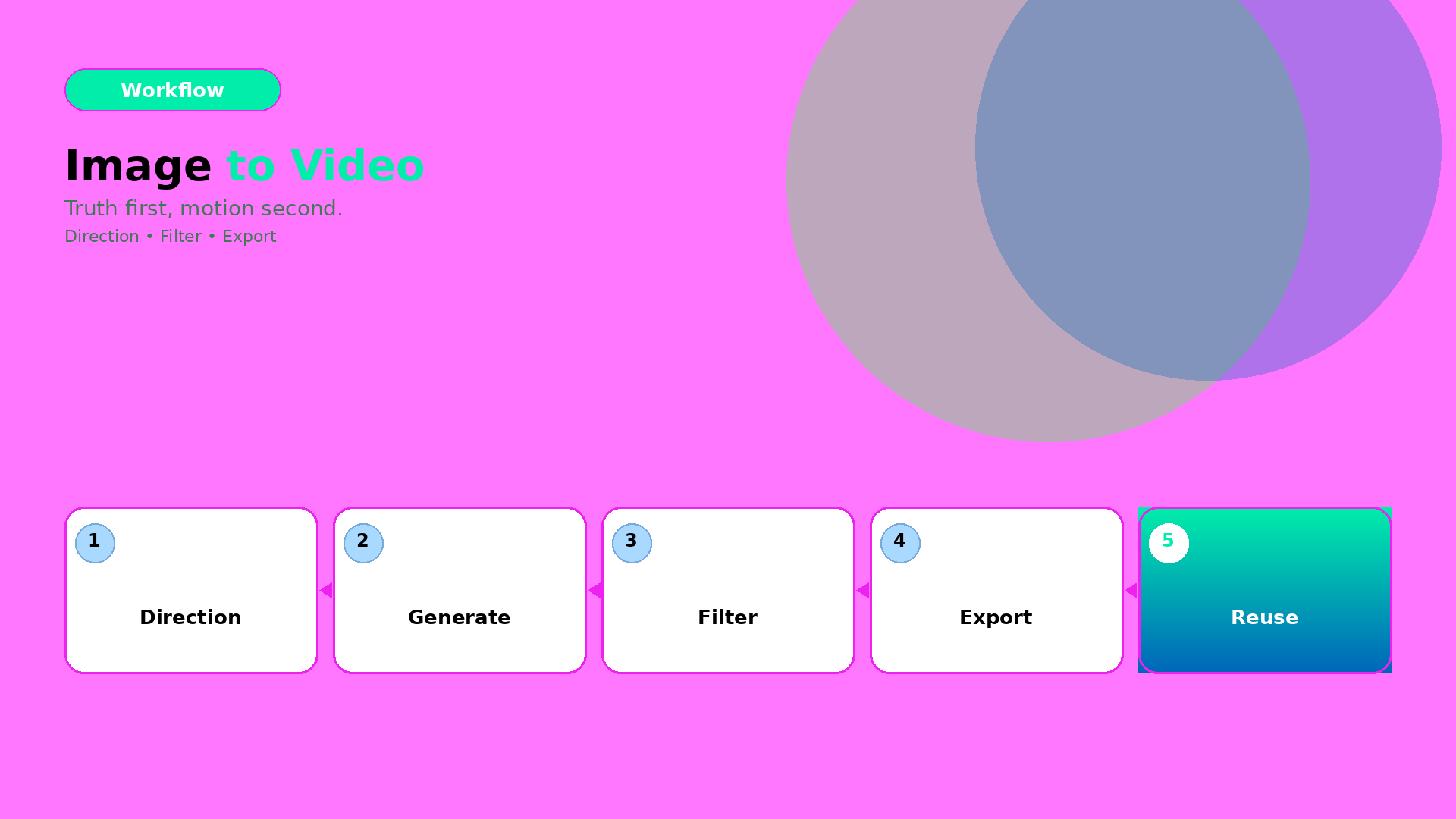
  • How to Use Image to Video with AI: Direction → Gates → Export

    How to Use Image to Video with AI: Direction → Gates → Export

    Image-to-video is deceptively easy.

    You convert one image, and you get motion. But production quality depends on one question:

    Did the direction preserve product truth?

    If yes, motion becomes proof. If no, motion becomes distortion.

    Key Takeaways

    – Image-to-video is efficient when you lock direction first.

    – Gates decide winners: geometry truth, identity stability, and caption/offer alignment.

    – Export variants should follow the same gate logic across channels.

    The 3-part workflow

    1) Direction kit (lock what must stay true)

    Define:

    • what moves (pose/camera feel),
    • what stays true (geometry, label readability, character identity cues),
    • what the scene must communicate (hook, proof, offer).

    This is the “creative direction” layer. Not another prompt.

    2) Generate candidates (then filter, fast)

    Generate multiple candidates under the same direction kit. Reject early with gates:

    • warped edges / warped proportions,
    • unstable identity cues,
    • text/label unreadability after resize.

    This prevents spending time on polish for failures.

    3) Export channel-safe variants (without rework)

    Export with rules:

    • correct aspect ratio,
    • stable safe zones for text and CTA,
    • consistent shadow family and background logic.

    Now your output becomes a reusable creative asset, not a one-off clip.

    What to do next

    If you want the deeper version of the same workflow, read:

    And if your bottleneck is “not enough angles”:

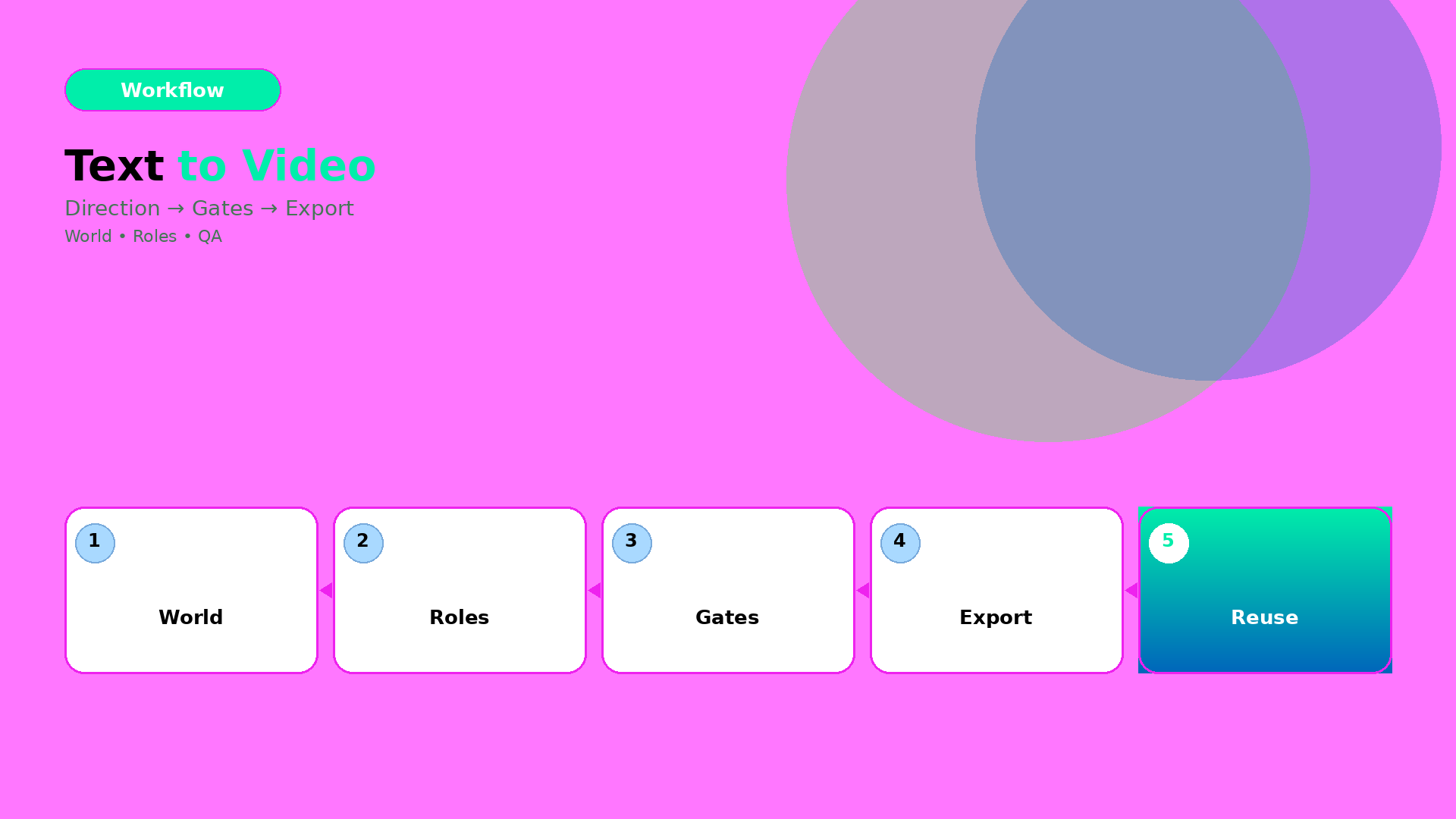
  • How to Convert Text to Videos with AI: Bottleneck-First Workflow

    How to Convert Text to Videos with AI: Bottleneck-First Workflow

    The common failure pattern in text-to-video is the same:

    People generate early, then discover late. They refine prompts while the world already drifted.

    The production fix is simple: stop treating text-to-video as a “prompt task”. Treat it as a workflow with gates.

    Key Takeaways

    – Text-to-video works when you lock direction before you generate.

    – The right QA gates prevent world drift (tone, shadow family, and identity continuity).

    – Efficiency improves when you route by bottleneck: geometry vs readability vs offer tone.

    Step 1: Turn text into direction (not a prompt)

    Start with one compressed direction brief:

    • World: the setting + light family + tone
    • Roles: what each scene must do (hook, proof, offer)
    • Constraints: what cannot drift (product truth, identity anchors, claim safety)

    If your direction brief can’t be spoken in 20–30 seconds, your video will splinter.

    Step 2: Generate under gates (batch, then filter)

    Generate more than you need. But do not “pick the best-looking”.

    Filter by pass/fail gates:

    1. World gate: does the light/tone stay consistent?
    2. Identity gate: does the character/product identity stay in range?
    3. Offer gate: does the visual imply the same promise as your copy?

    Any failure means you update the direction kit—not your luck.

    Step 3: Export variants channel-safe

    Text-to-video videos often die at export:

    • captions get cut
    • safe zones break
    • aspect ratio changes product proportions

    So export with the same gate logic:

    Channel Gate focus
    Reels (9:16) first-second readability
    Stories caption timing and proof hold
    Feed (1:1 / 4:5) product truth center framing

    Routing: which bottleneck decides your workflow?

    Use bottleneck-first routing:

    • if geometry is failing → choose direction/scene constraints that preserve edges and proportions,
    • if readability is failing → adjust label/typography rules before generation,
    • if offer tone is failing → align caption gate with scene roles.

    Model choice is downstream.

    What to do next

    If you want the workflow mindset:

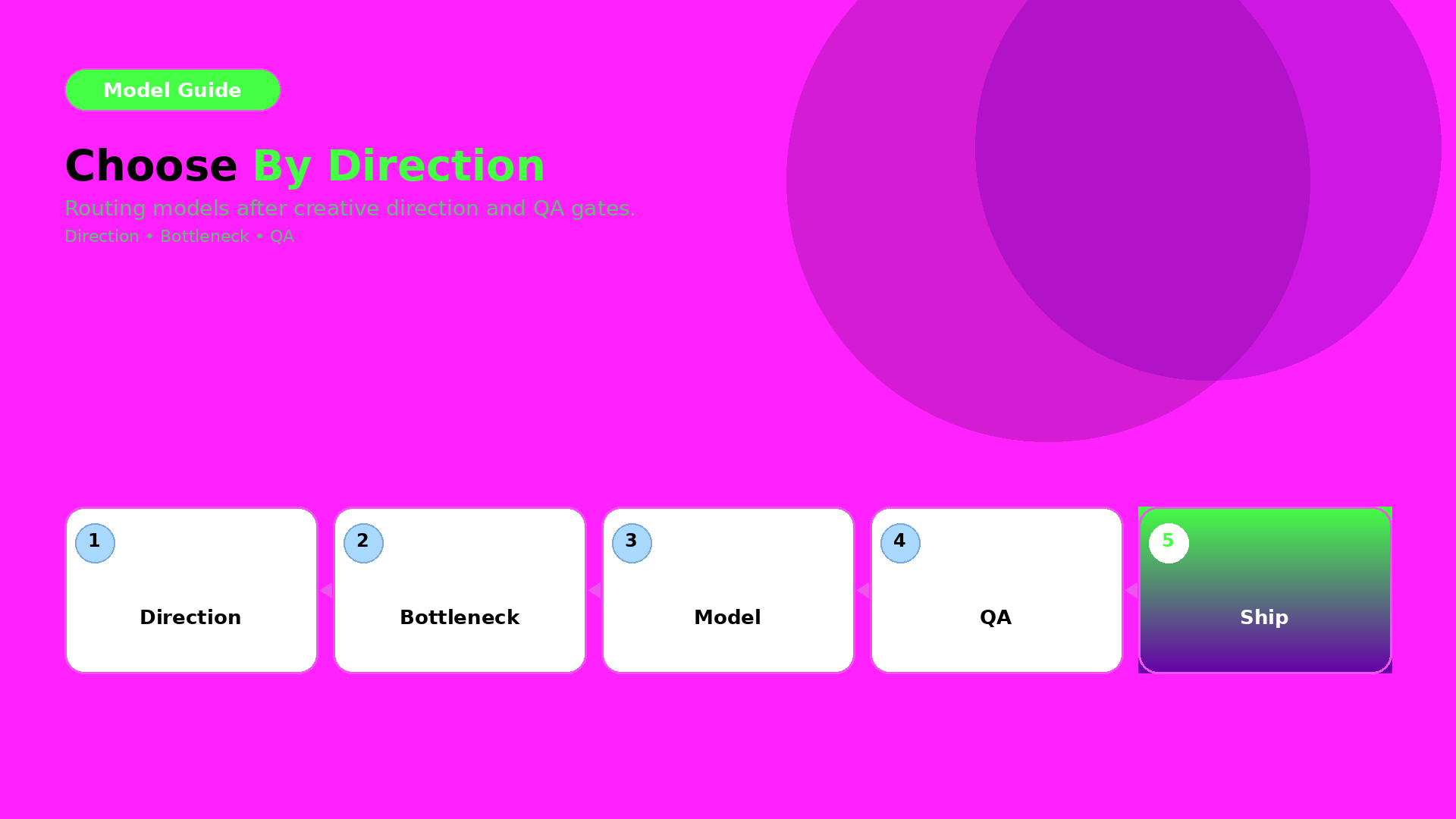
  • Choosing an AI Image Model by Creative Direction (Not Hype)

    Choosing an AI Image Model by Creative Direction (Not Hype)

    Model choice is not a “which one is best” question.

    It is a routing question.

    Route by creative direction and bottleneck after your QA gates are defined. Then the model becomes an implementation detail—not a gamble.

    Key Takeaways

    – Creative direction defines what must stay true (world + roles + QC gates).

    – The bottleneck defines what the model must solve for you.

    – Pick the model after you lock direction—then test under the same gates.

    Step 1 — Lock direction first (inputs you must keep constant)

    Before you compare models, lock:

    • world promise (light family + palette logic),
    • identity anchors (faces/characters or texture cues),
    • and your QA gates (geometry truth + readability).

    If direction changes while models change, you learn nothing.

    Step 2 — Identify your bottleneck type

    Most ecommerce issues fall into one of three bottleneck types:

    1. Geometry bottleneck: edges, proportions, product silhouette
    2. Texture bottleneck: materials, labels, stitching cues
    3. Readability bottleneck: text/label clarity after resize

    Your model should be selected based on the bottleneck you actually see.

    Step 3 — Route outputs through QA gates

    Don’t decide by what the image “feels like”. Decide by pass/fail:

    • geometry truth gate,
    • readability gate,
    • world continuity gate (shadow family + tone),
    • and offer tone gate (if your copy implies a different promise).

    A practical routing checklist

    Use this checklist whenever a new model trend appears:

    1. What bottleneck are we solving today?
    2. Are direction + gates unchanged?
    3. Can we compare on the same output formats (1:1, 9:16, listing)?
    4. Are we rejecting failures early (before polish)?

    If yes: test models. If no: fix the direction kit first.

    What to do next

    Start with the direction-after rule:

    Then upgrade routing to bottleneck-first:

    • pick the model by QA evidence,
    • and keep your gates constant.
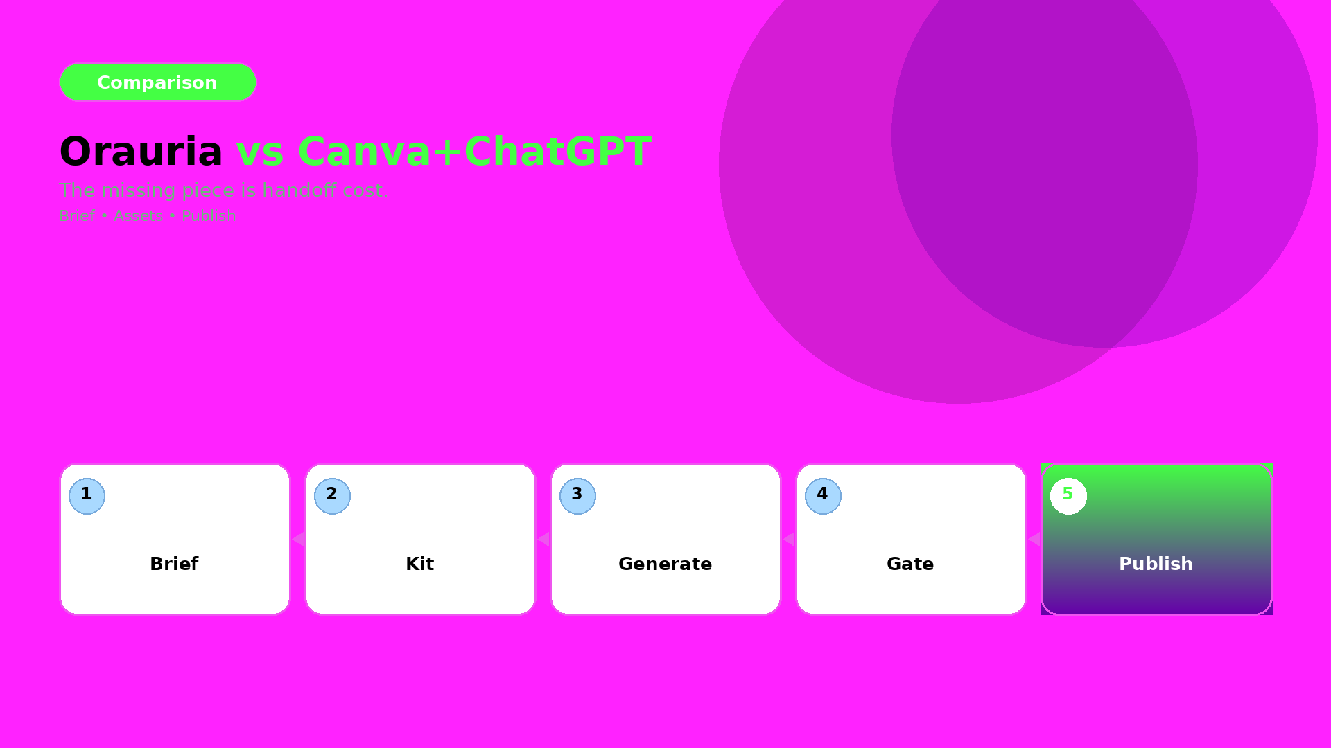
  • Orauria vs Canva + ChatGPT: Honest Comparison for Ecommerce Teams

    Orauria vs Canva + ChatGPT: Honest Comparison for Ecommerce Teams

    Many teams try this stack:

    • ChatGPT for briefs and copy,
    • Canva for layout and crops,
    • and “AI images from somewhere else” for visuals.

    It works—until you scale.

    The failure point is not output quality. It is handoff cost.

    Where Canva + ChatGPT excels

    Canva is great for:

    • quick crops,
    • fast social templates,
    • and design iteration when the direction is already locked.

    ChatGPT is great for:

    • brainstorming,
    • first drafts of captions,
    • and helping you write the brief.

    Where the stack breaks in ecommerce production

    When you go from one asset to a drop system, you need:

    • a shared brand kit,
    • consistent identity anchors,
    • and QA gates across formats.

    In a scattered stack, your system becomes “people remembering”. But production requires “rules enforcing”.

    Orauria’s advantage: workflow continuity

    Orauria is built around the loop:

    1. Brief (intent + constraints),
    2. Brand kit (rules that must not change),
    3. Gates (QC checks before you upscale/export),
    4. Generate and route variants,
    5. Publish-ready exports for ads and listings.

    This turns many outputs into one recognizable system.

    The decision rule (when Orauria wins)

    Orauria wins when:

    • you need 10+ assets per campaign,
    • you must preserve brand identity across sizes and channels,
    • and you don’t have time to manually re-explain the brief every run.

    If your process is “one designer, one asset, one export”, then Canva may be enough.

    What to do next

    If you are switching stacks, start with the mindset:

    • brief once,
    • lock kit once,
    • enforce gates,
    • then generate and publish.

    For a workflow blueprint:

  • Case: 30-SKU Shop, Zero Studio — Lookbook in 3 Days

    Case: 30-SKU Shop, Zero Studio — Lookbook in 3 Days

    This case is not about “fast rendering”. It is about fast decisions under constraints.

    A 30-SKU shop had no studio time. The goal was a lookbook that could also be reused for ads and marketplace listings.

    The bottleneck

    When you generate lookbook scenes quickly, your real failure modes are:

    • identity drift (faces/characters not stable),
    • world collapse (shadows and tone change scene to scene),
    • and QA blindness (geometry or label readability fails after resizing).

    So the case success is measured by: continuity + QA gates + reusable roles.

    Experiment setup (what we locked first)

    World kit

    • one light family (shadow logic stays inside a range),
    • one palette logic (background + product accents),
    • one continuity anchor set (identity + product geometry truth).

    Creative directions (roles)

    We used lookbook thinking:

    • hook role: first-second value,
    • proof role: texture + label readability,
    • offer role: CTA and promise tone,
    • reuse role: later export into ad-safe formats.

    Scene grid plan

    30 SKUs were not treated as 30 independent projects. They were mapped into a batch:

    • same world kit,
    • roles repeated across scenes,
    • only the SKU variable changes.

    The 3-day schedule (how speed actually happened)

    Day 1 — Plan + role map

    Lock directions and world kit. Write the QA checklist before any generation.

    Day 2 — Generate batches

    Generate scenes per role, not per SKU. Reject drift candidates early so we don’t waste polish time.

    Day 3 — QA gates + export

    Run the gates and export channel-safe variants:

    • lookbook page frames,
    • ad-ready crops,
    • marketplace listing support frames.

    QA gates used (what got checked every time)

    We used four gates:

    1. Identity gate: continuity anchors match across scenes.
    2. Geometry gate: edges and proportions stay stable.
    3. Readability gate: labels/CTA remain legible after resizing.
    4. Offer gate: captions imply the same promise as the visuals.

    If any gate fails, we update the kit (rules), then regenerate only affected outputs.

    What actually shipped

    • one coherent lookbook world,
    • consistent brand identity across many scenes,
    • and reusable exports for ads and listings.

    The result is not “many images”. The result is a production system the shop can rerun for future drops.

    What to do next

    If you want to build the same pipeline:

  • What Is Orauria? The AI Creative Workspace for Ecommerce

    What Is Orauria? The AI Creative Workspace for Ecommerce

    Orauria is not just another AI chat.

    It is a creative production workspace for ecommerce and marketing teams—built for the real bottleneck: turning an idea into a consistent set of assets that can be shipped, resized, and reused.

    The core idea: brief → kit → gates → publish

    Most content workflows fail because they treat AI outputs like standalone files.

    Orauria connects the steps:

    1. Brief: capture intent and constraints.
    2. Brand kit: lock palettes, light family, identity anchors, and rules.
    3. Gates (QC): reject drift before you upscale or export.
    4. Publish-ready exports: generate channel-safe variants without rebuilding from scratch.

    Why it matters for ecommerce

    Ecommerce needs recognition.

    Buyers expect the same product truth across:

    • listing visuals,
    • social feed and reels,
    • marketplace banners,
    • and ad campaigns.

    Orauria’s workflow mindset is designed to keep that recognition stable.

    What you do in Orauria (in one sentence)

    You build a reusable creative system, then generate assets that stay inside the same world promise.

    If you want the workflow blueprint, start with:

    What to read next

    If you want the thinking behind the system:

  • When to Use Prompt Normalizer vs Raw Creative Prompts

    When to Use Prompt Normalizer vs Raw Creative Prompts

    Most teams treat “prompting” as one skill. It isn’t.

    For ecommerce production, prompting is actually two different jobs:

    • turning a messy idea into a structured intent (normalizer),
    • and pushing style choices inside a locked direction (raw creative prompt).

    If you mix these jobs, you get inconsistent outputs and wasted iterations.

    Key Takeaways

    – Raw prompts are good for exploration.

    – Normalizers are good for alignment and repeatability.

    – Your workflow should choose the tool by bottleneck, not by preference.

    What is a prompt normalizer (production view)?

    A normalizer takes input like:

    • “make it premium”,
    • “use the same model”,
    • “make it look like our brand”,
    • “turn this into an ad”.

    And converts it into a structured brief:

    1. Intent: what outcome it must achieve,
    2. Slots: what can vary vs what cannot,
    3. Constraints: QA gates rules (geometry, readability, world logic),
    4. Output routing: which model family fits the bottleneck.

    In other words, it is the briefing layer.

    What are raw creative prompts (exploration view)?

    Raw prompts are where you:

    • try a new visual twist,
    • adjust scene tone,
    • explore typography density,
    • test hook variations.

    Raw prompts are not wrong. They are just wrong for tasks that require alignment.

    The decision guide: choose by bottleneck

    Ask this:

    A) Are you missing alignment?

    If results drift in:

    • face/identity,
    • shadow family,
    • label clarity,
    • caption promise vs visuals,

    then you are missing rules. Use a prompt normalizer.

    B) Are you already aligned and just exploring?

    If identity is stable and only style options are unclear, then exploration is fine. Use raw creative prompts.

    A simple workflow that prevents waste

    Use this loop:

    1. Normalize the brief (intent + slots + constraints)
    2. Generate exploration variants inside the locked world kit
    3. Gate by QA checks
    4. Ship only the winners into your content system

    This is what “workflow mindset” means in prompting: you are building a reusable system, not repeating trials.

    What to do next

    If you want the brief template:

    If you want workflow routing: